We’ve discussed Vitsoe around here before, primarily focusing on what they are most known for: Dieter Rams’ furniture designs, including the 606 Universal Shelving System and the 620 Chair Programme. Founded in 1959, they have worked with arguably some of the most influential mid century graphic designers in Germany, and their attention to detail in the company graphic identity and literature has always been just as impressive as the furniture itself. Now, Vitsoe has started to release some of it’s amazing archival material via it’s newly created Tumblr page, and it’s worth a visit.
I find myself most drawn to the posters and graphic identity that Wolfgang Schmidt created for Vitsoe early on. Being a record collector, I’m obviously obsessed with this 7″ that they pressed in the 1971 for one of the various live performance events in the showrooms.
The poster he designed in 1972 for the 620 Chair Programme is genius – it really captures the idea of ‘furniture as a system’ that both the 606 and 620 embody. Each unfolding of the poster reveals a new layout, ultimately culminating in a whimsical layout featuring the Vitsoe employees as the models.
Schmidt’s book of invitations for the Frankfurt fair in 1971 delivers humor via his iconography combinations.
Finally, Günther Kieser, most famous for his jazz and rock posters, art directed various photo shoots for Vitsoe. This is a postcard featuring one from 1968.
Bookmark the Vitsoe Tumblr page or follow the twitter feed for daily updated content.
A great practice idea for graphic designers is redesigning the US Dollar, compared to Canada and many European countries I feel we just got screwed a bit, while the detailing in the US dollar is classy I feel like the overall collection from coin to paper is not the best it can be, I don’t think any of the designs above are the answer either. I was thinking would anyone be down to submit redesigns to ISO50 and we can have a contest with giveaways? Let me know below if its a good idea and i’ll get together a submission post.
Now that most of us are familiar with logos both candidates are represented by for this U.S. presidential race in November, I wanted to take a second just to compare/discuss a few choices that were made. Below are links to their shops where a large collection of apparel, stickers, signs, etc. are available:
**Please note, my views are strictly geared towards reviewing the merch/branding and nothing of the election, we are a design site and this post is just my opinion and not of Scott Hansen or any of the rest of the contributors.
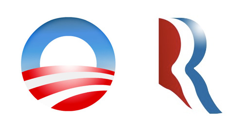
“The Logo”
I for one am surprised by the Romney logo, its actually not awful, when I first saw it I thought it was too loose and it had weak traits that wouldn’t translate well once it started getting pressed on things and it didn’t hold well by itself. When you lay it on a shirt with an outline it turns to garbage like many things but on white it actually has some legs. As for Obama’s logo I think its been clashing too much with the Bank of America logo in my head but once I shake that thought its solid, if feels right any which way you put it. Its almost a self contained environment within an icon, he should be proud.
“The Designer”
Both sides see that there is reasoning in this day in age to actually put some thought behind designing a shirt for the people that are going to dish out $30 and actually wear the shirt because they like the design. Both sides came with something consciously stylized, i’m sure both candidates didn’t see these and approve BUT someone did. Both aren’t dreadful but Obama edges out Romney on this one as well and here’s why: Obama went after the goal/statment and makes you read it while Romney just threw something “retro” looking and the message isn’t there. From the “Keep Calm And Carry On” iPhone Cases to garbage like “Swag” tees, in my observations this years youth and shirt buyers want statements and type for the first time in a long time, its pretty shocking actually.
“Campaign Font”
I don’t think this is Romney’s “font” but it is landing on a few of the pieces he’s selling. I think its confusing or just overlooked. Why such a departure from the conservative look? who is it for? on the other hand Obama keeps it clean and uses his font well…but who needs a website anymore on a shirt? I mean come on? I do enjoy a small font sitting under the big font layout wise, there’s some comfort in it especially if you’re designing for the general public.
“The Don’t”
I had to add this section, I should have called it the “Head Nodding side to side” section. I mean COME ON! really? we’re bringing in Orange… “but its fun Jakub and the Latinos might like it”it’s confusing and throws a tiny wrench into the branding. The Romney yoga pants are just…blowing my mind, i’m not even laughing at them, its like I just swung myself over the swingset for the full rotation and landed hard. You don’t even benefit from someone wearing them, you hid the logo on dark grey on the hip, its joke by the merch team I get it, good work guys.
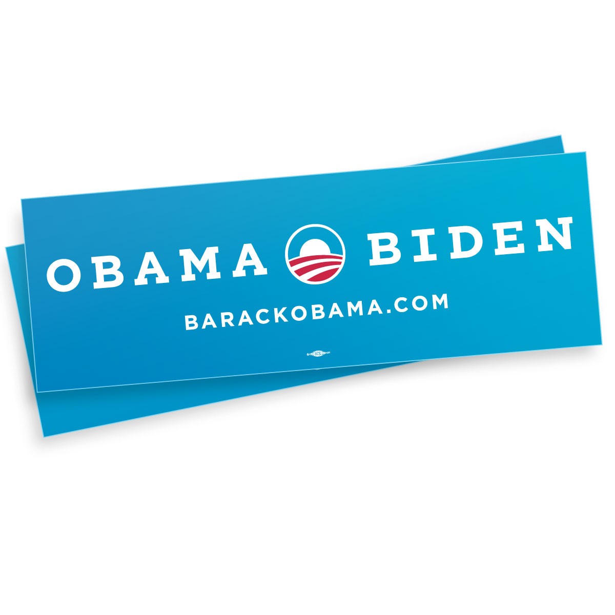
“The Classic Bumper Sticker”
Romney’s 2nd biggest failure in the merch department is the classic bumper sticker that every candidate needs… this thing is awful, its not 1988 and no one owns a Oldsmobile Cutlass Ciera to put this on. Obama’s is refreshing and more importantly brighter and only uses one blue and saved some cash by only printing with 2 colors which more cost effective, good choice.
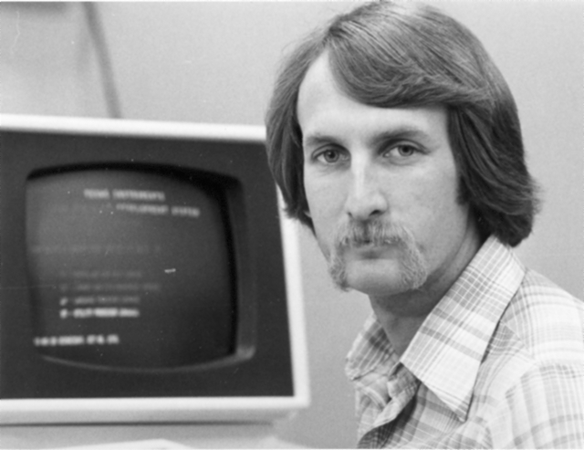
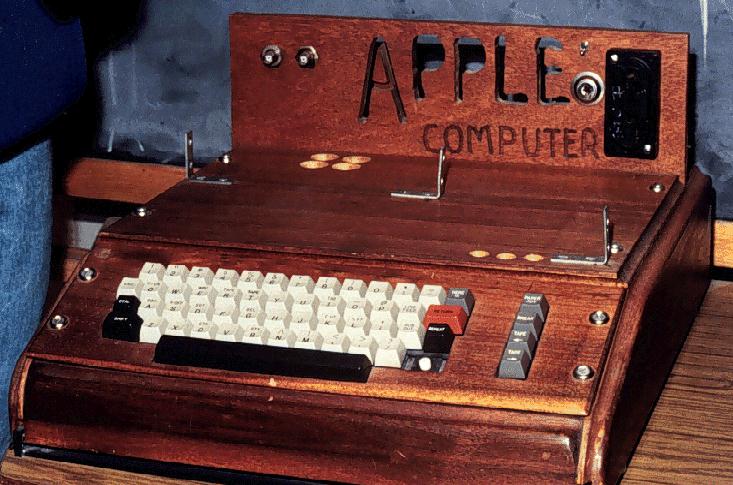
Ah, the 2012 Summer Games, now nothing more than the hazy recollection of infinite spoilers and borderline mental illness. While the overall visual presentation wasn’t quite as bad as a lot of people built it up to be (it was certainly better than this bullshit — but not this), London 2012 was an Olympics whose branding I seriously doubt designers will still be going on about 40 years after the fact. Perhaps it was just too advanced for our feeble 21st century minds to comprehend, so to ease us back into our stasis of perpetual nostalgia I present some more universally agreeable fare, from the simpler age of 1976, when everything happening in this picture was perfectly acceptable and also this crudely fashioned chunk of internet-free wood was your computer.
The 1976 Montreal Olympics branding sits right up there with Munich (my personal favorite) and Mexico on the pantheon of graphic design’s greatest achievements. I’m curious to see which of the more recent Olympics — if any — ends up being canonized by the design community in years to come. From the looks of things we shouldn’t hold our collective breath, it’s all been downhill since 1984.
Here we are, probably my favorite livery from the heyday of Formula 1: John Player Special. As Lotus’s title sponsor for much of the 70’s and 80’s, these beautiful black and gold machines spent alot of time in the winners circle. Emerson Fittipaldi, Jochen Rindt, Mario Andretti, and Ayrton Senna, to name a few, all drove JPS sponsored Lotus machines.
JPS was also active in touring cars and motorcycle racing, the black & gold scheme so iconic that many manufacturer’s road-going variants usually had a complimentary paint option – albiet without the lucrative cigarette advertisements.
The colors have proved so nostalgic that Lotus has donned them once again (without any association to the extinct cigarette brand) in their Formula 1 and Le Mans prototype cars, and I must say that it’s a hero’s return for most.
What I’m really looking forward to is checking out the Historic GP at this year’s inaugural F1 race in Austin, a little birdie told me that Mario’s old Lotus 79 will be buzzing around the new track.
With the London 2012 games (along with their controversial branding) in full swing I thought I’d revisit one of my favorite — Olympic or otherwise — branding campaigns ever: that which was created for the 1968 Mexico Olympics. Graphic Ambient has some beautiful images of the work in the real world, some of which I’d never seen before. I definitely have to say that I prefer Otl Aicher’s work for the 72 Munich games; but this has it’s own thing going on and after all it did come first! Related reading: Design Magazine #237 Via Graphic Ambient
I’ve just returned returned from a trip to both Munich and London, where I spent time with colleagues in both locations. Cosmic timing really, considering the London 2012 Olympics are on the horizon, and I’ve had Otl Aicher on the mind recently.
Much has been said in recent years about the shortcomings of the London 2012 graphic identity, but I hadn’t really been paying close attention to all the outrage, and had all but forgotten the design work – so I wasn’t prepared for the onslaught of Olympic schwag that greeted me at the official London 2012 shop at the St. Pancras Station in London. It’s borderline seizure inducing. Having just stepped off the train from Munich, where I spent time in Olympiapark and was exposed to Aichers work throughout the city, this London 2012 noise was especially jarring. And that mascot! Sigh. I took quite a few pictures, and had originally thought I’d post about Waldi vs Wenlock, but I decided I wouldn’t subject you to any of that madness. After all, this blog is here to celebrate beautiful things.
Scott has extensively covered Aicher’s work for Munich ’72 here before (in fact it’s where I was first exposed to it), but I thought the timing was right for us to be reminded just how amazing a coherent Olympic graphic identity and subsequent merchandising campaign can be.
Creative Review recently posted the above scans of the official Munich ’72 merchandise catalogue, and there are a few images of what look to be the official gift shops as well. While Waldi was the only souvenir that was actually designed by Aichlers studio directly, I find it really impressive how cohesive the entire output of the “Olympic Souvenir” department was. This is most likely due to the fact that Aicher dictated a very strict set of rules as to how the logotype and symbols could be used.
It’s easy to pick apart London 2012 when stacked up against the extremely high bar set by Aicher’s work for Munich, but let’s be real here, remember Izzy from Atlanta? NOTHING is as bad as that. What. Is. That. Thing.
I’m not sure if they entered the competition, but if they did I’d be real curious to see what Bibliotheque came up with for the London 2012 graphic identity. After all, they know a thing or two about Aicher’s legacy, having put together an exhibition of his Munich ’72 work over at the Vitsoe shop in 2007, comprised entirely of posters and print from their their own collection. This unofficial Olympic torch poster they did is pretty amazing as well.
Bonus link: While googling around, I found this site that offers up the official Olympic report books as PDFs. The Munich 72′ books span 3 Volumes, upwards of 1200 pages. For the true Munich ’72 geeks.


