We’ve been huge fans of Reuben Wu since the beginning years of the blog so we wanted to share this weeks SF gallery show with the readers. Info is above, i’m very jealous since i’ll be on the East Coast.
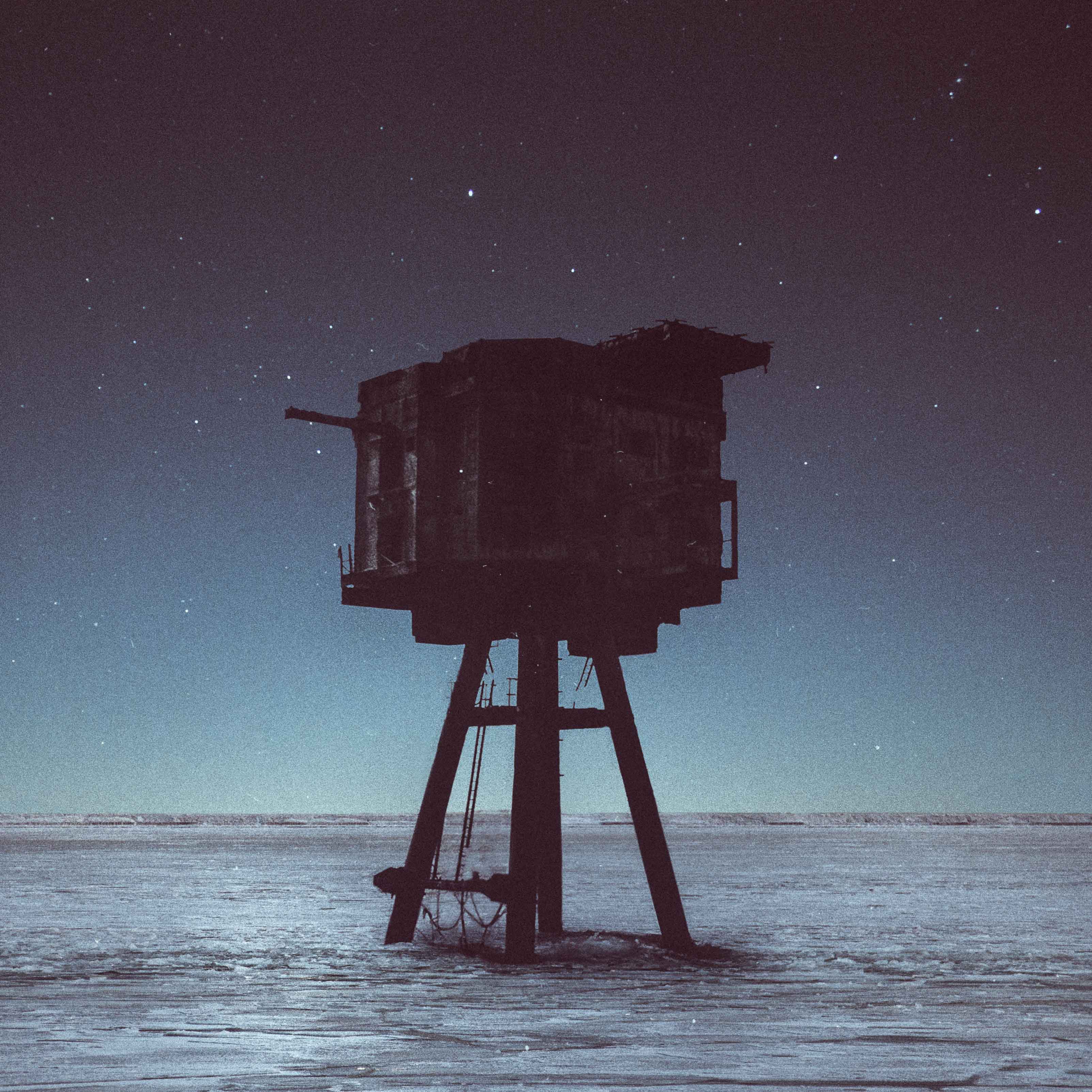
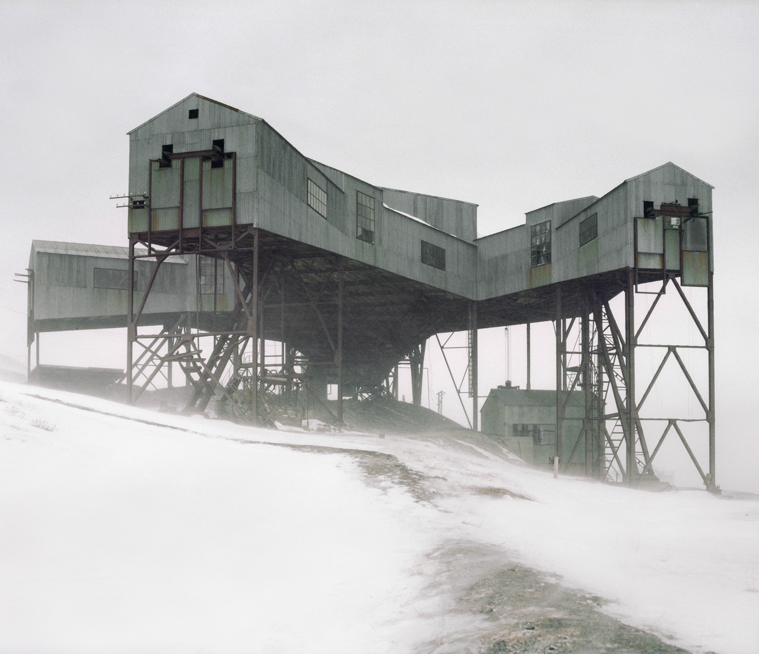
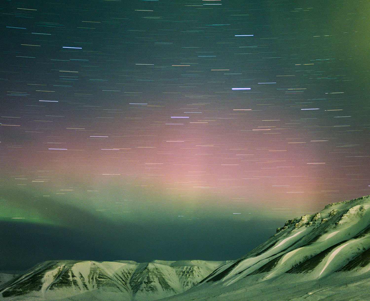
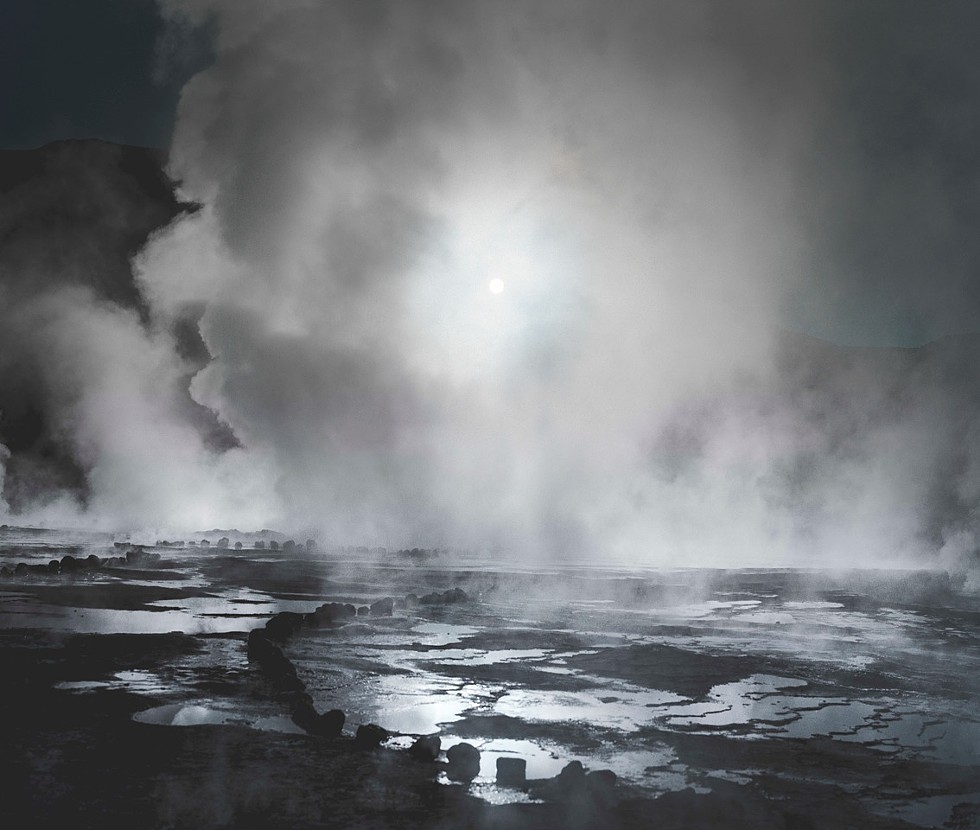
Somewhere between 1970s concept album art, expeditionary imagery, and Surrealist painting is where Reuben Wu’s photographs steadfastly sit. His are pictures made in the real world, however, through collapsing time and merging processes, the real is transformed into the surreal, evoking a response simultaneously familiar and foreign. The photographs amplify the strangeness of place and speak to Wu’s individual experience within it.
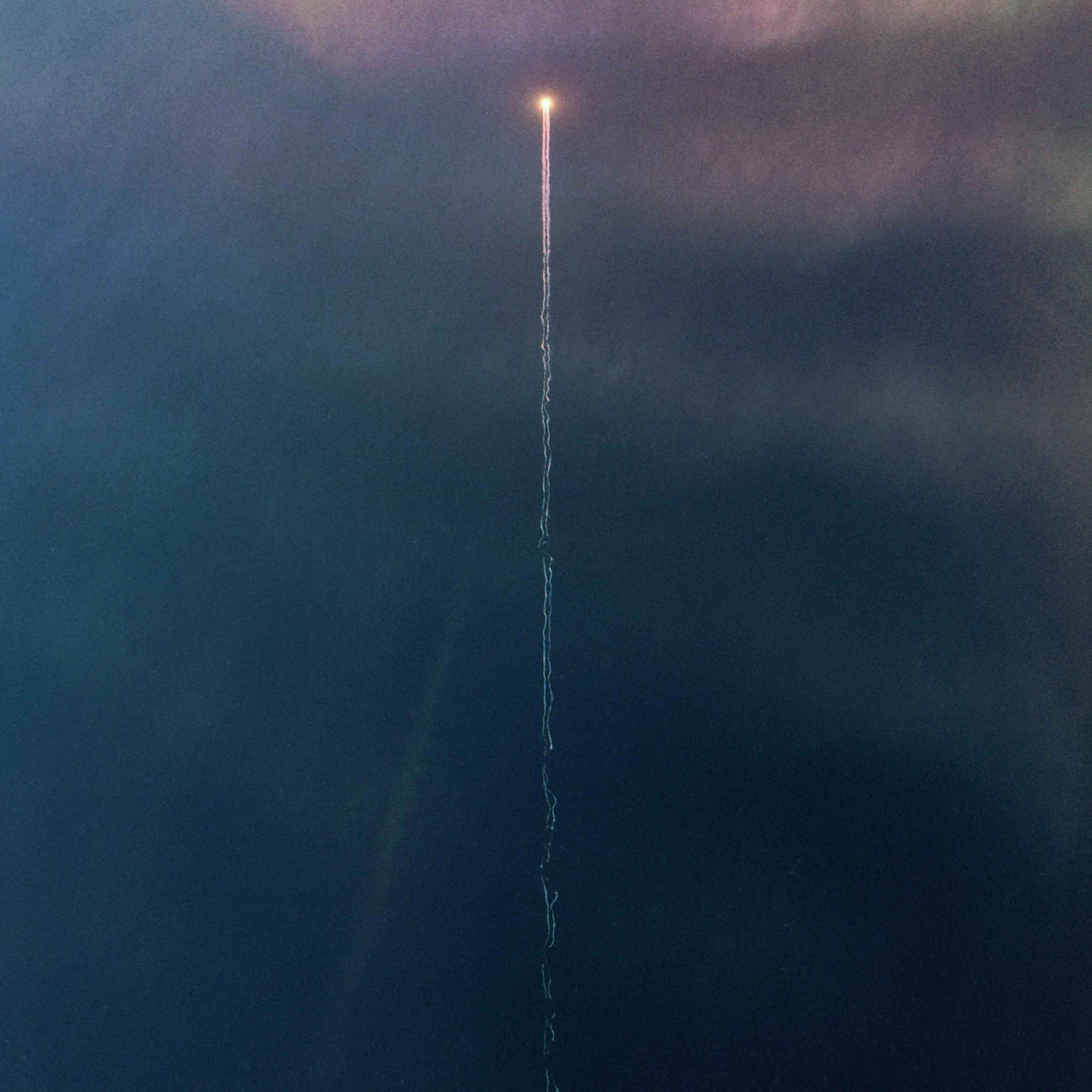
The remnants of his processes –chemicals dragged arduously across the sensitized paper surface, infrared film shifting the world’s natural hues, light leaking into the camera and hitting the film plane —leave traces of their varied journeys embedded in the final image. Wu’s physical journey is a similar one; he treks with cameras in tow to places that, for most of us, are left to those who fall into the category of “explorer”. Considering the lengths he travels to make his photographs, the unpredictability of Wu’s materials is not exactly what we’d deem trustworthy. The resultant images delineate from the expected photographic trajectory and provide a mode of looking that is equally experiential and aesthetically unique.
Reuben Wu (b. 1975) is a photographer and musician currently living in Chicago, Illinois. He received his MSc in 1998 from the University of Liverpool.
If you are in the Chicago area, make sure to stop by the Schneider Gallery for blog favorite Reuben Wu’s latest exhibition titled Distant Suns. Opening reception night is this Friday, January 10th, and will run through March 1st 2014, alongside Lynn Saville.
Some words from the gallery on Reuben’s work:
Somewhere between 1970s concept album art, expeditionary imagery, and Surrealist painting is where Reuben Wu’s photographs steadfastly sit. His are pictures made in the real world, however, through collapsing time and merging processes, the real is transformed into the surreal, evoking a response simultaneously familiar and foreign. The photographs amplify the strangeness of place and speak to Wu’s individual experience within it.
Schneider Gallery
230 West Superior St.
Chicago, IL 60654
(312) 988-4033
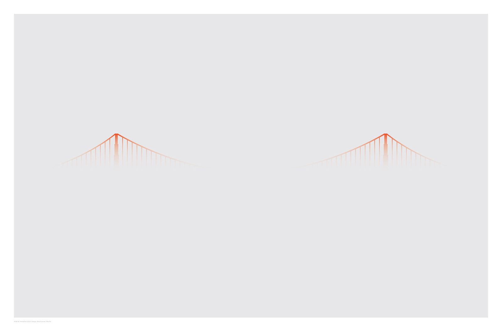
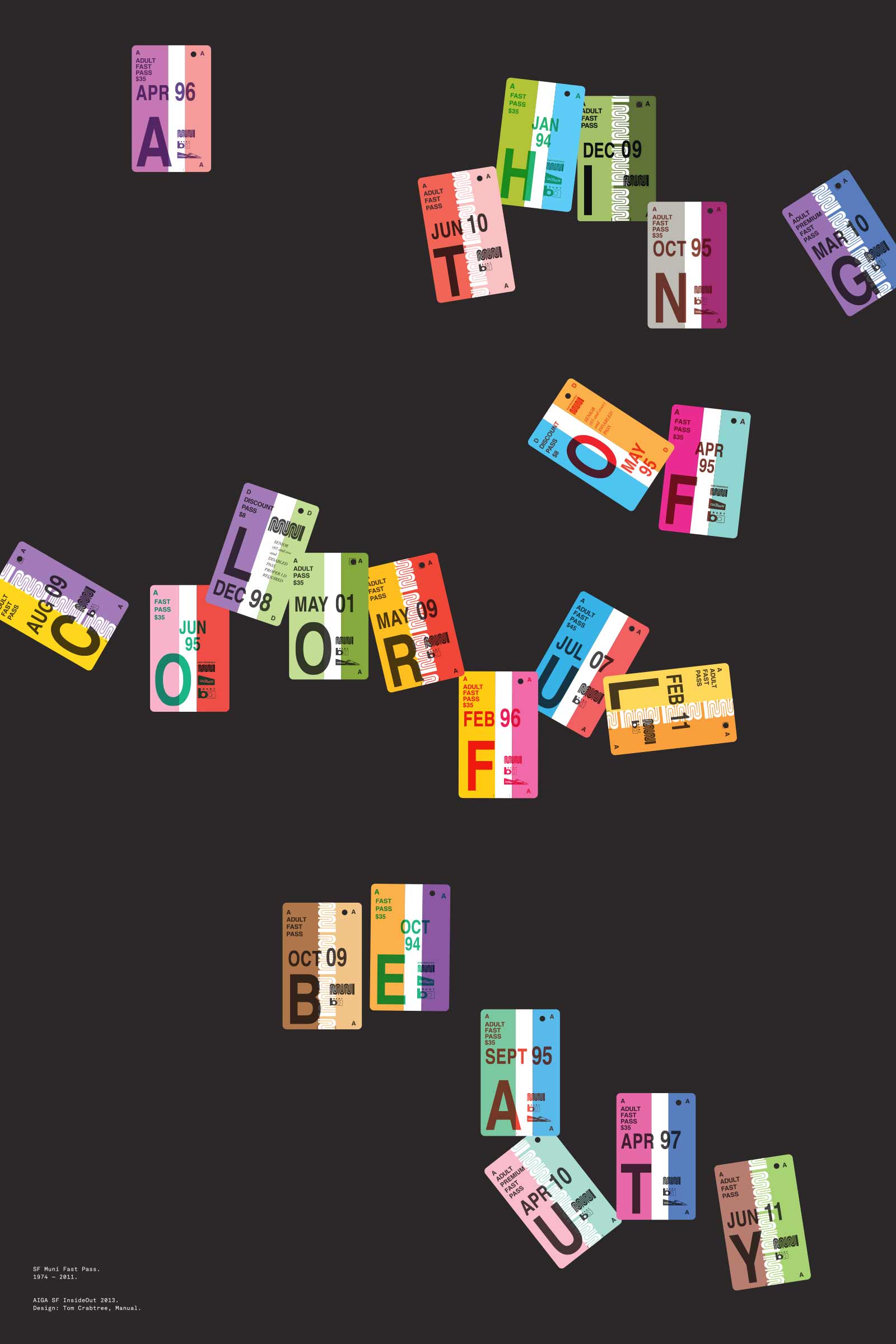
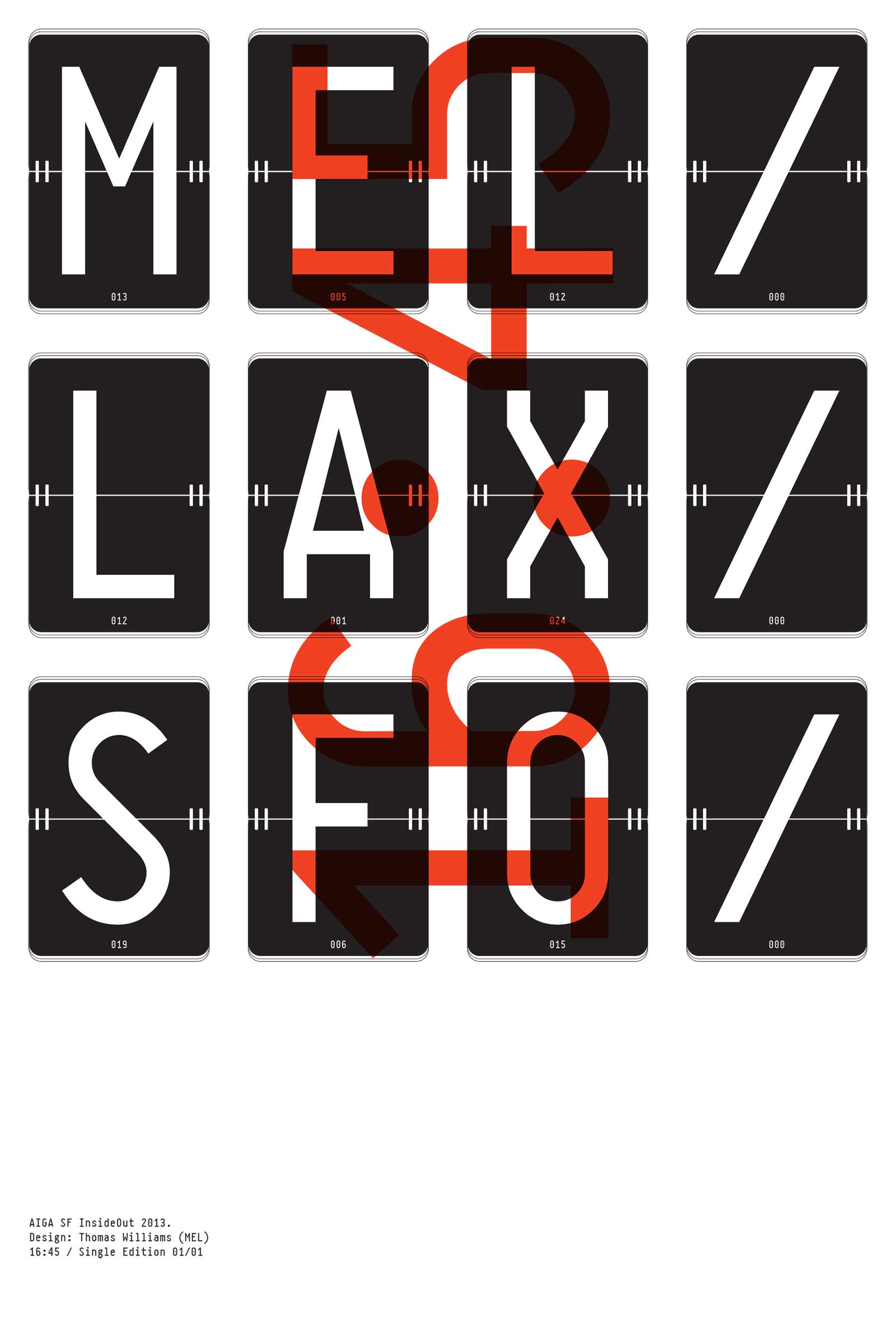
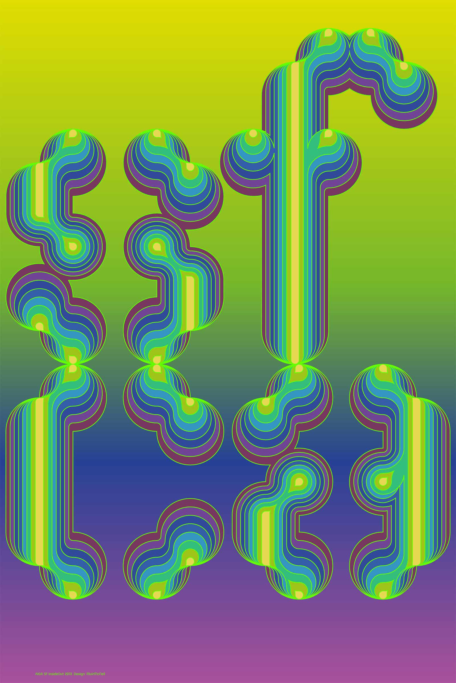
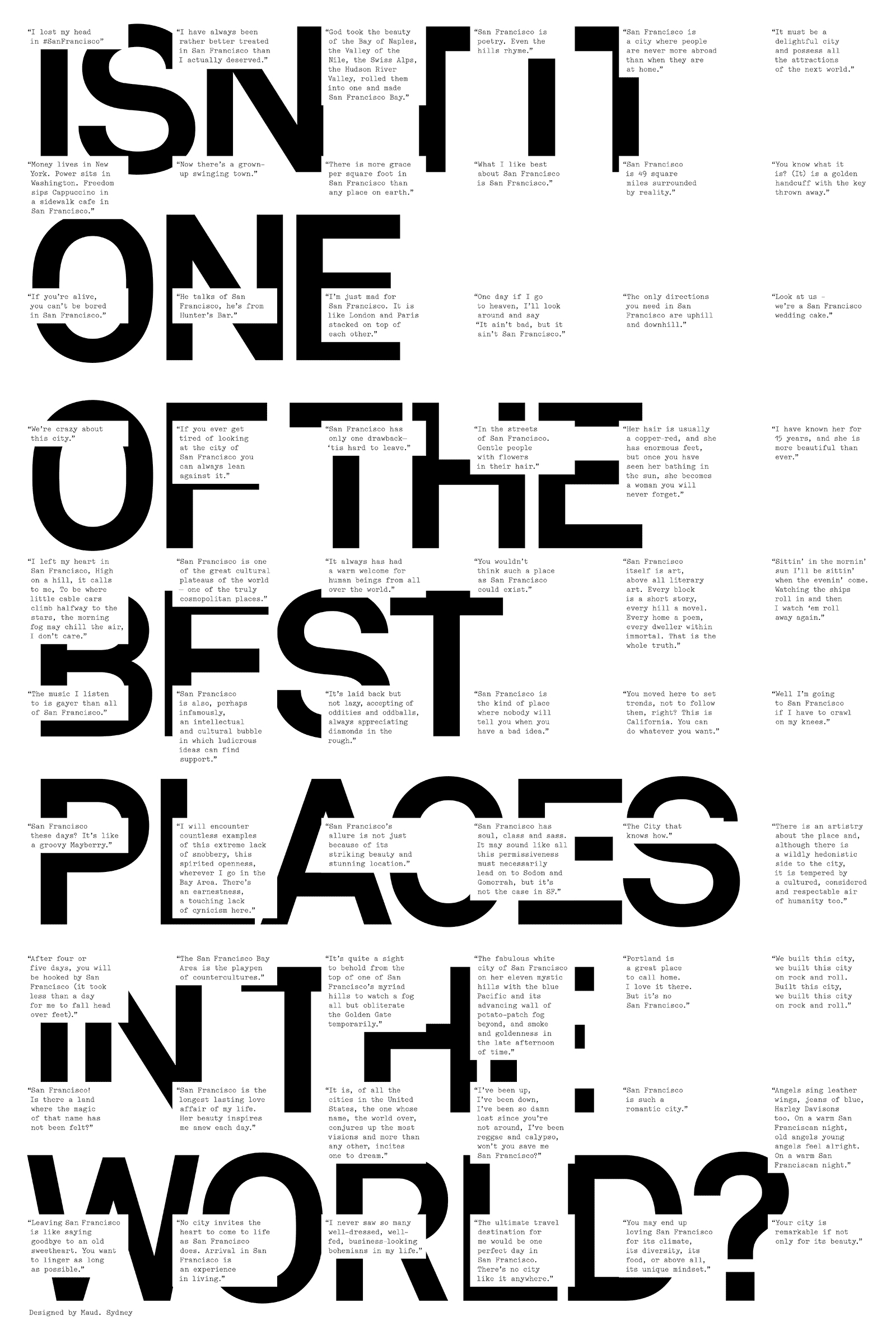
A curated exhibition and silent auction of original posters by some of the most influential San Francisco Bay Area and international creatives, revealing their personal impressions of San Francisco.
I’ve just returned returned from a trip to both Munich and London, where I spent time with colleagues in both locations. Cosmic timing really, considering the London 2012 Olympics are on the horizon, and I’ve had Otl Aicher on the mind recently.
Much has been said in recent years about the shortcomings of the London 2012 graphic identity, but I hadn’t really been paying close attention to all the outrage, and had all but forgotten the design work – so I wasn’t prepared for the onslaught of Olympic schwag that greeted me at the official London 2012 shop at the St. Pancras Station in London. It’s borderline seizure inducing. Having just stepped off the train from Munich, where I spent time in Olympiapark and was exposed to Aichers work throughout the city, this London 2012 noise was especially jarring. And that mascot! Sigh. I took quite a few pictures, and had originally thought I’d post about Waldi vs Wenlock, but I decided I wouldn’t subject you to any of that madness. After all, this blog is here to celebrate beautiful things.
Scott has extensively covered Aicher’s work for Munich ’72 here before (in fact it’s where I was first exposed to it), but I thought the timing was right for us to be reminded just how amazing a coherent Olympic graphic identity and subsequent merchandising campaign can be.
Creative Review recently posted the above scans of the official Munich ’72 merchandise catalogue, and there are a few images of what look to be the official gift shops as well. While Waldi was the only souvenir that was actually designed by Aichlers studio directly, I find it really impressive how cohesive the entire output of the “Olympic Souvenir” department was. This is most likely due to the fact that Aicher dictated a very strict set of rules as to how the logotype and symbols could be used.
It’s easy to pick apart London 2012 when stacked up against the extremely high bar set by Aicher’s work for Munich, but let’s be real here, remember Izzy from Atlanta? NOTHING is as bad as that. What. Is. That. Thing.
I’m not sure if they entered the competition, but if they did I’d be real curious to see what Bibliotheque came up with for the London 2012 graphic identity. After all, they know a thing or two about Aicher’s legacy, having put together an exhibition of his Munich ’72 work over at the Vitsoe shop in 2007, comprised entirely of posters and print from their their own collection. This unofficial Olympic torch poster they did is pretty amazing as well.
Bonus link: While googling around, I found this site that offers up the official Olympic report books as PDFs. The Munich 72′ books span 3 Volumes, upwards of 1200 pages. For the true Munich ’72 geeks.
Blog favorite Matthias Heiderich is having his first solo exhibition in the US:
Gallery Carte Blanche is pleased to announce the opening of Spektrum Berlin, Matthias Heiderich on Thursday, July 19, 2012.
Featuring the work of German-based photographer Matthias Heiderich, in his first solo exhibition in the United States, Spektrum Berlin challenges visions and stereotypes of Germany, in particular East Berlin, through colorful eye-popping urban architectural photography.
Viewed together or individually, each of Heiderich’s images transform the banality and universality of buildings into a mosaic of geometrical shapes, reconstructing the world we live in into an abstract canvas of lines, patterns, angular compositions, and vibrant colors. Saturated to the limits of reality, Heiderich’s prints, emerging directly from a 1980s color palette and influenced by 1950s and 1960s color photography and polaroid images, look at an industrial past with a present freshness and optimism for the future.
Self-taught, Heiderich doesn’t often play by the “rules”, however the influence of German photographic tradition is apparent in Heiderich’s work. Invested in the same rigor and pragmatism as Bernd Bechers, Heiderich creates systematic photographic typologies of industrial buildings and structures, emphasizing how each building is a product of human mind and skill. Following his natural instinct for composition, in series after series Heiderich experiments, searches for individuality, and cultivates a unique style and sensibility.
Spektrum Berlin, Matthias Heiderich opens on Thursday, July 19 and runs through September 13, 2012. The opening reception will be held on Friday, July 20th from 6pm–9pm.
Book Show is an exhibition of artworks, objects and structures that address the physical form of the book thats curated by James Langdon and Gavin Wade.
I’ve always wanted to take a stab at curating the aesthetics of a book, everything from canvas covers to different color pages, so when I saw these books the gears in my head started turning, anyone need any help on that front?
The idea behind the Clock is to be an inspiration for long-term thinking, to help make thinking long term automatic and common, instead of difficult and rare. It is hoped to be an artifact to connect its visitors to the future in the same way relics from ancient civilizations connect us to the past. Such a clock, if sufficiently impressive and well-engineered, would embody deep time for people. It should be charismatic to visit, interesting to think about, and famous enough to become iconic in the public discourse. Ideally, it would do for thinking about time what the photographs of Earth from space have done for thinking about the environment. Such icons reframe the way people think. [link]
The clock may reside mostly underground, near Van Horn, Texas, and will tick once a year. There is a fascinating set of principles guiding the construction of the clock. I enjoyed the various options for timing the clock: piezoelectric oscillator, pendulum, orbital dynamics and etc. “Sounds made up” as my roommate is fond of saying. Currently there is a prototype design at the Science Museum of London.
By the way I titled this post “10,000 Year Time Machine” because any clock that will work for this period of time is much more than a clock, it is a giant MACHINE. Apologies if you were expecting a post on an actual time machine like a Delorean.
The ideas for the artworks have actualized while processing time spent absorbing French Culture, exploring the City Of Lights, the vibrant colors, the exaggerated geometry, and the diverse architecture and fashion of Paris. These paintings were created entirely with spray paint, one of Matt’s favorite mediums. But the designs are very clean, and appear almost digital in their precise details and craft. An honest, analog attempt to achieve the same depth and abstract geometry of his digital “Vectorfunk” style. [Link]
Color! What more do you want? These paintings are by Matt Moore and are called Crystals and Lasers. At the bottom of that page he also has a cool collection of iPhone photos that he took of inspirational items while in Paris creating the series.