Epoch Artwork Lineage
The Epoch is a hinge. We tend to follow a linear trajectory until a point at which we realize that through free will the path can be bent and redirected.
I’ve been very busy for the past year or so working on a new album so it’s been a while since I’ve posted. Now that the new Tycho album — Epoch — is out I wanted to write a little about the meaning and origin of the artwork. I worked as a graphic designer for 14 years until I decided to pursue music full time so the visual element of Tycho has always been at the core of the project for me. I think the imagery tells a story that the music can’t fully articulate, and vice versa.

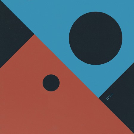
Past is Prologue (2006), Daydream (2007), Dive (2011), Awake (2014)
The sun disc, both literally and as an icon, has always been at the center of the artwork. From Sunrise Projector and on I’ve used the sun and circle as a metaphor for life; the sun being the life giver and the circle symbolizing the closed loop, the interconnectedness of the human experience with the physical world.
· The Trilogy Begins
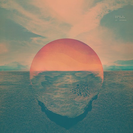
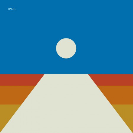
Dive (2011)
While I had explored a lot of these themes previously, I feel that Dive was the beginning of a trilogy of albums and so was the starting point for a narrative and symbology which have become central to the Tycho identity.
The cover for Dive was a foray into maximalism combining photography and design. I wanted to evoke the sense of being on an unavoidable path, one from which deviation was impossible. I wanted the viewer to be pulled into the image and be drawn toward the sun. I think this design speaks to the music in that it felt like the beginning of a journey and the multi-layered composition echoed the sonic aesthetic of the music. I spent quite a bit of the next couple years refining this style and creating various collage type images.
Dive Single (2012) – Another cover in the style of the Dive full length cover
· Enter Minimalism and The Trapezoid
Concert Poster (2012)
As a graphic designer I have always had a deep appreciation for minimalism and the simplified, efficient expression of ideas through form and color. But as a visual artist working within the context of Tycho my output had typically trended toward almost painterly styles, multilayered collages which were anything but minimal. But at some point after the release of Dive I decided that I wanted to get back to my design roots and bring a more simplified, refined style to the project. The beginning of this shift was around 2012 when we played The Independent in San Francisco. This was meant to be a simplification of the same path seen on the cover of Dive, the colors a reflection of the sun into that path. This was also one of my first uses of the trapezoid shape which would become core to the symbology of Tycho.
· The Awake Era
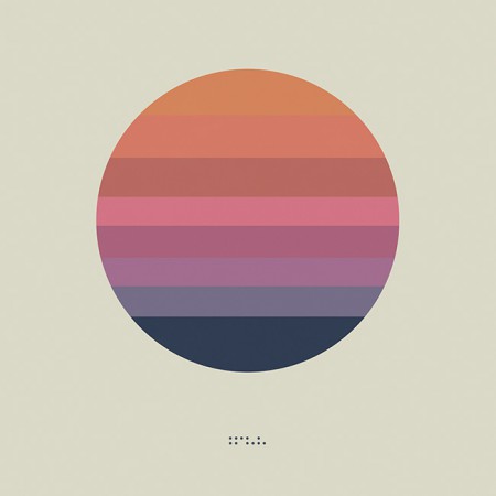
Awake (2014)
Dive was in many ways a breakthrough record for Tycho: it was when I first formed the live band and we began touring extensively. It also marked the period when I was finally able to quit doing freelance design and focus solely on the music and the imagery surrounding Tycho. After a couple years of touring it came time to make a new album and I knew this would be a pivotal release, quite literally a make-or-break record. I wrestled with the art direction for months before finally deciding to go in an entirely new direction from Dive and earlier works and create a minimalist direction for the release. I had always felt strongly about the spectrum and trapezoid from the 2012 poster and so I revisited the concept and incorporated the sun imagery to bring it into storyline.
Both the circle and the trapezoid symbols featured heavily in the videos and visuals for Tycho during the Awake tours (2014-2015)
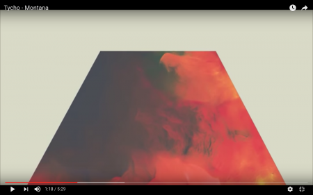
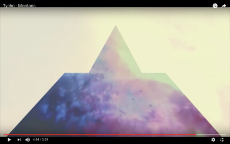
Montana Visuals (2014)
Montana Video (2014)
During the Awake album cycle I continued down this path and lots of imagery followed for show posters and releases.
Concert Poster (2014)
Montana Single (2014) – the trapezoid combined with the triangle
· The Darkness
The overall direction for Awake was very light and halfway through the cycle I started shifting things into a darker space for contrast and to foreshadow the next album.
Awake Deluxe Edition (2014)
Concert Poster (2014)
Awake Remixes (2015)
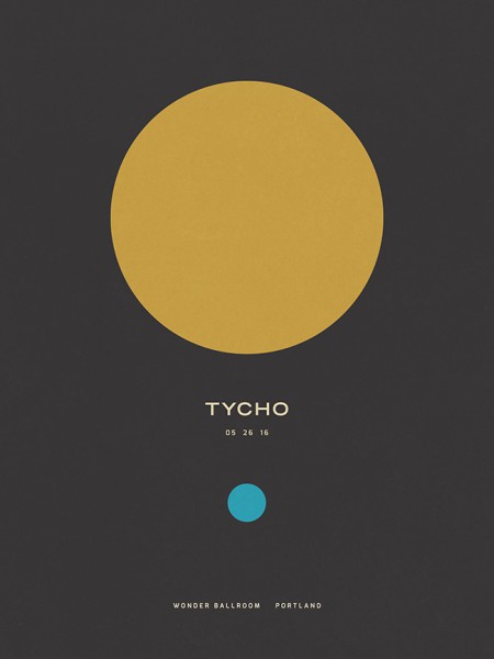
Concert Poster (2016)
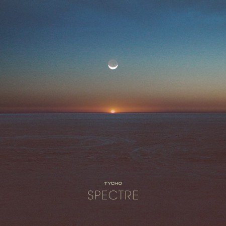
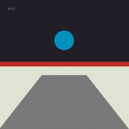
To compliment the darker themes for the Spectre and See singles I introduced the moon as the central element in place of the sun.
Spectre Single (2014)
Spectre – Bibio Remix (2014)
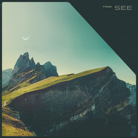
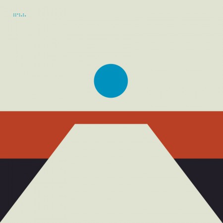
Tycho – See (2014)
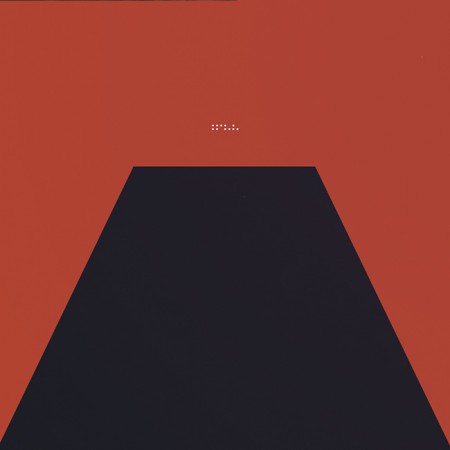
· The Epoch
Awake had been out for over two years and it was time to start thinking about the next release. Up until this point, when doing minimal compositions I had been using textures and distressing to give some depth to the images and break up solid fields of color. For the next phase I wanted to further simplify and remove any extraneous elements. I wanted to cut to the core of the message and try to distill things into a language of basic symbols.
Artwork for the first single from Epoch: Division (2016). This was designed after the album artwork and was meant as a transition which would introduce the elements and colors that would follow in the full length release.
Musically, this album was about circling back while maintaining forward motion; revisiting and refining the concepts of earlier albums with a view to the future. My primary goal was to incorporate the color scheme of the very first Tycho release: The Science of Patterns EP (2002). I also wanted to revisit the simplicity of that artwork as Epoch was all about focus and efficiency, chiseling away anything which was not absolutely necessary.
The Science of Patterns EP (2002)
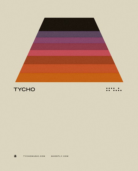
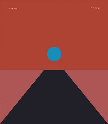
I also wanted to draw upon the two core symbols of the project: the circle and the trapezoid. But this time I wanted the circle to represent the moon, a body reflecting the light of the sun. In this way it was a metaphor for this album, a reflection of the previous works presented in a new form.
The following are selected iterations of the Epoch cover design which led to the final version.
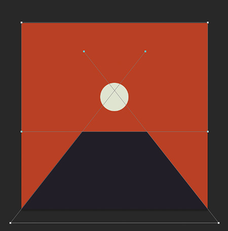
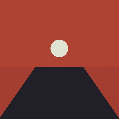
The initial concept (2015)
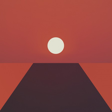
An early concept incorporating a more three dimensional look. I ended up leaving this in favor of a more simplified form
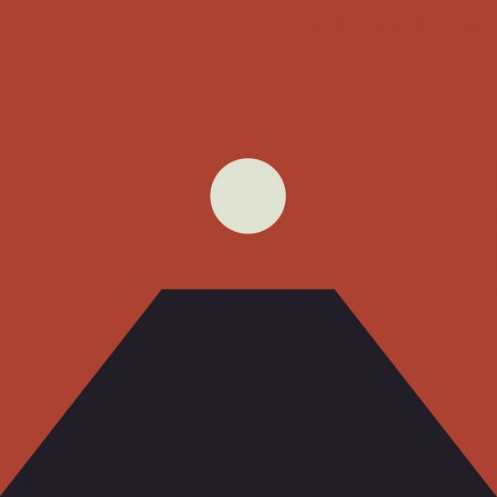
The first simplification, the horizon line is still subtly implied
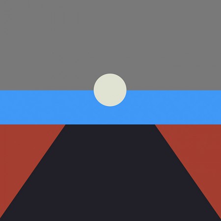
A tangental concept exploring the incorporation of more color. This ended up being the impetus for creating the alternate cover series for the countdown (discussed later)
Another alternate with more color and a defined horizon line
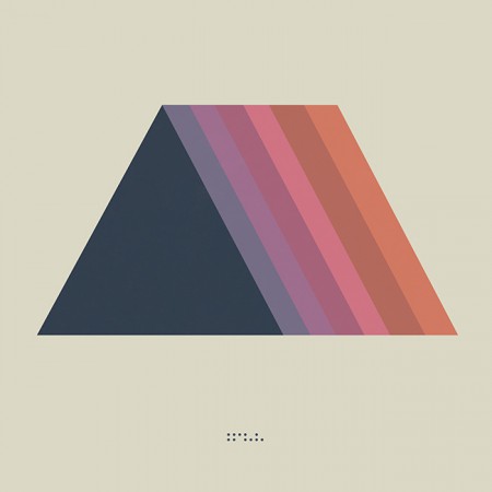
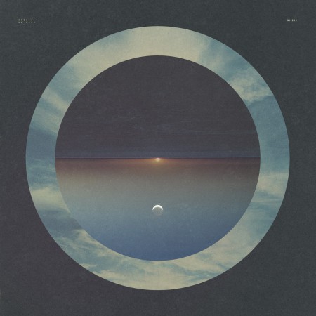
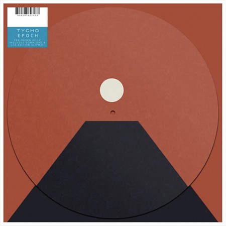
The final form: Tycho – Epoch (2016)
In the end I decided to keep the image ambiguous, the viewer should decide exactly what it was they were looking at and ascribe their own meaning to it. This meant stripping the image down to the essential elements, leaving a simple icon.
I felt that the power of this image would be in its simplicity and also in its portability. It could adapt to many form factors with ease and felt more like a modular system than a singular image. At this point you have to take into account that the vast majority of people will experience album artwork at a tiny square on a smartphone. At this scale a lot of nuance and detail will be lost. This is not to say that I intended to oversimplify purely for this reason, but it is a consideration.
· Release
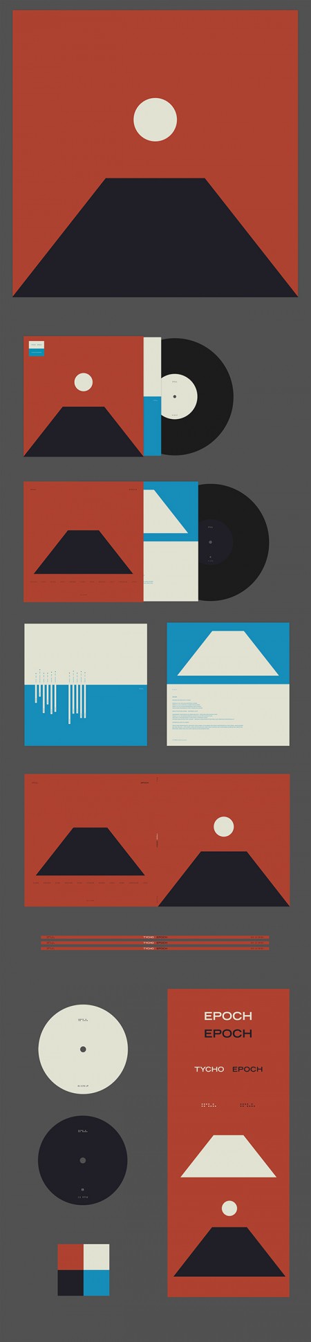
Epoch Vinyl Packaging
Epoch was released 30 days after completion as a surprise, as such there wasn’t enough time to have vinyl and CDs produced; only digital versions were available on release day. As a stopgap until the vinyl arrived, we decided to offer a custom slipmat with pre-order purchase at retail outlets. More about the release strategy in The New York Times piece With Vinyl, the Musician Tycho Establishes a Physical Presence
Epoch Slipmat
For the Awake release I cut up a print of the cover art into squares and released it as nine panels as a way to count down to the release. For Epoch I wanted to create several alternate versions of the cover art to use for build up. This release was not announced ahead of time so it was fun to slowly release elements of the design without people fully understanding what was coming. Here are a few examples of the alternate versions.
Tycho Descent Burning Man Sunrise Set Cover
06-division
08-local
02-horizon
04-receiver
All in all this was an enjoyable and fulfilling process for me as a designer. I’m looking forward to the next couple years, creating future permutations and working with this design/color system. The first example of this is below, the poster for the show at The Fonda in LA.
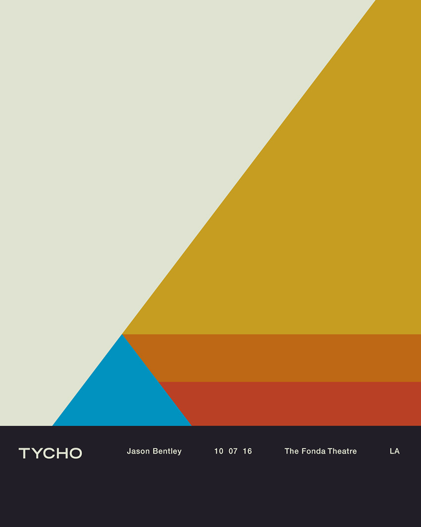
Tycho Fonda LA Concert Poster
Thanks for reading, if you have any questions leave a comment and I’ll do my best to reply.

34 Comments Leave A Comment
Leonardo Labriola says:
September 30, 2016 at 10:51 amThank you for sharing this narrative Scott! One of the most compelling aspects of your art, to an increasing degree over the years, is the ease with which it mystifies its audience. Perhaps it’s the minimalist ethos doing most of the work in this regard, but these pieces nonetheless capture our attention and force us to wonder as to their processes. I find it incredibly liberating to see the path the image takes to become the icon. In a way seeing this demystifies its preciousness (if such onerous shapes can be precious) making it all the more present for us as an audience. Thanks again!
Yves says:
September 30, 2016 at 12:40 pmGreat insight! enjoying the record as well
Dante Lee says:
September 30, 2016 at 1:14 pmThank you for sharing your thought process of not just the new album “Epoch”, but your progression from “Dive”.
I’ve been interested ever since the first release, and even more so with “Epoch” being the most minimal of your design language.
My first reaction on the album artwork of “Epoch” was staring into the sun infront of monolith in alien planet.
Just as your project “Tycho” names pays respect to 2001: Space Odyssey, I believe the black monolith in the form of trapezoid for audience’s perspective further pays tribute.
Siddhu says:
September 30, 2016 at 1:15 pmThanks so much for taking the time to talk about your process! I’ve enjoyed going back and watching the talks you gave on graphic design many years ago!
You’ve previously written about the weight that typefaces/font hold – what typeface have you been using for Tycho, and why has this remained constant for so many years?
Thanks!
Ekin says:
October 1, 2016 at 2:36 pmThis was pure joy to read. Thank you very much. I have to admit that I was actually slightly disappointed when you revealed the new album art. I did not expect you to go for a more minimalistic approach and reduce the 3-dimensionality even further. Also, even though I was expecting you to move to darker themes, I was surlrised by that prominent shade of red. It seemed almost missleadingly agressive to me. Regarding Awake and Dive I am still overwhelmed by how well the artwork fits to the music, how both components complete each other. And in my opinion Epoch an absolute milestone. There is so much beauty to discover in each song. And even though I like the album art of Epoch, even though its undeniably a cover that fits perfectly into the Tycho story, I would be happy to see if you considered returning to more plastic art in the future, such as the masterpiece that became the cover for Dive.
Brian says:
October 1, 2016 at 3:29 pmDefinitely digging this insight. I’d also be curious to hear about your process for the 11 designs leading up to the album release and if there’s any connection between the design and the song it was for. I thought the one for Local fit perfectly, like a mid-afternoon drive by the ocean under a bright blue sky.
On that note, I thought the second iteration you posted of the early design concepts for Epoch, the one with “a more three dimensional look”, embodies how Source makes me feel. The softness of the sky at dusk, right before and after the sun sets when you can actually look at it with the naked eye, though it’s still bright, and stare in silence. It’s a mature contrast to the way Dive opens with A Walk, which to me evokes the promise a sunrise brings with a new day.
It’s been cool to see Tycho progress over the years since PiP and I have no doubts about the direction you’ll take it. Keep it up.
Daniel says:
October 2, 2016 at 4:25 pmAs with the other commenters, I’m enjoying the music and the artwork!
The artwork for ‘Division’ uses some of the same elements, but it seems to be seen from a different lens. How does this relate to the design language of Epoch?
Sawyer Johnson says:
October 2, 2016 at 6:49 pmThanks for the insight, Scott! I was wondering if you’ve ever thought about showing your visual art in a gallery setting? I’m sure there would be plenty of galleries who’d love to show you work, and it’d be cool to experience it in a live setting all at once. Thanks for being such an inspiration!
Jordan Braithwaite says:
October 2, 2016 at 9:47 pmThank you for the in-depth look at your design process Scott, always a big inspiration.
I loved the design you created for the Division single artwork as well, and was blown away when you revealed the Epoch cover.
Can’t wait to see what other poster designs you come up with during this next tour season.
One question I do have though, I’m noticing less texture used on the Fonda Theater poster, are you going to start cutting back on the sweet paper texture you’ve used over the years?
Cheers, from a fellow graphic designer.
Alastair says:
October 2, 2016 at 11:56 pmThank you for this Rosetta/Seeing Stone, @Tycho
Mason says:
October 3, 2016 at 12:32 amLove the new album, and as always you killed it on the artwork.
I’m curious though, why did you leave out the Tycho dots on the final Epoch cover?
Steven Denfeld says:
October 3, 2016 at 1:17 amSuperb insight into the design process leading through, and up to, this culmination of “The Trilogy.” And Epoch, man, let me tell you, with each listen it becomes increasingly obvious that it is your finest work to date. The cohesiveness of the band as a whole, with different layers of sound and instrumentation swirling around and through each other, well, it’s a journey I cannot stop making on a daily basis since its release. Thanks Scott and band!
madchillunited says:
October 3, 2016 at 6:45 amThank you!
madchillunited says:
October 3, 2016 at 6:45 amThank you!
Wes says:
October 3, 2016 at 8:51 amAwesome! I just watched 2001: A Space Odyssey this past weekend. Are the similarities intentional?
Jordan says:
October 3, 2016 at 9:03 amYou’re the best! thanks for taking the time to explain all that no one does that! inspiration out that ass cant wait to see you at treasure island thanks for being the best band
Dale says:
October 3, 2016 at 1:12 pmSpectacular insight – loving the new album!
Austin says:
October 3, 2016 at 11:43 pmI noticed the drastic difference visually for “Spectre” during your live show in Dallas recently. Will you describe the meaning behind it?
Alex says:
October 4, 2016 at 3:01 amVery interesting – awesome read and inspirational. The album and its art fulfilled my expectations after Awake, which were high. Thanks so much Scott and Tycho!
JET says:
October 4, 2016 at 4:09 pmI love your nod back to The Science of Patterns in both your sound and your artwork, which to me is still by far one of my favorite albums! When I heard Division and Epoch, I couldn’t stop smiling at the nostalgia of sounds which brought me back to that album. It was a closed circle that made me feel complete. Your sound is solid and always enjoyable to listen. Thank you for allowing me to experience this wonderful journey. See you Thursday!
Jason says:
October 5, 2016 at 5:41 pmGreat read. Thanks for sharing the insight into your design process, really enjoyed it!
Sainta Spectre says:
October 5, 2016 at 6:15 pmThank you for sharing your truly visionary process with us. Circles came to me at a strange point in my life, and now I look at them and see myself in them. When I discovered Tycho, the connection was instantaneous. Your music has opened up a universe inside of me that has filled so many of my circles in so many ways. I believe that we are led through our lives, and symbols connect us with our paths and destinies. Seeing the circles of your albums, both musically and artistically, has been a divine appointment in my life. I saw Tycho play in PGH in 2015, and it was easily some of the most intense and spiritual moments of my life. When I heard the first few notes of “Montana,” I could not contain my overflowing joy. Thank you, thank you, thank you.
Matt says:
October 5, 2016 at 6:31 pmThanks for sharing this Scott, since I found this blog I’ve always enjoyed the artwork posted here. It’s clear to see where some of your inspiration comes from. Nostalgic, timeless, and clean design as always.
M.
dngr says:
October 5, 2016 at 8:09 pmThe 2014 ‘See’ cover brought back memories of Roger Dean’s work, including his game screens and packaging for Psygnosis. Badass photo and layout. Love the whole series here.
Alex says:
October 5, 2016 at 11:24 pmHi Scott, I just came across this article describing the cover art of Albums Covers: the Provocative and Persuasive Percussions Series (1958-1961). Might be interesting for you to read.
http://bit.ly/2dwUFgP
Cheers,
Alex
Alex says:
October 5, 2016 at 11:26 pmThe artist’s name did not paste: Josef Albers’s Albums Covers: the Provocative and Persuasive Percussions Series (1958-1961)
http://bit.ly/2dwUFgP
I apologize for the typo.
Douglas says:
October 6, 2016 at 12:20 amTruly enjoyed reading about your creative thought process…you have a one-of-a-kind attention to detail. Agog at the sheer productivity and voluminousness of you work; never bored, stay busy and keep on going with the good stuff…wunderbar
-douglas in SF
JerichoCane says:
October 6, 2016 at 11:16 amI saw the album cover of Epoch, and i just had to know where the inspiration came from. Loving that you don’t actually reveal it. It strongly reminds me of one of the monoliths from 2001: A Space Odyssey. Great album and art !
Paige says:
October 7, 2016 at 3:21 pmThank you for walking you through your process. It’s always interesting to see where artists go while thinking out a concept. I love watching the journey to your final product. You are an inspiration and this makes me want to go back and start designing again.
Uer says:
October 11, 2016 at 4:40 pmVery nice, I like in particular the darker variations. I missed your AMA, but noticed you studied computer science, how did you get started in graphic design? Can you share your design process?
Uber says:
October 18, 2016 at 4:21 amI looks a bit like illuminati stuff. I mean pyramid with eye-like symbol on top?
Brian says:
October 19, 2016 at 9:04 pmThank you for another spectacular album. I’ve been listening to it at least once a day since it has been out!
I was at your show on 5 26 at the Wonder Ballroom in Portland. It was my birthday, and I flew in to town from Chicago to see you guys :)
If you ever make more prints of the Wonder Ballroom poster, I would definitely be interested in picking one up!
Thanks for all you do, your music means a lot to me.
Brian
MDA says:
November 3, 2016 at 7:59 amGreat post Scott! I loved the narrative of how you got to your current minimal style and the interplay between depth and color.
I’ve always thought of the Epoch cover as an homage to Japan. The moon to me represents an inverted Japanese flag, as well as a celestial body while the trapezoid evokes a silhouette of Mt. Fuji. It’s very interesting to hear what your intent for the art was with proper context.
Cheers!
Pavel says:
November 21, 2016 at 12:55 pmWow! Amazing post!! Thank you :)
I haven’t visited this blog in a long time, but with your latest album release I thought that the artwork was a great, minimal evolution so I came here to see what else you’ve been posting and I get this whole visual history of your work. Awesome!