Brené Brown asks – “What would you try if you knew people would never say ‘this’ about you?”
One of the biggest struggles for any creative is how to handle fear. The fear of criticism, comparison and scarcity. Some may think it’s best to ignore the chatter and just shut those people out. Instead Brené takes a different approach…
Step inside the arena and find out how she handles the critics.
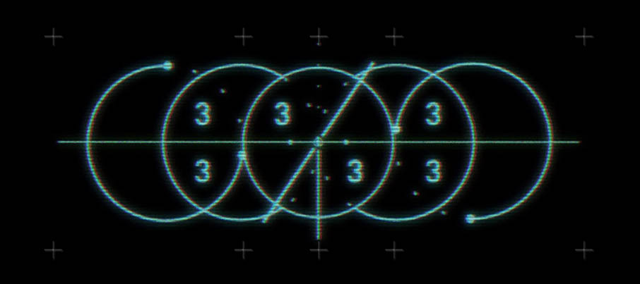
Tony Zhou’s Every Frame a Painting is a video series dedicated to the ‘analysis of film form’. His episode on Nicolas Winding Refn’s use of the quadrant system in Drive was the first video that drew me in. Each episode does a great job breaking down and explaining the little details that are sometimes overlooked. It reminds me of the first time I discovered the hidden arrow and spoon within the FedEx logo. When you finally realize it’s there, you appreciate the art behind what we see in front of us that much more.
Other videos that grabbed my attention were David Fincher’s “not what I do, but what I don’t do” approach to filmmaking and the different ways text messaging and the internet are represented on screen.
But it was an episode on Japanese film director and animator Satoshi Kon that got me really stoked. This was my first introduction to the world of Kon and his signature editing style. Inspired by George Roy’s Slaughterhouse-Five, Kon’s use of matching scene transitions has also inspired other filmmakers and their films – Inception and Scott Pilgrim vs. the World are two examples that immediately come to mind.
Before passing in 2010, Kon left us with one last gem – Ohayo. His final piece covers something we deal with every day; the dreaded morning wake up routine – illustrated in the most beautiful of ways.
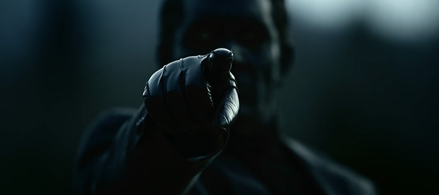
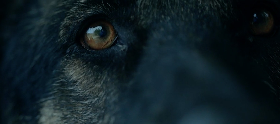
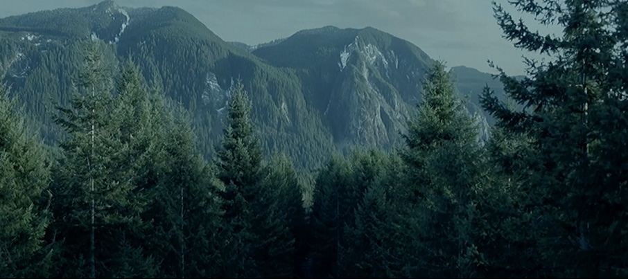
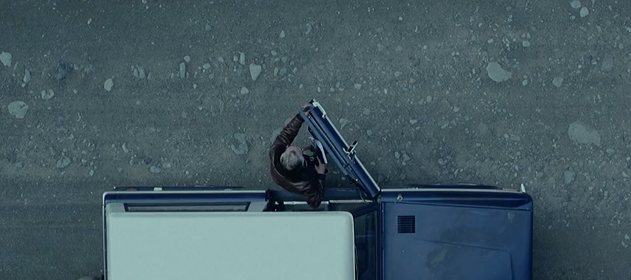
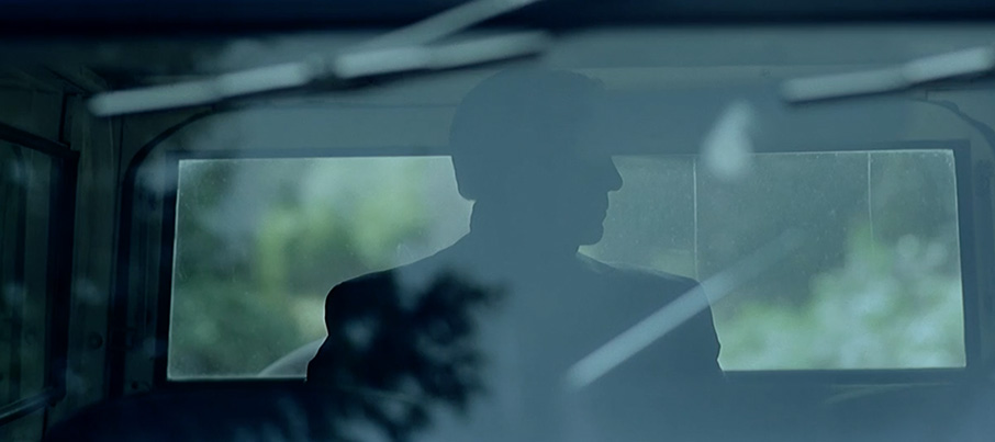
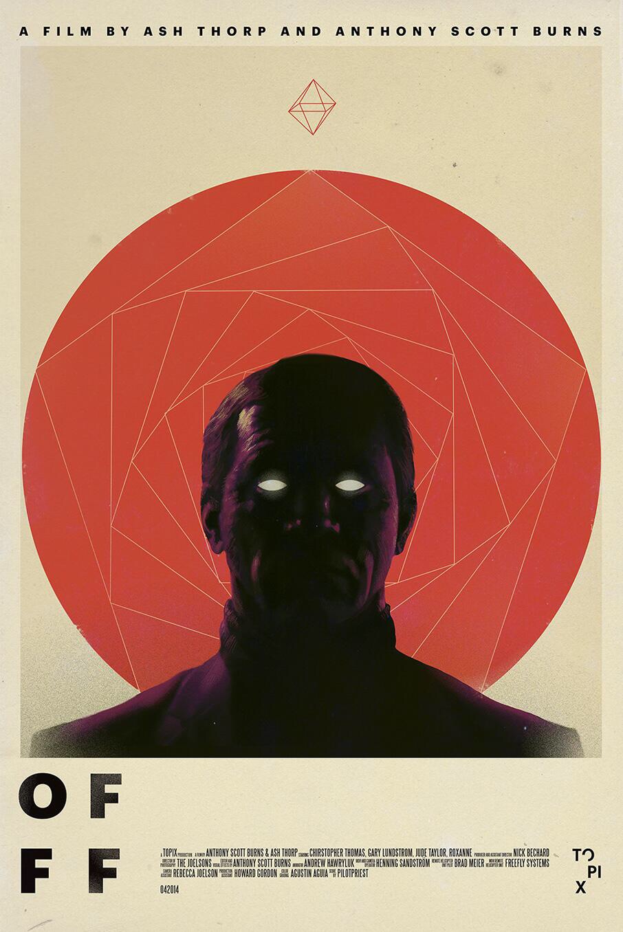
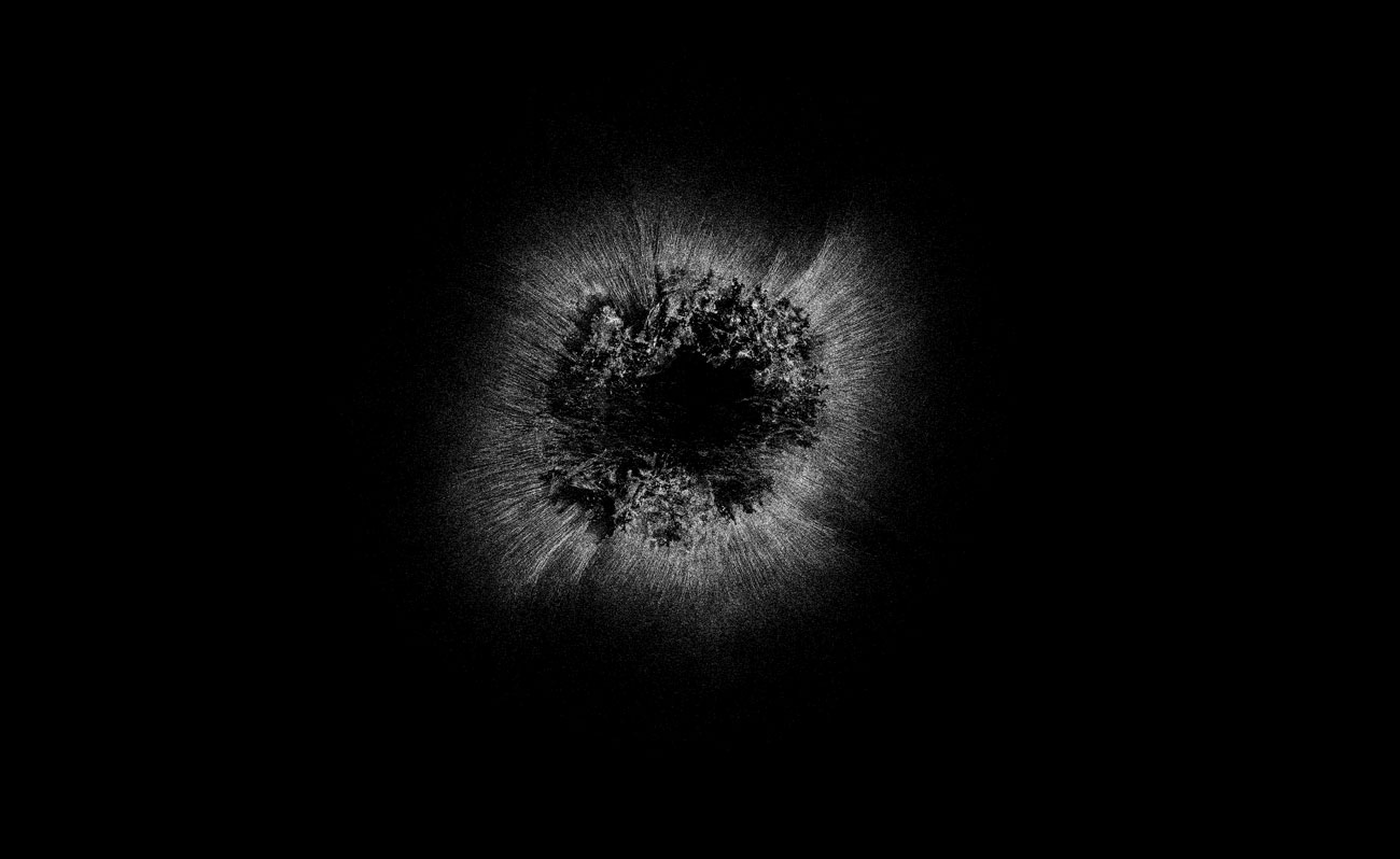
Anyone in the visual creative field knows the OFFF titles are the pinnacle of pieces to work on. This year I feel like it was brought to a whole new level. The duo of Ash Thorp and Anthony Scott Burns brings us another incredible short film. Their last collaboration was on Manifold, directed by Burns, which was one of my favorite pieces last year. The visuals in this piece are arresting to say the least, from the aerials, to the dark visitor to the german shepherd and the haunting suspense. Excellent work from the entire crew involved in this piece.
I’d like to write more, talk about how well shot this, post even more stills from the film, but I’d rather not spoil the journey for you. I really hope these two continue projects like this, this is pure inspiration. Now, let’s dim the lights, enter fullscreen and get headphones deep.
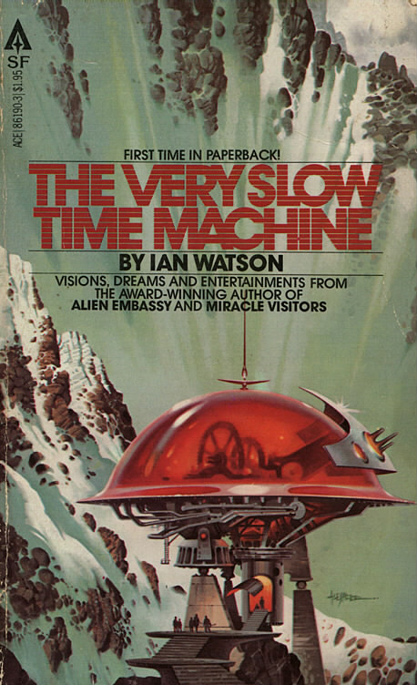
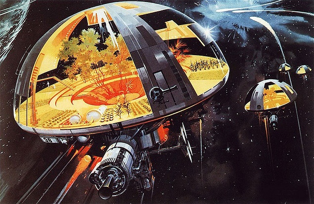
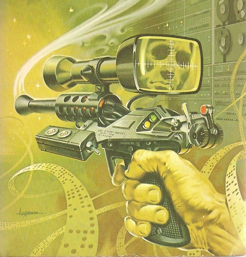
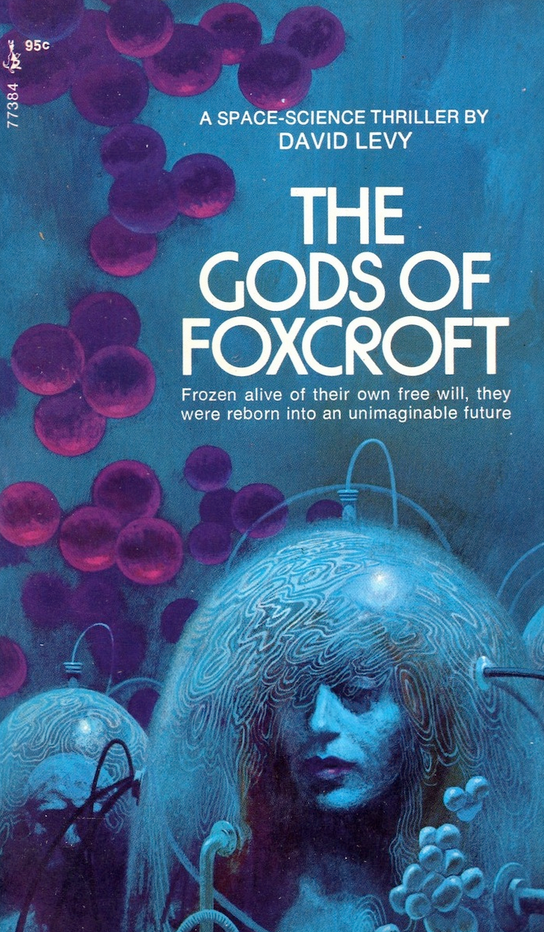
This week I decided to do a feature on Paul Alexander. He got his start working with architecture firms and advertising agencies, he then signed up with a New York City artists rep which got him on the radar with publisher ACE Books around 1977. ACE along with a number of other publishers for various books and magazines kept him very busy over the next two decades. He is very well known for his mechanical style and Vincent Di Fate called him “one of the top “gadget” artists currently working in the American paperback market”.
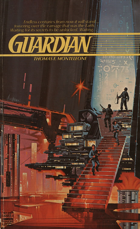
I really love illustration on that Guardian cover. I’m not a huge fan of most 80s sci-fi book covers but this one was released so early on in the 80s that it still feels like it isn’t too far gone. If you dig into some of his later stuff you will see what I mean about the heavy 80s style, I am talking raised lettering book titles with full mirror gloss finish. His early work really does differ from his later work, not so much in actual subject matter or quality but the style change is really evident. It’s clear throughout all his work he was an absolute master at the technical and mechanical elements.
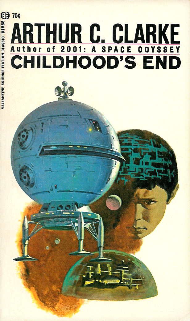
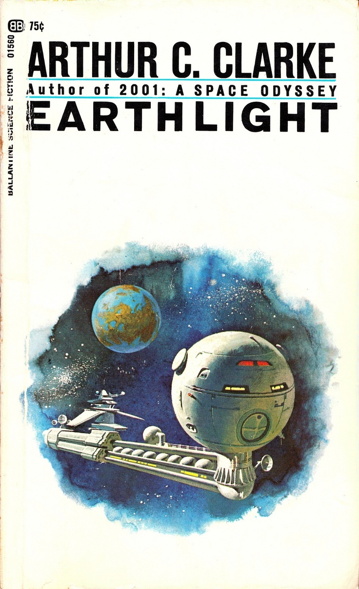
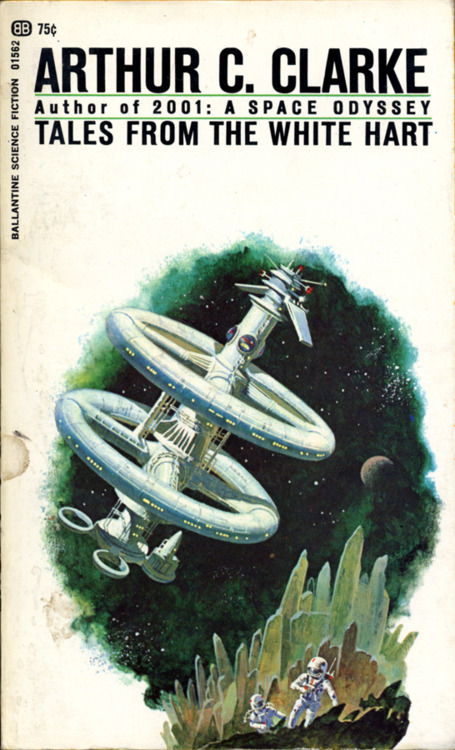
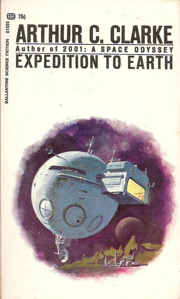
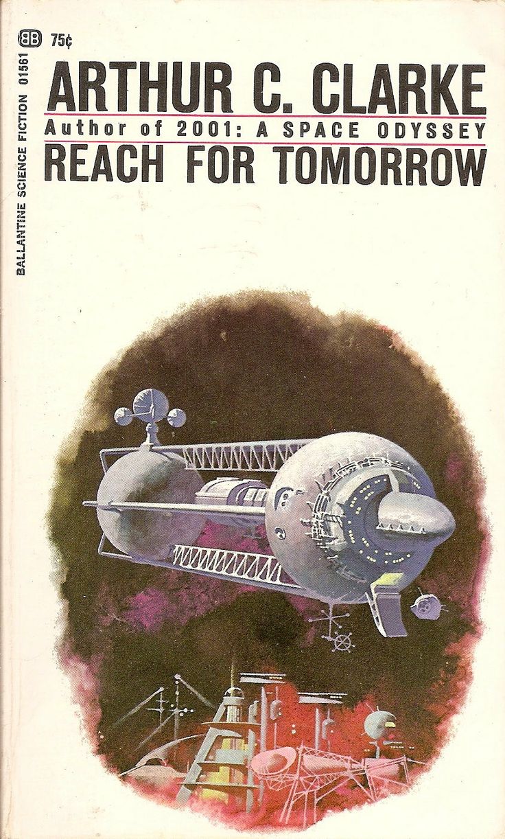
This week’s post starts with one of my personal favorite covers–Childhood’s End, which is also a great read. It’s pretty short and I think its up there with Arthur C Clarke’s best. On the back book cover I learned that Ballantine Books did a whole series of similarly illustrated covers–all just as beautiful. I love how the same illustration style and structure is maintained over the entire series of covers while each book is given its own dominant color. When I sat down to look into the series’ artist, everything unfortunately end in “artist unknown” or “uncredited cover art.” There is some speculation that the artist of the Earthlight cover may be Dean Ellis, but it’s not enough to tie him to any of them for sure. While I debated not posting this series after I found no conclusive artist, I decided they’re too good not to post. I am hoping a solid artist credit surfaces so that I can come back here to post an update. If anyone comes across anything, be sure to post in the comments below.
I’m happy to see the #sundayscifi tag on instagram is starting to get some posts. I will be pulling some ideas for future editions on there (in fact there is one I already know for sure I will be posting). As always, feel free to share your own favorite sci fi artist suggestions or thoughts on the post in the blog comments.
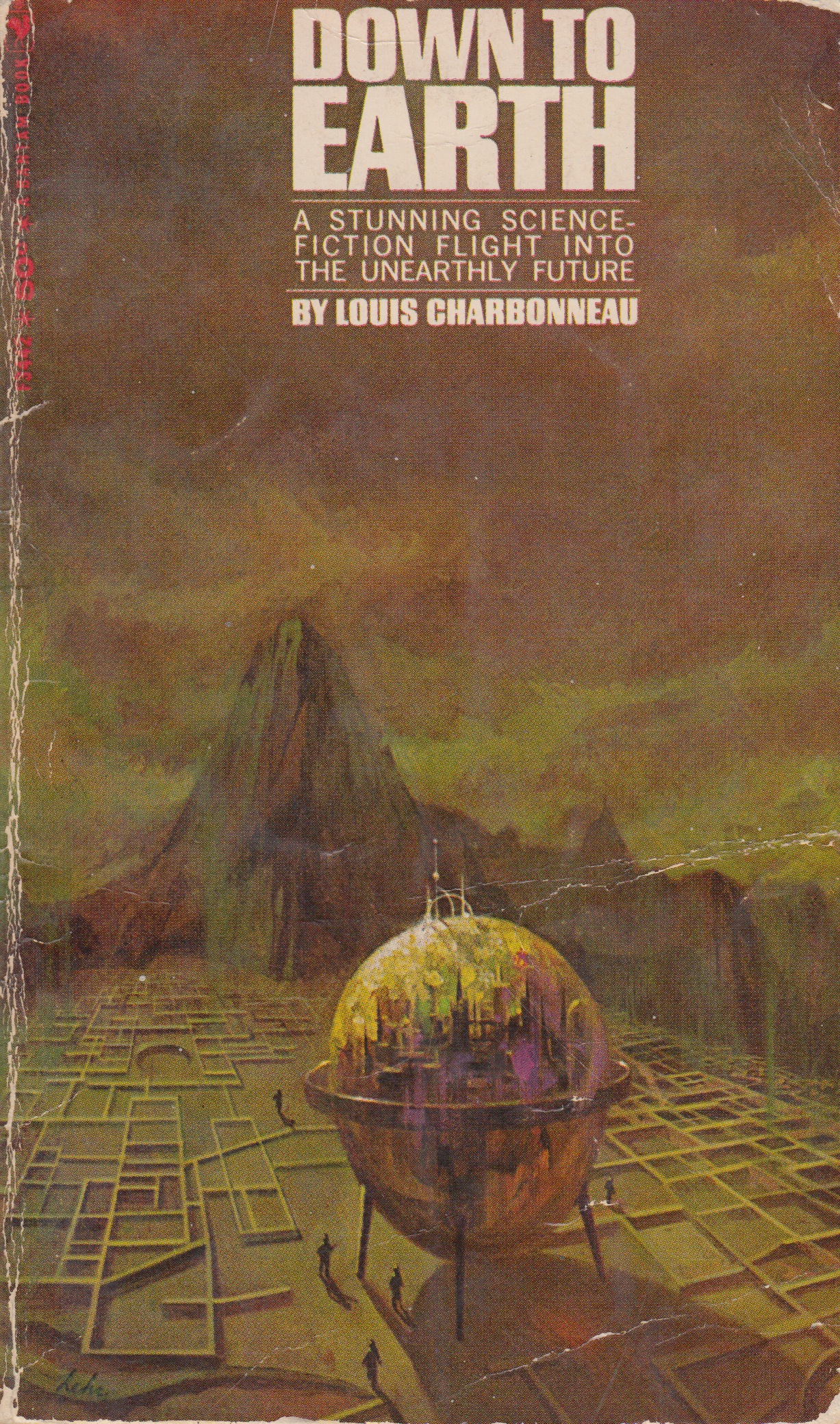
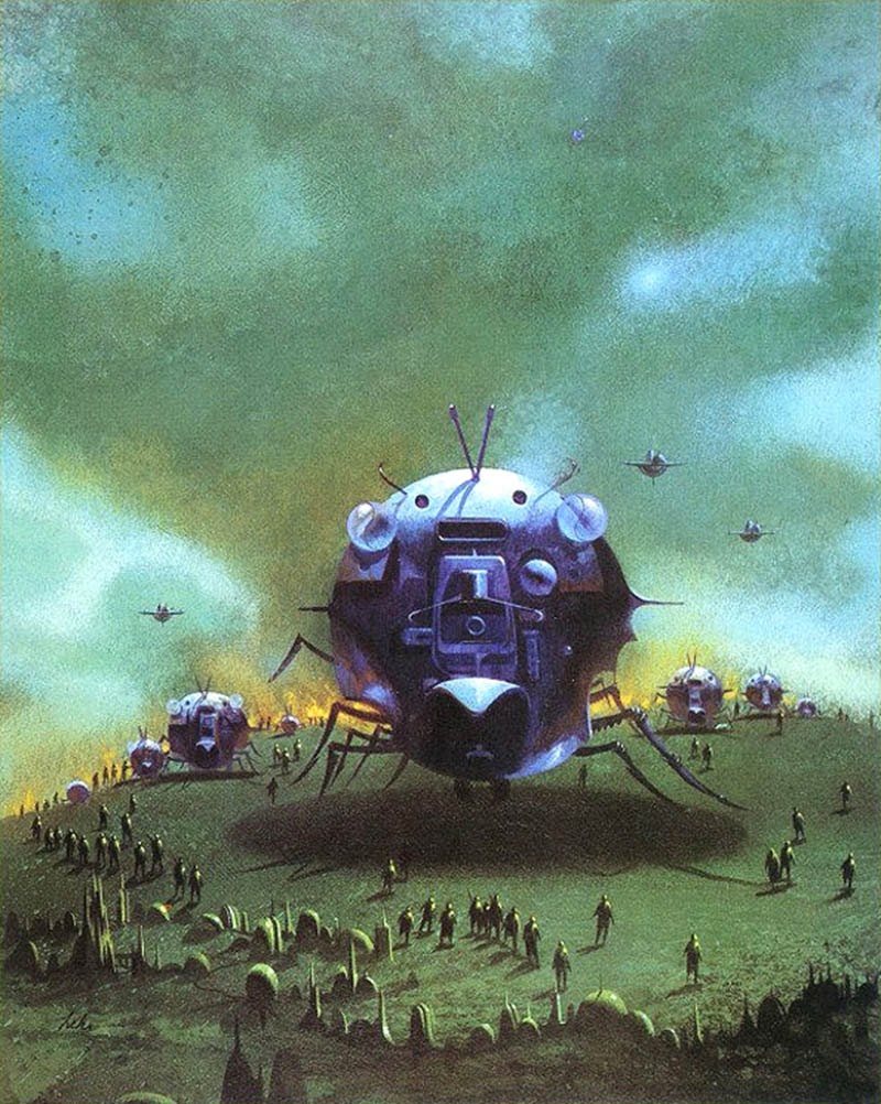
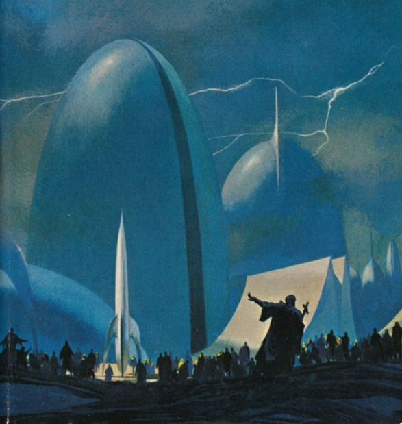
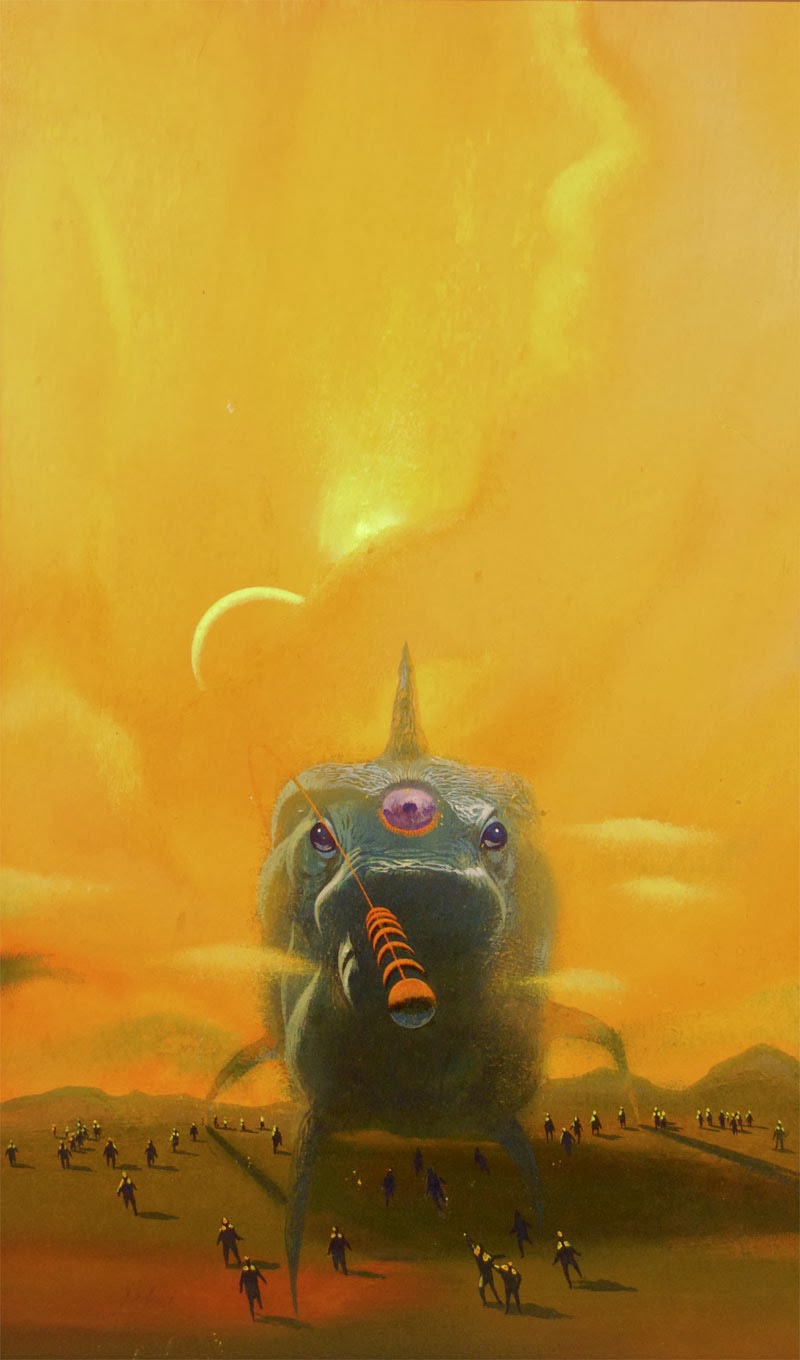
Paul Lehr illustrated a ton of work for sci-fi kings like Robert Heinlein, Isaac Asimov, and H.G. Wells. While last week we saw John Berkey’s scientific and technical approach to space craft and space flight, Lehr’s work is certainly more organic in both his subjects and technique. He leans more towards fantasy-like creatures, life forms, and orbs. There is also a recurring scene of numerous people all surrounding an object or life form. I find it interesting when artists have a heavy overarching presence of certain themes in their art; links between separate bodies of work. I was thinking while posting this week’s covers how different one artist’s view of the future can be from the others’. I think that seeing each artist’s different take on the future will be an interesting part of this series.
I’m curious–does anyone has any favorite images from this week or a preference between the styles seen this week or last?
Ducking into used bookstores over weekends and after work, I have become a bit of a sci-fi paperback junky. I love the feeling of rummaging through stacks of forgotten paperbacks and discovering that hidden gem of a cover. There is just something about the idea of the future as illustrated by artists of the past that I find fascinating. If you do enough digging you can come away with some great covers for under a few bucks. Recently I began scanning and cataloguing my finds and this has led me to the idea for a new blog series I will be posting here on Sundays. Every week my post will be inspired by one of the covers I own or a new find. Some of these may be well known while others more obscure. I look at this as a way to learn about and resurrect some of the great cover illustrators and designers of the sci-fi genre. If you have suggestions or your own favorites, leave a comment or contribute to the collection of covers with a nice straight on shot of your find and tag it #Sundayscifi on Instagram. I started the tag off with a few of my own images but I would love everyone to include their finds.
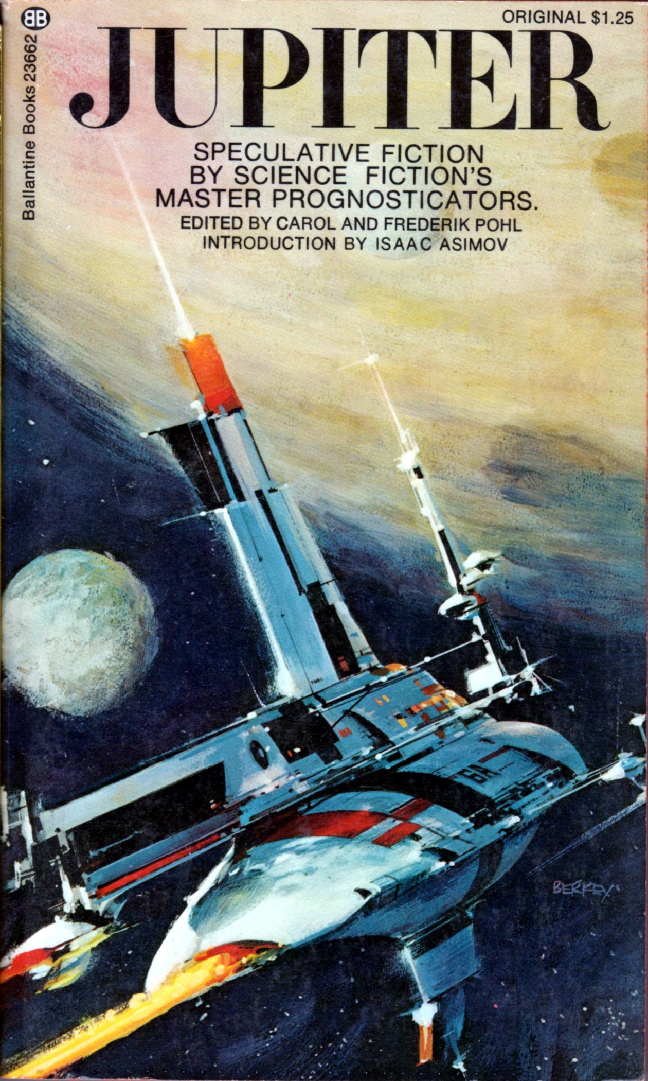
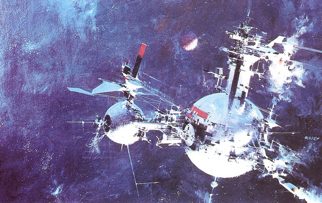
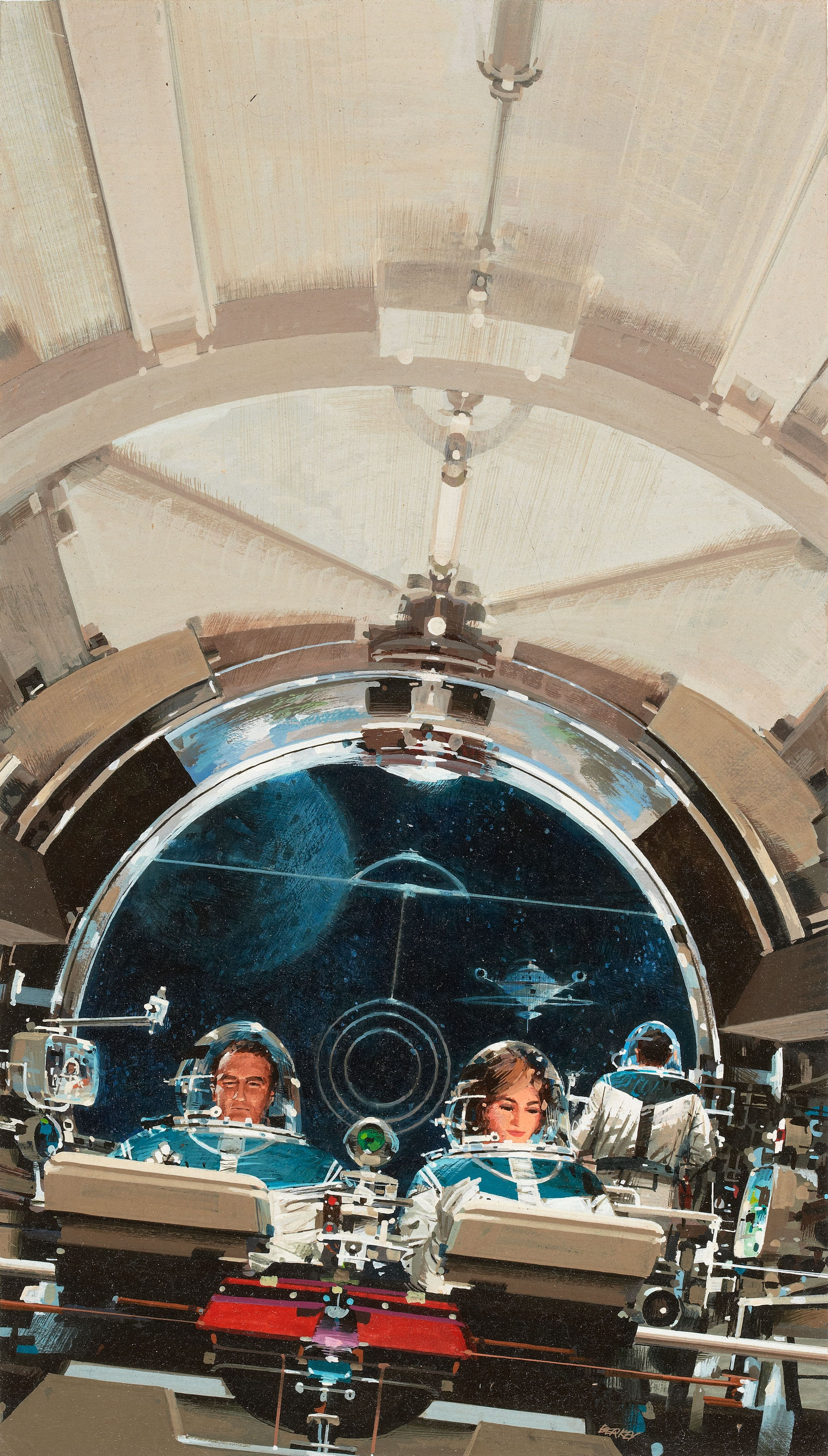
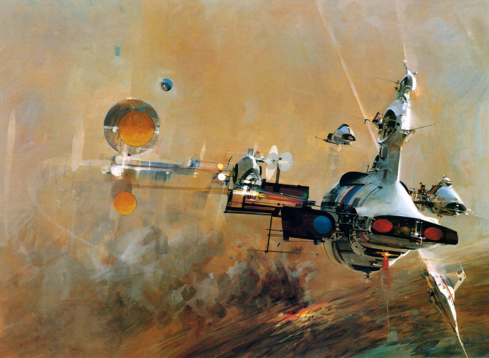
To start the post off, I am featuring one of the better known artists of the sci-fi genre. Most know John Berkey for his illustrations for Star Wars, but he holds a massive catalogue of varying types of work. Beginning in the 1960s, he was commissioned by NASA to further their space program as part of their efforts to travel beyond the Earth’s atmosphere and ultimately to the moon. No matter the type of work, I consistently love his use of color. My personal favorite thing about his work are his spaceships. The details of his images draw you in and you can get lost looking at every tiny detail he includes.