The Epoch is a hinge. We tend to follow a linear trajectory until a point at which we realize that through free will the path can be bent and redirected.
I’ve been very busy for the past year or so working on a new album so it’s been a while since I’ve posted. Now that the new Tycho album — Epoch — is out I wanted to write a little about the meaning and origin of the artwork. I worked as a graphic designer for 14 years until I decided to pursue music full time so the visual element of Tycho has always been at the core of the project for me. I think the imagery tells a story that the music can’t fully articulate, and vice versa.
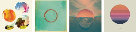
Past is Prologue (2006), Daydream (2007), Dive (2011), Awake (2014)
The sun disc, both literally and as an icon, has always been at the center of the artwork. From Sunrise Projector and on I’ve used the sun and circle as a metaphor for life; the sun being the life giver and the circle symbolizing the closed loop, the interconnectedness of the human experience with the physical world.
· The Trilogy Begins
Dive (2011)
While I had explored a lot of these themes previously, I feel that Dive was the beginning of a trilogy of albums and so was the starting point for a narrative and symbology which have become central to the Tycho identity.
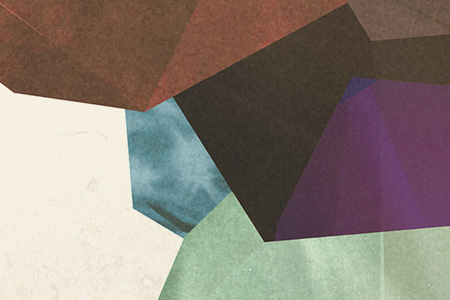
The cover for Dive was a foray into maximalism combining photography and design. I wanted to evoke the sense of being on an unavoidable path, one from which deviation was impossible. I wanted the viewer to be pulled into the image and be drawn toward the sun. I think this design speaks to the music in that it felt like the beginning of a journey and the multi-layered composition echoed the sonic aesthetic of the music. I spent quite a bit of the next couple years refining this style and creating various collage type images.
Dive Single (2012) – Another cover in the style of the Dive full length cover
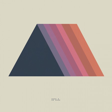
· Enter Minimalism and The Trapezoid
Concert Poster (2012)
As a graphic designer I have always had a deep appreciation for minimalism and the simplified, efficient expression of ideas through form and color. But as a visual artist working within the context of Tycho my output had typically trended toward almost painterly styles, multilayered collages which were anything but minimal. But at some point after the release of Dive I decided that I wanted to get back to my design roots and bring a more simplified, refined style to the project. The beginning of this shift was around 2012 when we played The Independent in San Francisco. This was meant to be a simplification of the same path seen on the cover of Dive, the colors a reflection of the sun into that path. This was also one of my first uses of the trapezoid shape which would become core to the symbology of Tycho.
· The Awake Era
Awake (2014)
Dive was in many ways a breakthrough record for Tycho: it was when I first formed the live band and we began touring extensively. It also marked the period when I was finally able to quit doing freelance design and focus solely on the music and the imagery surrounding Tycho. After a couple years of touring it came time to make a new album and I knew this would be a pivotal release, quite literally a make-or-break record. I wrestled with the art direction for months before finally deciding to go in an entirely new direction from Dive and earlier works and create a minimalist direction for the release. I had always felt strongly about the spectrum and trapezoid from the 2012 poster and so I revisited the concept and incorporated the sun imagery to bring it into storyline.
Both the circle and the trapezoid symbols featured heavily in the videos and visuals for Tycho during the Awake tours (2014-2015)
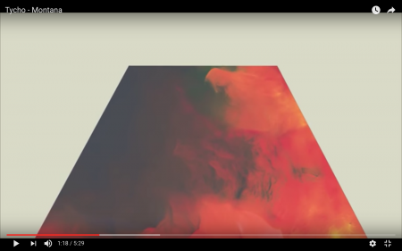
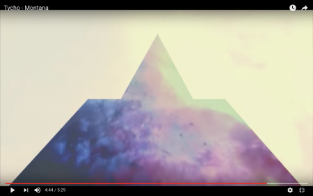
Montana Visuals (2014)
Montana Video (2014)
During the Awake album cycle I continued down this path and lots of imagery followed for show posters and releases.
Concert Poster (2014)
Montana Single (2014) – the trapezoid combined with the triangle
· The Darkness
The overall direction for Awake was very light and halfway through the cycle I started shifting things into a darker space for contrast and to foreshadow the next album.
Awake Deluxe Edition (2014)
Concert Poster (2014)
Awake Remixes (2015)
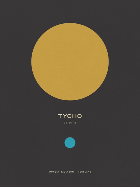
Concert Poster (2016)
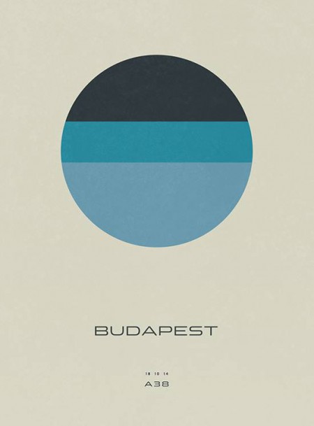
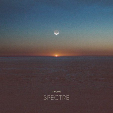
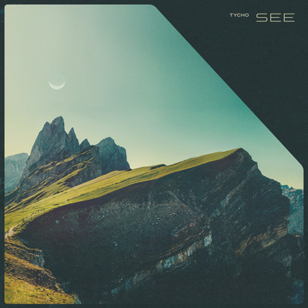
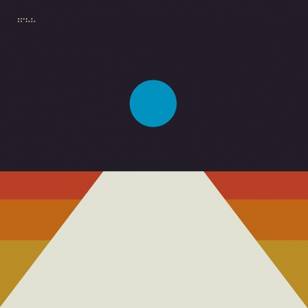
To compliment the darker themes for the Spectre and See singles I introduced the moon as the central element in place of the sun.
Spectre Single (2014)
Spectre – Bibio Remix (2014)
Tycho – See (2014)
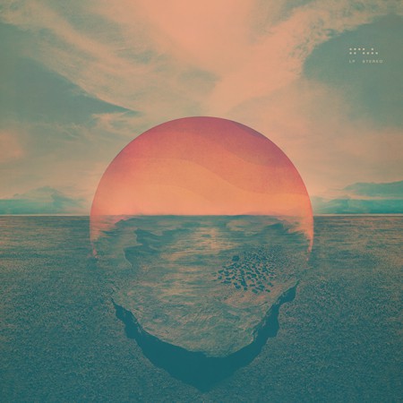
· The Epoch
Awake had been out for over two years and it was time to start thinking about the next release. Up until this point, when doing minimal compositions I had been using textures and distressing to give some depth to the images and break up solid fields of color. For the next phase I wanted to further simplify and remove any extraneous elements. I wanted to cut to the core of the message and try to distill things into a language of basic symbols.
Artwork for the first single from Epoch: Division (2016). This was designed after the album artwork and was meant as a transition which would introduce the elements and colors that would follow in the full length release.
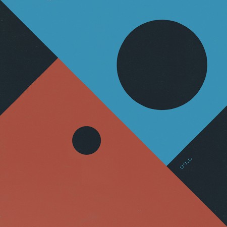
Musically, this album was about circling back while maintaining forward motion; revisiting and refining the concepts of earlier albums with a view to the future. My primary goal was to incorporate the color scheme of the very first Tycho release: The Science of Patterns EP (2002). I also wanted to revisit the simplicity of that artwork as Epoch was all about focus and efficiency, chiseling away anything which was not absolutely necessary.
The Science of Patterns EP (2002)
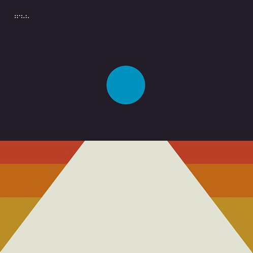
I also wanted to draw upon the two core symbols of the project: the circle and the trapezoid. But this time I wanted the circle to represent the moon, a body reflecting the light of the sun. In this way it was a metaphor for this album, a reflection of the previous works presented in a new form.
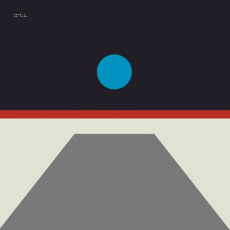
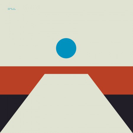
The following are selected iterations of the Epoch cover design which led to the final version.
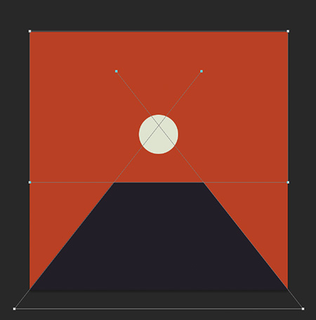
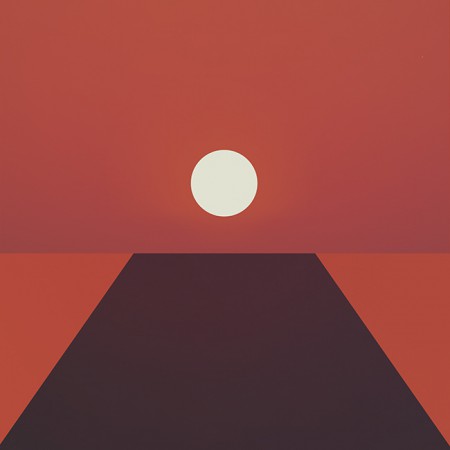
The initial concept (2015)
An early concept incorporating a more three dimensional look. I ended up leaving this in favor of a more simplified form
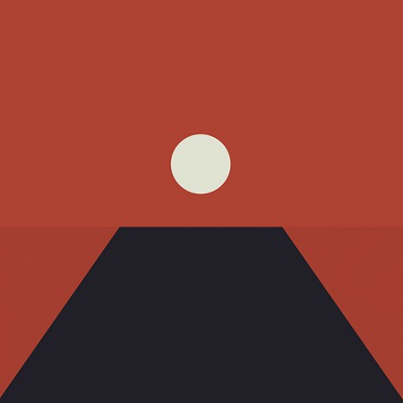
The first simplification, the horizon line is still subtly implied
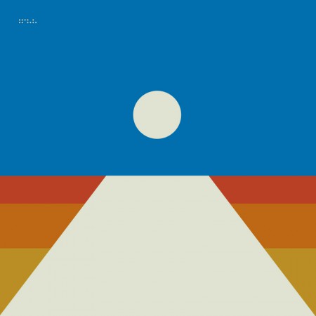
A tangental concept exploring the incorporation of more color. This ended up being the impetus for creating the alternate cover series for the countdown (discussed later)
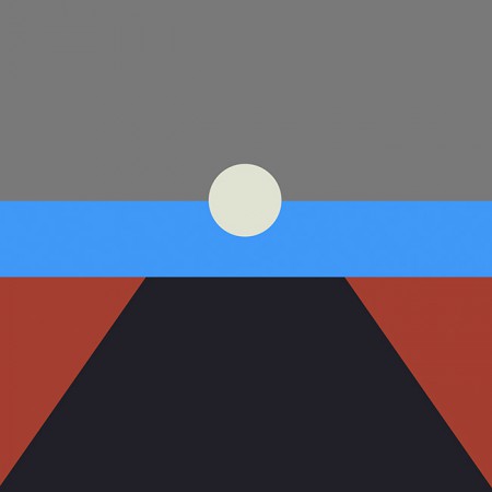
Another alternate with more color and a defined horizon line
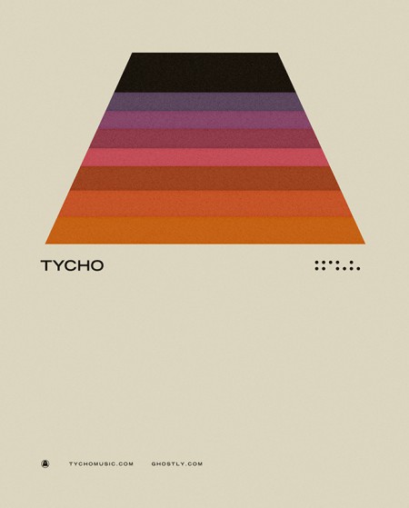
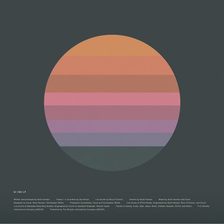
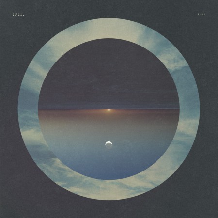
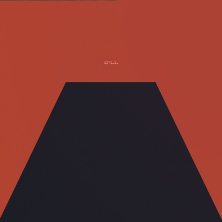
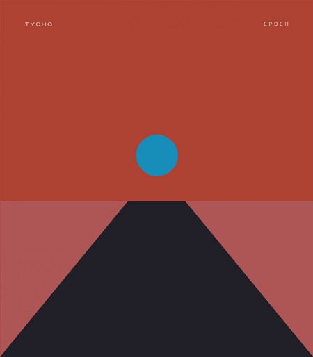
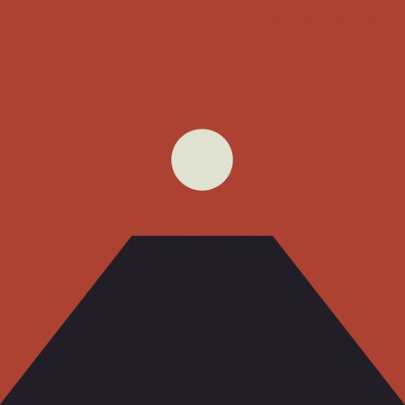
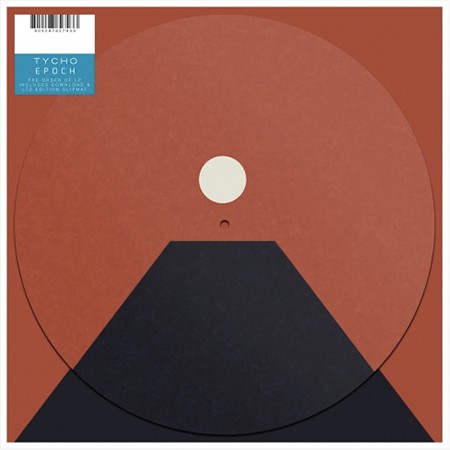
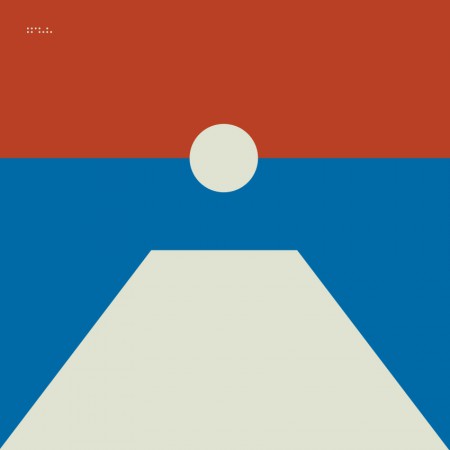
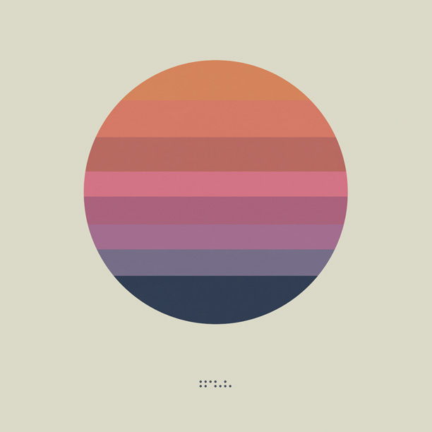
The final form: Tycho – Epoch (2016)
In the end I decided to keep the image ambiguous, the viewer should decide exactly what it was they were looking at and ascribe their own meaning to it. This meant stripping the image down to the essential elements, leaving a simple icon.
I felt that the power of this image would be in its simplicity and also in its portability. It could adapt to many form factors with ease and felt more like a modular system than a singular image. At this point you have to take into account that the vast majority of people will experience album artwork at a tiny square on a smartphone. At this scale a lot of nuance and detail will be lost. This is not to say that I intended to oversimplify purely for this reason, but it is a consideration.
· Release
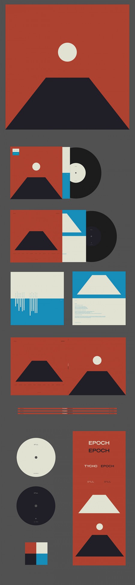
Epoch Vinyl Packaging
Epoch was released 30 days after completion as a surprise, as such there wasn’t enough time to have vinyl and CDs produced; only digital versions were available on release day. As a stopgap until the vinyl arrived, we decided to offer a custom slipmat with pre-order purchase at retail outlets. More about the release strategy in The New York Times piece With Vinyl, the Musician Tycho Establishes a Physical Presence
Epoch Slipmat
For the Awake release I cut up a print of the cover art into squares and released it as nine panels as a way to count down to the release. For Epoch I wanted to create several alternate versions of the cover art to use for build up. This release was not announced ahead of time so it was fun to slowly release elements of the design without people fully understanding what was coming. Here are a few examples of the alternate versions.
Tycho Descent Burning Man Sunrise Set Cover
06-division
08-local
02-horizon
04-receiver
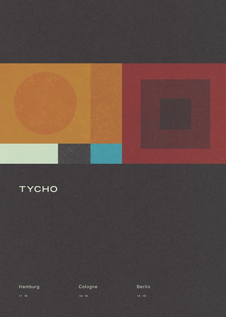
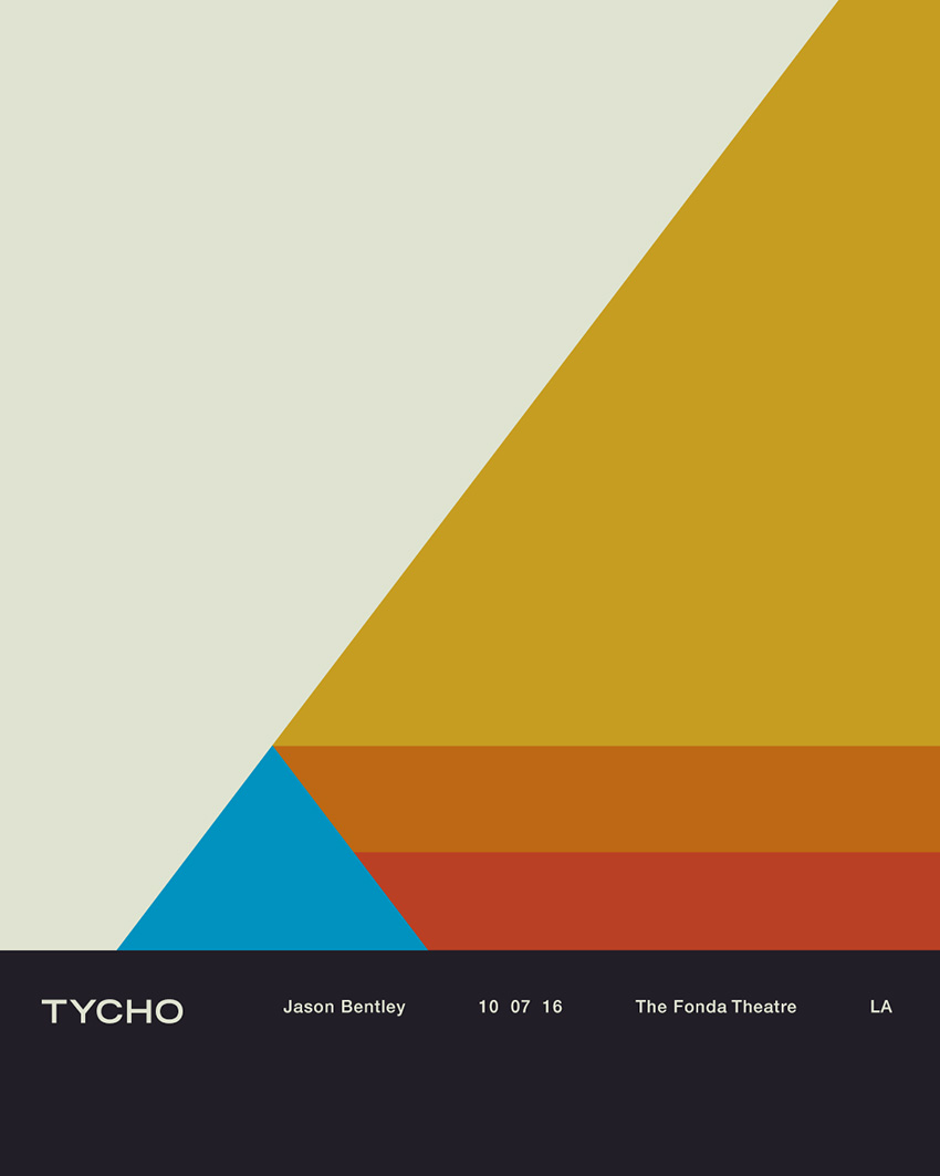
All in all this was an enjoyable and fulfilling process for me as a designer. I’m looking forward to the next couple years, creating future permutations and working with this design/color system. The first example of this is below, the poster for the show at The Fonda in LA.
Tycho Fonda LA Concert Poster
Thanks for reading, if you have any questions leave a comment and I’ll do my best to reply.
Tycho Sunrise DJ Set on The Dusty Rhino at Burning Man
Thursday, September 1, 2016
Thanks to everyone who made this morning so special. Thanks to Clarke and the Dusty Rhino crew for having me. Special thanks to my brother Dane for all the help.
Enjoy!
Track Listing
Tycho – Spectre (Bibio Remix)
Boards of Canada – Dayvan Cowboy
Tycho – Montana (Christopher Willits Remix)
Maribou State – Natural Fools
Krankbrother – When You’re Watching Me
Cubenx – Blazing
Rival Consoles – Ghosting
Hammer & Ludd – Controller
Tourist – Run
Tycho – Epoch 48:58
Com Truise – Silicon Tare
Jonathan Wilson – Desert Raven
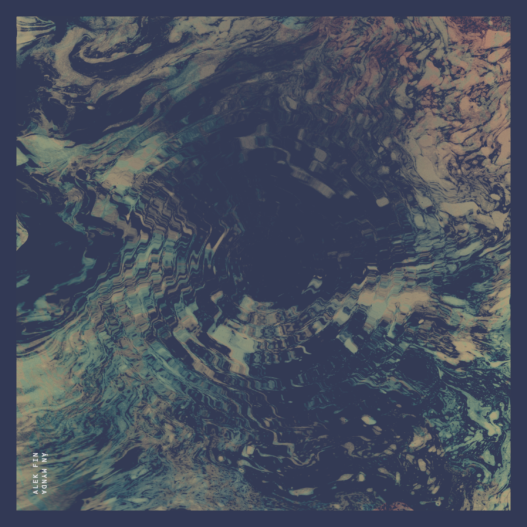
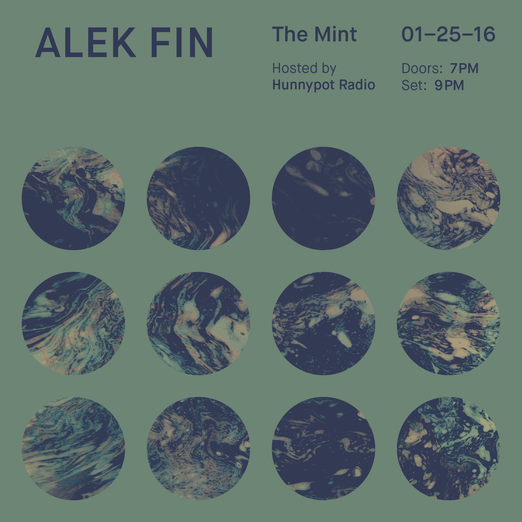
Following a three year hiatus after the release of his debut EP Mull, producer and musician Adam Finkel, who goes by pseudonym of ALEK FIN, returns with his latest effort Án Mynda; a five track EP of which he has shared an intimate live rendition of the title track, Án Mynda, exclusively with ISO50:
This video was filmed in my old studio space where Jeff, Mike and I built and crafted the live show behind closed doors for years. Grateful to have that space preserved on film and finally give everyone a look into what we’ve been working on.
– Adam
Credits:
Directed, filmed and edited by Travis & Taylor Keaster
Mixed by Jason Sharp
I was first introduced to Whitestone via my involvement with Italian electronic musician and producer Indian Wells’ sophomore release, Pause, for whom I did the album art for. Whitestone had contacted his label, Bad Panda Records, expressing interest about collaborating in creating an “interactive experience” for the release as part of a new platform they were developing. Naturally, as a designer (and musician myself) I was intrigued, specially after watching the video above, so I asked Roey Tsemah, founder and creative director of Whitestone, if I could pick his brain for a bit:
ISO50: What is Whitestone exactly, and who is behind it?
Roey: Good question, Whitestone is a platform for interactive music. It is a place for artists and fans who want more than just pressing play.
I am a musician, and as most musicians I’m also one of those die-hard music fans who still buy vinyl. About 4 years ago I set myself a goal to take album artwork to the next level, help artists make use of the browser as means of expression and create music for the internet.
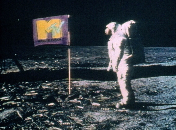
I’m always comparing it to MTV. MTV created a place for artists to release music for TV and by doing that they inspired a different kind of creation. Conceptual artists like Peter Gabriel used the medium creatively and made history with videoclips like Sledge Hammer. We would like to do the same with interactive music.
At the moment we are a team of 4 people and we want to keep the platform independent so artists like us can gain the most off of it. We are raising funds on Kickstarter to help us build the platform and community. We hope that artists and fans who read this will help us bring Whitestone to life.
When MTV actually played music videos
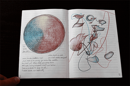
Roey Tsemah’s Sketchbook
ISO50: What inspired you start a platform like this?
Roey: Artists like Bjork, Radiohead and Arcade Fire, who have made interactive apps and videos before. I just want to see more artists make stuff like this. Also, I think interactive experiences are a great way to add value to music online. Fans want to support artists but at the moment the only reward artists give them are MP3 downloads… Personally I don’t have anything to do with MP3s, they just take up space on my drive. I think there are better ways to reward supporting fans.
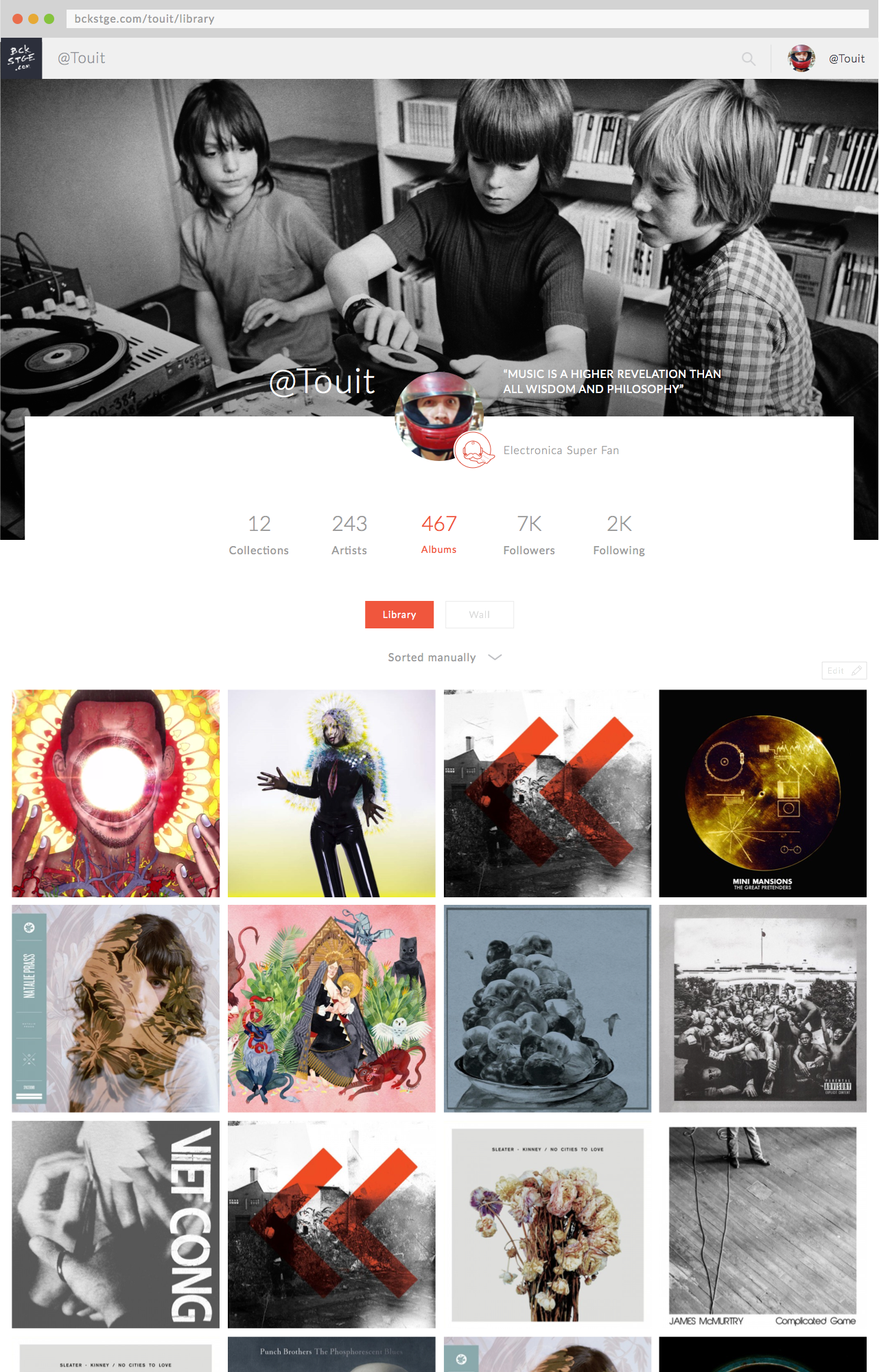
ISO50: How will people collect this new form of “interactive album art”?
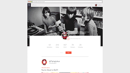
Roey: Members accounts (both fans and artists) are built out of two main components – The Timeline and the Library. The Timeline (pictured above) is similar to other social networks, while the Library (pictured below) works similarly to Pinterest. Both fans and artist can add albums, mixtape, interactive experiences etc to their library, regardless of where they are online. Other fans can then follow them based on their curation. The whole idea is inspired by the way we used to discover music before streaming – we used to check our friends music collections, go through their CDs, bootlegs and mixtapes – our music collection says a lot about us and I believe it’s the best way to discover music.
Whitestone doesn’t distinct artists from fans in that sense, all artists I know are first of all music fans. At the moment there is no place we can explore, for instance, The Gaslamp Killer’s music collection, imagine how cool that would be…
Music fans (me included) spend hours, days and nights learning everything about albums we love, many of us contribute our knowledge on music forums and Facebook groups. Whitestone has a ranking system to reward such fans, encouraging them to participate and share their knowledge. The higher fans are ranked among the community they become influential and the platform rewards them with badges and coins to buy content on the platform. Also,they get the attention of their favourite artists who can then reward them with merch, gig tickets etc.
ISO50: What artists, both musicians and visual, would you like to see adopt your platform?
Roey: The general rule is everyone who gets inspired by the medium, the internet, the screen, code and data. Artists who see the possibilities in creative code, generative art etc. I love what Random Studio are doing and also Resn. They create rad interactive experiences. Musicians like Flying Lotus of course, Cold Cut and any Ninja Tune artists. Warp also, but that’s just because I’m into this kind of music at the moment. I also think it may benefit many ambient and minimal techno artists like Claudio PRC, for example
ISO50: So you’re a designer as well, what would you say is your favorite album cover and why?
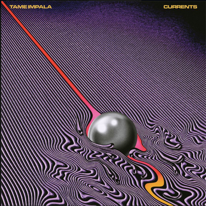
Roey: Ow… there are so many… I love Ghostpoet’sSome Say I So I Say Light, the newFKA Twigs and Currents by Tame Impala (which I think would make for a sick interactive experience). Everything Bjork makes. Same with Radiohead (I love the process they go through with their longtime collaborator Stanley Donwood) Flying Lotus, Moderat, there are many, many more. I guess I can’t really name a favorite because I love different kinds of stuff. I think what attracts me most is the process and how the result reflects on the music.
Tame Impala – Currents (Design by Robert Beatty)
ISO50: Where do you see Whitestone in the future?
Roey: Basically I want Whitestone to be a hub for true music fans and artists online. A place where they can connect and support each other. A place not owned by a huge corporation but a small independent group of artists. I truly believe that together we can pull this off, I hope the readers will join us and help make it happen. We made a special website to honor all our backers, it’s an interactive credits page where every backer becomes part of a “Stone” -The bigger the stone is, the stronger we become as a community, the closer we get to our goal.
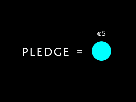
If you wish to support Whitestone, visit their Kickstarter campaign and pledge to get one of these amazing art/research books designed by Roey himself, among other rewards:
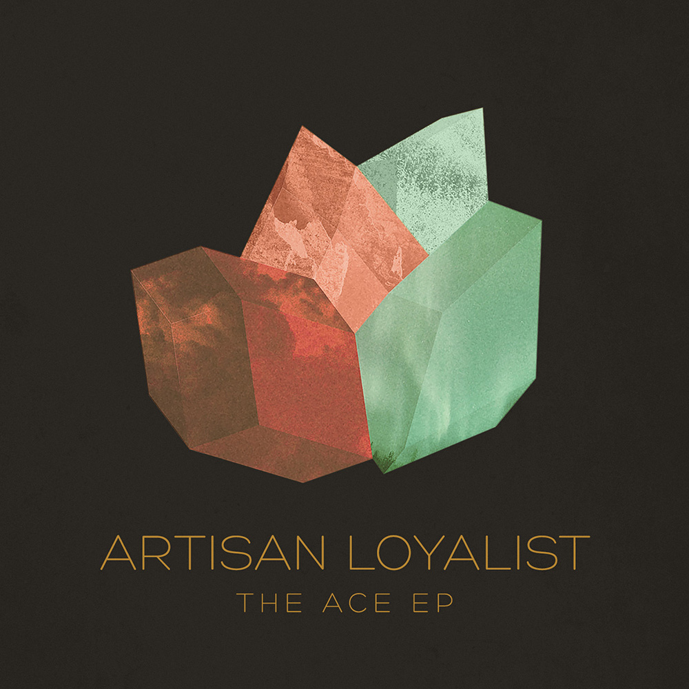
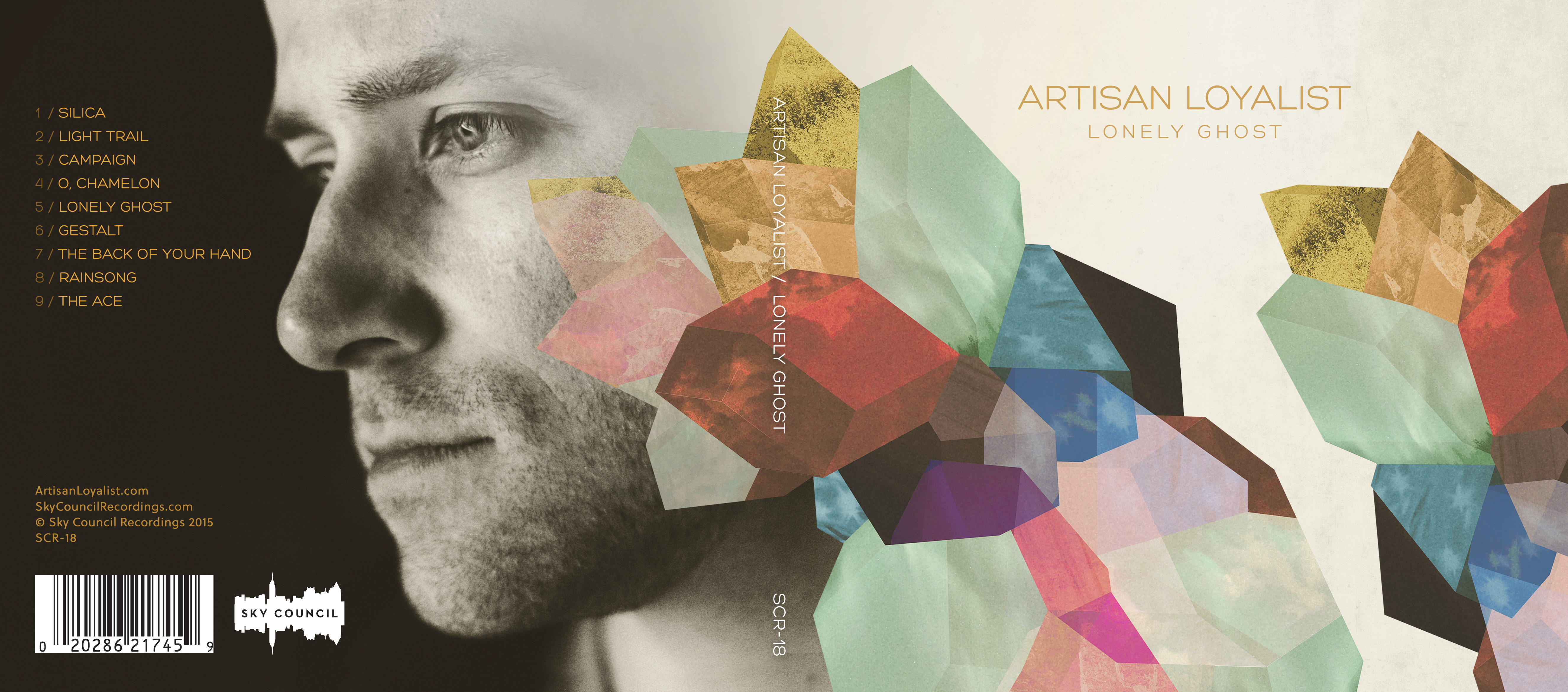
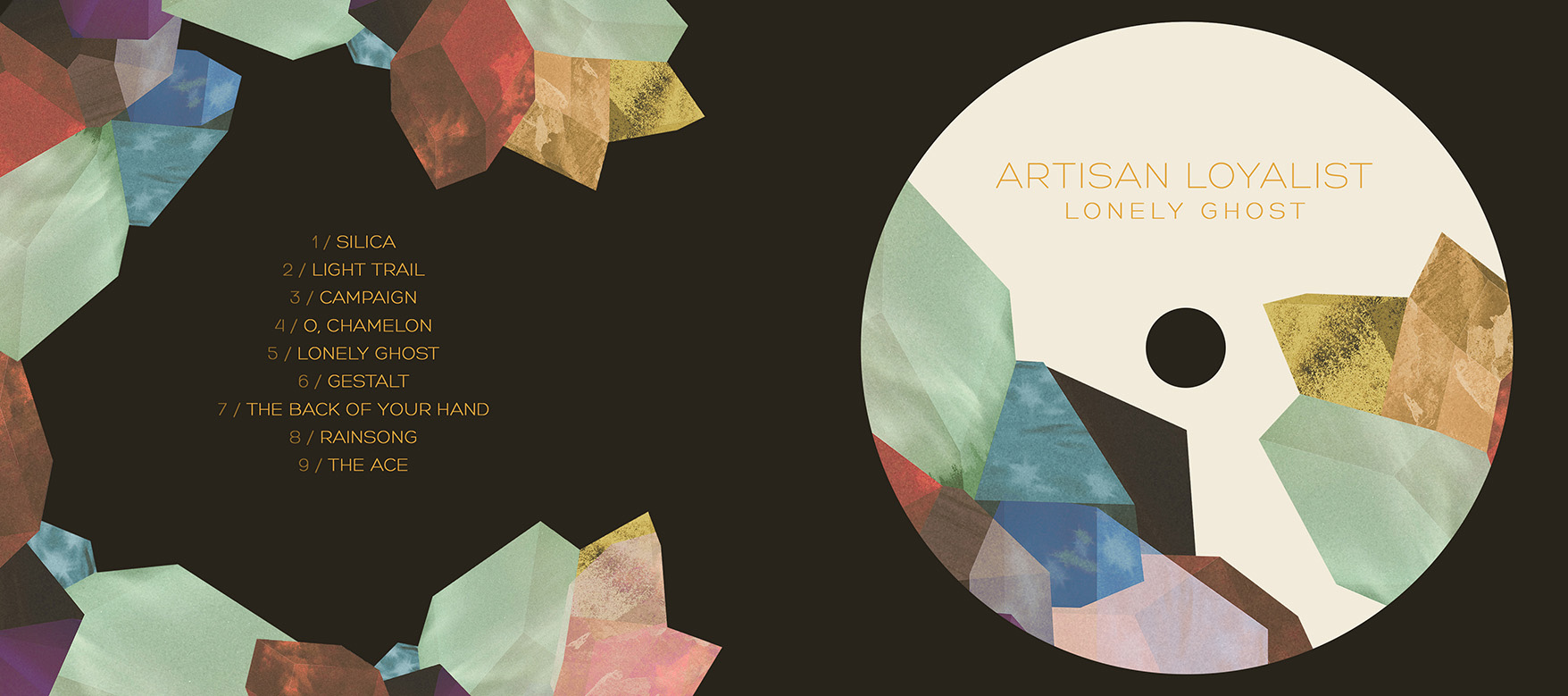
I recently had the opportunity to design some album art for Artisan Loyalist on the upcoming full-length album, Lonely Ghost, and the recently released teaser, The Ace EP. Initially, the artwork for The Ace EP was derived from pieces of the Lonely Ghost design: the gem-like cluster started in Illustrator as basic flat shapes that I had worked into 3D, and then overtop, layered a large number of photos I had taken to get the various textures.
This is the premiere streaming release of the the track Light Trail. Lonely Ghost is set to release on Tuesday, February 24th 2015 on Sky Council Recordings, and you can pre-order now on iTunes and Amazon.
Can we file this under fine art? I think we will. I might be too young to say i’m a true fan, if anyone ask Beamer he turned me onto them and probably has the whole catalog on vinyl and cassette.
I am into this art, reminds be of my mom’s airbrush homework but with detail and a story. You might write them off one by one but as a collection i’m sort of feeling it.
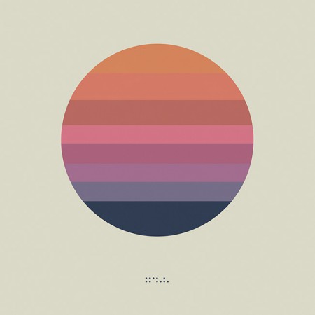
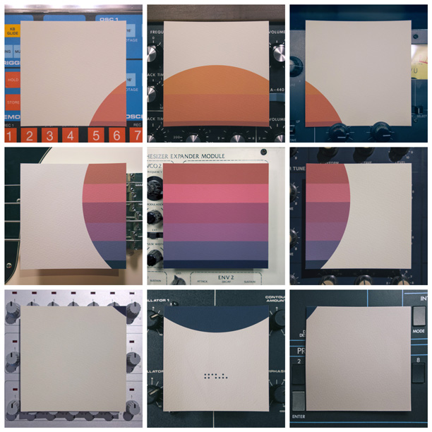
As you may have noticed I haven’t been very active on the blog over the past year. This is because I had decided to focus solely on my music project, Tycho for a while. I spent the last 9 months or so working with the band on a new record which is now complete. Of course, Tycho is very much an audio / visual project so I’m still working consistently on design whether it be album covers, show posters, or online assets. I was working on the cover art and developing the packaging in parallel with the recording process this time around. We recently shared the final artwork for this LP, entitled Awake (listen to the title track here). I’ll go more into the reasoning behind and making of the artwork later, but for now here is a quote from this Reddit discussion of the cover art that I commented on:
This design was mean to be a flag; more of a symbol than what I would think of as traditional album art. I felt that, with physical mediums disappearing, album art didn’t necessarily have to fit a given format and I wanted something that could be readily transported.
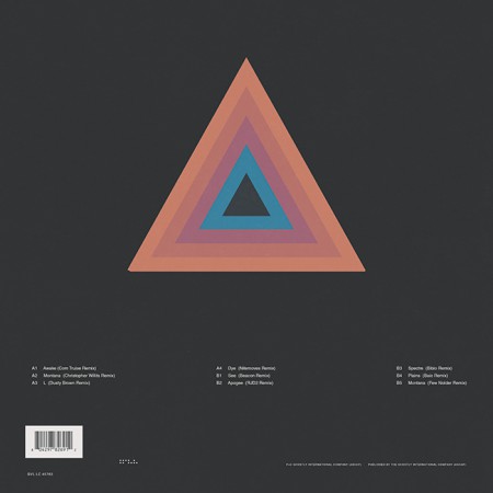
If you look at earlier artwork you’ll see that I was pursuing a more maximalist / photographic direction for Tycho (e.g. http://imgur.com/a/kk93f ). But this album has a more stripped down, visceral thing going on and I wanted that reflected in the artwork. Really this is meant to be an inconized form of the sun / circle motif present in a lot of the Tycho cover art to date. Kind of like a unifying symbol for all the output that preceded this release. I see this, for various reasons, as the first true Tycho album and so wanted to focus everything into a simple form that encapsulated that idea. On a side note, there are eight color bands in the circle, each one representing a track.
The beauty of creating the artwork for the music over all these years is that I am free to develop a cohesive lineage with the imagery. From what I have seen of my peers over these past 13 or so years as a designer, we generally tend towards simplification as we go along and I think that is an important part of design: efficiency of communication. Whether this particular design is effective in that respect obviously isn’t something I have the objectivity to comment on, but that was the goal at least.
The album will be released on March 18th, 2014. Here is the track listing:
Tycho – Awake (2014)
1. Awake
2. Montana
3. L
4. Dye
5. See
6. Apogee
7. Spectre
8. Plains
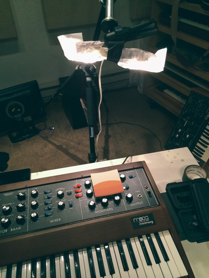
And those who were following along on Instagram, Facebook, or Twitter know that we released the artwork first via a 9×9 grid. I printed the artwork, cut it up, and photographed it using various pieces of musical equipment as backdrops. Here’s the grid in one image:
Makeshift lighting setup. All my camera gear was stolen recently so limping along with a point and shoot setup for now.


