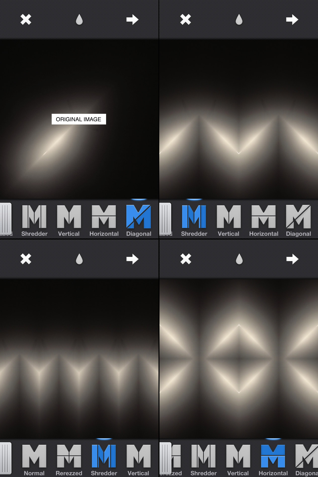
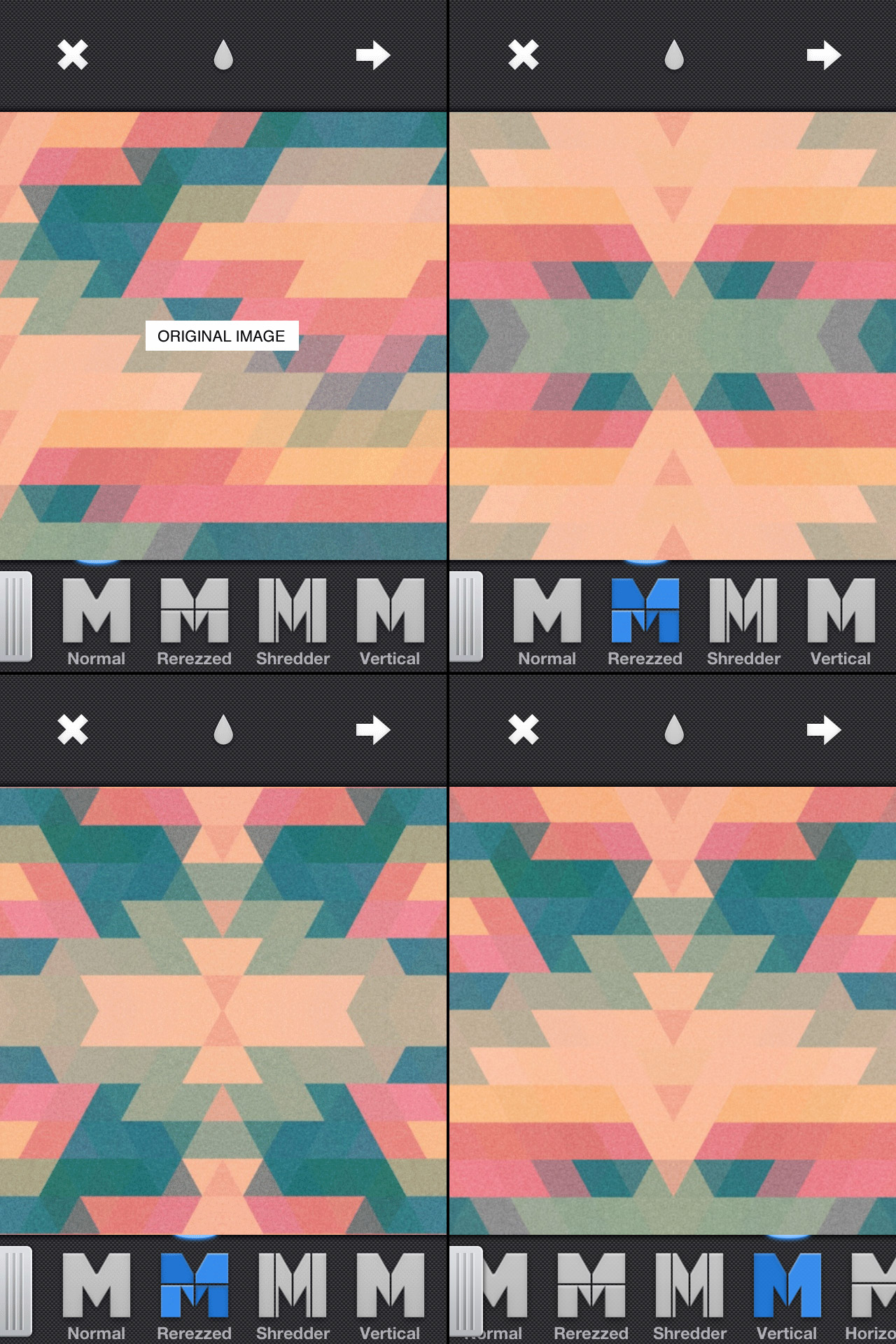
If you are interested in mirroring on the iPhone at all and you haven’t heard of Mirrorgram you are missing out. It’s just about everything you could ask for in a mirroring app. You can snap a photo in the app or load one in, but the real beauty of it is once you are mirroring an image you can move it around to get the mirror just right. Above are a couple images I ran through Mirrorgram. The first one is a photo of a hanging light in my living room. I then mirrored it on a 45 degree angle to get the slit of light and then brought it back in to Mirrorgram again. The second one is a photo I took of a type poster and then ran it through PXL to get the jagged triangle pattern and then through Picfx to get the colour and the grain. I brought it into Mirrorgram to get the different patterns you see above.
Image Blender is my go to app for blending and masking but I was getting frustrated using the brush tool to mask a straight line, then it dawned on me that I could use a solid black or white image to “knock out” the part I wanted to be transparent (or in this case to be opaque). Once I blended down the solid black or white I could bring the image back in and use the blending modes to get the transparency.
The screenshots above show this process. The original photo was the edge of a window frame. I overlaid a blank white image at four different angles. I then flipped it and blended it over the mountain photo. Tip: Swipe to the right to move and rotate the image and then from the main screen tap and hold to flatten down, switch images or copy. I did the final color adjustments in picfx, another go to app for me. If you have any other Blender tricks post them below!
I’ve been delving into the depths of the internet over the past few weeks; reading about everything from ultra high speed video camera comparisons to the best post production workflow for the 5DMKII to FCP. One of the best resources I’ve found is Prolost, the site of filmmaker Stu Maschwitz. The blog is generally about filmmaking, with a heavy lean on post production techniques, typically as it relates to DSLR equipment.
You may have already heard of it, but as was true for The Strobist a year ago, I had not and am very glad to have discovered such an informative resource. I came to Prolost by way of an article on color correction called Memory Colors. It’s not a ‘how to’ by any means, but puts forth some interesting information on the theory behind color correction and manipulation.
With the release of the new (now fixed) firmware for the MKII, it’s been hard to escape the buzz. Finally the MKII can shoot 24p! (In case you don’t see why this is awesome.) Of course now I am lamenting the fact that it can’t do 60fps (all of a sudden I had the urge to get some really smooth slow motion). Maybe next time.
Antonio Carusone from the always excellent Aisle One Blog has written a great article covering the various problems we as designers face when setting type and how to best approach them. The article focuses on using web-based CSS solutions for type layout, but the concepts covered are universal to typography and can be applied to print layout as well. The hanging quotes part is great, but they’re missing the part about “hanging T’s”, I always have trouble with that one. Link
A while back Computer Arts magazine asked me to write an illustration tutorial for an issue which focused on textures. The idea was to revisit the classic Bob DylanBlowin’ In The Wind / Mister Tambourine Man poster. I really enjoyed the project and ended up using the resulting image as the basis for my Progress Austin concert poster. Computer Arts has made the entire article available on their site as a PDF which you can download here. They’ve even made the original source files available so you can follow along with the tutorial. If you have any questions feel free to post in the comments and I’ll try and fill in any blanks.
“Creating eye-catching imagery for print can be a balancing act between the two distinct worlds of computer-based design. Scott Hansen shows you how to get explosive results in Photoshop…
The strengths and weaknesses of vector and raster graphics have long been apparent: vector is known for its clean lines and resolution-independent scalability whereas raster has a more photographic nature. Although vector graphics are particularly suited to print work thanks to their scalability, there are some things you can’t do without bringing rasters into the picture.
In this tutorial we show you how to bring together both vector and raster elements to create a seamless piece that sits well in both worlds. The concepts we explore will lend a timeless, weathered feel to what would otherwise be a rather stark design. Relying on Photoshop’s powerful raster tools and quite adequate stable of vector tools, we can tap the strengths of both without leaving the familiar realm of Adobe’s most powerful graphics app. We can unite two styles of design by employing Photoshop’s powerful blending mode options along with advanced gradient masking techniques to produce an illustration style that is truly unique.”