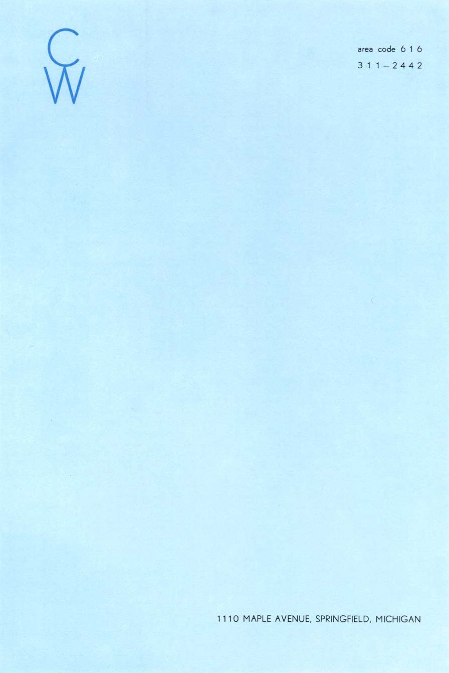
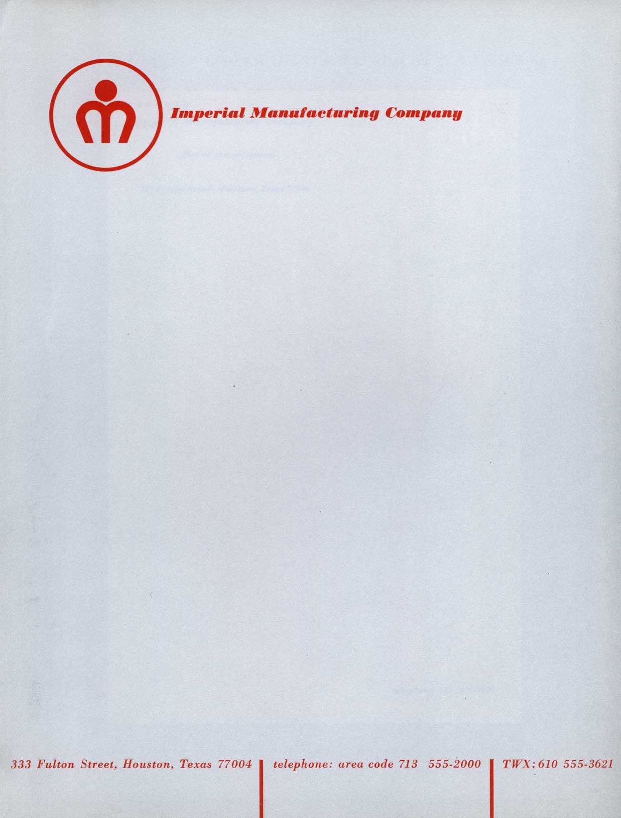
Afiler’s Flickr has some excerpts from a book by Ladislav Sutnar aptly entitled How To Show Telephone Numbers On Letterheads. As you may have guessed, the book features various examples of type placement in letterheads. It’s a very nice set of classic examples of a dying art form and is designed by one of the key architects of information design. I’ve always seen letterheads as a great opportunity to get away with being a minimalist in an otherwise standard design scenario. It’s pretty easy to convince a client that clean, efficient design is the answer in the case of a letterhead as most of the page is required to be blank by default. Of course they will probably still ask you to make the logo bigger. View the entire set on Flickr
Headphone time: The language in this video is potentially NSFW.
I don’t know where I stumbled on to this video, but It’s amazing, hilarious, and insightful all at the same time. Judging from the title I thought I was about to be subjected to some sort of right-wing rant about morals and values in America, little did I know I was actually in for a very down to earth lesson in design. I really like this guy’s attitude and it’s rare that you hear someone speak so frankly and unpretentiously about design. In my opinion, he hits the nail on the head with this and I couldn’t agree more. Even if you don’t agree with him, you absolutely must agree with the Futura titling.
I don’t have much info on this, but apparently it’s a trailer from an upcoming series called The Draplin Project featuring a guy named Aaron Draplin. Aaron’s site is full of interesting stuff and some very nice examples of industrial modernist design. I’ve posted the poor quality YouTube version above for ease of viewing, but you can also download the hi-res Quicktime version from Jess Gibson’s site.
Up top is the original handbook for the Digital PDP11 Microcomputer (front and back). This was a successor of the PDP8 line I covered earlier. This time around we’ve got a liberal shift into the magenta range for the interface. The lower image depicts the machine in use; funny how they’ve dubbed it a "microcomputer" yet it’s peripherals fill an entire room. Makes me realize that for all the ills of the modern world, we as digital artists certainly live in a fortunate time for our chosen profession. The great irony here (considering the proliferation of computer based desktop publishing) is that these brochures for computers were all set photographically, by hand. I’m not sure what typeface that is, it looks rather custom so perhaps it never made the leap to the digital realm as a font. Let us all know if you have any ideas about it’s identity.
Really liking the cream border on the handbook and it looks to be intentional in this case as opposed to being an effect of aging like we saw in the Blue Note covers. Also, here’s an interesting example of a programming card from the PDP, unfortunately it’s a bit cut off.
Here are 4 pretty guitar focused musicians that i think have nothing really in common that i’ve always shared with people in the past on mixtapes or as new music to get into.
Christopher Willits i don’t think could of made a fuller sound than this, usually known for his 12k glitched out guitar pieces before this release on the album Surf Boundaries. All the way thru he just packs in the drumming like Caribou and the guitar at 3:26 couldn’t be anymore insane and lovely, it really comes down to the detail in this track, i can’t imagine recording it all.
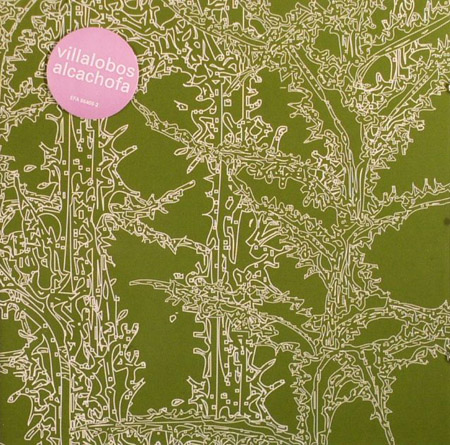
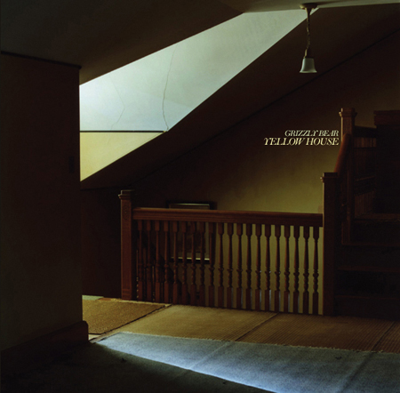
Ricardo Villalobos usually known for his 14+ min South American influenced minimal techno puts together one of my favorite tracks on his Alcachofa LP which is the artwork shown above and also a nice change up for techno fans and really opens the door to having new fans of the music. You can find more Villalobos on the Erlend Oye DJ Kicks compilation and his remix of Depeche Mode.
As for Sun Kil Moon, it’s a side project for Red House Painter’s Mark Kozelek, i’m not a good follower of lyrics but i think its about a true story of a boxer that died in a match named Duk Koo Kim, this song is a must have, it might be abit intense like most Mark Kozelek songs in an emotional way but even at 14:33 i end up pressing rewind to hear it again, make sure you have a nice upbeat track to follow it up.
The Boats barely have a guitar in this song but i’m guessing there’s a bass guitar and a harp sample in there thru most of it. This song always reminded me of if Portishead had to play unplugged or if Matmos and Bjork came back together for another release.
Christopher Willits – Medium Blue
[audio:willits.mp3]
Ricardo Villalobos – Waiworinao
[audio:villalobos.mp3]
Sun Kil Moon – Duk Koo Kim
[audio:sunkil.mp3]
The Boats – And There are Stars that Fell from The Sky
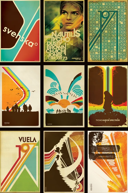
The prints you see above have all been reprinted and restocked over at The ISO50 Shop. Many were out for quite some time and they usually move fast once back on the shelves, so if you’ve been holding out for your favorites to be in stock, now’s the time.
I often get asked where I get my prints made so I thought now would be a good time to touch on that subject and go into a little more detail about the process. I have all of the small format posters done at a print shop in Sacramento, CA called Blue Moon Printing & Graphics. I found the place back when I used to live in Sacramento and even after moving to San Francisco I still use them as my primary printer. They are a relatively small shop so the service and attention to detail is far beyond anything you’ll find at some of the larger printing companies. I’ve found that personal attention to the output is the key element in getting your prints back looking the way you intended. It’s very difficult to make the transition from what you see on your screen to a printed piece of paper and no matter how well calibrated your equipment is you’re always going to experience a shift in color, saturation, contrast etc. The trick is to tweak the original file and the printer itself to try and compensate for these shifts and it’s important to find a print shop that is willing to work with you through this process.
I have the prints made on a digital thermal press which is essentially a toner-based process. I really like the output of this process because in the darker areas the toner builds up a thicker layer, giving an almost screen-printed effect when viewing an area of high contrast (such as a transition from cream to dark brown; the dark brown will appear to be painted on top of the cream background). The other advantage of the digital press (as opposed to offset) is that there are no plates involved so proofing and tweaking is a much quicker (and cheaper) process. You can adjust the file and run off a new proof in about 5 minutes as opposed to etching new plates and resetting the press as you would in an offset scenario. The only real downside of this process is the format limitation, the prints can only be 12"x18" at the largest. You are also limited to the type of paper you use as the toner won’t adhere to coarser papers; although I like to use a natural tone cover stock which is pretty smooth so this is not a big issue for me. The natural tone stock also has a yellow cast to it so that the yellow range in the lighter areas of the image is boosted. It gives the image a sort of aged, authentic feel which I think takes a bit of the edge off the digital output.
Blue Moon does have a traditional offset press but they just recently got it and I’ve yet to test it out. If you’re looking for a good printer I highly recommend them, and since they can do the whole proofing process via mail it doesn’t really matter where you’re located (my friend in New York does all his printing through them). You can find more information at their website: http://blumoonprinting.com.
I’ll be doing a post on monitor calibration soon in which I will go into more detail about preparing work to be printed and working with color profiles and printers…stay tuned.
I always wondered how much of an influence the music i grew up listening to had on the sort of stuff I gravitate towards now days. I hope some of these “oldies” are a nice change of pace for everyone, hey i might even link this post to my Dad.
I wouldn’t normally post something like this, but it is Friday and this is pretty good. I am having bad flashbacks from my freelance days, sort of in the same vein as this. Enjoy the weekend, but if you have clients like these, I am sure you’ll be stressing all the way through it anyways.

![11_02[1]](https://blog.iso50.com/wp-content/uploads/2008/07/windowslivewriterpdp11handbook-1c7d11-021-2.jpg)
![11_03[1]](https://blog.iso50.com/wp-content/uploads/2008/07/windowslivewriterpdp11handbook-1c7d11-031-2.jpg)
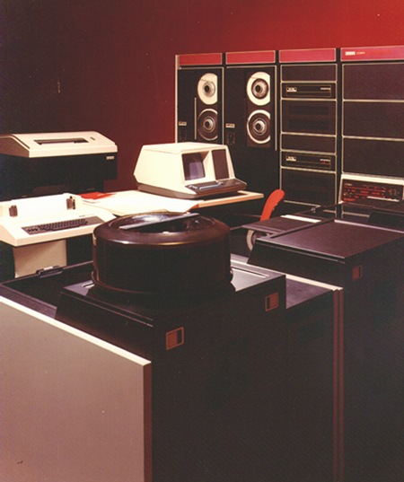 Up top is the original handbook for the