Top 5 Best NHL Logos
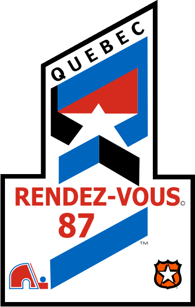
All Star Game logo from Quebec in 1987
Now onto the brighter side of the NHL logos and branding. The worst logos list was easy compared to the best. I fit in a few into the top just based on necessity ala a well crafted unique font and a aesthetics that the general public would lean towards.
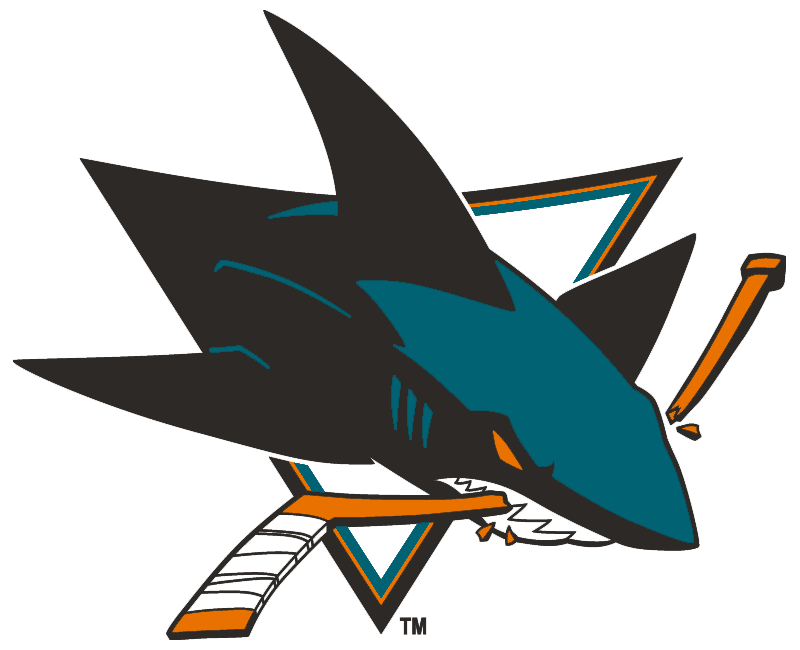
#5 San Jose Sharks
Starting off with the Sharks logo, it has appeal right away to a younger crowd, its fitting for the area the team lives in and it has a modern take which i’m not against. The reason I put it in the top 5 was because it might have that modern speedy look that I might complain about BUT there is reason here, its a shark breaking through a hockey stick, its a fast creature unlike lets say the Blue Jackets logo there was no reason. Also, it looks like someone took the time with the details and pulled it back a bit to find balance and I can appreciate that.
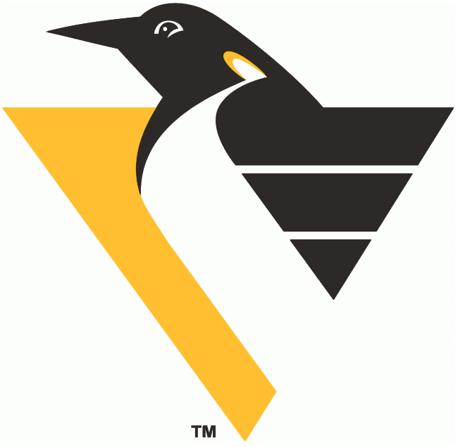
#4 Pittsburgh Penguins
This one might be a hard one to have people agree with me on. I personally thought it was iconic and it simplified the penguins image for the better. The problem I have with the current Pittsburgh Penguins logo are the old school equipment he’s wearing, if it was more timeless i’d probably like it more. I love the wings here and the bit of yellow on the neck, it shows off that detail is doable in a simple logo.
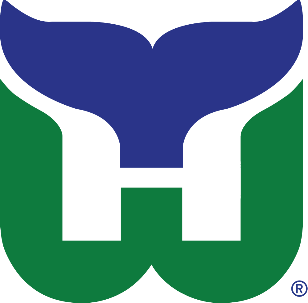
#3 Hartford Whalers
Classic. Hands down maybe the best executed sports logo for a designer that has to work under the these circumstances: a whale mascot and a team called the Whalers. Do you see the H for Hartford? And we thought the FedEx arrow was special. What a fluid effort, too bad they are now the Carolina Hurricanes, who have a horrid brand.
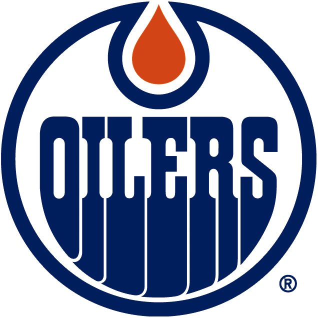
#2 Edmonton Oilers
So you’re getting paid to do a logo for a sports team, probably a dream job for many designers. You’ll probably want to make it your own and be remembered for your best effort, right? so probably on the top of your list would be a custom font and this designer knocked it out of the park.
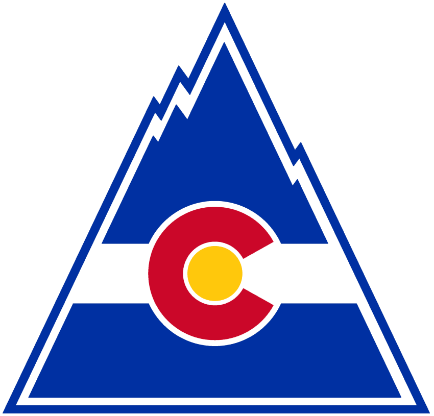
#1 Colorado Rockies
When you can take the States flag and transplant it into a team logo and hand in something literal but also create something that can look great on any piece of merch then i’m all in. The designer that created the MLB Colorado Rockies probably will always feel 2nd best. This is bold, grabs your eyes, its for all ages, a city can be proud of it, the uniforms looked out there but one of a kind.

11 Comments Leave A Comment
Rob says:
March 10, 2015 at 3:15 pmOoooo I forgot about that Rockies logo.
hannes says:
March 10, 2015 at 3:36 pmEye is real weak on the pens one, otherwise it’s their best one. Have you seen the old edmonton 3rd jersey with the flying Gear like a comet?
Jakub says:
March 10, 2015 at 3:51 pm@ROB
The Blues were tied with the Wings at 6th ;)
@HANNES
I don’t know how I missed that logo
http://www.sportslogos.net/logos/list_by_team/12/Edmonton_Oilers/
Also, sort of into the effort of the guy working as well from those years but it makes no sense to me.
a vince says:
March 10, 2015 at 8:14 pmWhoa! Not going with the Winnipeg Jets (79-90)? There is something magical though about the Edmonton logo :)
Kevin Phillips says:
March 12, 2015 at 5:41 amGreat choices, nothing can beat the Whalers mark, the Sharks logo gets really messy when it’s small though. Love the Flyers logo too, a really classic, simple look.
Next, lets do AHL logos. My vote would be the mighty Maine Mariners sadly defunct now. But what a mark.
http://www.gamewornauctions.net/products/Early_1980_s_John_Paddock_Maine_Mariners_Game_Worn_Jersey-140-42.html
Loving these posts.
Rob says:
March 12, 2015 at 6:49 amI agree with all of these EXCEPT #1! I know I’m biased but the classic Sabres circle logo is a one of the best sports logos around.
matthew says:
March 12, 2015 at 8:27 ammissing: flyers
Beebo says:
March 18, 2015 at 7:08 pmHow can you leave out the Flyers logo. Shit’s rad.
Charles says:
March 27, 2015 at 7:49 pmThe Minnesota Wild missed the mark? Naw, sorry I think that is a mistake. Its Minnesota and a beast.
Anonymous says:
March 30, 2015 at 12:33 pmdid you know that in the san jose logo there is a hidden ‘s’ and ‘j’ in the tail and dorsal fin…i was surprised it wasn’t mentioned.
Anonymous says:
March 30, 2015 at 1:20 pmNice find on the S and J