Branding Overview: Obama vs Romney
Now that most of us are familiar with logos both candidates are represented by for this U.S. presidential race in November, I wanted to take a second just to compare/discuss a few choices that were made. Below are links to their shops where a large collection of apparel, stickers, signs, etc. are available:
**Please note, my views are strictly geared towards reviewing the merch/branding and nothing of the election, we are a design site and this post is just my opinion and not of Scott Hansen or any of the rest of the contributors.


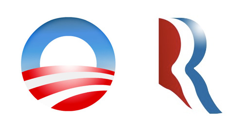
“The Logo”
I for one am surprised by the Romney logo, its actually not awful, when I first saw it I thought it was too loose and it had weak traits that wouldn’t translate well once it started getting pressed on things and it didn’t hold well by itself. When you lay it on a shirt with an outline it turns to garbage like many things but on white it actually has some legs. As for Obama’s logo I think its been clashing too much with the Bank of America logo in my head but once I shake that thought its solid, if feels right any which way you put it. Its almost a self contained environment within an icon, he should be proud.


“The Designer”
Both sides see that there is reasoning in this day in age to actually put some thought behind designing a shirt for the people that are going to dish out $30 and actually wear the shirt because they like the design. Both sides came with something consciously stylized, i’m sure both candidates didn’t see these and approve BUT someone did. Both aren’t dreadful but Obama edges out Romney on this one as well and here’s why: Obama went after the goal/statment and makes you read it while Romney just threw something “retro” looking and the message isn’t there. From the “Keep Calm And Carry On” iPhone Cases to garbage like “Swag” tees, in my observations this years youth and shirt buyers want statements and type for the first time in a long time, its pretty shocking actually.


“Campaign Font”
I don’t think this is Romney’s “font” but it is landing on a few of the pieces he’s selling. I think its confusing or just overlooked. Why such a departure from the conservative look? who is it for? on the other hand Obama keeps it clean and uses his font well…but who needs a website anymore on a shirt? I mean come on? I do enjoy a small font sitting under the big font layout wise, there’s some comfort in it especially if you’re designing for the general public.


“The Don’t”
I had to add this section, I should have called it the “Head Nodding side to side” section. I mean COME ON! really? we’re bringing in Orange… “but its fun Jakub and the Latinos might like it”it’s confusing and throws a tiny wrench into the branding. The Romney yoga pants are just…blowing my mind, i’m not even laughing at them, its like I just swung myself over the swingset for the full rotation and landed hard. You don’t even benefit from someone wearing them, you hid the logo on dark grey on the hip, its joke by the merch team I get it, good work guys.

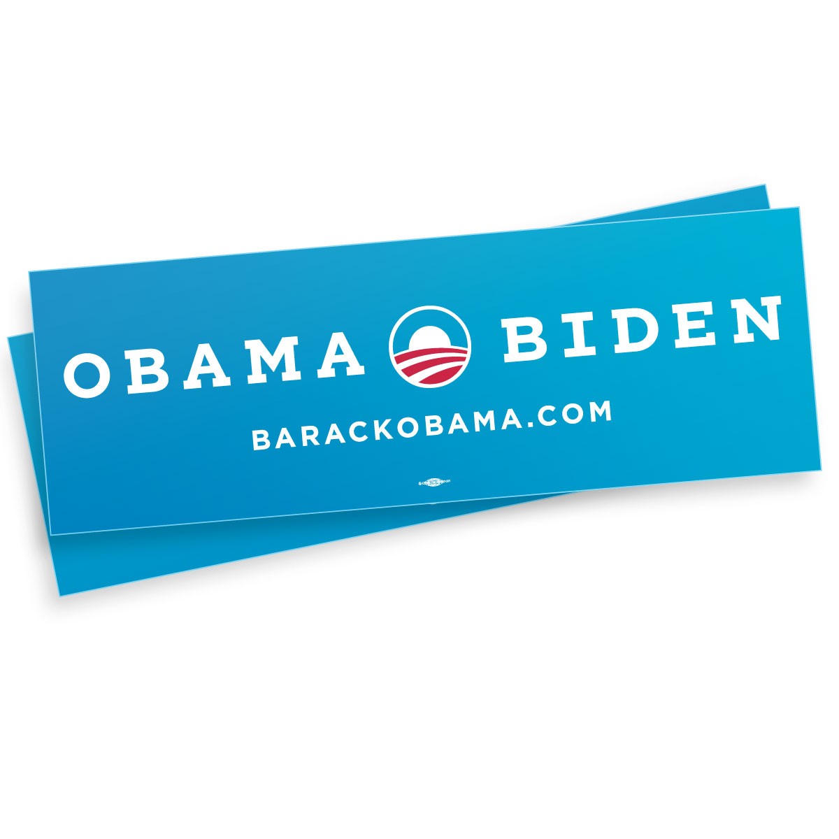
“The Classic Bumper Sticker”
Romney’s 2nd biggest failure in the merch department is the classic bumper sticker that every candidate needs… this thing is awful, its not 1988 and no one owns a Oldsmobile Cutlass Ciera to put this on. Obama’s is refreshing and more importantly brighter and only uses one blue and saved some cash by only printing with 2 colors which more cost effective, good choice.

23 Comments Leave A Comment
Matthew Butler says:
August 27, 2012 at 5:26 amgreat overview and I would have to agree with thoughts on all of these.
Lawrence says:
August 27, 2012 at 7:04 amRomney’s looks like Aquafresh
Mat says:
August 27, 2012 at 7:10 amIs it me or does Romney’s logo look like the girl with three boobs from Total Recall?
CS says:
August 27, 2012 at 7:23 amRomney logo is a straight (unconscious?) riff on the iconic PBS logo.
mg33 says:
August 27, 2012 at 7:24 amRomney is a thief! :D
http://cdn04.cdnwp.thefrisky.com/wp-content/uploads/2012/08/15/robinson_bmx_romney_081512_m-600×450.jpg
j says:
August 27, 2012 at 11:23 amI think Obamas branding is stronger, Romney branding is old and grey. But I love the similarities between Obamas logo and the one from The Manchurian Candidate (1962) movie posters – Knock off? Google it –
Jakub says:
August 27, 2012 at 12:11 pm@ LAWRENCE hahaha good eye
@ CS if it is, he better keep funding it
@ MG33 NICE find!
@ J I can see it but it doesn’t jump at me
Rory says:
August 27, 2012 at 12:50 pmWhen I look at both logos in the first example, I definitely prefer the Romney. It has dimension. The Obama one is, as you mentioned, completely BOA, and all the negative connotations that go along with it.
The Romney T-shirt i dont feel is too bad, yes the nostalgia is hokey but the message is that of the Hawks, the war mongers, the aggressors, which he is certainly trying to convey with statements like “Russia is the enemy” and other nonsense.
The one thing i will say is that Obama’s merch has a subtle overall theme (to me) and it feels like propaganda machine ish, not in practice but in the type faces chosen and the layouts etc. It definitely has that “socialist” look…hmm…
FRANKEN5TE1N says:
August 27, 2012 at 1:07 pmLatinos for ¡Orange! Romney’s logo looks like a half assed sponsor for a celebrity rehab golf tournament.
mg33 says:
August 27, 2012 at 2:15 pmHas anyone else thought “Romney sweatpants? Really?”
kbpeterson says:
August 27, 2012 at 2:36 pm@Jakub – hahaha, I have a ’92 Cutlass Classic
Doog says:
August 27, 2012 at 4:05 pmJust my $0.02, here.
Obama’s branding seems more professional. For one, the Obama logo is clean and simple as a result of being constructed from 1 thick-bordered circle and a few smaller circles that are nearly concentric. It’s distinctive, symbolic, and clean, all aspects one would want to have in a logo.
Romney’s logo is distinctive and symbolic, too. But it’s lacking the clean lines of the Obama logo, thus lacking a more professional air. The left leg of the “R” in the Romney logo is lopped off somewhat haphazardly. Then it makes a few slight detours before it connects to the right leg of the “R.” I know that some historically good logos don’t rely on clean lines, but in this instance, it just doesn’t seem like a good fit, despite it being necessary to emphasize the play on perspective in the logo. That’s my only real gripe with the Romney logo. I think it looks good overall, though.
In terms of overall merchandise design, both Romney and Obama seem toe to toe. Of course, they’re both designing with respect to their demographic.
jane825 says:
August 27, 2012 at 7:59 pmI think it is important to understand the demographics each campaign is trying to reach. The Obama team is trying to reach voters age 18-30, Romney’s campaign is trying to reach voters 45+. When looked at through that lens, the design choices by both campaigns seem pretty spot on. Also, the merchandise being sold is for one campaign purpose–making money and increasing the amount of low dollar campaign donors, not for messaging and not for branding.
Ryan says:
August 27, 2012 at 8:16 pm“…it’s like I just swung myself over the swingset for the full rotation and landed hard.”
LMFAO!
Aaron says:
August 28, 2012 at 6:46 amI think no matter who you are, it is almost impossible to not have a bias given ones political affiliation. I found myself disagreeing with you more on the critiques of my favored side than the other. To each their own, but this is one of those subjects I believe a lot of us can’t subjectively critique.
I’d personally be more interested in what the international design community has to say about the two campaigns.
Matt says:
August 28, 2012 at 12:59 pmHey, I have an Oldsmobile Cutlass Ciera! Got it from my grandmother, and yes, I am way overdue for an upgrade.
Jakub says:
August 28, 2012 at 1:11 pmhey hey hey I love Oldsmobile Cutlass Ciera’s i was just making a point
Brian Park says:
August 31, 2012 at 10:53 amAm I the only one who hates letter-based logos integrated into a complete name? With that Romney logo I just see “OMNEY” and lose the logo.
I’m also not sure why a bumper sticker would have type rotated 90° counterclockwise for the website. Something tells me that’ll be impossible to read driving down the highway…
Alex N says:
September 4, 2012 at 10:00 amRomneys logo looks like it could be a toothpaste illlustration. lol
brand workshops says:
September 13, 2012 at 12:25 amGreat show off for Obama and Romney! Whatever design they have, it’s still upon the people whom they would choose among the candidates, right? Personally, Obama’s brand give me more impression rather than Romney’s ‘toothpaste’ letter R.
Mark says:
September 22, 2012 at 10:09 amI would agree with all your points. You should do a write up on the online banners. I think it would be a great write up.
Emm says:
September 25, 2012 at 12:39 amIt looks like Obama’s design is working. USA Today printed the following article:
http://www.usatoday.com/news/politics/story/2012/09/24/obama-has-edge-in-political-merchandise/57837296/1
Anya says:
November 1, 2012 at 11:32 pmHi Jes! Welcome to Arts Dafts first of all. Glad to see a new face! I’m glad you found this list helpful. I’ll pbboarly keep adding to it over time to make sure it’s always up to date. I can’t wait to see what we come up with too!