Lance Wyman For Obama
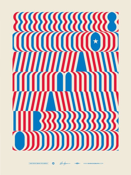 The latest limited edition “Artist’s For Obama” poster is by none other than Lance Wyman. Wyman, as you may recall, is the branding genius behind the 1968 Mexico Olympic logo as well as countless other brilliant marks. It’s really great to see someone still practicing successful design after all these years and obviously having fun doing it. I always wonder if design is one of the few art forms in which one can remain relevant throughout most of their lifetime; it seems that many other artistic pursuits (music, painting, etc.) are typically characterized by brief periods of genius followed by a sharp decline in output whereas the measured application of a practical, systematic approach to design can be extended into the decades. Maybe it’s that we tend to stick to coffee as opposed to heroin.
And please, save the politicking for some other blog’s comments. I am simply pointing out the fact that Lance Wyman has created new work, no one’s trying to start a huge discussion about who’s voting for whom. If, on the other hand, anyone has anything to say about the effectiveness of the design in question, please don’t hesitate to speak up.

27 Comments Leave A Comment
gwdesign says:
October 29, 2008 at 1:40 amAs i look at this drinking my coffee at 1:40am :D
Wondering why he started OBAMA 08 from the bottom up? Maybe because top-to-bottom looked like a falling line graph?
The 8 kinda bugs me at the top, because it reminds me of the Alfred Hitchcock profile logo, and looks like a head. Otherwise its an awesome image.
Alex Cornell says:
October 29, 2008 at 2:27 amI would agree with the above comment. Starting at the bottom does seem like a strange choice. It wouldn’t be as much of a problem, I don’t think, if there wasn’t a star in the zero of the “08”. That little graphic element draws my eye there immediately and I start reading top/down. (overriding a right/left eye path) It’s momentarily confusing trying to spell O-B-A-M-A starting with zero.
I think, confusion aside, my only concern would be the colors. Obviously red/white/blue conjures the American flag here, but I’ve always considered it a pretty boring color palette, regardless of context. Just a personal preference I guess.
I do think it’s a cool poster though, especially if you look at it long enough and start to see some of the 3D shapes that emerge.
adrian says:
October 29, 2008 at 2:34 amit’s better than yours.
Daniel Carvalho says:
October 29, 2008 at 2:38 amI like it, it has a great patriotic feel to it. The shades of red and blue give it a really classic quality. Which is quite amazing, because it’s making an association or rather, gives me the impression that the candidate represented is standing for the America’s original virtues and ideals. Not desiring to, for lack of a better word, change, an already established country, but to progress it further than it has ever been.
My only personal gripe with this design is that I feel it’s perhaps somewhat too abstract regarding the type.
Josh says:
October 29, 2008 at 4:56 amIt is a little abstract regarding the type and that star does draw my eye and cause me to read downward, however, I think we can all agree that this is considered art, and extremely good art at that. So all of the things that may seem slightly wrong with this piece actually can be quite intriguing at the same time.
Jana TheJunction says:
October 29, 2008 at 5:16 amIt’s great! You definitely would want to put it up on your front door just about now.
matt says:
October 29, 2008 at 6:14 am“…it seems that many other artistic pursuits (music, painting, etc.) are typically characterized by brief periods of genius followed by a sharp decline in output whereas the measured application of a practical, systematic approach to design can be extended into the decades.”
-i think this comment is of itself a brief period of genius.
daniel says:
October 29, 2008 at 6:23 amIf you were open to talking politics, it’d be interesting to discuss the use of branding techniques – generally used to market products, which typically have no substance – to promote politicians, who typically have no substance either, but should. For instance, is Obama a leader or a brand. But pretend I didn’t say that!
Love this blog.
Patrick Midway says:
October 29, 2008 at 7:33 amScott, Im sure you have seen this blog but if anyone else is interested in Obama art and design pieces, check out http://www.ObamaArtReport.com lots of great stuff.
Jeremy Pettis says:
October 29, 2008 at 8:21 amPersonally I love the choice of starting in the lower left. No complaints with this poster at all, it’s beautiful and it is what it is. I love how the single star grabs hold of your attention, would it do that at the bottom?
Britton says:
October 29, 2008 at 8:29 amI agree with Alex Cornell about the color palette, that it’s not too interesting, but it is indeed patriotic. I really like this poster except for the whole Obama thing!
chris says:
October 29, 2008 at 8:36 amI agree with Jeremy. Starting in the lower left is effective communication: Obama’s name is rising just like he’s aspiring to ascend to the highest office in the land.
cairo says:
October 29, 2008 at 9:19 amIt is good to see some new stuff from wyman. one of the best around. and one of the main reason I got into this stuff.
Rent says:
October 29, 2008 at 10:49 ameven though the color scheme is somewhat bad, what else could you really do? red, white, and blue are almost necessary for this type of design just for the subject matter…
Scott says:
October 29, 2008 at 1:10 pmdaniel-
I suppose I am, it was mainly just a preemptive strike against the kind of people who weighed in on my original Obama post with inane one liners and quips with no real substance or explanation to back them up. Besides, this isn’t a political blog and I don’t think anyone cares how we feel about politics, we’re graphic designers. But yeah, if you want to talk about the branding and it’s relationship with the campaigns, I think that is totally fair game.
Sean says:
October 29, 2008 at 3:32 pmI disagree with gwdesign about the 8. It doesn’t look like Mr. Hitchcock as much as it does Mr. Peanut. But it doesn’t distract. And the red/white/blue palette doesn’t bother me too much as the colors seem less primary than they might be. It does kind of mess with the rods and cones, though. Is there a space ship hidden in there?
Grant says:
October 29, 2008 at 4:57 pmwow – gorgeous. well done.
Anonymous says:
October 30, 2008 at 12:49 pmlance wyman is the man – he makes the sickest environmental design
Moka says:
October 30, 2008 at 1:58 pmLovely design. For aesthetic personal reasons I hate the ‘blue red and pure white’ combo but I suppose it wouldn’t make much sense if it didn’t represent the american’s flag colors.
Kamil says:
October 31, 2008 at 3:28 amWhen I saw this poster first time I reflected about direction of text.
And this is very interesting for discussion.
Does anybody know how it working in practice and why that direction and not different?
Jayden Lawson says:
October 31, 2008 at 5:27 pmFirst impression: cool.
After detailed inspection: cool.
Smart use of line and colour – with three stripes of red beside each character to properly distinguish them. I like how he’s joined the 3 red stripes of the 8 with that of the 0.
Cool.
texas says:
November 3, 2008 at 9:54 pm‘coffee as opposed to heroin’ haha
Kelly says:
November 4, 2008 at 8:57 amI think the piece has some nice motion to it.
It has almost an optical illusion / motion thing going on.
The name rising instead of falling is a nice touch.
Very vintage looking as well.
Frank says:
November 6, 2008 at 11:12 amHey Scott,
any chances to see new prints of your own Obama poster now that the campaign is over?
thanks
Frank
Stefan Kalscheid says:
November 7, 2008 at 2:50 amNice Poster. Yes, the text direction was irritating at first but it ´s one of the things that makes this poster so interesting. I´d love to see a closeup. Wonder how he constructed those letters. At first I thought it was based on “Gerstner Original” because of the shapes of “B” and “8”.
Adam says:
November 10, 2008 at 6:54 amI love it and bought one ! It was a really difficult task to get one from the Obama office being up in Canada, but I did it !! Just before it sold out !
I just love the movement it gives off, very powerful. I find this piece more artistic than the others.
Anne Vaughn says:
November 12, 2008 at 1:36 pmk4ywe4p40zp3ah3a