Olympic Logos
So the much anticipated / extremely controversial Beijing Olympics are in full swing and despite the issues surrounding the host country, the games themselves have been incredibly entertaining. From a visual perspective the whole production is off the charts. If you didn’t see the opening ceremonies, do yourself a favor and watch the replay. I can’t even begin to describe it so I’ll just say there was a roll-up LCD screen about the size of a football field and a mass-scale drum display that looked like some sort of giant human Tenori-On.
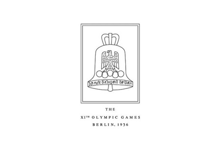
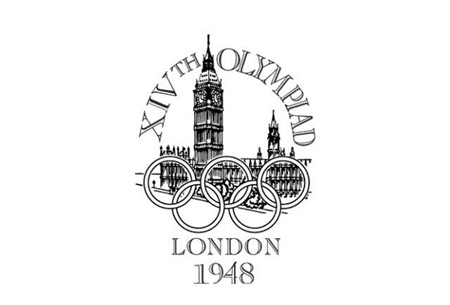
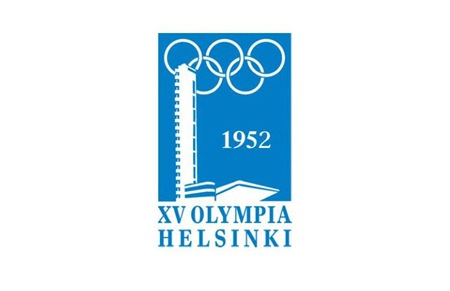
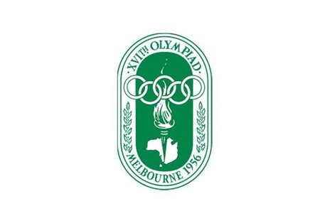
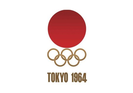
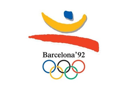
Obviously branding and information design are central to each Olympic experience and while I’ve posted a lot on past Olympics, I thought it would be good to get all of the logos together in one post. It’s very interesting to scan through these; the stylistic transitions say a lot about the country and historic era of origin. Helsinki kicked off the modern approach, but then Melbourne and Rome had to go and screw everything up for 8 years. Tokyo ’64 started what turned out to be a 24 year winning streak of incredibly well thought out, masterful logo designs which continued unabated until Seoul decided to kill the party with something that can only be described as inexplicably bad. From then on out it was a lowest common denominator free for all of middle of the road mediocrity. This, of course, coincided with the dawn of cheap, accessible desktop publishing where everyone all at once decided to forget everything they had ever learned about typography and color theory. I think this was also around the time that the Olympics was maturing into the massive corporate money machine it is today, so the shift in style makes a lot of sense given the new set of imperatives driving the branding (i.e. MAKE AS MUCH MONEY AS HUMANLY POSSIBLE).
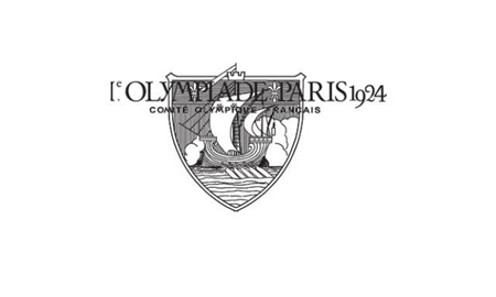
Although there were 8 games prior 1924, I’ve started with Paris as it seemed to be the first of the modern games that had a specific logo mark associated with it. Most of the earlier games had posters but nothing you would consider a logo. Also missing are 1940 (Tokyo > Helsinki) and 1944 (London) which were both canceled due to World War II.
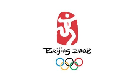
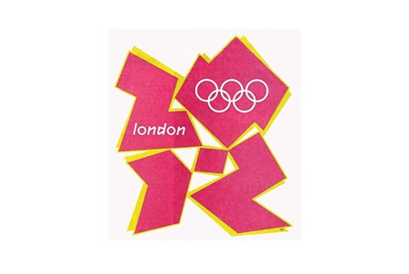
And it wouldn’t be completely without a peek into not-so-distant, yet oh-so-hideous future (London 2012). To tell the truth, something about this is starting to appeal to me. At the very least I can say I prefer the 2012 logo to some of it’s more boring ancestors (i.e. 1988-2008).
Most images via Sachin Tomar
Comment on this post

76 Comments Leave A Comment
Vijay says:
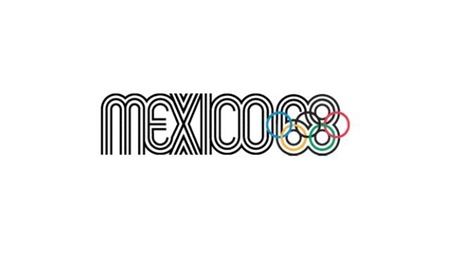
August 12, 2008 at 4:47 am’64, ’76 and ’96(nice concept) rock my world. 2012 is getting a lot of bad press but I like it ’cause it’s a break from the usual trend. A lot of people are having fun with this one though: http://tinypaste.com/1fcf0
PT says:
August 12, 2008 at 5:10 amYeah, i did not like the London one at first— there is something about it though, it has defiantly grown on me. 1984-1992 are the worst in my opinion- they just remind me off IT company logo’s IBM, Microsoft etc.. Helsinki and Melbourne are 2 i really like out of these lot.
Your right, that opening ceremony was off the hook crazy— i do however know how they did most of the big LCD’s/Projections, i’m pretty certain these guys done it, Electric Canvas (http://www.theelectriccanvas.com.au/) Amazing stuff and a whole lot of pixels.
Maurits says:
August 12, 2008 at 5:14 amNice! That “Mexico’68” logo really rocks! Nice entry by the way…
Garo says:
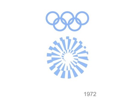
August 12, 2008 at 5:16 am’64, ’68, ’76 & ’80 ftw.
At least the 2012 isn’t a city skyline silhouette, or worse a plan view of the Thames. But it’s too fashionable for my taste.
Joaquim Marquès Nielsen says:
August 12, 2008 at 5:20 amHmm, there should be a page dedicated to coming up with new suggestions for the 2012 logo – or maybe there already is? It would be entertaining to see what people could come up with.
So yeah, I think that the current one is quite nasty. I’m getting a really intense 80’s vibe, hehe. But who knows, maybe the designers totally redeem themselves when they games begin in 2012 (the ultimate test of the logo). I can’t wait…
Oh and yeah, I haven’t been commenting a whole lot on you blog these past months – been enjoying summer :) One trip to Malgrat de Mar to go, and that’s a wrap!
Cheers people.
Nicholas says:
August 12, 2008 at 5:44 amThere is something about seeing the entire progression of logos that makes the London 2012 logo look pretty good, or at least like it fits. All the logos seem to represent certain design ideals at that point in time and that is what it looks like the London designers were trying to do, instead of mimicking the 60’s or 80’s logos.
Evan says:
August 12, 2008 at 6:15 am2012 really seems to lack inspiration and thought. I agree that there should be a page for suggestions, the design sure could use it. I’m diggin the Melbourne 56. Thanks for putting this up!
sean patrick says:
August 12, 2008 at 6:30 ami think the 2012 logo has been really blown out of proportion. i mean its no iso50 design, but it is still better than the atlanta one. geeze, and people want a 90’s resurgance! whyyyyyy????????!!??!?!
this was a great post of some very iconic logos. thanks for posting all of this!
thelottery says:
August 12, 2008 at 6:33 amChicago should win the 2016 bid based on design alone: http://images.nbc26.com/images/chicagoolympics.jpg
Neil says:
August 12, 2008 at 6:36 amYou know, I also like the London more than any other logo post-1988.
Ted says:
August 12, 2008 at 6:38 amBoo, you have to download SilverLight to watch the replays. I refuse to install that thing.
Anonymous says:
August 12, 2008 at 6:50 ampersonally i am thrilled that the london 2012 logo is not bland! the last 4/5 logos are very middle of the road. I think its a shame the logo that makes the rounds everywhere is the pink and yellow version, which is just one of many options. Also its not just a static logo, but something that works pretty well in motion.
gareth says:
August 12, 2008 at 6:51 ampersonally i am thrilled that the london 2012 logo is not bland! the last 4/5 logos are very middle of the road. I think its a shame the logo that makes the rounds everywhere is the pink and yellow version, which is just one of many options. Also its not just a static logo, but something that works pretty well in motion.
Cam says:
August 12, 2008 at 6:52 amI’m sorry but the London 2012 logo still looks like Lisa Simpson giving some dude a BJ.
Doug Vander Meulen says:
August 12, 2008 at 7:41 amI agree with thelottery, Chicago’s logo is very nice. Their original logo was even better (http://www.spudart.org/blog/images/2007/2016-chicago-olympics-logo-.png), but can’t be used while they bid for the Olympics, something to do with not having any Olympic imagery in the logo until the city is awarded the games.
It easily wins out over the other options: http://brandavenue.typepad.com/brand_avenue/images/2007/10/18/chicago_logo_3.jpg
Marc Garner says:
August 12, 2008 at 9:08 amLove or hate it the London 2012 logo really shows where design is headed. The next big design look is ugly, and the 2012 logo is a prime example. Say good by to layered, beautiful design. I think we’ll start to see more and more stuff that looks like your 5 year old nephew drew it in a cheep vector app.
tholomaios says:
August 12, 2008 at 9:14 amLook at Madrid 2016 logo.
http://comunicacionelectoral.files.wordpress.com/2007/11/1194882894_0.jpg
Chris says:
August 12, 2008 at 9:42 amWhere are the winter olympic logos?
Rent says:
August 12, 2008 at 10:08 amthat London 2012 one is yuck…I think the only one I truly like that much is the Mexico ’68. either way a very cool and relevant topic to touch upon. thanks for sharing Scott.
mango says:
August 12, 2008 at 10:53 am1. After watching the opening ceremonies, China shown me that beside copy and paste, China has man power and labor.
2. Where are all the designers? The Olympic Logo design gets worst every year.
NAVIS says:
August 12, 2008 at 11:21 amPHELPS!!!!
I was so happy when the US smashed the wee little Frenchies in their precious 400m relay event. Oh yeah, they also broke the WR by four seconds.
Anyone catch that race?
Jay Williams says:
August 12, 2008 at 12:08 pmThe 1980’s logo looks like it could be listed right next to one of your ISO50 posters, amazing how design trends come and go.
greg says:
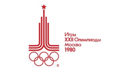
August 12, 2008 at 12:51 pmI like 1980 the best.
Jakub says:
August 12, 2008 at 1:02 pmthelottery –
thanks for sharing the Chicago one, i really like it
Scott says:
August 12, 2008 at 1:10 pmthanks everyone for adding info in your comments. as for future logos, I have been working on a post about potential host city proposals. That should go up before beijing is over. As for winter olympics, I’ve been saving up images for that, but that post will have to wait until……the winter olympics. there are a lot of very nice ones.
Navis-
holy shit, yes I did see that. perhaps the best race of any kind I’ve ever seen, I had a couple friends over and we all yelled so loud when they won, woke the whole neighborhood up.
frank says:
August 12, 2008 at 5:10 pmHelsinki is surprisingly weak. I guess it’s “modern” but so what? If a similar logo were submitted by the Chinese for 2008 you would all be saying how boring it is.
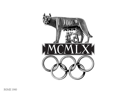
Rome 1960 is great! The use of shading is a strange move but it works. I like how it’s an anti-modernist logo in 1960.
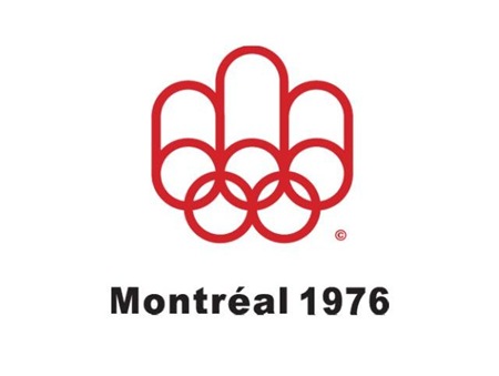
Mexico 68 is obviously the gold standard here. The best Olympic logo by a long shot. I can’t believe anyone is actually defending Montreal 76 though. It’s such an ugly generic piece of crap. It’s exactly as generic in a mid 70s way as all of those crappy mid 90s logos. It reminds me of something like McDonalds signage circa 1980. And the ’80 logo isn’t much better. These designers were still just riffing off of the amazing Mexico ’68 logo all of these years later.
I also don’t see how Seoul is “inexplicably bad” yet LA ’84 gets a pass. Not that it’s great or anything but I see a pretty consistent run of mediocrity starting with Montreal 76 and running all the way up to the present.
I think this just comes down to where the cutoff lies in your personal taste for the styles of different decades. Can anyone explain why Athens 04 is somehow intrinsically bad from a design point of view but Montreal isn’t?
frank says:
August 12, 2008 at 5:13 pmAlso, I like the Munich logo just because I’m a sucker for op art eye candy. It’s kind of awkward as a standalone logo though with the rings on top of the circle like that. I guess it looked ok the way they used it in context though.
http://cache.eb.com/eb/image?id=84929&rendTypeId=4
James Lee Vann says:
August 12, 2008 at 7:47 pmNo logos for Winter Games?
Scott says:
August 12, 2008 at 7:49 pmFrank-
I guess I need to add a disclaimer to all posts: “The ideas expressed herein are opinions, not dictates.” because that’s what all this is: one man’s opinion. One uneducated man’s opinion at that, I don’t carry the bias of 4 years of design school with my opinions therefore someone with that schooling might consider my opinions as uninformed, and they might be right…
I think Helsinki stands out because of how forward thinking it was for the time.
As for Montreal, I would defend that logo to the death, but again, just an opinion.
I completely agree with mexico and munich, classics all around.
Glenford says:
August 12, 2008 at 8:15 pmi spent hours pouring over some hoity toity blog a year or so ago (?) about that 2012 logo. there were some very interesting things said, but at the end of the day i feel that my BS detector cuts through all the cerebral musings and it just doesn’t feel good. i dunno, i actually don’t have a hate on for the 2012 part, except i don’t understand why the 2 has been decapitated, but the main thing that just kills it for me is the ‘n’ and the ‘d’ in london. friggin’ terrible.
Glenford says:
August 12, 2008 at 8:21 pmi’m sure you’ve seen this version of the 2012 logo:
http://www.woostercollective.com/londonsh.jpg
Tracey Grady says:
August 12, 2008 at 9:38 pmI agree that Mexico is the standout. On the other hand I dislike Montreal – I’ve seen it before and it’s always annoyed me. I’ve always liked the Barcelona logo because it’s bright and dynamic, and moving away from the corporate feel of the 80s logos. I’m not a fan of the London logo, although I think it’s interesting that it’s moved away from using the Olympic colours.
Leigh says:
August 13, 2008 at 1:02 amMy favs would be ’72, and ’76. Mexico ’68 is interesting, but I wish it didn’t overwhelm the Olympic logo hiding in the 68.
I also think the London 2012 logo looks horrific.
Karl Roos says:
August 13, 2008 at 2:13 am’64 is unbeatable.
chrispis says:
August 13, 2008 at 3:54 am’64 + ’68 the best,… and whatever people trying to say,… 2012 sucks!!!
marshall says:
August 13, 2008 at 7:32 ambleh @ ’84 and on…
i wonder what happened.
marshall says:
August 13, 2008 at 7:42 amanyhow… i dont think ’68 is that great. it kind of all blends together in my eyes. Tokyo ’64 is my fave. so simple and clean.
and lol @ the lisa simpson comment…
i like that chicago logo alot.
Grey Granite says:
August 13, 2008 at 7:46 amDude… you just lost all respect for complimenting that logo. That hurts.
Benjamin A. Wendelboe says:
August 13, 2008 at 11:30 amThe 1992, 2004, 2008 are by far my least favourite, and the 2012 is kind of growing on me too.. ’64, ’68 and ’80 would have to be my favs..
Querelle Living Ware says:
August 13, 2008 at 10:52 pmFew seem to have noted that the logo designs very much follow the dominant schools of thought of their time. You’ll note the jarring design change between ’88 and ’92 (right about the time populist post-modern aesthetics entered the arena – speaking of arenas, check out Barcelona’s Olympic Stadium design and contrast it with the space age designs of Tokyo, Munich and Montreal…this explains a lot). L.A. and Seoul, though still “Modern”, carry transitional elements: they are not purely abstract forms (as are ’72 and ’76), nor are they as pared down as their 70s predecessors…they are simple and geometric, yes, but slightly “tarted up” as much early 80s po-mo design was, yet, as the Olympics are a highly conservative entity, the designers no doubt still felt the need to cling to the dominant idea of a logo (ie; a simple shape, minimal as possible). To argue that designs are “bad” or “good” relies on taking into account the sensibility of the time, and asking ourselves, what is the logo supposed to do? Though I am personally a fan of ’64-’76 (because I’m a freakazoid Modernist) I have to pause and measure each logo as a design idea within the design hegemony of its time and ask, “Is it successful? Why or why not?” Case in point: though I’m not a fan of it, I think Barcelona’s logo is highly successful. Atlanta is cluttered (because it is trying to communicate too many ideas and to allude to too much at once), Sydney is derivative of Barcelona and, similar to Atlanta, overburdened (too many boomerang references). Both Athens and Beijing work because they return to the minimalism we normally ascribe to logos, though their forms are classical and not really all that groundbreaking as design statements.
matt says:
August 14, 2008 at 5:35 amMontreal- best olympic logo ever?….maybe tied with mexico.
Brones says:
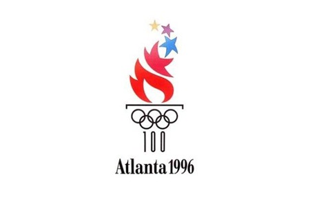
August 14, 2008 at 6:58 amI really like the Atlanta one. I can’t see why it gets hated on so much. It looks good in passing but there’s more to find if you take it in…I like it.
I have a theory that the designer of the 2012 logo knew he didn’t need to spend too much time on it…because if the Mayans were right we’re all gonna die in a fire anyway. :P
Rob McDougall says:
August 14, 2008 at 12:20 pmyeesh. I was just starting to enjoy those logos, then the 80s happened and it was downhill from there… what a dirge of ideas for the last ~30 years!
Matt says:
August 15, 2008 at 9:21 amRussia. hands down. they invented graphic design and apparently the best olympic logo in over a century.
Jason Tavarez says:
August 16, 2008 at 12:12 amYou know what’s funny, I actually posted my own story about how the logos evolved just now, and came across this posting while submitting to Digg (they were checking for similar stories). I mention the 70s and 80s designs looking too corporate for the most part, with the 90’s getting too playful in an attempt to get more personal with the viewer.
I also give my thoughts on the London 2012 design, I think it’s going to be a love hate thing with me. Feel free to check it out to get some new insight.
Anonymous says:
August 17, 2008 at 8:50 amwin mexico…decidedly
Eve Martel says:
August 18, 2008 at 7:12 amEven if the Montreal logo has a special place in my heart (I’m a Montrealer and live 4 minutes away from the Olympic Stadium), I’m in love with the Mexico logo. I found this amazing souvenir program at a flea market last Saturday.
Front cover:
http://www.flickr.com/photos/allabouteve/2768578973/in/photostream/
Back cover with:
http://www.flickr.com/photos/allabouteve/2768579309/in/photostream/
Bas says:
August 20, 2008 at 12:33 pmI prefer Montreal, ’76. And that Chicago logo is just awesome.
I think Sydney’s and Barcelona’s logos are really aweful. And I don’t see the beauty in London’s new logo either.
Bill Nad says:
August 20, 2008 at 2:50 pmI ma a Canadian and the 70s were a bit of a heyday for Canada as well as the time that I was going through elementary school. Looking at the Montreal ’76 logo definitely beings back memories as basic as it looks now.
tanya says:
August 20, 2008 at 8:16 pmI have to agree with some of the comments, I consider Mexico ’68 to be the best. For me it has a 60’s aesthetic but the design is also quite loud, much like the late 60’s so I think it’s fitting. I’m not offended by Montreal like the others; that screams 70’s to me. Any of the logos with dancing/leaping individuals are unimaginative. Eve, I’m totally jealous of your flea market find.
Ben Blood says:
August 21, 2008 at 2:43 pmJust posted on Daring Fireball: Design and Branding of the Olympic Games
http://www.colourlovers.com/blog/2008/08/18/design-and-branding-trends-olympic-games/
roo says:
August 27, 2008 at 5:29 pmLONDON GT IHT TWICE NOT FAIR ~!!!!!~
BRING IHT TO NZ MICHAETL PHEPLZ SUK
backyard ni donglloyd says:
August 28, 2008 at 2:12 amwow amazing olympic logo!
Spangle says:
August 31, 2008 at 3:12 amReading the comments below is very interesting, most people like the Mexico 68, why, because its completely different, there’s a consistent format to each logo, and doesn’t really express the true nature of the host city with the possible exception of Sydney 2000.
Why is that, many reason I guess, conservative approach, lack balls from the Olympic organisers, or dare i say bad design!
The one thing you can say about the London 2012 identity it bucks the trend, Lord Coe said “We don’t do bland – this is not a bland city”
It’s a refreshing, vibrant logo and last Sunday, cutting through a well rehearse, staged managed, corporate end of games show piece the logo blaze into life, full of attiude, dymamnis, colour and fun. This what london will be like.
Its not a thing of beauty granted, but it captures the essence of a thriving, bustling, multicultral, vibrant city. I believe its the only Olympic logo that has conveyed the true spirit of the host city, and as the brand rolls out over the coming months, you will agree it’s up there with the best of them.
Luiz Calado says:
December 15, 2009 at 6:41 amWhat about the logo for the 2016 Olympics in Rio, as seen here?
http://image3.examiner.com/images/blog/EXID23585/images/rio2016.jpg
;-)
gthreeplus says:
December 16, 2009 at 6:09 amWow that Chicago old logo is beautiful…”gradients on a logo” rule breaking and all. Reminds me of something like a fantasy book cover. The newer one is nice too – but that old one is just awesome. The London reminds me of a throw back to the movie “Class Act” with Kid n Play. Early 90s design isn’t without its tragedies.
Dan says:
December 17, 2009 at 3:59 pmI actually enjoy the Atlanta logo, David Butler headed up it’s efforts and he has proven to be a great designer. I don’t care much for anything else after 1984 though!
Cláudio says:
December 21, 2009 at 1:52 pmMexico 68 is my favorite.
aerodin says:
January 8, 2010 at 7:38 pmThe logo work in ’76 blew me away, but what really impressed me was the architecture in Montreal. Roger Tailliebert did it so absolutely mind numbingly awesome. I managed to play a water polo tournament up there many years ago and the execution of the entire olympic village and the natatorium is incredible. There are numerous ’76 posters inside. I’ve got some vinyl of the ’76 Olympic Score I love it so much! Check out:
http://blogs.creativecow.net/blog/842/top-5-olympic-poster-designs
Rainbow Beaver. What is that? I love it.
Pegasus says:
February 17, 2010 at 7:25 amTokyo 64 and Montreal 76 by far the best Olympic logos of the century. Timeless. There was a comment about how these modernist logos don’t really capture the flavo(u)r of the host city. Not true. (Well, I can’t comment on Tokyo 64 since I have never been there, and wasn’t born yet at that time, but …) Montreal 76 is awesome. aerodin’s posted link is helpful. Canada in the 70s was really embracing modern minimalist art and architecture. The logo really reflects the time, the place and the Olympic connection is so strong. The rings, the podiums, and am I the only one to see a hint of the maple leaf in that logo? Not to mention the strongest logo to apply to Olympic merch, which was becoming extremely important when considering a final design.
Priscilla says:
February 19, 2010 at 11:32 amI think the best one is Rome and Japan. Obviously Mexico too. But the one from Rome made me study it longer than the others! Also Japan is so neat and so strong, it works! As for the London logo… PLEASE HELP THEM! It ‘s just terrible!
schmalohr says:
February 23, 2010 at 12:27 pmas technology evolves, the design becomes less meaningful and less refined. i like the 64, 68, 72, 80. It is apleasure to see the design periphery of these times, especially mexico and germany. In times where designers build and steer global brands it seems to be unimportant to analyse and reflect in issues of form, function, color, typography and (the bad word…) tradition.
Cabian says:
March 8, 2010 at 5:22 amI think you are absolutely crackers!