Go here right now icelandwantstobeyourfriend.com. This marketing campaign is absolutely hilarious, genius, and refreshing. I want to be Iceland’s friend, a lot, after reading through all this (go to the Twitter or Facebook page for more fun). I’ve always wanted to go there anyway, but this certainly supplements my desire. I had no idea Iceland was such a cool person, thanks Takk Takk.
I have heard that many people use the Inter-nets to make friends, and to talk about themselves. So that is what I want to do, too. I know you are probably very busy doing important things, but if you want to be my friend, you can.
– Iceland
Still from Heima, the beautiful Sigur Ros documentary.
Graham Smith’s brilliant Unevolved Brands is “A progressive study on brand & logo simplification“. It’s also a lot of fun; we sat here for quite a while going through each logo and trying to guess the brand it represented. They run the gamut from completely obvious to frustratingly cryptic and all the while Smith strings you along with vague hints as to the logo’s true identity. The fact that I recognized any of them is sort of a sad testament to the pervasiveness of the modern global brand. They’ve drilled these things into our heads to the point where all we need are a couple colors and basic shapes.
Unless some sort of Mad Max / Waterworld situation goes down and people start just wearing leather suits and fish skin canteen holsters, brands aren’t going anywhere. But it would be nice to see more companies start shifting to simpler, text-free versions like these (Nike and Apple are good examples of brands who have already gone pretty far in this direction). A lot of Smith’s simplifications are really nice to look at actually.
Be honest, did you get most of them? I feel like UK people have an advantage, a few those I’ve never even heard of.
Awesome behind the scenes segment on the making of the 1980’s HBO intro. Every time I get frustrated with work I’ll think of this and remember how lucky we as creatives are to have modern tools. Although compare this to the digitally generated DVNO video. +1 for analog, again. I don’t know what amazes me more, that they achieved these effects with such limited technology, or that HBO was willing to go to such expense for an intro sequence.
Well it looks as though Gapgate is over as quickly as it appeared. After all the speculation, they did indeed pull a Tropicana. And what started out as a fun little experiment for us, quickly swelled far beyond our expectations. We received hundreds of submissions, so many that we had trouble keeping up. So now it’s time to sort through all of them and choose the winners. But before we do, I wanted talk a little about the contest in general and what we’ve learned during the past week.
As we mentioned in the previous post, the contest is not affiliated with Gap in any way. We are not crowd sourcing a new logo for Gap. To think that we are is to misunderstand the concept of crowd sourcing as well as our intentions. This contest was designed to give people an opportunity to put themselves in the shoes of Laird + Partners; to see what they would do if tasked with the (apparently) impossible mission of rebranding Gap. These mega-rebrands are always hit with a wave of inevitable criticism, but rarely do you see designers offering viable alternatives in addition to their critiques. It’s harder than it looks. I wanted to challenge our readers to not just criticize the new logo, but provide an alternative solution. The contest was an exercise — like a school project — and had nothing to do with Gap’s ludicrous (thankfully temporary) decision to engage in crowd sourcing.
The entries were interesting to say the least. Submissions ran the gamut from tongue-in-cheek innuendo to well executed contenders to the original logo. What filled the space between was a raft of subtle variations and incremental evolutions that all seemed to rely heavily on the original brand. But I suppose that’s what’s at the core of this whole argument: people apparently love the blue square.
So now we leave it up to you again. Please refer to the submissions on the original post, noting the number of the submission (directly below the image on the left) and place your vote here. Voting will be open until 11:59 PM Wednesday October 13th. (Update: Voting is now closed, winners posted soon)
Thanks to everyone who submitted a logo, good luck!
Editor’s note – In answer to some of the questions in the comments: This contest is not for Gap. We are not affiliated with Gap. Gap has nothing to do with this contest. This is for fun, not Gap. Gap will not be using any of these logos. Gap will not be forcibly entering your home and removing belongings. This is not a secret conspiracy by Gap and the Freemasons to get you to design free logos. This is not crowd surfing. I bought some socks there one time like five years ago. Also, Gap has apparently been using the new Helvetica logo for nearly a year now, everyone just decided to notice and get super pissed off when they added a gradient square this week. If you submit a logo to this contest, you retain the rights to that logo.
By now you have seen the new Gap logo. By now you have sent a “this is terrible” rant to all your designer friends. By now Gap is probably about to pull a Tropicana. (Update, they did).
OK so I get it, you don’t like the new logo. I don’t either. I want the little gradient square to fall into the gap and never come back. But I couldn’t help but think: what would I have done if Gap had come knocking and asked me for a new logo? How do you rebrand a company as ubiquitous as The Gap?
So rather than rant and rave, let’s fix this. We are a community of designers and I’m sure someone here can come up with something better. So here’s the contest:
Your Job: Design a new logo for the Gap. Assume a fairly open brief and think about where their brand is and where it’s going.
Timeframe: 1 week. Contest ends on Wednesday October 13th. Short yes, but this isn’t school, let’s work quick.
First Place: Your choice of giclee print from the ISO50 shop (size 24 x 36), a shirt of your choice (also from the shop), and a process feature article here on ISO50 (If you choose to, you can write a process piece on how you developed the winning design, which we’ll post here on the blog).
Two Runners Up: Two shirts of choice from the ISO50 shop.
Instructions: Email alex [@ symbol] iso50.com with the subject line “New Gap Logo” and attach your redesigned Gap logo. Please make sure your file is in JPEG or PNG format and clearly displays your logo. Size 450w x 250h pixels please. Center the logo, make it look nice. Limit two entries per person.
Due to the extremely high volume of submissions, entries may not be posted right away, but we’ll do our best to get them all up before the 12th!
Voting: Winners will be determined by a popular vote after the last submission date on a separate post.
Legal: All entries remain the sole property of the designer who created/submitted them.
In my new, and sure to be infrequent column, I’m discussing brands of note, some old, others new, and those long gone. As someone interested in the development of brands, these posts are less about business, and instead about where art and industry marry in historic form.
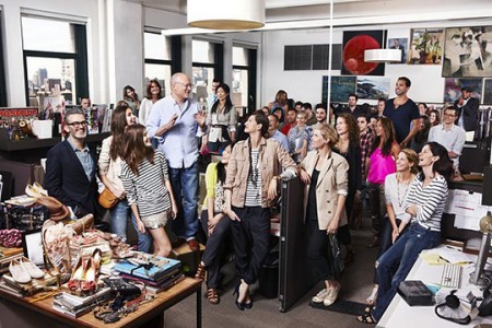
An unexpected brand making well-deserved headlines is J. Crew. Yes, that one. I had the same reaction when a few of my trusted friends made me aware of the brand and it’s current status. My memories of the brand were from the mid-90’s, of $98 Rollneck sweaters and greater misdeeds. Now I count myself amongst the fans for this most seemingly common of brands.
In it’s current moment, J. Crew has become less of a product line and more of a sensibility. The best example of J. Crew as a ‘perspective’ is their ‘In Good Company’ collection, which combines the 2000’s obsession with brand collaboration and good old fashioned curation, pairing the company up with well-worn heritage brands like Sebago and England’s 86 year-old outerwear brand, Belstaff. This is what is affectionately call an “ethos grab” or the adoption of the traits from greater brands via their inclusion in your own.
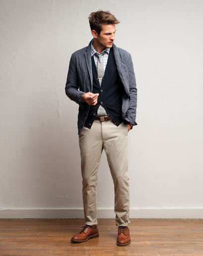
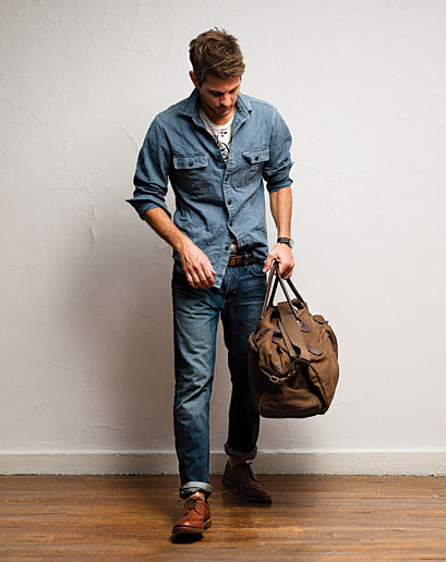
Riding on a wave of preppy fascination ushered in by a few East Coast indie bands, men’s clothing saw a sea change in recent years towards a more subtle look, taking over for a trend of logos and bright colors. J. Crew also wisely eschewed an overt prep direction, Instead opting for classic American and work-inspired clothing.
Like any brand resurgence (Apple, being one), it starts at the top and it infects the whole company. Mickey Drexler is the patriarch of this evolution, and his attitudes towards hiring and culture have informed the brand’s ascendency since he joined in 2003. Creative director Jenna Lyons has become a celebrity in her own right.
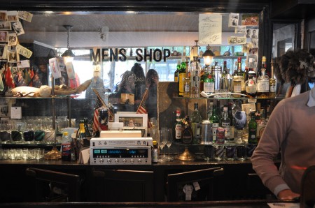
The inclusion of Andy Spade, co-founder (with his wife) of Kate Spade and his own confusingly named Jack Spade brand, was another brilliant hire, whose sly blend of Midwestern charm and a hint of old school smarm (David Spade is his brother) created the best asset perhaps of J. Crew-dom, the Liquor Store shop in Tribeca. A barely refurbished bar as men’s shop, and a signless work of retail genius.
“It’s odd that people think they have to brand everything with their own name to be successful. Certain companies are experts at certain things. I love brands that show humility and don’t try to be all things to all people. How many brands that got bigger got better?”
J. Crew
Founded: 1983
Golden Age: 2008- ?
Typeface: Goudy Old Style
While this has been around the Behance block, I can’t help but admire this piece by Francisco Andriani. The use of typography in these pieces is gorgeous. The noisy photographs and large type along with a relaxed but secure color palette also really sets the mood of airports.
Seeing these info graphics makes me want to see this style implemented nicely in the terminal. Large monitors showing arrival and departure times with this style would be stunning. Especially if used on large installations like these. With a little collaboration I could see Tyler Thompson’s boarding passes and Francisco’s info graphics alongside one another in the near future in airports.