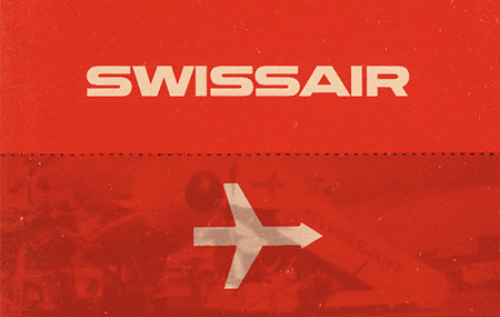
Switzerland’s current national airline (no, not that old one with the best branding possible) has undergone a rebrand and Brand New has all the details. A lot of people have been grumbling that the original “cube” logo was better — and I certainly agree — but judging this at face value, I have to say I’m into into it.
Brand New via Sam Valenti
Further reading: Be sure to check out Shelby’s post on Swissair’s (the now defunct Swiss national airline) branding.

There’s always been an arms race of sorts, between startups, surrounding their 404 pages. Often times sites do something unusual on this (hopefully) seldom viewed page. When we first started working on Nosh, we had a lot of fun brainstorming ideas for our 404 page. We wanted it to be crazy and I think it ended up being just that.
Above you will find the video that became our 404 page. It’s loud, crazy and weird. Definitely the most fun I’ve had on a Sunday in a long time. I’ve written up some production notes here — if I miss anything feel free to ask in the comments and I’ll be sure to answer. Follow me on Twitter here.
Continue reading →

Last week I wrote a quick post about the Nosh Promo video I made. Today I wanted to go into the production and describe all that went into its creation. Basically it was insane 25 hours from when we started, until the next morning when I exported the final video and the power went out in my apartment building (literally AS I hit export). Above you’ll see the composite I put together to show how each step of the post-process contributed to the final video. View the final video here or at the bottom of this post. I’ll describe each step in detail after the jump.
Continue reading →
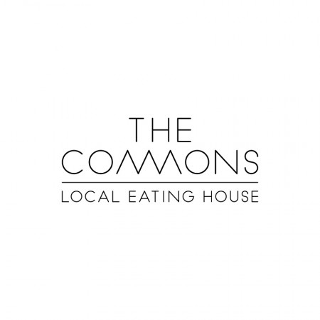

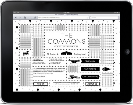
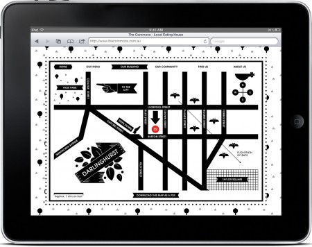
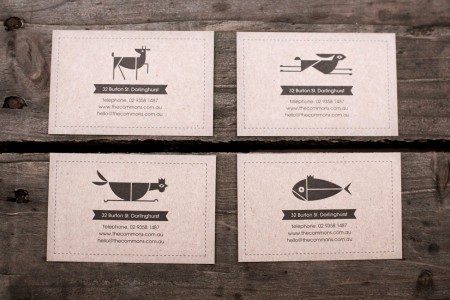
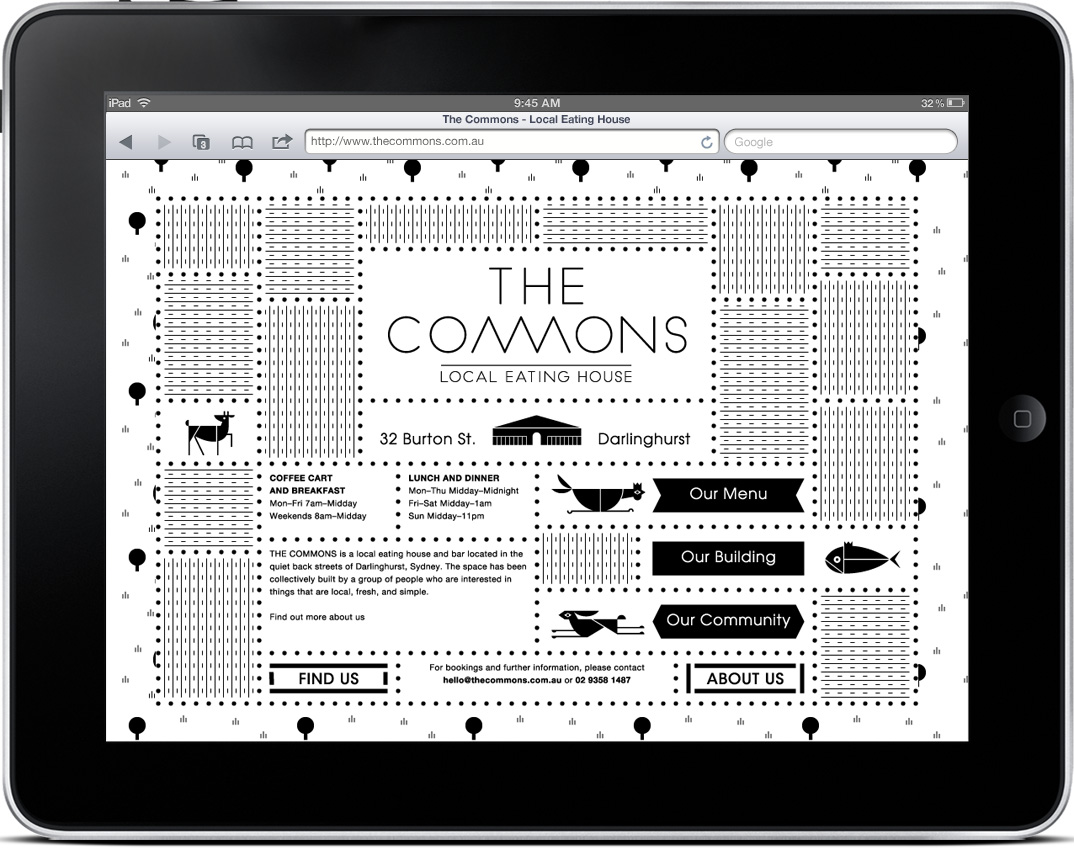
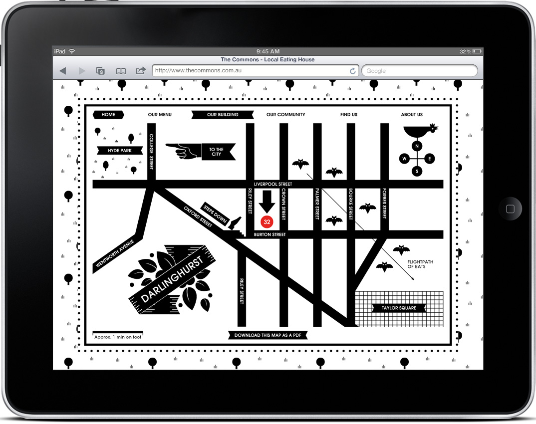
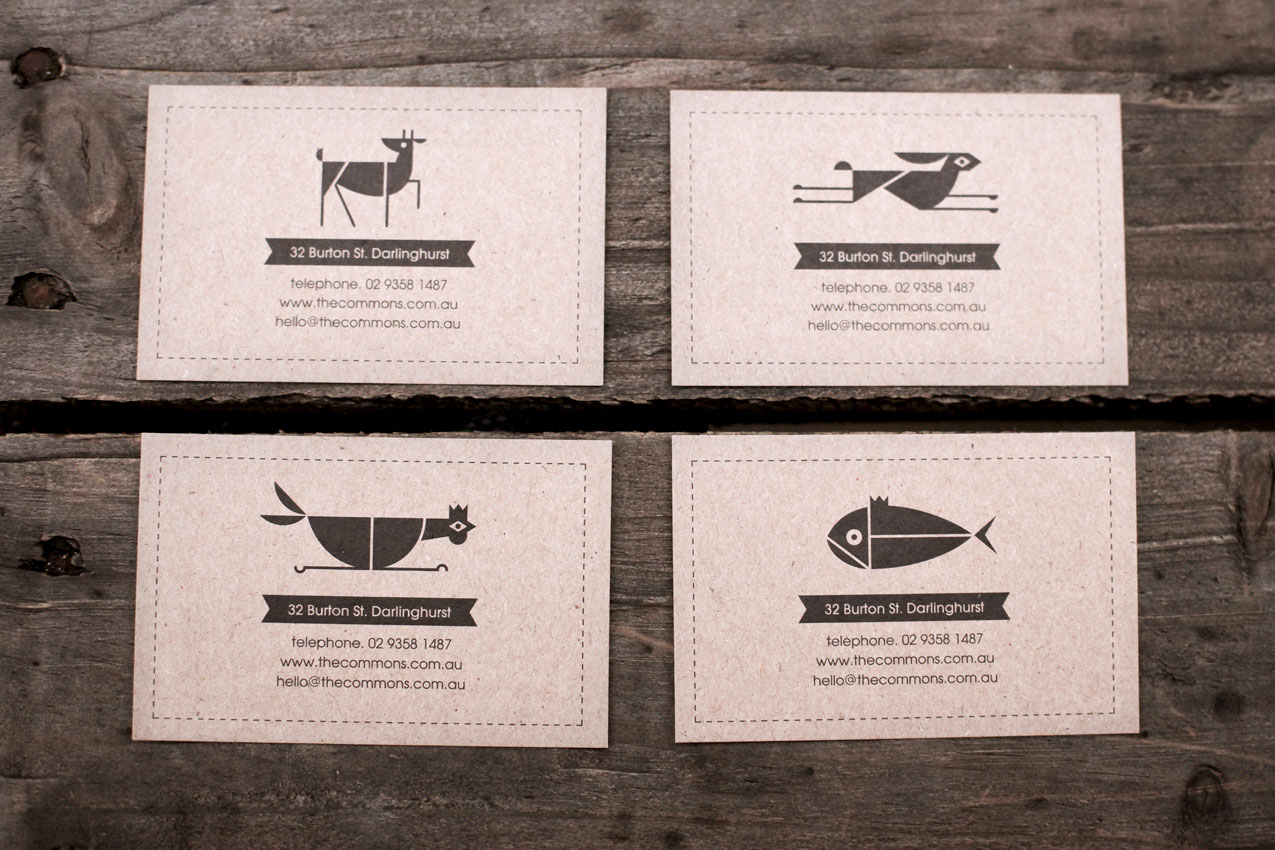
I typically start my designs in black & white, but eventually I reach a point where I feel like the work is missing something, and at this time I begin to incorporate some color. That’s why I’m impressed by design that succeeds in B&W, and Craig & Karl’s work for The Commons is some of my favorite yet. The fact that it is successful across an entire system is even better. Check out more pictures here.
Craig & Karl via Allan Peters


It’s hard to pin down what Apolis Global actually is. One part clothing shop, one part advocacy group, they guys at Apolis are certainly a versatile bunch. I’m writing about them mainly because of how impressed I was with their overall branding. They’ve got their visual message down. I placed an order through their shop and received the awesome artifacts above. It took me a moment to open the box because I didn’t want to destroy it.
I actually found Apolis by way of their logo, which I absolutely love. You can find out a little more about it here.


Some really cool illustrative branding over at Matt Payson’s site. It kills me to post images that aren’t at least 450px wide and screw up the layout, but this is deserving work. Such a refreshing and well executed take on branding, I’d wear shirts of most of these.
Via Draplin

Continuing with the wildly infrequent discussion of brands.
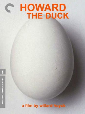
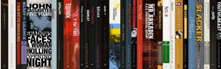
In an era where physicality in media is increasingly discussed, The Criterion Collection, a “publisher of premium editions of classic and contemporary films”, has established a strong customer loyalty through a combination of quality consistency and innovation (early adoption of Laserdisc, DVD and online streaming). Criterion has become one of the most recognized names in a field that isn’t commonly considered to carry prestige brands.
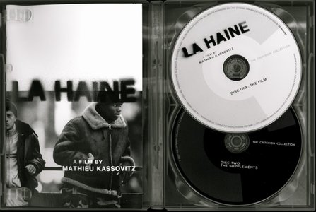
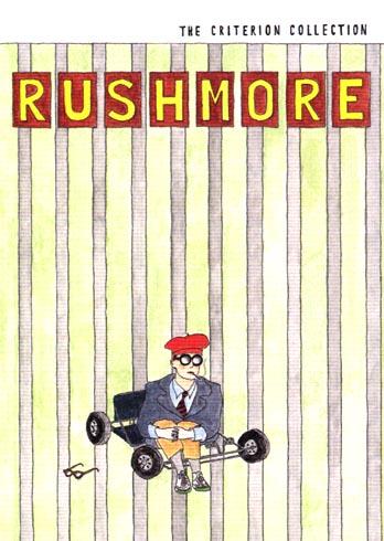
I retroactively discovered Criterion after purchasing one of my favorite films Rushmore, many years ago. The design of the original poster art always left me cold, as it attempt to market the film as a teen rebellion flick, sort of a suburban CHE. The sly illustration of the solitary protagonist WAS the movie to me, which made me put down the extra dollars for this film I knew I’d always own. It was only afterwards that I realized “The Criterion Collection” banner on the side was a mark of a unique brand of curated special editions.
The secret to their success seems multifaceted.
Curation: Criterion has been responsible both for releasing films that have been overlooked, under-distributed and even just unheralded amidst box office success, finding new life given the Criterion treatment. Can Chasing Amy and The Criterion versions often sit alongside the original or Blu-Ray versions, at a higher price, but given the quality of extras, these editions are deemed to be better thought out than their peers.
Scarcity: There is a time frame in which most Criterion releases exist, possibly due to short print runs for lesser known titles or presumably the duration of the license for the film they acquired. The limited nature of these DVDs creates a collector aftermarket eager not to miss out, much like the contemporary vinyl market.
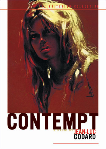
And of course, Design: The quality and uniqueness of their packaging puts them in league with some of the best companies in media today. The design is never of one style, but always of a character that is distinctly theirs. It is a commonly held fact that the best brands are the ones that are able to be parodied. The presence of a ‘Fake Criterions” blog laughs at the prospect of weaker films getting this special treatment (Im a fan of the Air Bud one in particular, very Hoop Dreams).
It could be stated that a Criterion Collection library, sitting alongside a well appointed vinyl and book shelf, will not be something to sneeze at in the Netflix era.
Founded: 1984
Founders: Robert Stein, Aleen Stein, and Joe Medjuck (company info is rather circuitous)
Identity: Pentagram (Inspiration is here).


I’ve been admiring Paul Gardner’s band posters this morning, great use of color and execution of ideas that aren’t too literal or same-y, you know like owls and hand drawn guitars, urgh I hope to see more posters like this around Brooklyn. I noticed one in there though that is a bit ISO50 Terrabyte-ish but i’ll pretend I didn’t see it.