The Commons
Posted by Jon


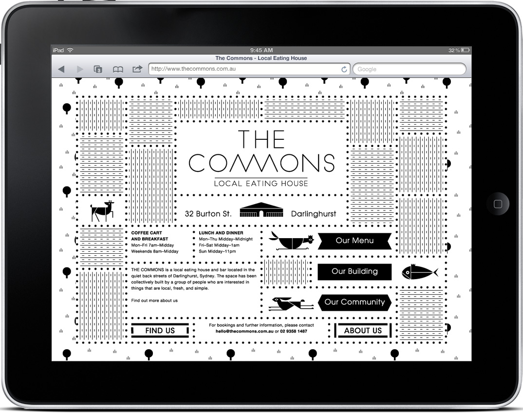
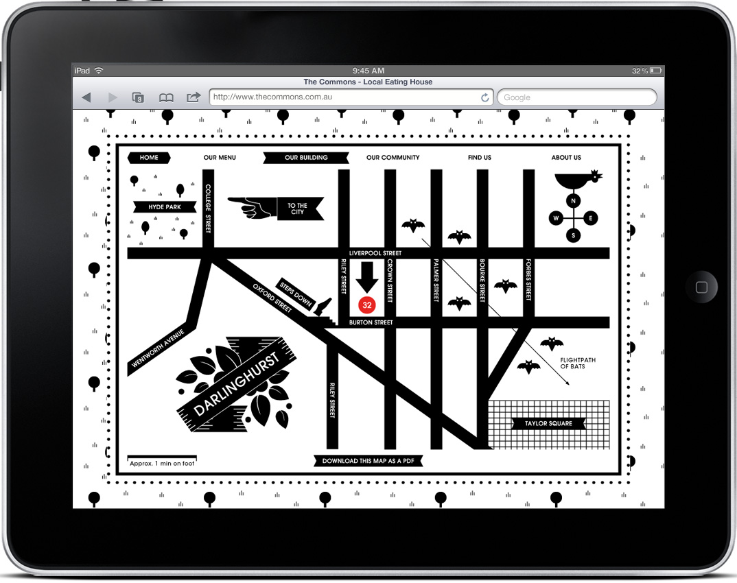
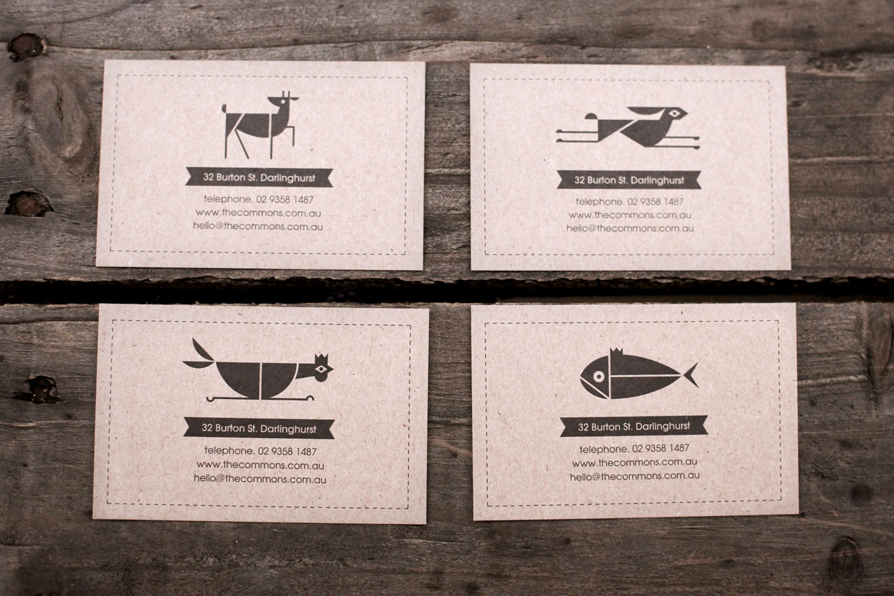
I typically start my designs in black & white, but eventually I reach a point where I feel like the work is missing something, and at this time I begin to incorporate some color. That’s why I’m impressed by design that succeeds in B&W, and Craig & Karl’s work for The Commons is some of my favorite yet. The fact that it is successful across an entire system is even better. Check out more pictures here.

4 Comments Leave A Comment
Simon says:
June 4, 2011 at 12:18 pmI like the little 32 dot. That’s all the color you need!
Marcus says:
June 4, 2011 at 7:29 pmThe front page to the site is brilliant.
Just little things like the type and line weight do it for me, the connected m’s couldn’t have been more perfect.
Good find!
Joseph K says:
June 6, 2011 at 5:43 amIt’s not a bad little establishment, either!
Designgrill says:
June 11, 2011 at 2:38 amLovin it!