")
")
")
")
")
")
")
")
")
")
")
")
")
")
")
")
")
")
")
")
")
")
")
")
")
")
")
")
")
")
")
")
")
")
")
Branding 10,000 Lakes is a project or massive undertaking by Art Director and Graphic Designer Nicole Meyer.
Lake logos have a tendency to be, well, fairly ugly. This project was created to rethink what they could be.
One Minnesota Lake. One Logo. Every day.
Should only take a little over 27 years to hit ’em all. Stay tuned and enjoy!
– Nicole Meyer
Who wants to get something similar going for California State Parks, which continue to be in danger of being affected by massive budget costs, some might even be closing soon? Just throwing it out there…
You can follow Branding 10,000 Lakes on:
TWITTER
FACEBOOK


Update Required
To play the media you will need to either update your browser to a recent version or update your Flash plugin.
I’ve been an ISO50 reader for a long time—long before Jakub and I put on Ghostly International Roller Hockey Team jerseys and took to a rink in rural New Jersey to embarrass the label—and so when Jakub invited me to take a whack at a guest post, I naturally jumped at the chance. (Meanwhile, does anyone want my (priceless) jersey?)
I’ve since moved to California, where I work out of the Los Angeles “Vitsoe apartment,” which is both the home I share with my wife, and a unique space where we show Dieter Rams’ 606 Universal Shelving system deployed in all ways. From straightforward bookshelves, to workstations, to room dividers, kitchen shelving, and closets, it’s pretty much all represented here (we specifically chose an apartment without any built-in storage).. As a former dj and avid collector of music, my favorite use of the system is for media storage. After all these years of collecting vinyl, I’m finally able to put it all on shelves that will not bow under the weight. Vinyl collectors: contact me, it’s more affordable than you’d think!
I thought it might make sense to do a first post about some of the songs that have been keeping me going while working out of the apartment—and since it’s a Vitsoe apartment, share some images of the shelving put to use for various media, plus the beautiful Dieter Rams equipment we listen to it all on.
Lorn – Weigh Me Down (Illum Sphere Remix).
Unbelievably beautiful reworking of one of my favorite tracks on Lorn’s new album “Ask the Dust.” I’m huge fan of his heavy hitting beats, but this is a nice change of pace, skillfully re-tooled by Illum Sphere. For a taste of Lorn’s own softer side, check out ‘Pause’ from his ‘Self Confidence Vol.2’ unfinished / unreleased / demo tracks over at the Brainfeeder site. A strange anomaly in a very dark oeuvre.
Yppah – Blue Schwinn.
I’m a huge fan of Joe Corrales’ work as Yppah, it’s sort of a shoegazy version of Bonobo, a combo that is pure win in my book. This track is from his third and most recent release on Ninja Tune, “Eighty One.” Anomie Belle’s vocals are a great addition in an instrumental sense, I love how she’s just swirling around in the background and I’m unable to make out the words.
Lost Twin – Soothing Words.
There’s no shortage of great producers in Brighton these days. I can’t remember exactly how, but I found him via Bandcamp, and to my pleasant surprise, he’s offering the whole ‘Birds’ album for free. I would have no problem paying full price (and then some) for his work. Although obviously entirely different in tone, there’s something a little Burialesque about the auto-tuned quick vocal snippets.
Dextro – Ring Cycle.
I’m not sure exactly why Dextro has stayed off most people’s radars for so long: He deserves far more exposure in my opinion. His first release was on Border Community, then the subsequent releases were through his own imprint, 16K Records. Maybe that’s why. I don’t know. What I do know is that his sound manages to successfully bring together elements of Ulrich Schnauss, Slowdive, and dare I say it, BOC. His last album, Winded, from 2009, is a real gem. I’m hoping he follows it up soon, it’s been too long.
A Sol Mechanic – [Almst(Touching)].
I’ll never tire of a good “Everything in Its Right Place” sample. In his own words “it’s less of a remix and more of a branch off. N E Ways.” That’s a good way of describing it, because after that amazing initial drop, the sample gets filtered into the background and the minimal stutter beat takes over.
Geskia! – Melamine.
Geskia’s sound is unabashedly Scoott Herren influenced, and most of his work occupies a space dead center between Prefuse and the long gone DeLarosa & Asora projects. This is a compliment, as he pulls off what so many other fail to do successfully.
Jai Paul – BTSTU.
There’s been a lot of buzz about this kid from London, and deservedly so. I saw a tweet from Four Tet that said simply: “that Jai Paul track,” which of course sent me into a Google frenzy. What I discovered is that there are literally only two tracks under his belt to date. It sounds like he’s in good hands over at XL, in a recent NPR spot I heard them describe how they are giving him loads of space and time to do what he needs to do, because that’s just how he rolls. He really has a grasp on the “Less, but better” approach.
Autechre – See On See (Pixelord Remix).
The thing I like about this unofficial Pixelord remix of ‘See on See’ from 2010’s Oversteps is that it brings me back to the Tri-Repetae days, when the tracks were grounded in dark emotion, and they would hit you in the gut with crisp, hard beats. They lost me long ago, but it’s nice to be brought back if even for a few minutes.
Rob Fissmer


Since I was a teenager i’ve wanted to do custom hats, mostly just a cap, i’ve always been fascinated by the choosing color combinations to the quality of the sewing of the patches, embroidery, and all over printing. After digging around I have to say there is an amazing culture set in place of people making high end hats beyond New Era. I hope to do a custom ISO50 one someday soon because i’m itching to do one like the beautiful Oxford one by Quiet Life, here’s a few companies that do it properly:
Quiet Life
Brixton
Obey


Building a fast car is expensive. Title sponsors pay large sums in sponsorship fees to display their brand prominently on a race car, and their brand esthetic usually dictates the color scheme applied to the rest of the vehicle. Some people lamented the arrival of decal-infested machines, but I’ve always been fascinated with how a creative paint job can make a some of these objects much more memorable.
In this first series, I’ve featured one of motorsport’s oldest title sponsors, Martini & Rossi.
-Rory


Falling in love with this site called The Noun Project which “collects, organizes and adds to the highly recognizable symbols that form the world’s visual language, so we may share them in a fun way.” I personally love the Tornado, I just keep downloading and downloading some of the great ones not even to use but just to have like some graphic design hoarder.


Matt Lehman is really good at logos, and illustrations. It’s been a long time since I’ve seen such a fun and well executed branding portfolio. There are some straight up classics in there, and that Warner Nashville one, wow. I’d love to see this guy get more into poster work, but simplified. I feel like some of his illustrations tend to get a little busy while minimalism seems to be his strong suit. The two included above are good examples of a nice balance of clean lines and texture.
More good stuff over at Matt’s Portfolio


Classic branding and packaging design by Barcelona-based firm Marnich Associtates. The stuff for Noguera & Vintro is incredible. Interestingly enough — and despite that excellent branding — they’re apparently the “exclusive distributor of Hello Kitty in Spain”. Good thing you have this incredible, minimalist branding, because we all know Hello Kitty retailers and very concerned with modernist graphic design.
All joking aside, this seems like a very strange choice of branding considering the product / market. It also just plain looks weird on the site with all that garish Hello Kitty stuff going on in the middle. Do you think the client asked for this seemingly incongruous style of branding or was it foisted upon them by an overzealous design shop? Judging from a lot of the playful work on Marnich’s site, I’d bet on the former as I could see them treating this right. Odd.
Via Aisle One

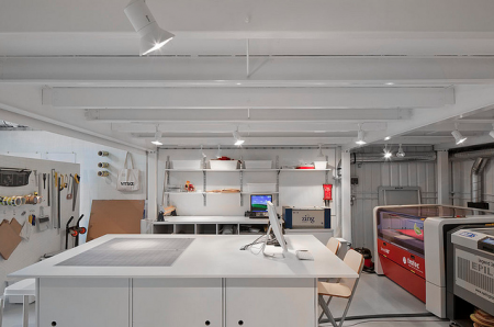


Many of us artists/designers/musicians love dreaming about our ideas becoming a physical piece that you can hold, touch, gift or make available for others to have. I really appreciate the printers, warehouses and studios that have to deal with our minds and files. So here’s to CutLaserCut, a well branded youthful laser cutting company that I dream of using someday soon, check out their Flickr and keep these physical type of companies close, I hope to see more creative uses of what they offer in the future and thats up to us.
")
")
")
")
")
")
")
")
")
")
")
")
")
")
")
")
")
")
")
")
")
")
")
")
")
")
")
")
")
")
")
")
")
")


