VOTING IS NOW CLOSED! Thanks to everyone who participated, I really appreciate all the great feedback. I will be going through and picking a winner over the weekend, you will be notified via email if you’ve won.
UPDATE: As per Damo’s request this is now a contest. The best analysis will receive a signed copy of this poster. You must enter a valid email address in the email field when placing your comment so you can be contacted if you win (the email address is not viewable by the public). If you’ve already entered a comment but did not enter an email address, just place another comment with the email and reference your original comment. I can see the IP address you post from to match them up. This contest ends this Friday, Feb. 15th.
UPDATE: After considering some of the early responses to this post (namely Jacob’s) I’ve added two more versions for your consideration.
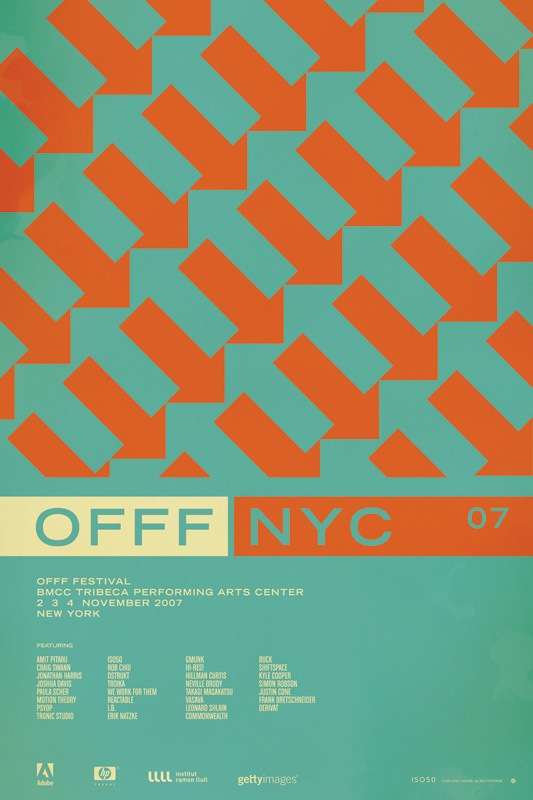
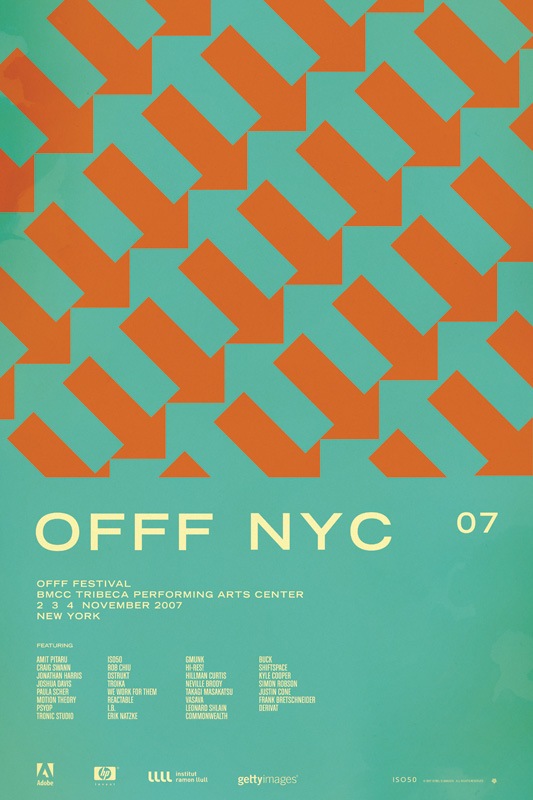
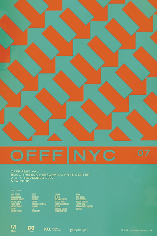
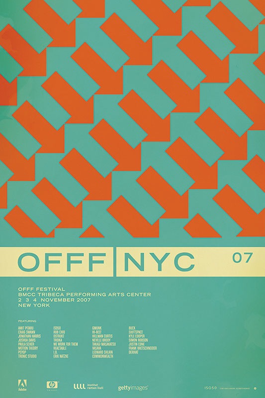
So I have been putting together a batch of prints that will be released over the next few months. Included is the poster from the OFFF 2007 festival in New York. There have always been multiple versions and I’ve really had a hard time deciding which I like best, and consequently, which will get printed. So I thought I would try a little experiment and let you guys choose your favorite. They are shown above in order: verions "A", "B", "C", and "D". Let me know which you like best by sounding off for A, B, C, or D in the comments. Or you could just say they are all terrible and to start over. Click the images above to view larger versions of each.
My 2 cents: At this point I think B, C, and D are the strongest. B has a cleanliness and reservation about it that I like. The type is able to stand on it’s own and given that it’s Trade Gothic Bold Extended, that’s a very good thing. But I think the solid bar in C and D really pulls things together. Right now I am really leaning towards C just because it feels so cohesive. The top portion is reserved for the red / orange color and the bottom, informational portion has the cream. I think this links the main title and the arrow design together nicely and makes the overall composition feel more like a single unit whereas some of the others seem a bit broken up.
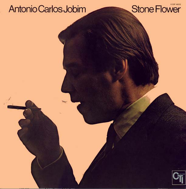
Jakub sent me this image tonight which is, of course, amazing. It reminded me of my favorite Bossa Nova song "Aguas de Marco" so I thought I would post both. Note this is not the cover of the album this song is from. Impeccable style going on here, typography is top notch and the photographic composition is near perfection. That salmon color in the background is usually a dead giveaway for cross processing, wonder if that’s what’s going on here? If you look closely at his collar you’ll see a bit more evidence of the xp.
As Jakub pointed out, the original version has a black border as well as an alternatively effected version of the photo. Sort of torn on which I like best, the border sort of encapsulates the negative space which is nice, but there’s something about this version I think is a bit cleaner. There’s also a rather nice full vertical version here.
Antonio Carlos Jobim y Elis Regina-"Águas De Marco (Waters Of March)"
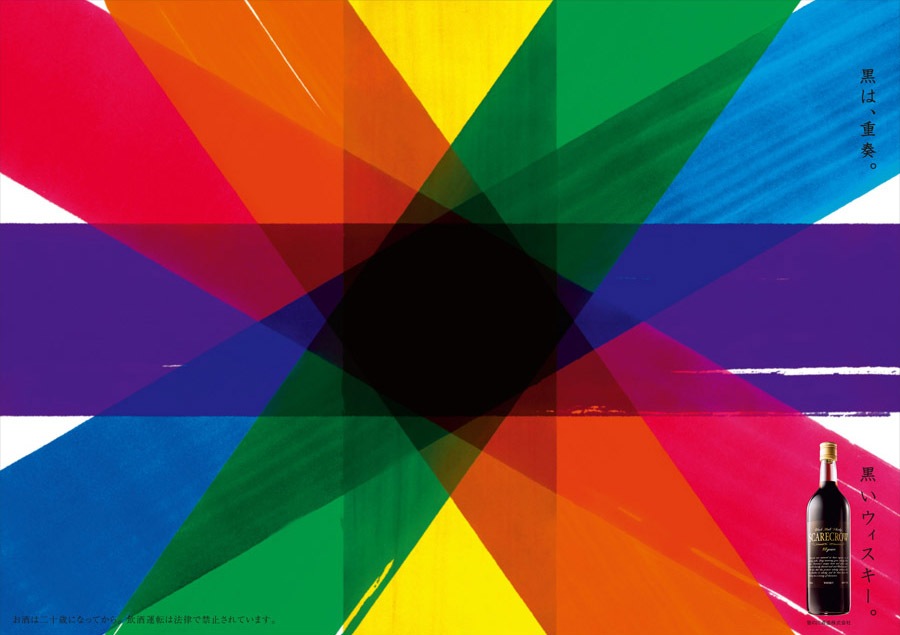
Not exactly sure what this is for, seems to be some variety of Japanese liquor or wine named "Scarecrow". At any rate, loving the colors and textures here. I wonder if this was handmade or digitally composited? I’ve rotated the image to fit a larger size in the page format. Click for original horizontal version. Via FFFFOUND
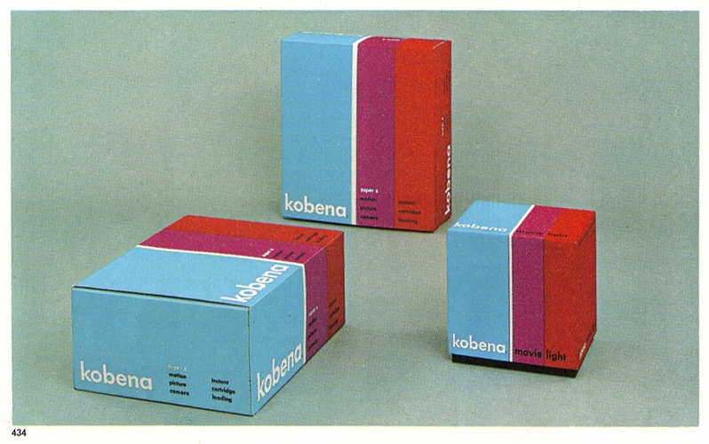
More great packaging, this time via Everydaylifemodern’s Flickr page. Would be great to have a laser cutter just so you could make concept packaging like this and put it on your shelf.
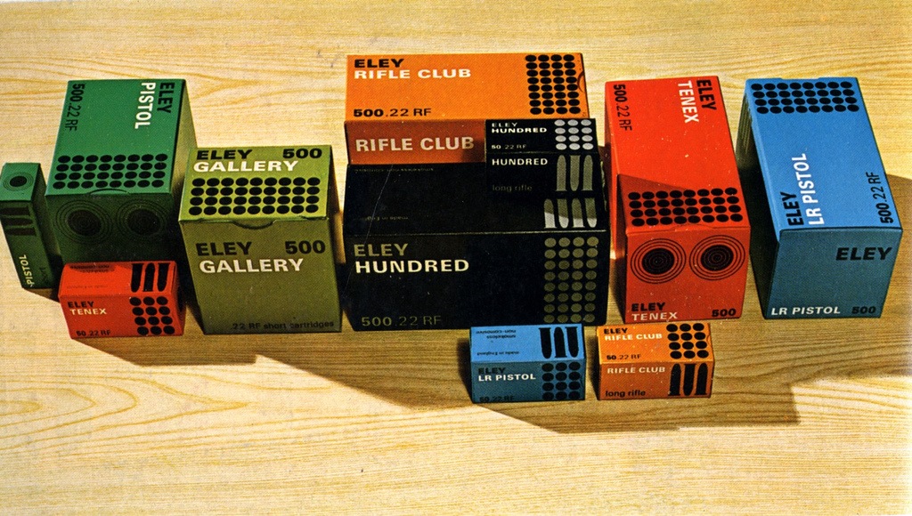
"Eley, Imperial Metal Industries (1966) Range of packs for cartridges made by Imperial Metal Industries (Kynoch)
Artist: David Mawford / John Harrison Agent | Studio: Service Advertising Co. Ltd., London. Art Director: John Harrison"
Some nice packaging via Crabstick’s Flickr. I have to say that the quality of product packaging design has seriously declined over the past 20 years. If I ever saw anything in a box like this now I’d buy 15 of them regardless of what was inside.
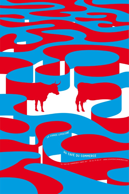
Caught this on FFFFOUND yesterday. Loving this design but lacking much information on it. I really like FFFFOUND but they are sometimes bad about citing sources so it’s hard to find the origins of the work they post. At any rate, this is a very nice print, anyone have any more info on it?
UPDATE: Via Aurélia in the coments. This is the work of FRÉDÉRIC TACER who, according to his website, is a 22 year old design student at National College of Arts and Design Olivier de Serres in Paris. Looks like Frederic has a pretty good start, this certainly doesn’t look like the work of a student, more like a seasoned vet.
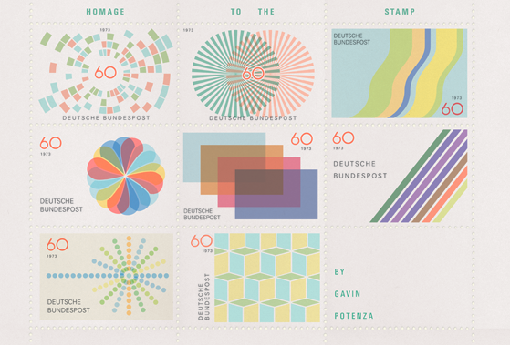
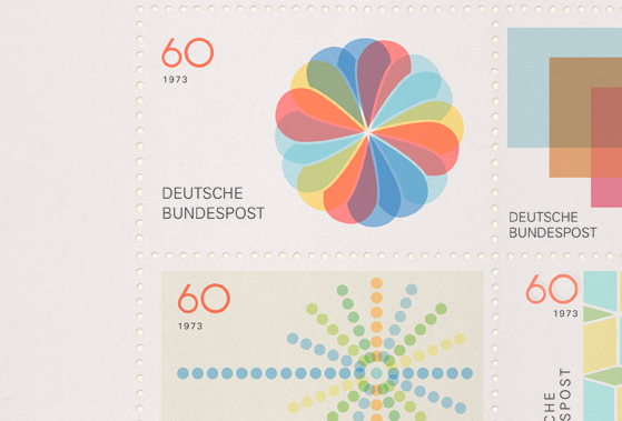
Ever since I saw his great 2007 Holiday Card on I’ve been waiting to see more from Gavin Potenza. When I awoke this morning this nice little birthday present waiting for me on FFFOUND. I love the concept and I love the fact that it’s purely a design exercise, which is very fitting considering the name of his site (exploratorydesign.org). As I say in my workshops, that’s when most people will do their best work, when there is no spec, no client, no parameters other than your own. Just you, your imagination, and your tools. As he says on his site, this piece was inspired by Otl Aicher, one can’t really go wrong with that kind of source.
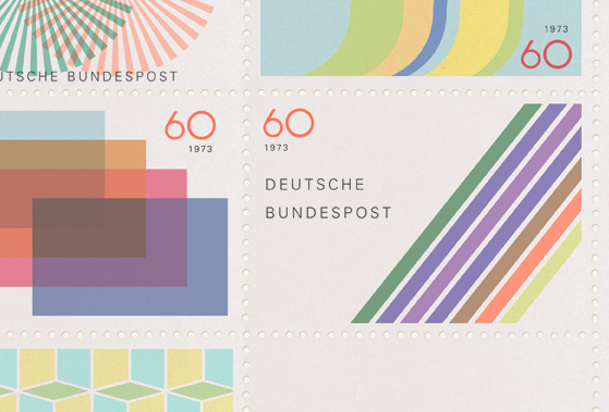
It’s minimalist, reserved design like this that intrigues me more and more these days. To me, modernism is about taking all your ideas about color and type and form and expressing them in the most efficient way possible, which I think is the very core of what we are all trying to do as designers. Also, stamps are awesome, I collected them when I was a kid…along with my obsessive hoarding of any other printed material I could get my hands on. Unfortunately I only had access to boring American stamps so it got boring real quick.