Design Democracy: OFFF 07 NYC
VOTING IS NOW CLOSED!
Thanks to everyone who participated, I really appreciate all the great feedback. I will be going through and picking a winner over the weekend, you will be notified via email if you’ve won.
UPDATE: As per Damo’s request this is now a contest. The best analysis will receive a signed copy of this poster. You must enter a valid email address in the email field when placing your comment so you can be contacted if you win (the email address is not viewable by the public). If you’ve already entered a comment but did not enter an email address, just place another comment with the email and reference your original comment. I can see the IP address you post from to match them up. This contest ends this Friday, Feb. 15th.
UPDATE: After considering some of the early responses to this post (namely Jacob’s) I’ve added two more versions for your consideration.
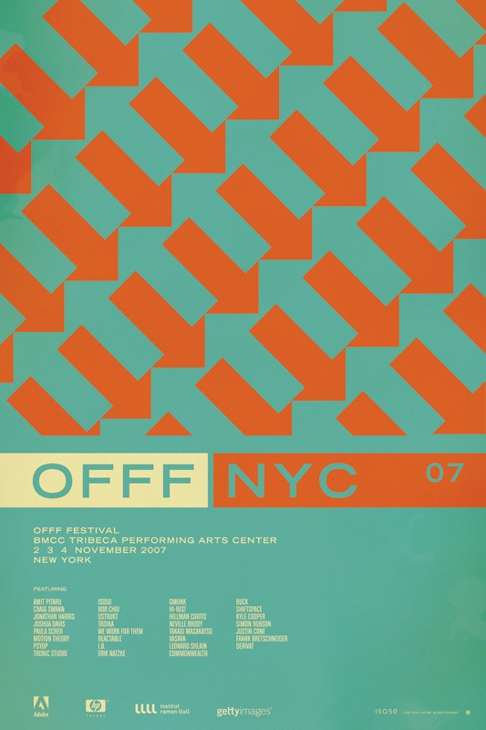
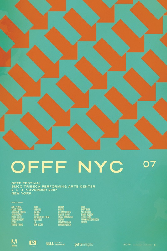
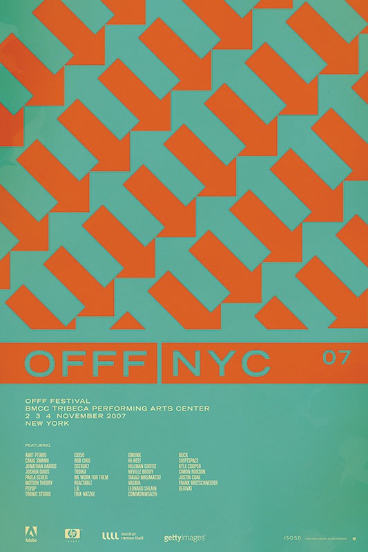
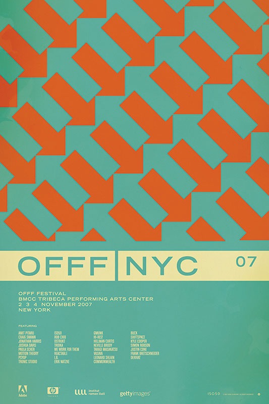
So I have been putting together a batch of prints that will be released over the next few months. Included is the poster from the OFFF 2007 festival in New York. There have always been multiple versions and I’ve really had a hard time deciding which I like best, and consequently, which will get printed. So I thought I would try a little experiment and let you guys choose your favorite. They are shown above in order: verions "A", "B", "C", and "D". Let me know which you like best by sounding off for A, B, C, or D in the comments. Or you could just say they are all terrible and to start over. Click the images above to view larger versions of each.
My 2 cents: At this point I think B, C, and D are the strongest. B has a cleanliness and reservation about it that I like. The type is able to stand on it’s own and given that it’s Trade Gothic Bold Extended, that’s a very good thing. But I think the solid bar in C and D really pulls things together. Right now I am really leaning towards C just because it feels so cohesive. The top portion is reserved for the red / orange color and the bottom, informational portion has the cream. I think this links the main title and the arrow design together nicely and makes the overall composition feel more like a single unit whereas some of the others seem a bit broken up.
Click here to cast your vote in the comments

91 Comments Leave A Comment
J.Cross says:
February 13, 2008 at 11:39 pmI gotta go with B, I think because in A with the type in the bars, I visually group the type in with the design on top. As opposed to B I appreciate the type and the pattern independently and my eye goes back and forth. But I can see how it could drive you insane, they’re both pretty great.
Eric says:
February 13, 2008 at 11:45 pmIts hard when they’re both side by side, because for me, B looks almost unfinished when sitting next to A. They’re both nice, but i think Id have to go with A.
jacob says:
February 14, 2008 at 12:04 amHi Scott:
Here are my 2 cents…
I like the strong horizontal band that is present in A, but the use of the same red/orange in the band makes the arrows feel as if they are continuing past their set horizontal barrier.
Have you tried removing the red/orange band that knocks out the ‘NYC 07’ in A and changing that text to the white or the red/orange.
I think ultimately, I prefer B. Although the OFFF looks like it isn’t anchored anywhere. In A, that anchor comes from the strong horizontal.
Curious to hear your thoughts/remarks.
Best!
Jesse says:
February 14, 2008 at 12:04 amDefinitely A. It pops better, and I think with the white OFFF on the left, it works with the mass of white copy below it.
Shud says:
February 14, 2008 at 12:09 amA. no contest.
ralph fisker says:
February 14, 2008 at 12:21 amvery much B
i like the breathing space
Scott says:
February 14, 2008 at 12:29 amUPDATE: I’ve added 2 new versions to the voting. Please choose A, B, C, or D.
Please note that any comments appearing above this one were based on the original post which only included 2 designs to choose from, A and B.
Thanks for the input so far!
-Scott
Scott says:
February 14, 2008 at 12:31 amJacob-
Good points all around. I went back in my project folder and dug up the versions with solid colors across the bar, and you were right, they do look nice. still not totally sure which to go with, but I’ve added those versions to the voting so we’ll see which ends up on top.
Thanks everyone for the input, definitely a big help, keep them coming.
unlimilove says:
February 14, 2008 at 12:33 amB!
cause emptiness attract my eyes
Matt says:
February 14, 2008 at 12:34 amI like D the best. The orange and blue are so close in value that its hard to read “Offf NYC 07” from a distance. Plus the off white bar brings out the text as well. D.
Jesse says:
February 14, 2008 at 12:39 amDammit. Now I’m attracted to D.
Definitely D. Good think I checked this site again.
Jakub says:
February 14, 2008 at 12:57 amA. All the way.
jacob says:
February 14, 2008 at 1:26 amHi Scott:
Thanks for the nice comments and props!
My vote is now for D. Much cleaner and organized into sections of information. In my first glance I get the horizontal bar, the arrows and then the information at the bottom. Which ultimately is how it is suppose to be read… I think.
On a side note: Are you doing any speaking engagements/shows in SF anytime soon. I’m here and would love to meet you in person. Also, what’s your trick for getting your colors to look so flat/matte? Care to share?
RepSeven says:
February 14, 2008 at 1:30 amD. No doubt about that. It is the easiest one to read plus it still has all the graphic strength the others have. Nice piece of work. When are you coming to Montreal?
Jason says:
February 14, 2008 at 1:45 amI have purposely not read the comments above because I don’t want them to influence my own, so please forgive any redundancy.
After careful consideration, I’m partial to D.
B: this is my least favorite because it lacks the visual “weight” that the other three have as a result of the reversed-out type
C: is 2nd from my least favorite. I love the visual effect of the blue and orange arrows, but executing the “first-read” in those colors hurts my eyes.
A: is my 2nd favorite, but…
D: is my favorite because it has a bit more power in its composition as a result of the all-white bar than A does. The overall proportions are attractive, the most important text is legible instantly, and the gestalt of that version is much stronger than any other version.
I backed away from the computer to look at each from a distance, and D is the clear winner, in my opinion.
-Jason
chris says:
February 14, 2008 at 1:48 amA
Jason says:
February 14, 2008 at 1:50 amawesome… just read the comments, and was disappointed to hear everyone saying A or B… then realized that C and D were added later.
Glad the recent posts are pulling for D! It’s strong and powerful in its composition, and I think the cream “bar” (not the orange “bar”) provides the link between top/design and bottom/information.
Go D!
Schlafende says:
February 14, 2008 at 1:56 amD
Anonymous says:
February 14, 2008 at 2:10 amA – Just communicates the best i think, like the compostion and color acents. on A you can realy ‘read’ the poster and it leads you along trough the info..so A gets my vote.
Leggozcreations says:
February 14, 2008 at 2:11 amA – Just communicates the best i think, like the compostion and color acents. on A you can realy ‘read’ the poster and it leads you along trough the info..so A gets my vote.
(that was my comment;-)
Tom Elders says:
February 14, 2008 at 2:19 amIm going to opt for A too. I don’t have any insightful comments as to why. It just feels like the one.
Now for point number 2; A colleague and I have been trying to get ahold of you for a while now about some work we’d love for you to take a look at. I can see you’ve been busy but if you could get in touch and let us know one way or the other wether you’re available it would be greatly appreciated. We sort of sold your work internally and now the powers that be want answers. I left me email with this comment. Laters.
Jehad says:
February 14, 2008 at 2:23 amGo for A : the composition is amazing. The orange band sort of “bounds” the “OFFF” giving it a space of it’s own. It stands out and serves the purpose.
Leigh says:
February 14, 2008 at 2:37 amD: The white bands balance it out.
Damo says:
February 14, 2008 at 2:44 amD + even though everyone is saying A – personally i see more clearly D with the cream header – the band jumps out at you giving you the important info of what it is and where it is – function firstly! and divides the finer details. also it breaks the over use of red/orange colour – the contrast with the aqua/teal can really strain your eyes – A seems to lose the NYC amongst the colour of the arrow field…and I see the nice rebound off this cream headlining band with blue arrows….D definetly!!
Damo says:
February 14, 2008 at 2:46 amOh yeah – so can we make this a prize competition? :) for whom gives the best critique ? lol a free poster of choice :)
LAB says:
February 14, 2008 at 2:52 amI personally like D. I love how it seems to be cut into 2 section, the white and the orange. I think the bar makes it stand out beautifully and really adds the 1960’s edge to it. The white also goes with the text at the bottom and doesnt make it seem jumbled up. The use of negative space is awesome aswell and so is the use of golden mean.
D FTW!!!!
Stephen says:
February 14, 2008 at 2:55 amBetween a and d
I’m going to say A.
The reasons for this have already been commented on, so I wont repeat.
Matthew says:
February 14, 2008 at 3:08 amI think D. Also- “Trade Gothic Bold Extended” is maybe my favorite font ever.
Andros says:
February 14, 2008 at 3:09 amThe A.
No comment because my English is very poor. Sorry.
Scott says:
February 14, 2008 at 3:10 amGood call Damo…. done:
UPDATE: This is now a contest. Whoever’s analysis is best will receive a signed copy of this poster. You must enter a valid email address in the email field when placing your comment so you can be contacted if you win (the email address is not viewable by the public). If you’ve already entered a comment but have not entered a valid email address, just place another comment with the email and reference your original comment. I can see the IP address you post from to match them up. This contest ends this Friday, Feb. 15th.
pablo says:
February 14, 2008 at 3:36 amA.
For me, mixing the colors in the title is the best way to link the design and the information.
Chris says:
February 14, 2008 at 5:22 am‘D’ …
… simply because the eye comes rest easily on the Event headline. With all the other designs this isn’t as effective. ‘A’ may be more cohesive as an overall feel and balance but in terms of driving the posters message home ‘D’ is more effective.
In ‘D’ the information and clarity is at its best. This is because the juxtoposition of the pattern (with all due respect) noise dropping into the clarity of the white headline it has the effect of focussing the brains attention on the main message. As Derren brown says here (http://www.channel4.com/entertainment/tv/microsites/M/mindcontrol/trick/phone.html) if you overload a brain with confusing information and then give it a simple instruction the brain latches onto this. So ‘D’.
Hey ho what do I know though…
Paddy says:
February 14, 2008 at 5:40 amI like D most. It has a stronger informational hierarchy than the others. The information is defined by the cream, the graphics by the orange.
As I’m sure you know, with any kind of informative design, defining and organising your information is as important as catching the eye.
D also appears the most naturally balanced when viewing all the posters from a distance. The solid bar gives the title a visual weight that A and B both lack, and the cream, as I said helps tie all the text together and defines the hierarchy, as well as increasing the legibility of C.
I’m also just a big fan of the cream colour against the blue. Gorgeous.
rafael says:
February 14, 2008 at 6:21 ampeople seem to lend towards the D version, which i agree to be the best resolved one. its information flow and hierarchy (from bar (title) to pointers (illustration) back to the bar and to the text area) feels more natural and spontaneous.
i like the B version too, but it’s like a “calmer” version. but i’d go with the D.
awesome colors too. these posters remind me of some great values in design that seem to be diffused these days.
keep it up!
Desmond says:
February 14, 2008 at 6:38 amA.
I am not that great in explaining in detail so I made a PDF with your designs and text corresponding to the version.
Also made some blocks to show exactly what I meant.
Here are a few download links, look which you prefer,
http://rapidshare.com/files/91773522/iso50.pdf.html
http://download.yousendit.com/1869101F6A187CE2
Johannes says:
February 14, 2008 at 6:39 amAll of these would work but the bar really pulls it together, and in C the main type is maybe not visible enough.. So that leaves us with A and D. I’d have to go with A because the colour change adds a little more interest. And the red arrows point towards the red bar, which is kinda nice.
Justin K. says:
February 14, 2008 at 6:46 amI am currently tied for time so please excuse the grammar, ect.
It looks like your having trouble getting the flow of the arrows merge with your type so that they feel solid and in place.
Therefore, I have a few suggestions you can try out and see how it works out for you.
A. Remove the bottom arrows that cut off from the design above, push up your offf text.
2A. Also you can embed the NYC 07 into the arrows, if you want the offf nyc together try 3A.
3A. You can try to keep the design as it is, and throw more of a lighting backdrop to the arrows and then give the arrows 2 different colors to show an edge.
4A. Scrap the arrows and redesign either the arrows or the design itself.
B. The text merge lacks openness from the arrows. Might want to try suggestion A.
C. Too much usage of the orange color, junk.
Well, got to go I’ll take a look later and see if I can give more feedback.
Bobby says:
February 14, 2008 at 7:10 amD Is my winner.
C doesn’t have enough contrast, which the white blocks take care of. Plus they create a proper divide between the arrows (which disappear mysteriously invisibly in B). D takes care of the invisible by both revealing text (unseeable because it is the same colour as the background) with a surrounding white block, and utilizing this presence to perform the function of justifying the disappearing arrows.
stephen lynch says:
February 14, 2008 at 7:22 ami personally think A is the strongest design simply for the fact that it is the most legible as well as it carries a coherant visual language in regards to color choice.
as for legibility, i feel that breaking up ‘offf & nyc 07’ with different background colors instantly communicates to the viewer the ‘ what the event is’ & ‘where it is being held’ with very little chance of confusing the two as one statement. i believe that this is a very important characteristic for when viewed ‘in-passing’ or ‘very quickly’ it instantly registers that you have seen two different statements rather then just one line of text or a large single color bar dissecting the design.
in regards to a visual language, the two colors used can also be viewed as a ‘key’ in order to decipher the posters information – the orange standing for location & the white for the event. each of these colors are specific to the content in which they exhibit & again organize the posters information in a very clean & coherent way. in looking at the poster it is apparent that all the orange arrows are pointing directly at nyc, communicating again where the even in being held, whilst the white bar stating ‘offf’ & the white text below communicate direct information about the event, who is speaking & even the event sponsors.
again these are simply my thoughts but i truly think that poster A, aside from being a stunning design, best communicates with its viewer regardless if they are familiar with the event or not.
Marshall says:
February 14, 2008 at 7:42 amI think they would all be improved if the logos increased in size by 500%.
har har.
I have to say i think D is the strongest right now. From my experience folks always want the event to standout from the artwork. Having the event name inside the cream colored bar makes this happen. I also think the cream bar makes your contrasts of contrasts work well, the red arrows on the on the green background create that kind of harsh effect where if you move your eyes around the arrows seem to move, and then the cream colored things stay nicely in place and feel very soothing.
So yeah. D.
Phil says:
February 14, 2008 at 8:05 amD. Hands down.
You have the orange arrows guiding the eyes down, and then BAM white wall, with reversed text (which = sexy). C, starts off the same, but the white box of D just makes it pop a little better :).
greg says:
February 14, 2008 at 8:06 amI’m gonna go with D. I like the fact that the arrows design is its own entity, and that the cream bar makes the title pop. It delivers the information quickly to the viewer. That’s my take.
Chris says:
February 14, 2008 at 8:10 amD, definitely. There’s nothing I can say that others already haven’t, but just from a readability standpoint it’s the clearest. I guess A would be my second choice, but having the title in two different blocks of colors is a little to mixy-matchy for my tastes.
Nice posters all around.
Galt says:
February 14, 2008 at 8:11 amHey man. I generally love your work, but sadly this poster doesn’t represent it well and I’d not print this one. The overall feeling I get is one of discordance. If the poster were a piece of music it would be out-of-tune. The callout of the event name in the last version with the reversed type works best because it’s viewable at a distance and it calls out to the viewer to come closer and read the event details, which is what you want. I feel like the event details could be a bit larger though. In the hierarchy of elements, the details of the event seem like they should be given more weight. The uneasy feeling, for me, comes from the arrows graphic. I appreciate the clever use of positive and negative space but the overall form of the graphic, to me, seems a bit heavy-handed and the colors too dissonant. The effect makes me want to look away, which is not ideal for a poster. I would like it much better with that entire area replace with empty space. Sorry man. I pretty much love all your other work.
james says:
February 14, 2008 at 8:37 amA, for a couple of reasons.
1. I like the differentiation between the two blocks of type, and it calls attention to the overall title of the event, OFFF. The orange block containing NYC 07 might be harder to see from a distance, but this is okay because the two elements that grab attention are the bright arrows above (which point to NYC anyway) and the title. That will lead someone to check the poster out at a closer range.
2. The choice to use orange on blue creates a bit of vibration between the colors, which typically happens with complimentary schemes. It bends the rules, which is excellent in my books. This also creates a sense of unease along with the diagonals of the arrows, and as we know if something looks like danger or a warning, we WILL look closer. This play on color is prevalent in the old Penguin book covers I’m seeing a lot in these days, and I think this poster (A) is a prime piece of informational design in that fashion.
ralph fisker says:
February 14, 2008 at 8:40 amB
B of Beethoven
B of Best
B of Beautiful
B of Balleluia
LAB says:
February 14, 2008 at 8:43 amLol i love how now that this is a competition everyone is putting in a lot of critique. Its funny what people will do and say for paper with ink on it.
K.Skinner says:
February 14, 2008 at 8:43 amHmmmm tough one for sure…
Tis hard seeing them all together…
During my viewing I have to say my favorite must have changed 2 or 3 times. All your work is very hard to critique. I understand the strong graphic treatment your going for. So when it comes down to brass tacks I would have to go with A.
I hate over analyzing things, I think sometimes things should just come down to yes or no… But in the name of competition here we go.
Initially I was drawn to B because of it’s simplicity. Then I thought D because of the strong separation created by the title knocked out of the cream. The title is very readable. I like the nostalgia that the cream ads, for that reason I don’t like C. Then I though maybe it was more interesting just to make the one section of the title to pop using the one block of cream so I settled on A. Yeah definitely A.
Maybe an E with the NYC from B and mash it with A… just a though… you probably already tried that though…
Denise says:
February 14, 2008 at 8:45 amFirst of all I love this poster SO much! In fact last week I was looking for it b/c I wanted to buy it on your website but I didn’t see it. So it’s heavenly that you are doing this contest b/c I want to win a signed copy FOR sure!!! Actually you didn’t really like A but I really liked A. That’s the one that hits me in my gut. I really like the simplicity and clean feel of B but A has a balanced feel to it. The orange stripe that contains NYC 07 connects me with the orange arrows and then the antique white stripe that contains OFFF connects me with the type below. I really feel the ying and yang effect going on. I love this poster. Love it. I can see it hanging in my home office. :)
Gen says:
February 14, 2008 at 8:51 amI’m voting for D. I think it has the best visual balance with the bar being the same off white color as the information text. I think it sections off the two areas of the poster well.
Landon says:
February 14, 2008 at 9:01 amI’m quite a fan of D. I feel like C has a little too much orange for my preference, and I don’t altogether enjoy the space around OFFF NYC without the cream. I do love the way you’ve divided the space however. It has a clean feel I’d love to balance one of my walls with.
Rafael says:
February 14, 2008 at 9:22 amA is the best one, in my opinion. The contrast between the cream and the other colors bring the eyes to the most important area of the poster: the information area.
Zach says:
February 14, 2008 at 9:50 amA is the strongest.
The most important information on the poster is the conference name. The second most important piece of information is the location. As you used the same font size and vertical placement of these elements you need a way to push the location back a bit and let the conference title become the most prominent information on the page. It should be the first thing your eye is drawn to without forcing someone to read left to right. Keep in mind you’re are using strong diagonal arrows that constantly draw the eye to the location. Version A offsets this nicely by using a cream block to punch out your title.
All of the other versions lack the visual hierarchy you should be going for.
Turney says:
February 14, 2008 at 10:21 amD, the solid creme sets it “off”
Eric T. says:
February 14, 2008 at 10:28 amMy vote goes to D.
The orange arrows allow the big contrast with the creme banding which makes the name pop out. I feel the two color banding of A is not necessary since you already have separation with the vertical line. The creme banding also seems to introduce and link to the text/information that comes next.
aerosolos says:
February 14, 2008 at 10:28 amOh my, this was hard but my choice is A
You really need to create a line break in the full poster, and not only beacuse the rain of arrows disapears at a certain point, but also because is the starting point of information (text information) so option B was crearly out of my analysis (was just my eyes or B has a more “orange red” color than the others). The weight of name and location text was “delitefully” chosen, creates an interesting contrast with the arrow weights. The boxes you create around the name and local really make the info break, but in C the global image loses the spark that can capt the atention, the information is visible, but we dont see it right away like in D, but in D e see it perfectly and it is so well ballanced that the name and local are at the same level, it not an bad solution but, as a matter of hierarchy this would be better with different weights ou colors, so this was the main reasons why i choose A, because the simple fact of NYC has a red box is the right ballance of the overall poster. We first see what, then where, and then the rest. Fantastic work, congratulations.
PS:. Nothing can be beautiful or pretty unless it is based on a detail and this defines the overall.
Pedro says:
February 14, 2008 at 10:33 amI love how the arrows are clearly pointing down, even when you can still see the blue arrows pointing up in the negative area. Mostly because the little spacement between the rows of orange arrows in contrast to the rows of blue ones. Also leads you into a nice movement feeling once you realize there are arrows ponting up after first noticing the ones pointing down.
It’s hard to decide between A, B or D. It’s quite clear to me that I like C less, but that’s probably because white is my favorite color and it really works in this piece by breaking the heavy blue/orange contrast and giving it a little more air.
B is great for it’s cleanliness, it really stands out better when the four images are put together, but I’m not sure if it would stand better that the others on its own.
A has a great balance between white and orange, specially since it’s highlighting the name of the event rather than the name of the city. If you’re already in NYC you’d suppose the event is happening there, making it a less urgent information.
In the other hand, I think C has too much white, dividing the image in clearly separate parts more than the other ones do instead of pulling it together like the orange bars do.
A and B are the best ones in my opinion, making it really hard to choose between them. I think A would work a little better on it’s own than B, because it looks more solid and the bar also makes it a little warmer and comfortable, the way the letters are involved. Still B is damn sexy when you look it among the other ones.
So yeah, A is my choice.
ps.: Check out João Gilberto’s version of Águas de Março from his 73 album, it’s my favorite.
neven says:
February 14, 2008 at 10:40 am(B)less is more
Greg Formager says:
February 14, 2008 at 10:53 amMy vote is B. I think it has a longer lasting aesthetic and a more efficient delivery than the others. The type is allowed to breathe and the grid is more apparent.
Casey says:
February 14, 2008 at 11:05 amWell, at first I was saying B but now I gotta go with D. It just draws my attention most. I think the cream color does a good job at designating the information without coming across too harsh, while the arrows compliment this by “directing” you again to the headline. I don’t feel that this breaks the composition, it rather acts as a tool to guide the viewer. Something about C just doesn’t look finished to me….. Anyways, Good Luck!
Mike313 says:
February 14, 2008 at 11:10 amD) I like the way the title text of the poster jumps out and clearly shows where the poster’s elements split. The balance is nice, but not jarring. I also really like the readability of the Blue on cream and readability is at the heart of good design (for me anyway)
Gabriel Perez says:
February 14, 2008 at 11:16 am.::A::.
I like both color combo’s
Luke says:
February 14, 2008 at 12:45 pmI would like to cast my vote in for B. Like someone mentioned above, I think the lack of the boxed text adds a longer lasting appeal in a way. It is almost more stylistically neutral in a positive way.
I don’t mean to overstep my boundaries as a respectful critic, but I do have an idea. From my quick reading of the comments above, I didn’t see anyone else mention this. In my own design work I tend to be an-over perfectionist, and what my eye is drawn to immediately in this work is where the arrows end. The small triangle remnant is almost distracting. To others this would mean nothing, but my suggestion would be to try aligning the rows so that the angles of the arrows line up to that baseline. Granted you would still have every other arrow cut off to a rhombus shape, but i think that could potentially aid in seeing the design above as a whole.
Yes, with that you would lose the negative arrows, and newly created negative spaces might be distracting, but I think it might just be worth it.
“D” is also nice. I definitely see the cutoff less with the cream box.
In the end we all know these are so nice regardless of what you choose, if sucking up will get me a nice print for my wall. :)
Thanks Scott.
Luke says:
February 14, 2008 at 12:47 pmIs that title text centered over the golden ratio? Right on.
Alan says:
February 14, 2008 at 1:03 pmIn looking at the options, C and D are definitely the strongest. My opinion is that D is the best option for two reasons. First, the OFFF title is very visible, which is the purpose of the poster afterall. Second, making the bar and the text at the bottom the same color separates that section from the illustration which I also like. Breaking things up is a good thing in my opinion. I see option D as an excellent example of the illustration complementing the content, which should always be the goal in graphic design.
Forrest says:
February 14, 2008 at 1:10 pmI would chose D. Here is my analysis of each:
A: At first glance, this was my favorite. The band around the “OFFF NYC” works well by separating the type at the bottom from the graphic. However, after studying longer, the orange band conflicts too much with the rhythm that the arrows create.
B: I don’t believe B is as successful because of the lack of the band. For myself, I am caught off guard by the abrupt stop of the arrows but nothing there but the type.
C: I like this one as well, but the lack of the creme color for the “OFFF NYC” makes my eyes shift with the orange a little too much, and becomes distracting.
D: This one, I believe has a more natural balance of the orange and creme that seems more organic than the rest. It is for this reason that it creates a bridge between the organic feel with the geometric arrows. I love how the orange arrows shift with my eyes, but the creme band keeps it focused at the same time.
Great piece, good luck judging!
Luke says:
February 14, 2008 at 1:10 pmi couldn’t resist. no worries, I’ll remove it tomorrow.
http://farm3.static.flickr.com/2114/2265690954_fa4a9d9b72_o.jpg
Patrick says:
February 14, 2008 at 1:21 pmOf the ones here, D has the strongest composition. The white horizontal bar fades into the blue background and brings out the orange arrows even more. But if you could create 1 more option, I think a variant of A could be interesting. In A, if you changed the arrows over the white bar to also be white, you would get a very nice play of white arrows ending in the white horizontal bar and the orange arrows ending the orange horizontal bar.
Jasper F. Agterbosch says:
February 14, 2008 at 2:01 pmA is the best Scott.
First moment: what the .. ?! (overall design, with it’s mood and it’s balance)
Second moment: offff .. ?! (because of the white background it catches the eye en leads you to ‘offff’).
Third moment: where .. ?! .. ah! ..NYC (because of the red, next to white, it makes it secondary, which is good)
Too make a short story long; the way you guide the eyes (of the observer) through the information is almost intuitive.
A lot of times this ‘path of the eyes’ is a secondary issue for a lot of designers .. a shame really.
So, A it is :-)
Lamar says:
February 14, 2008 at 2:07 pmMy vote is B. The design is clean and striking. The one with the white bar is nice as well but my eye tends to go straight to the bars and stops. B has a typographical hierchy which I think looks beautiful on the blue background.
Scott Strickland says:
February 14, 2008 at 2:53 pmYOU MUST PICK D.
Ok, now that I have your attention let me tell you why.
1.The composition is stronger due to the contrast of the horizontal band.
2. The horizontal band acts as a “visual placeholder” that anchors down the composition.
3. The horizontal band also gives it more of a sense of balance and of structure.
4. The design lends itself to a “utilitarian” feel perhaps best conveyed through the “visual hierarchy” and visual clarity that the horizontal band imposes.
5. The horizontal band gives the design a nice 60s “Steve McQueen” feel that cannot be denied. Don’t deny it.
Once again, YOU MUST PICK D.
Memphis Monster says:
February 14, 2008 at 2:56 pmI like “C” because it’s got the funk.
Luis Serrano says:
February 14, 2008 at 3:39 pmSometimes you can almoust feel what is the best option, and for me is defently poster A.
Rithli says:
February 14, 2008 at 4:11 pm‘D’ appears to be the best solution among the four.
The header text being contained in the horizontal white bar contributes much to the structure of the whole piece. It manages to the successfully divide the type from the upper graphic but maintain both elements and meshes them into one solid piece without being obstructive. Everything is visually divided into their own sections, but continue to stay related and comprehensive to the entire design.
Dan78 says:
February 14, 2008 at 4:12 pmHi Scott,
Been following your work for a long time. Good idea this feedback gig, my 2 pence would be on ‘D’. I very much see this one as doing two jobs; 1 being the upper part with the arrow pattern – for attention grabbing and a pleasing image, then 2, the information section being the lower part. I much prefer D to the rest – but lets be honest we are nit picking – they are all good and to the untrained eye any one of them would be a goer.
Your fan in the UK.
Damo says:
February 14, 2008 at 5:24 pmWOW! Incredible! Since suggesting and the action to update the submission of posted critiques and comments toward a competition winning a signed poster by Scott has delivered amazing and enthusiastic results! I am simply amazed! Well may I say good luck and well done to all of you who have contributed their own critiques on this particular poster design…by communicating aesthetic reasons and our own semiotic analysis of design really can lift and further our understanding of design…this is a sure way to successfully collaborate!…when engaging with the visual, expressing our likes and dislikes to how we see things is important…
well done Scott and ISO50 Fans!!!!!!
reading these critiques has left me inspired more again buzzing with seeing all this activity!
Camilo says:
February 14, 2008 at 7:25 pmI like A, The band brings the final visual balance to the piece. In comparison to D, i like that the red/orange part of the band creates a relationship between arrows (movement) and the location of the event, and which makes it just more interesting and attractive to the eye.
I think D is a great solution but A takes a bit further.
Wayne says:
February 14, 2008 at 7:54 pmD is the correct answer. You eye wanders the least, and is most easily locked onto. Hues are balanced, text has plenty of contrast while not distracting.
I would purchase D.
I would purchase D.
I would purchase D.
I would… ;)
Cameron says:
February 14, 2008 at 8:08 pmI have always been a fan of (A), But I feel that (D) directs the eye much better.
D wins it for me.
Scott says:
February 14, 2008 at 8:19 pmThese are all great points….keep them coming. Also remember, it’s not really about how functional the design is at this point, the poster was already used and the event already held. The key at this point is what simply has the most visual appeal, which would you rather hang on your wall. After reading a lot of these I see that “D” is the clear favorite thus far…. I am still torn. To me, D is the most solid and functional of the designs but something about C feels a lot more forward thinking, maybe more modern whereas B has a really classic vibe that I am drawn too. When I originally designed this I was really going for that whole 60’s industrial modernism feel and I think B captures that best. But that may be the problem, I can’t really be objective at this point, I’m always considering the reasons behind the designs and not the designs themselves.
Anyways, keep the good ideas coming, this has turned out to be a great learning experience and I appreciate the great feedback.
Eric says:
February 14, 2008 at 10:14 pmI haven’t read all the comments thus far, and I’m sure enough has already been said, but I’ll add my 2 cents as well-
I think D is the best execution.
In A, the color differentiation in the horizontal bar is too much of an unnecessary element. The break in it between “OFFF” and “NYC” serves the purpose of separating those type elements well enough. Considering the orange also causes the reversed out “NYC” type to get lost against the background color, I think it’s an unnecessary and poor decision.
B I really like in its simplicity, but when compared to D I feel like D has a more significant impact with the added weight. But on its own I do really like the natural design all of the delicate type creates.
C suffers from the same problem that A does, where the reversed type is just lost with that orange on blue. The arrow pattern, while I do like it, is more visible than the subject of the poster. Plus, where the arrows in the pattern end at the bottom creates a nice kind of varying rhythm in their shapes, and that orange bar makes that harder to see and appreciate.
So my vote goes for D, as being not only the most functional, but the most pleasing to look at as well. It lets all of the individual elements sing on their own while not disrupting the poster’s purpose.
Matt says:
February 15, 2008 at 2:30 amAgain, I think D gets the information across the best because the type and image are so contrasted.
But here lately I’ve been tearing up ffffound and am totally feeing B from a retro minimalist stance. The headline creates its own rule that separates the type from image yet unifies the two with implied lines.
Solution: D = promotional poster, B = wall worthy
Chantelle says:
February 15, 2008 at 3:07 amScrolling through the 4 I was instantly drawn to version D. It has a feeling of completion and a natural flow whereas the others seem to be missing something. The orange paneling with the text punched out in versions A and C seem a little harsh for the eye to read and version B although clean seems incomplete. There is a strength in the event name in version D which I think is lost a little in the others.
Chantelle says:
February 15, 2008 at 4:53 amOops, email address for comment: ‘Scrolling through the 4 I was instantly drawn to version D. It has a feeling of completion and a natural flow whereas the others seem to be missing something. The orange paneling with the text punched out in versions A and C seem a little harsh for the eye to read and version B although clean seems incomplete. There is a strength in the event name in version D which I think is lost a little in the others.’
enra nier says:
February 15, 2008 at 7:29 amA is the right one! the bg-colours at the title supports the message: OFFF / NYC – 2 different parts ….
Paul says:
February 15, 2008 at 9:05 amA looks like you couldn’t decide and tried both white and orange, just to see.
B seems like it’s incomplete without the bar, like you left that layer turned off
C the orange bar hurts my eyes
D is a perfect execution of balance. Do the right thing, Radio Raheem would say D!!
Blake Barton says:
February 15, 2008 at 9:57 amD is the winner. The title type, being the most necessary information on the item, is the most identifiable upon first viewing. In comparison to A, B, and C, it seems more confident and solidified with the white rectangle occupying the center.
A , intentionally or unintentionally, neglects the NYC 07.
B, the negative space is comfy, but the lack of the stark white rectangle (like in D) keeps it from feeling as certain and sure.
C, although more hypnotic and cool due to the orange rectangle for type, it is just a bit “muddy”… the type doesn’t succeed as it does in choice D.
Shawn Parkinson says:
February 15, 2008 at 12:21 pmFor me, this is down to A and D because:
B looks a little unfinished without the bar and knocked out type.
C does not give enough prominence to the headline of the poster because it seems to blend in to the arrows.
A is the one that I’d choose because it gives the headline a little hierarchy without making it seem disjointed by using the different colours. Also the visual tension of the 2 different colours attracts me to that headline.
Cheers,
Shawn
Jasper F. Agterbosch says:
February 15, 2008 at 2:27 pmScott, it’s probably personal but, I think these designer tricks to get the info across are a real aspect of the design, even when the actual event is long past (as is the case with this work).
It’s a fundamental part of the design for me.
Scott says:
February 15, 2008 at 5:32 pm======================
======================
VOTING IS NOW CLOSED
Thanks to everyone for all the great feedback, I will be going through and picking the winner(s). You will be notified via email if you’ve won.
======================
======================
Brian says:
May 1, 2008 at 10:56 pmI found really interesting the sounds you get from synthesizers on Tycho music, which ones do you use?