Assembly Line Design
Posted by Scott
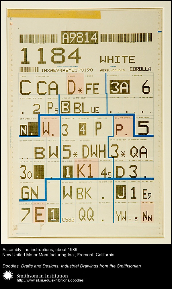
Loving this, already has the tape and everything, so many great details. Could do without the blue lines though. Via FFFFOUND

Loving this, already has the tape and everything, so many great details. Could do without the blue lines though. Via FFFFOUND
1 Comment Leave A Comment
Marcus Evans says:
February 13, 2008 at 3:34 pmThe OCR font (I’m guessing) is really cool and I certainly agree that there are a lot of details in there that are great. I saw the blue lines as a good thing though… It kind of made it more intriguing for me…
Of course the funny thing is it was never designed to make us think it looked beautiful! =)