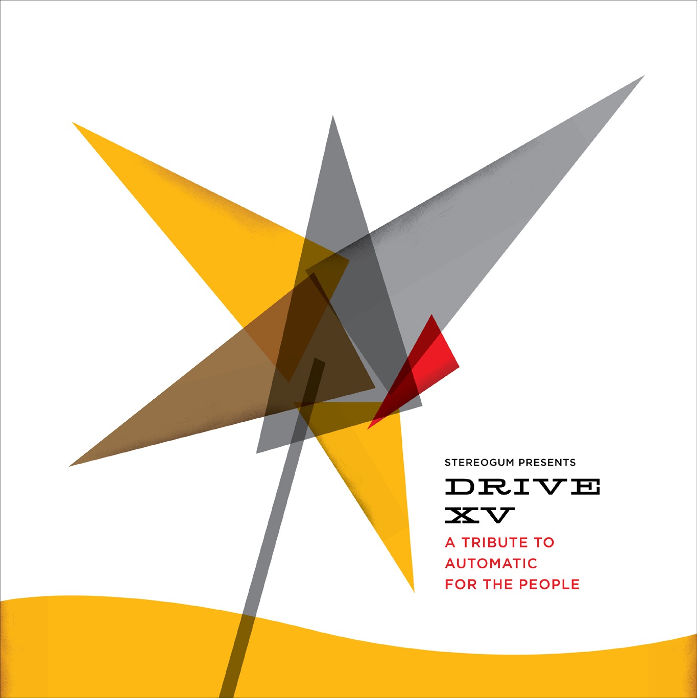
Was talking to the guys from Stereogum today about a design project and they sent me a link to Drive XV, the 15 year Tribute to REM’s Automatic For The People. I remember when Automatic For The People originally came out, it was really something unique at the time, one of my favorites. So apparently Stereogum has designers sort of re-imagine the cover art for the tribute albums and I thought this one came out quite well. Really like the type treatment and minimal approach. You’ll notice that it vaguely follows the form of the original. Bonus: name those fonts
Design aside, the Shout Out Louds’ tribute to Man On The Moon is superb, have a listen below. I hear some Paul Simon Graceland in that chorus, anyone else?
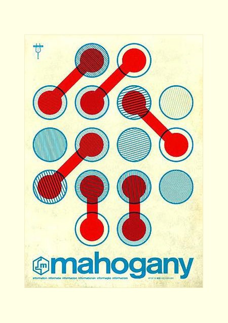
Found this on Mahogany’s Myspace page yesterday. Really nice, unfortunately this is the biggest version they had posted, if anyone has a higher rez copy please send.
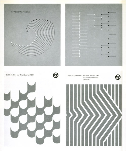
This series of images by Dietmar R. Winkler appeared in Graphis 71-72. It is perhaps the most perfect thing I have ever seen. I would love to reproduce this and print it up large format for my wall. Does anyone know where to find an original full size version? I am posting this from a KFC in Prague at the moment (sadly, it’s the only free WiFi spot in the area), will be posting some pictures soon.
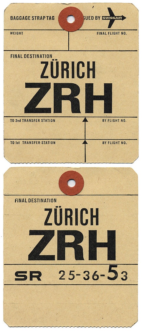
Been posting so much photography lately thought I’d throw in some design related stuff that was also travel related. This has to be the best airline tag I’ve ever seen. Love the "SR" type on the back side. When I saw cool stuff like this back when I was a kid I would always try to take the whole stack. I ended up with boxes of it by the time I left home for college. I think the majority got tossed out over the years, no big tragedy though, I grew up in California so none of it was anywhere near this good. Image via alistairh on Flickr.
I found this a while back and thought today would be as good as any to post it. Happy Holidays!
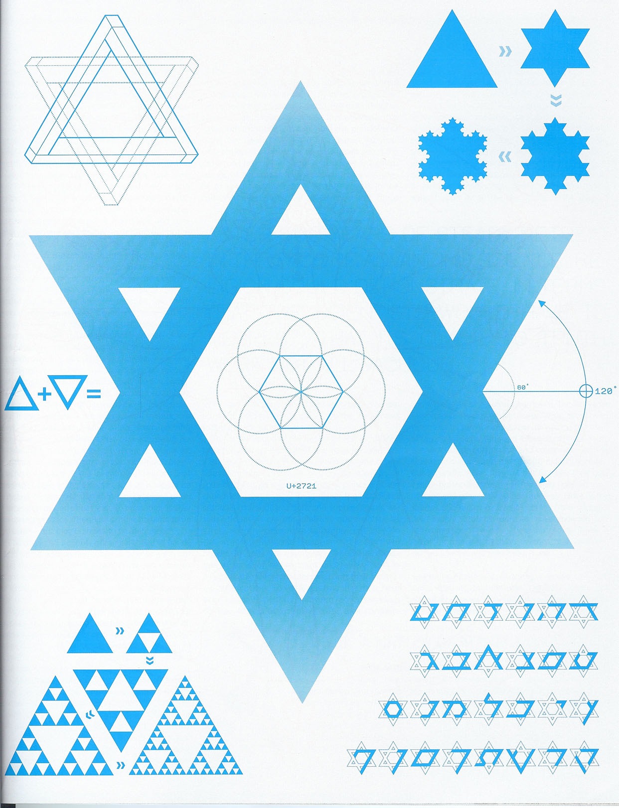
"As illustrated by this chart from the latest issue of Seed, the star patterns we see in Jewish, Islamic and Bahai design reflect how simple rules can give rise to complex patterns, such as the Sierpinski Triangle (lower left) and Koch curve (upper right) fractals. The intrinsic bond between faith and geometry has fascinated religious philosophers for centuries, from Pythagorean mysticism and the Kabbalah to Islamic design and the Gospel of John. In fact, as we’ll be exploring more in depth on my other site, the word "logos" can be translated both as "word" and "ratio." Via The Blingdom of God
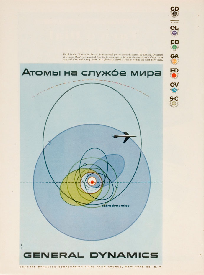
I was having a conversation the other night with some designer friends and we were trying to come up with a name to encapsulate this style (example by Erik Nitsche). I have heard it generally referred to as "modernism" but we wanted something a bit more specific. In particular it should refer to this sort of subject matter; mid-century technical manuals, industry literature, signage, World’s Fair campaigns, Olympics campaigns; basically any design commissioned by an institution or by a company, like General Dyanmics, who doesn’t market directly to the public. I suggested "Institutional Modernism" and I think "Industrial Modernism" was thrown around.
So is there an established term for this sort of design? This seemed like a very unique time in history when a large amount of money and talent were directed at projects which weren’t corporate ad campaigns directly targeted at the general public. I think this fact alone shaped the output and resulted in some of the best graphic design the world may ever see. Whatever the case may be it’s designs like these, more than anything else, that have influenced and informed my own application of typography. It seems that no one has done it better before or since.
FYI: As Vytis quickly pointed out, the headline reads "Atomy na sluzhbi myra" – Translated: “Atoms – serving the world” In a servant-master way…"