Institutional Modernism?
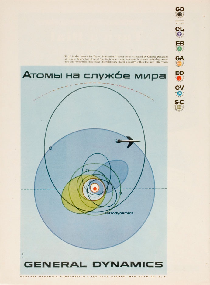
I was having a conversation the other night with some designer friends and we were trying to come up with a name to encapsulate this style (example by Erik Nitsche). I have heard it generally referred to as "modernism" but we wanted something a bit more specific. In particular it should refer to this sort of subject matter; mid-century technical manuals, industry literature, signage, World’s Fair campaigns, Olympics campaigns; basically any design commissioned by an institution or by a company, like General Dyanmics, who doesn’t market directly to the public. I suggested "Institutional Modernism" and I think "Industrial Modernism" was thrown around.
So is there an established term for this sort of design? This seemed like a very unique time in history when a large amount of money and talent were directed at projects which weren’t corporate ad campaigns directly targeted at the general public. I think this fact alone shaped the output and resulted in some of the best graphic design the world may ever see. Whatever the case may be it’s designs like these, more than anything else, that have influenced and informed my own application of typography. It seems that no one has done it better before or since.
FYI: As Vytis quickly pointed out, the headline reads "Atomy na sluzhbi myra" – Translated: “Atoms – serving the world” In a servant-master way…"

9 Comments Leave A Comment
Vytis says:
December 18, 2007 at 4:33 pmAtomy na sluzhbi myra – “Atoms – serving the world” In a servant-master way…
Gareth says:
December 18, 2007 at 6:54 pmIve been thinking about this on and off for a couple of hours now. I don’t know of any existing name for this beyond ‘Modernism’ for categorization.
Institutional modernism works in someways, but I don’t think corporations fit under the institutional umbrella, and the Olympics wouldnt be industrial. Its wordy, but Modernist Commercial Art would be my ungainly “mr obvious” solution :S bleh
Scott says:
December 18, 2007 at 7:06 pmGareth-
I guess I would want to stay away from the word “Commercial”. My favorite examples of this style are, for example, the signs on the engineering building at Cal Poly, or the book cover of a Project Management handbook from the 60’s. I guess I would want a phrase that encapsulated this 60’s ethic of basically spending a lot of time and money designing things that now days wouldn’t even get a second thought and would be designed by a junior member of some state design team….or would be done by a private firm with the lowest common denominator in mind. I guess it’s hard to explain, but it just seems like back then they looked at these things as art, whereas today it’s just about communicating the basics and no one really cares about how it looks. I suppose this could be the function of the medium. Anyone with basic computer knowledge can output a mediocre page layout, whereas back then only highly trained, skilled craftsmen were capable of doing page layout so they may have actually cared a bit more about the output?
drew kora says:
December 19, 2007 at 5:18 amI design a lot of covers for brochures and catalogs. I work for a university. I draw a lot inspiration from this era of design, too. This blog has been an awesome resource for ideas, too.
But I think you’re right, Scott, that today they just want to communicate the basics. Or rather, communicating things in a very literal way instead of thinking out of the box a little more. There’s less interest in something a little more abstract like they did in the 60s because it’s so easy to stick a photo on everything. Believe me, photos have their place, but I have to fight every time I present a cover with no pictures. It’s always “where are the students, why not more color photography, and what are these shapes…?” I’ve gotten to be pretty persuasive these days, but it’s not easy.
Anyway, “institutional modernism” sounds like a pretty good name for this era of design, but I’d almost add “mid-century” to it to make it specific that we’re talking about the 60s.
Gareth says:
December 19, 2007 at 11:05 amScott, I know exactly what you mean, and “commercial” sounds about as crass as “desktop publishing” which, along with the quickening of society, is probably responsible for the poor quality of visual design today.
@drew; I’m surprised to hear that you feel restrained in a university environment, I’d assume that you would have more creative license…Unlike the pure business-to-consumer world where most things are dumbed down and unsophisticated to appeal to the lowest-common-denominator. Maybe you need to get the professors in the art department to back you up and argue for the theoretical and historical value that you are bringing to the table.
Justin says:
December 19, 2007 at 11:50 amI thought you weren’t a ‘design intellect’ as you stated? Just giving you a hard time. Good points.
jayson says:
December 20, 2007 at 7:32 amhttp://telstarlogistics.typepad.com/telstarlogistics/2007/11/flight-thru-ins.html
An example of an earlier style I found, but I think this fits within the same style.
xclvcexkci says:
April 23, 2008 at 6:50 pmWow, cool man, big thanks! http://ujtfnsjbvo.com
Ogi says:
January 6, 2010 at 9:42 amAwesome post, love the design. What font is he using in General Dynamics?