Boulder Print Now Available
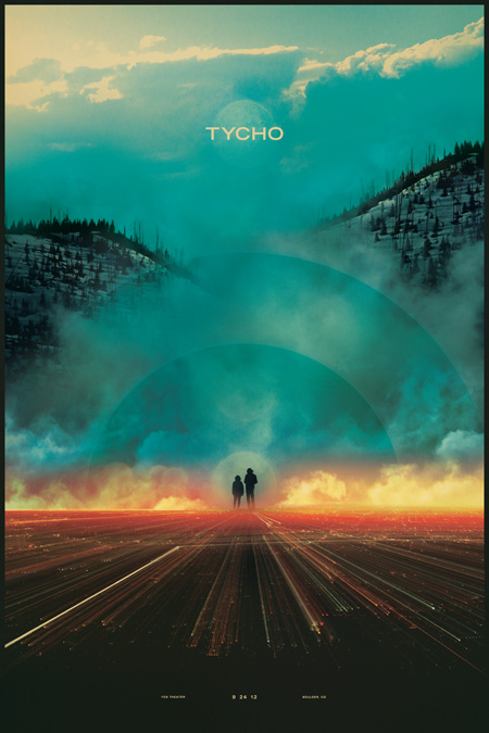
The poster for the Tycho show in Boulder is now available as a signed limited edition lithograph print.
Dimensions : 16″ x 24″
Lithograph on 100# Superfine Eggshell Text, White.

The poster for the Tycho show in Boulder is now available as a signed limited edition lithograph print.
Dimensions : 16″ x 24″
Lithograph on 100# Superfine Eggshell Text, White.
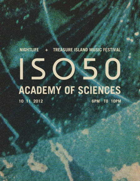
Today, we will have the ISO50 pop shop open for ONE DAY ONLY at the official Nightlife pre-Treasure Island party at the California Academy of Sciences. We will have a merch booth with all new and classic posters and shirts available and Scott will be there to sign and hang out.
NightLife takes place Thursday nights (6-10pm) at the California Academy of Sciences
55 Music Concourse Drive, San Francisco
More information here.
SHIGETO LIVE
Also, there will be a special live performance by Shigeto and a DJ set by me Jakub aka Heathered Pearls. Hope to see you at 6pm, ticket info here.
HEATHERED PEARLS MIX
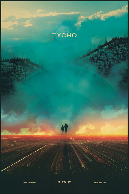
I’ve been waiting for a long time for this show and it’s finally here. Wedsnesday will be the first Tycho show in Boulder, CO and we’re all really excited. So excited that I created a poster specifically for the show. This also marks the first time I’ve designed a print from start to finish on the road (been out here for a few weeks now). The show will be with The Album Leaf at The Fox Theater this Wednesday, September 26th, 2012. Details and tickets here, hope to see you out!
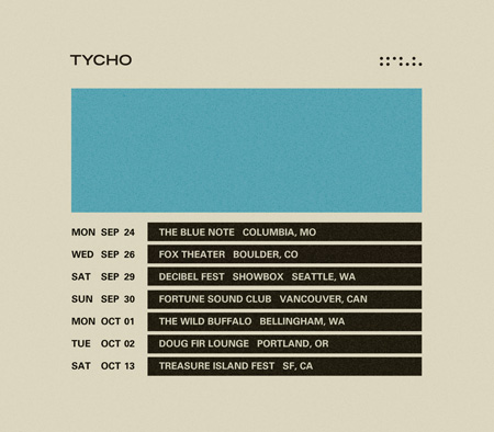
We’re in the home stretch of our Fall Tour with only a handful of dates left. This will likely be the last full Tycho tour for a while as I plan to head back to the studio to work on new material. Thanks to everyone who’s made this past year so special, we’ve had an incredible time travelling around seeing so many wonderful people and places. Hope to see you all again soon!
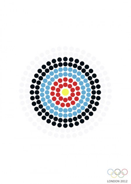
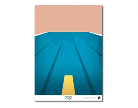
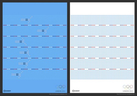
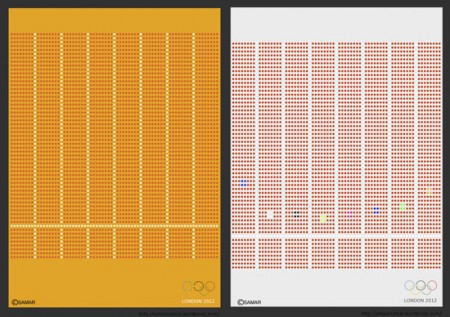

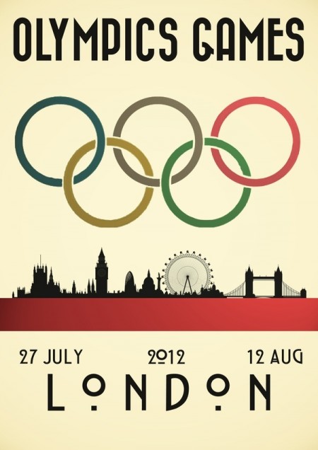
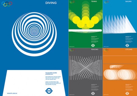
If I was a right out of university for graphic design my first projects for myself before working on my own would be grabbing up a project like this for exercise. The olympics have a great history for amazing posters and branding and fine color scheme to work with so why not see what you could do and test out your skills. I personally like the empty pool swimming ones but the font couldn’t be any smaller which pretty much knocks it out of the running to be a real poster for the public.
via kathykavan

I’ve just returned returned from a trip to both Munich and London, where I spent time with colleagues in both locations. Cosmic timing really, considering the London 2012 Olympics are on the horizon, and I’ve had Otl Aicher on the mind recently.
Much has been said in recent years about the shortcomings of the London 2012 graphic identity, but I hadn’t really been paying close attention to all the outrage, and had all but forgotten the design work – so I wasn’t prepared for the onslaught of Olympic schwag that greeted me at the official London 2012 shop at the St. Pancras Station in London. It’s borderline seizure inducing. Having just stepped off the train from Munich, where I spent time in Olympiapark and was exposed to Aichers work throughout the city, this London 2012 noise was especially jarring. And that mascot! Sigh. I took quite a few pictures, and had originally thought I’d post about Waldi vs Wenlock, but I decided I wouldn’t subject you to any of that madness. After all, this blog is here to celebrate beautiful things.
Scott has extensively covered Aicher’s work for Munich ’72 here before (in fact it’s where I was first exposed to it), but I thought the timing was right for us to be reminded just how amazing a coherent Olympic graphic identity and subsequent merchandising campaign can be.
Creative Review recently posted the above scans of the official Munich ’72 merchandise catalogue, and there are a few images of what look to be the official gift shops as well. While Waldi was the only souvenir that was actually designed by Aichlers studio directly, I find it really impressive how cohesive the entire output of the “Olympic Souvenir” department was. This is most likely due to the fact that Aicher dictated a very strict set of rules as to how the logotype and symbols could be used.
It’s easy to pick apart London 2012 when stacked up against the extremely high bar set by Aicher’s work for Munich, but let’s be real here, remember Izzy from Atlanta? NOTHING is as bad as that. What. Is. That. Thing.
I’m not sure if they entered the competition, but if they did I’d be real curious to see what Bibliotheque came up with for the London 2012 graphic identity. After all, they know a thing or two about Aicher’s legacy, having put together an exhibition of his Munich ’72 work over at the Vitsoe shop in 2007, comprised entirely of posters and print from their their own collection. This unofficial Olympic torch poster they did is pretty amazing as well.
Bonus link: While googling around, I found this site that offers up the official Olympic report books as PDFs. The Munich 72′ books span 3 Volumes, upwards of 1200 pages. For the true Munich ’72 geeks.
Posted by: Rob Fissmer
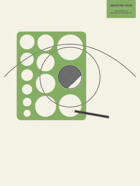
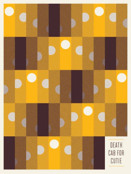
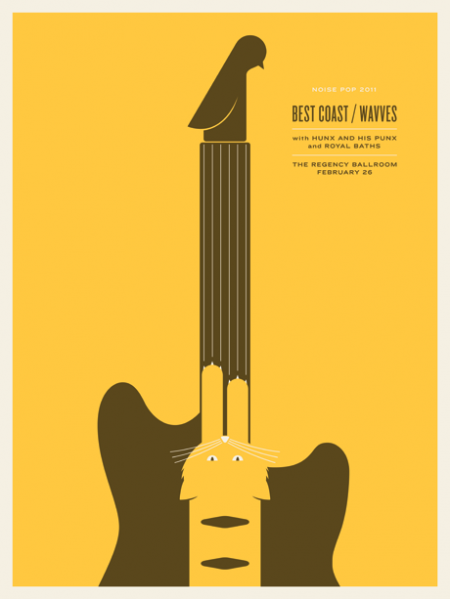
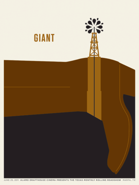
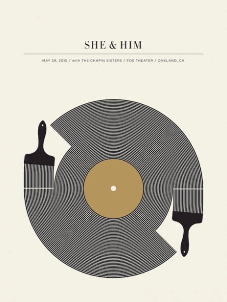
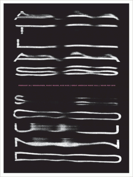
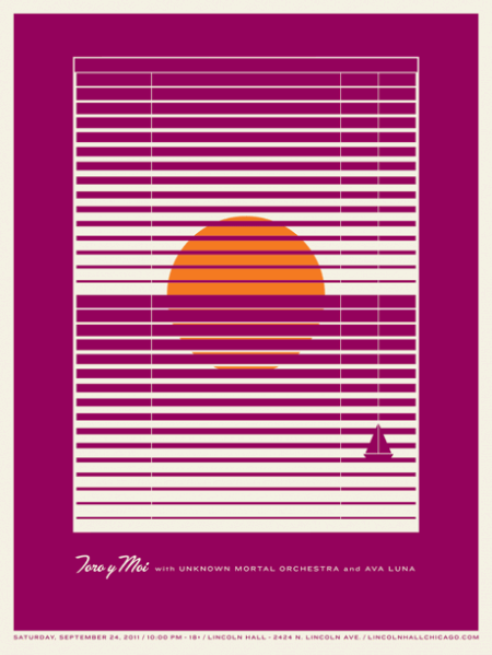
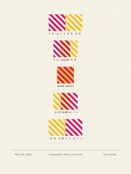
Jason Munn released a few prints for the SFMOMA, i’m definitely a fan like Scott was when he first posted him back in 2009. The new material has great subjects and its a style that people aren’t ever really getting sick of since minimalism and band names on posters are almost as American as Apple Pie.
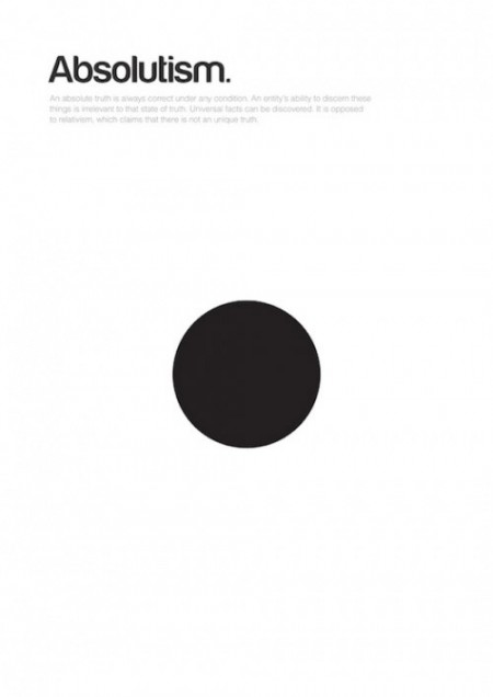
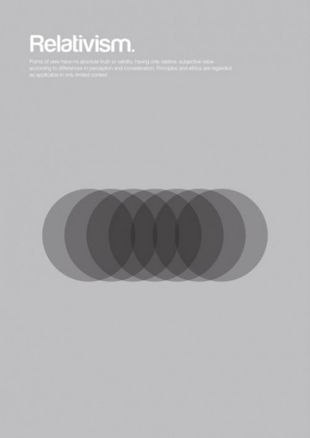
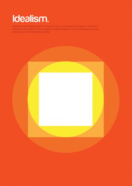
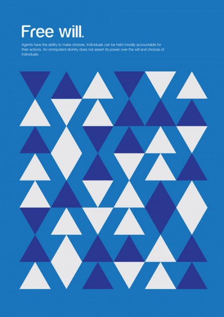
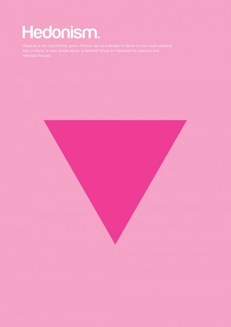
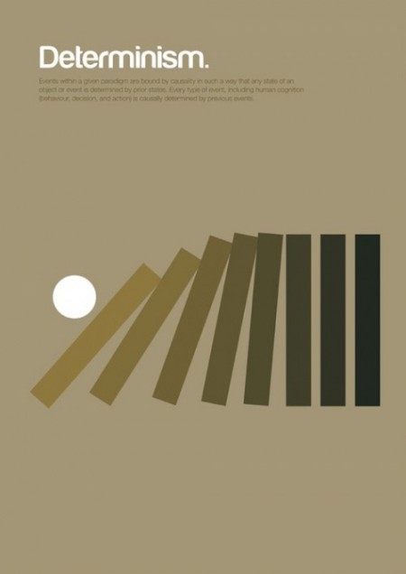
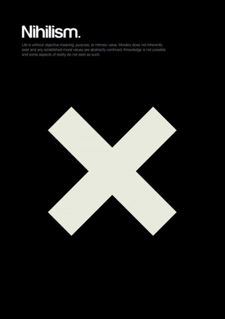
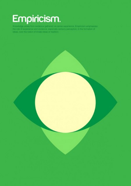
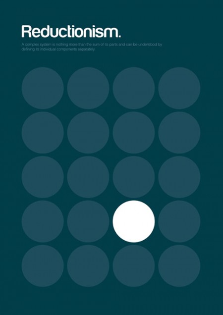
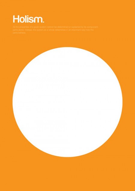


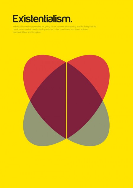
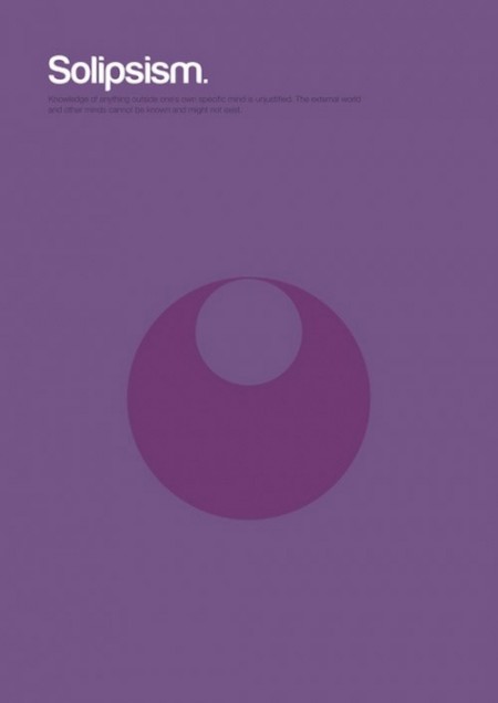
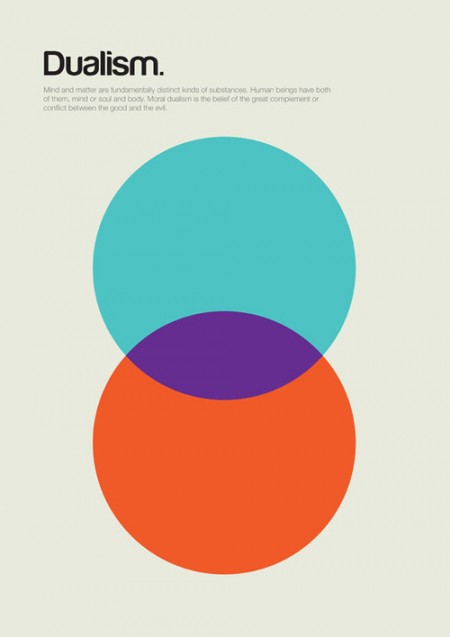
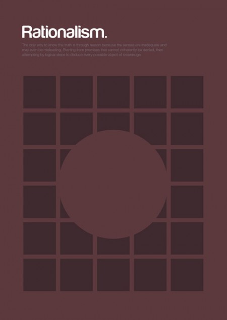
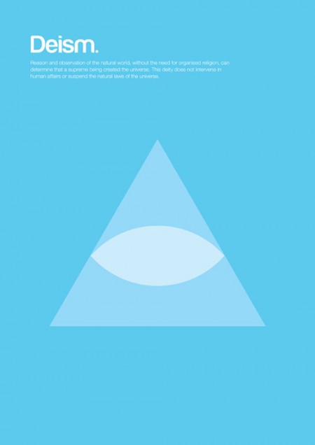



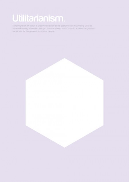
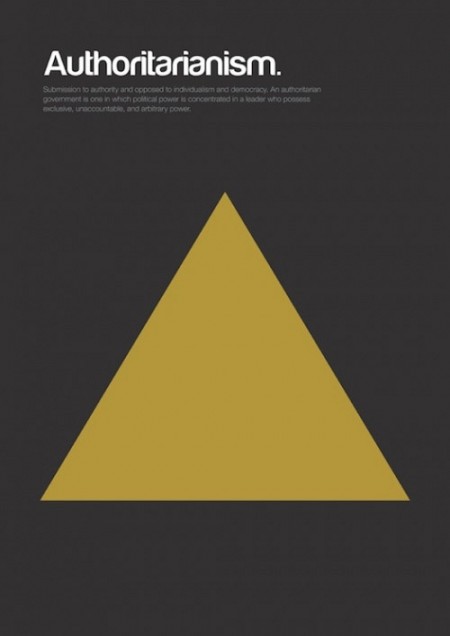
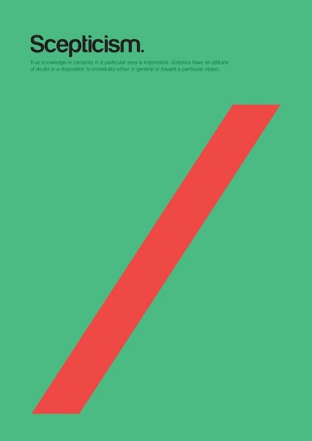
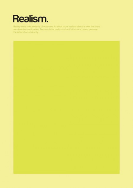
Poster series explaining complex philosophical theories through basic shapes, by London based designer Genis Carreras.
Aside from the posters, there is also a journal from the same series by the name of Philographics (Click on image below).
Posted by B3PO
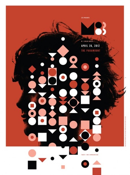
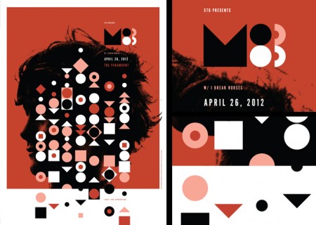
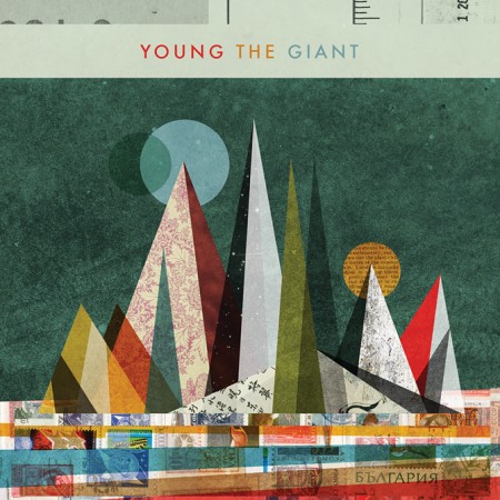
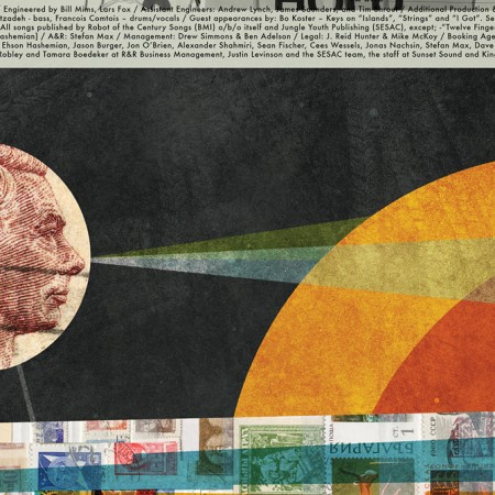
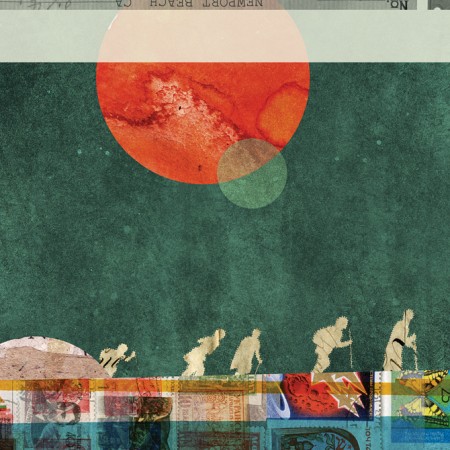

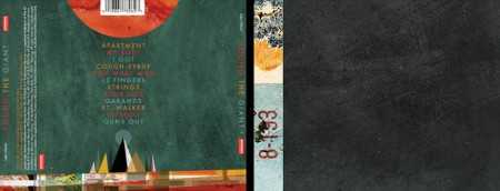
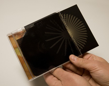
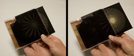
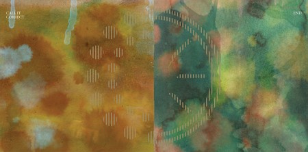
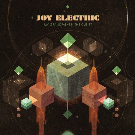

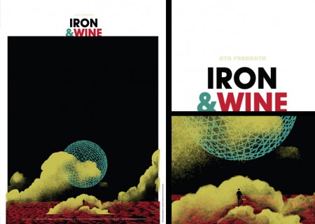

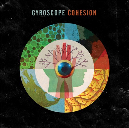
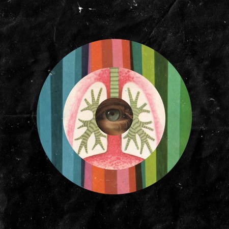
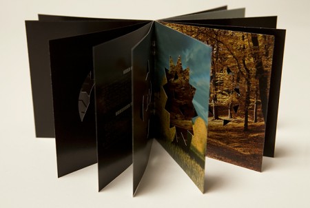
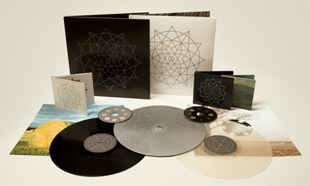

Invisible Creature is a Seattle based design studio comprised by brothers Don and Ryan Clark. From music packaging and band posters, to logos and identity, these guys do it all and they do it well, to the point of even being nominated for 4 Grammy awards for their music packaging.
Really enjoy their great use of textures and clean vectors.
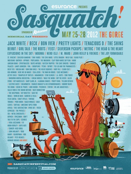
They are also behind the Sasquatch Music Festival identity, which Tycho will be playing at the end of this month, along acts such as Beck, Apparat, Purity Ring, Gardens & Villa, Com Truise, Star Slinger, Active Child, Lord Huron, to name a few.
Posted by B3PO