IBM Smarter Planet Posters
Posted by Scott


Ogilvy Paris turned out some nice looking posters for IBM’s Smarter Planet campaign. Some dicussion of the fonts and more posters over at Fonts In Use.
Ogilvy Paris turned out some nice looking posters for IBM’s Smarter Planet campaign. Some dicussion of the fonts and more posters over at Fonts In Use.


Some selections from Cuban Poster Blog.

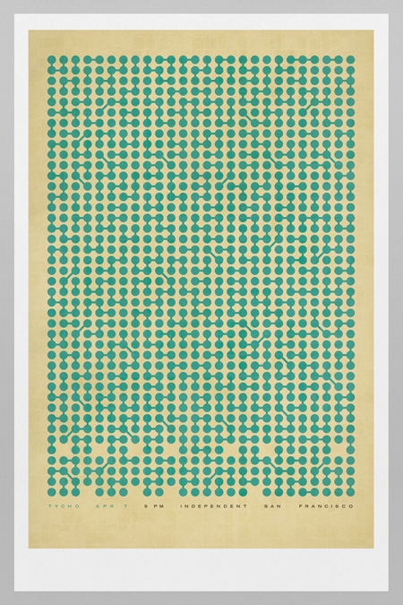
The winners in the Tycho poster + ticket giveaway (for Tycho live in SF 4/7) are in. I decided to add another winner and give everyone posters so there were a total of five posters and six tickets up for grabs. So without further adieu, the winners are:
Colin Johnston – Poster + 2 Tickets
Curtis Joseph – Poster + 2 Tickets
Zac Witte – Poster + 2 Tickets
Christian Lawrence – Poster
Cristina Dennison – Poster
Congrats to the winners, you should be receiving an email with details soon. Please get in touch (talk [at] iso50 [dot] com) if you don’t hear anything within the next few hours. Thanks to everyone for entering, hope to see you Thursday night here in San Francisco.
Note: Winners chosen using Reasearch Randomizer based on comment number.


![]()
![]()

Fire up your Epsons, the Dutch site Memory of the Netherlands has an extensive high-res archive of Wim Crouwell’s work up for your downloading pleasure. All the recognizable classics are in there along with a lot of stuff I’d never seen before. I didn’t know it was possible but I now have even more respect for one of the true masters of graphic design.
That top one is incredible, I’m going to Genuine Fractal that immediately tomorrow and try to get a solid print out of it. On a side note, my friend tried to translate and said it spells out “olanda” so we’re thinking it says “Holland”. Can anyone confirm this?
Memory of the Netherlands Archive via Wanken and Flyer Goodness


Came across these interesting variations of the great Josef Muller Brockmann’s Beethoven poster and was pleased to see the alternate use of negative space. These variations were created during a 100 day workshop by Jessica Svendsen—see more versions here.
Via Designspiration


If you’ve heard recently, the Old Spice guy Isaiah Mustafa is back. His return makes this the perfect time to share with you a project that I (Shelby) completed a few months ago for fun. The goal was to create a refined and informative infographic. At the time of creating this the Old Spice campaign entitled “The Man Your Man Could Smell Like” was in full swing. Wieden + Kennedy were the brains behind the whole campaign and the results of their vision led to an exponential amount of social media buzz, exponentially exceeding the expectations.
The question was how do I design for this. Do I pair the design with what the brand has established or do I take an alternate route? At the time I was heavily inspired by the international typographic style and Massimo Vignelli. This explains for the minimal layout and geometric line angles similar to the New York City subway maps. This direction didn’t come immediately. I had toyed around with various versions that were far from being relevant to Old Spice or being easily readable. Although with the final version having the least amount of information, it felt the most appropriate.
Data was collected from the marketing firm Symphony IRI.
Typeface used: Helvetica Neue Ltd Std


You may remember Mark Brooks’ work for Santamonica from a while ago. Well he’s back at it and this time I’d say he stepped it up another level. There’s a ton of great work for the Barcelona-based apparel company over at Mark’s Behance page. Also check out his great logo section.


I just came across UK based illustrator Mike Lemanski’s work today and I’m so glad I did. A quick browse through his portfolio will leave no doubt this guy is on top of his game. I’m really enjoying his application of the 60’s playful illustration vibe without falling overboard into kitsch. Can’t wait to see more from him.
Via Grainedit (thanks!)