Now onto the brighter side of the NHL logos and branding. The worst logos list was easy compared to the best. I fit in a few into the top just based on necessity ala a well crafted unique font and a aesthetics that the general public would lean towards.
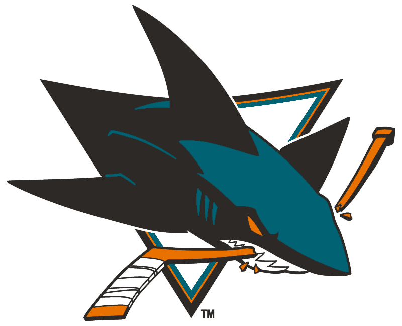
#5 San Jose Sharks
Starting off with the Sharks logo, it has appeal right away to a younger crowd, its fitting for the area the team lives in and it has a modern take which i’m not against. The reason I put it in the top 5 was because it might have that modern speedy look that I might complain about BUT there is reason here, its a shark breaking through a hockey stick, its a fast creature unlike lets say the Blue Jackets logo there was no reason. Also, it looks like someone took the time with the details and pulled it back a bit to find balance and I can appreciate that.
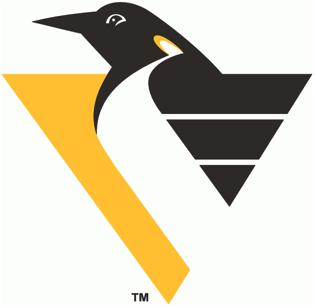
#4 Pittsburgh Penguins
This one might be a hard one to have people agree with me on. I personally thought it was iconic and it simplified the penguins image for the better. The problem I have with the current Pittsburgh Penguins logo are the old school equipment he’s wearing, if it was more timeless i’d probably like it more. I love the wings here and the bit of yellow on the neck, it shows off that detail is doable in a simple logo.
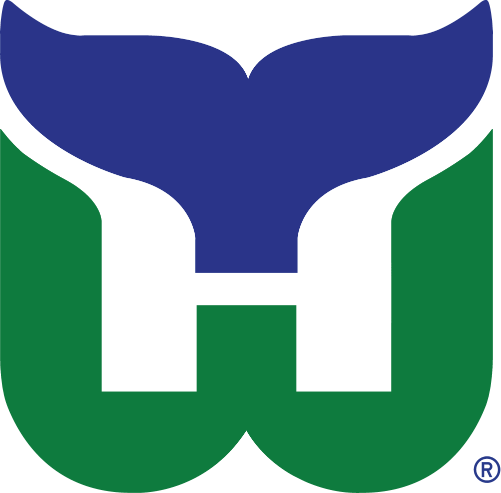
#3 Hartford Whalers
Classic. Hands down maybe the best executed sports logo for a designer that has to work under the these circumstances: a whale mascot and a team called the Whalers. Do you see the H for Hartford? And we thought the FedEx arrow was special. What a fluid effort, too bad they are now the Carolina Hurricanes, who have a horrid brand.
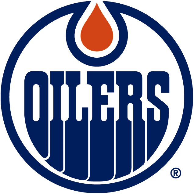
#2 Edmonton Oilers
So you’re getting paid to do a logo for a sports team, probably a dream job for many designers. You’ll probably want to make it your own and be remembered for your best effort, right? so probably on the top of your list would be a custom font and this designer knocked it out of the park.
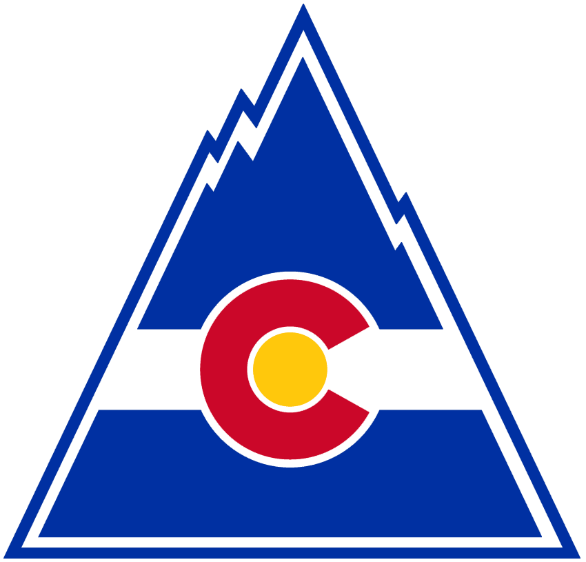
#1 Colorado Rockies
When you can take the States flag and transplant it into a team logo and hand in something literal but also create something that can look great on any piece of merch then i’m all in. The designer that created the MLB Colorado Rockies probably will always feel 2nd best. This is bold, grabs your eyes, its for all ages, a city can be proud of it, the uniforms looked out there but one of a kind.
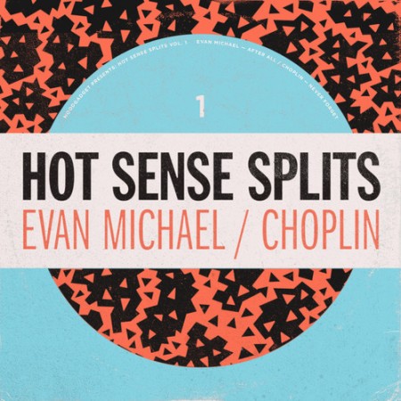
Started a new disco edit series on Moodgadget, we’re actually taking demos(info below), i’ll keep posting them on the blog, with art direction from longtime ISO50 commenter H34dUp.
Moodgadget presents a new series of split singles, featuring disco edits from Brooklyn Bass helmsman Evan Michael, and introducing the secret edit project of veteran Moodgadget designer, Alex Koplin, as Choplin. An update to one of the SOS Band’s classic hits, “After All” adds a bass heavy push and pull with minor chords and glitzy arpeggiation creating a new dynamic. “Never Forget” presents a re-working of Dexter Wansel honing in on an impeccable groove you might have inadvertently passed over in the original. – Moodgadget
To submit a demo to the series: info at moodgadget dot com
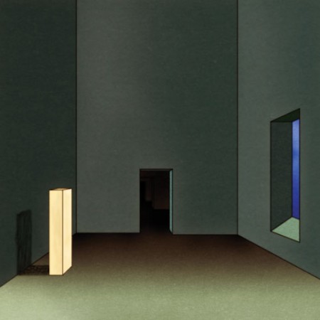
This has been one the most outstanding branding for a release/musician i’ve ever seen. The vision for Oneohtrix Point Never’sR Plus Seven album has pristine art direction touching on early 90’s european surrealism which I have a have such a soft spot for. The main stand out is this video by Takeshi Murata, if you haven’t seen it yet then I highly recommend it, its like still life 2.0.
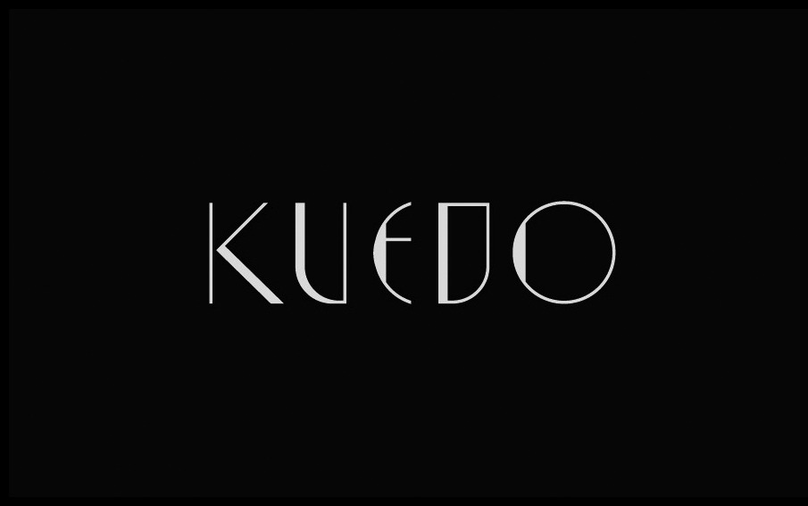
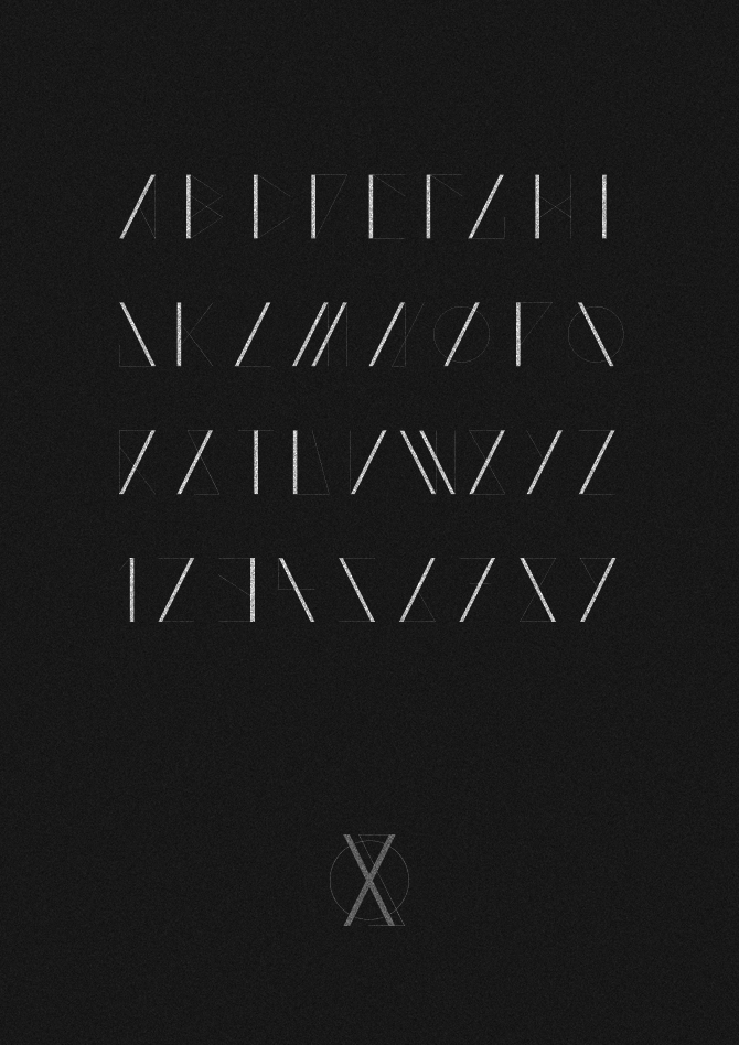
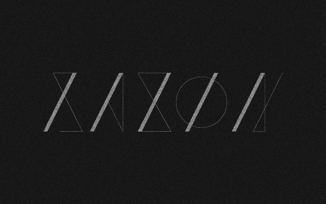
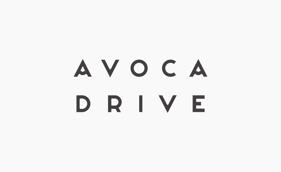
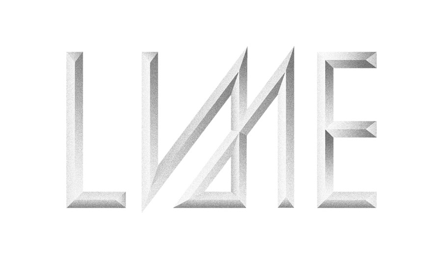
Sam Chirnside does some great font branding for musicians, I dug a little deeper into his catalog and grabbed up most of them. My favorite has to be the AVOCA type, its those subtle clean changes that takes the uniqueness up more than just a few notches.
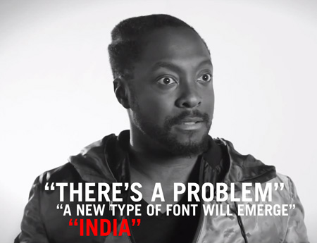
I dare you to watch this all the way through; I still haven’t made it. Is this a joke? If so, who’s in on it? I have to imagine that someone at WSJ, at some point between filming and uploading the video to Youtube, realized this man was completely insane but just decided to roll with it. Either that or Will.i.am has an incredible sense of humor and this is just the first in a series of hilarious lectures where he just fires off random thoughts from the top of his head about various topics ranging from foreign policy to automotive design.
Who thought it would be a good idea to interview Will.i.am about logo design in the first place? What was that whole thing about India? So many questions…
To make it easier on you I’ve distilled the wisdom of this video down to some key concepts you need to be familiar with when developing a logo: “The New World”, “What India is going to do to the world”, “English, but with a different alphabet”, “Problems”, “Don’t use the word brand”, “New types of fonts”.
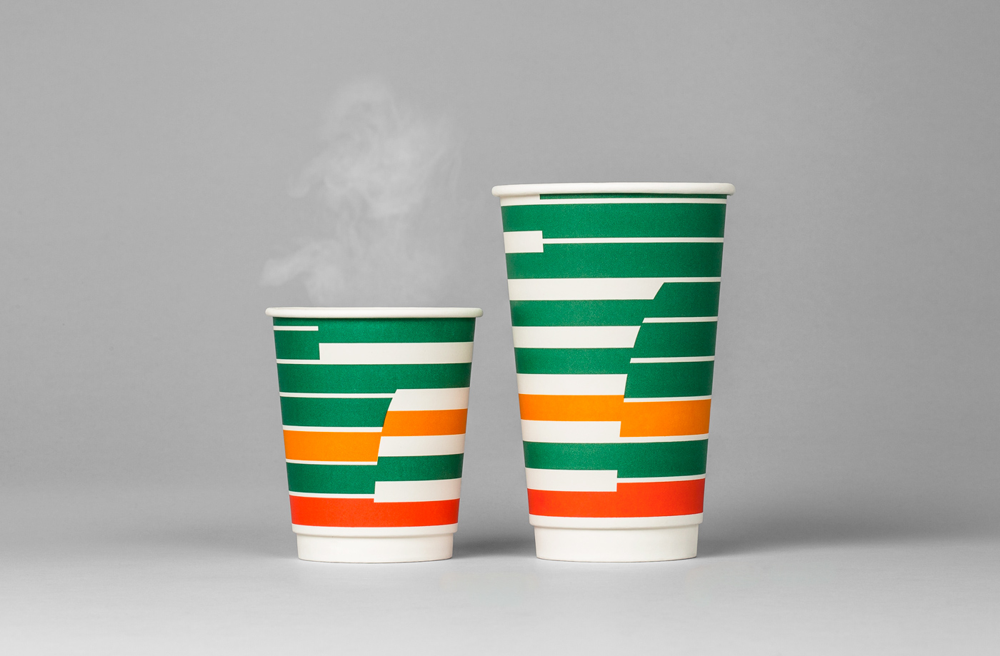
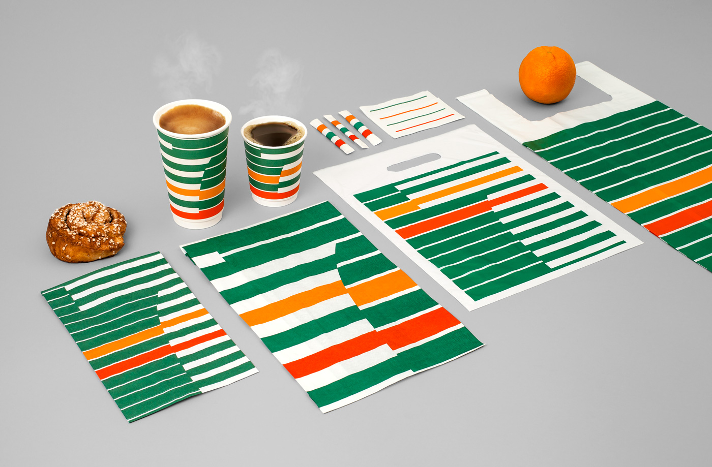
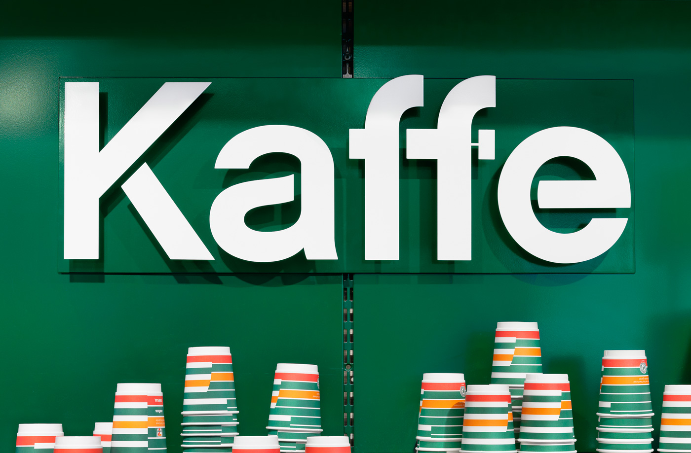
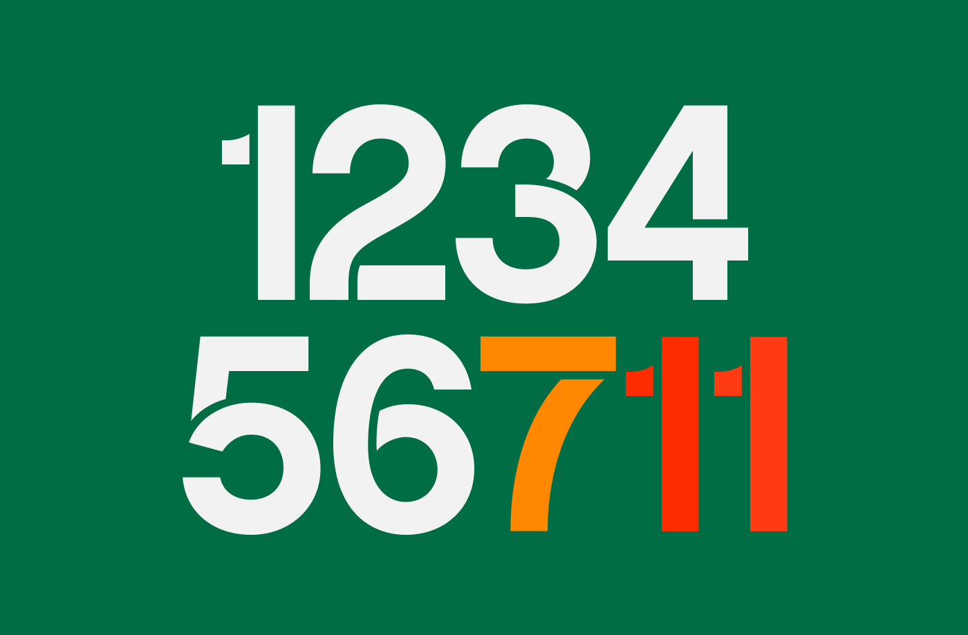
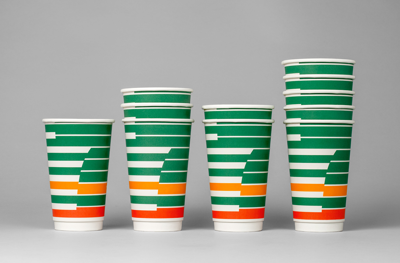
BVD perfectly executes a rebrand for 7-Eleven in Sweden, look at that cup! Projects like these serve as excellent reminders that even an experience as steeped in mediocrity as patronizing a 7-Eleven can be made desirable through good design. I suddenly have a craving for bad coffee.
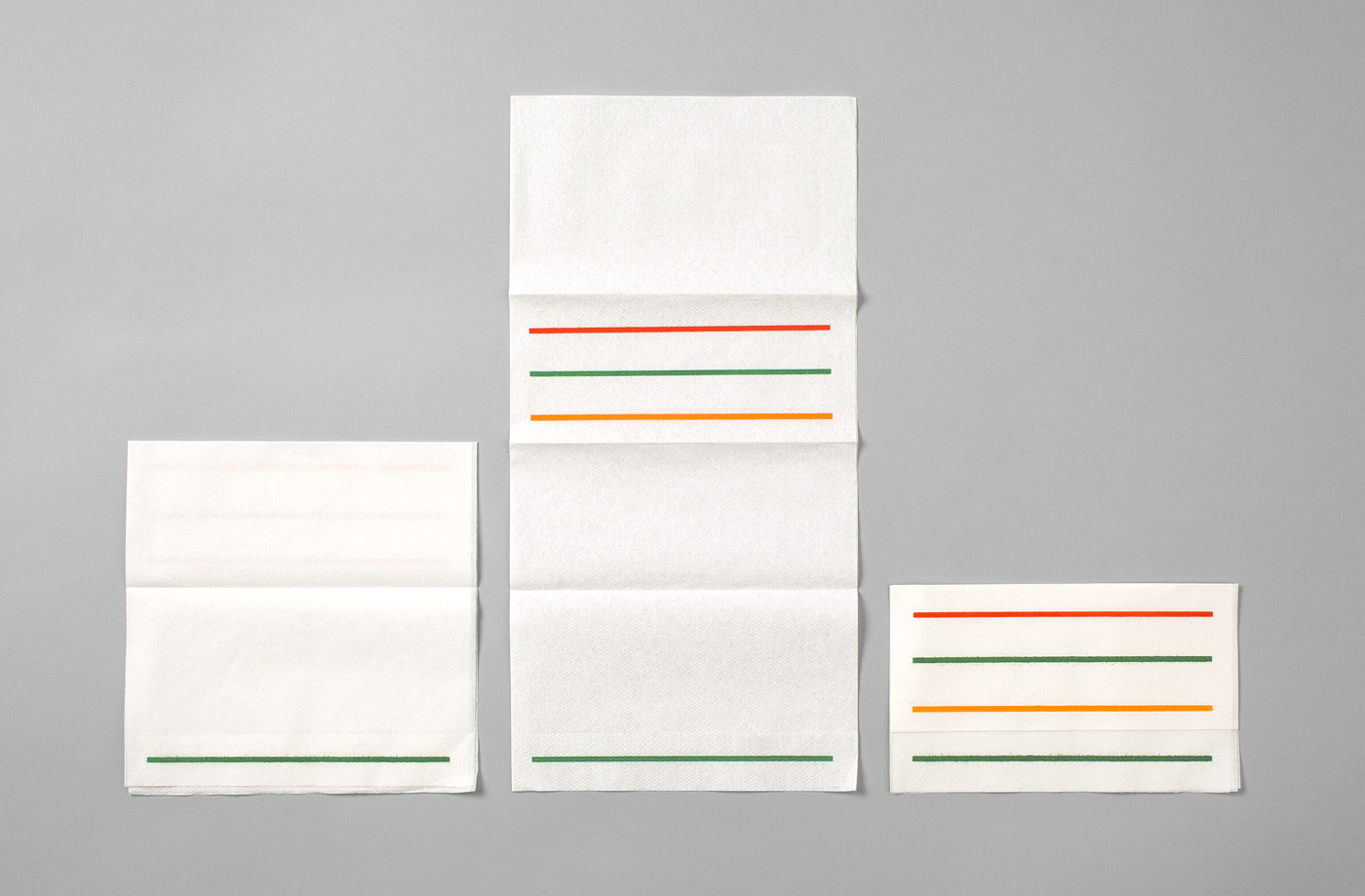
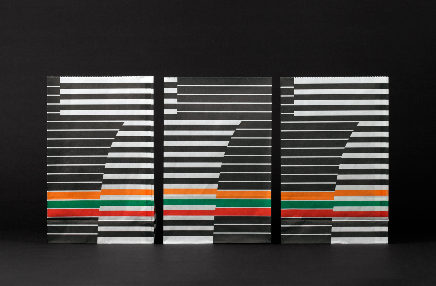
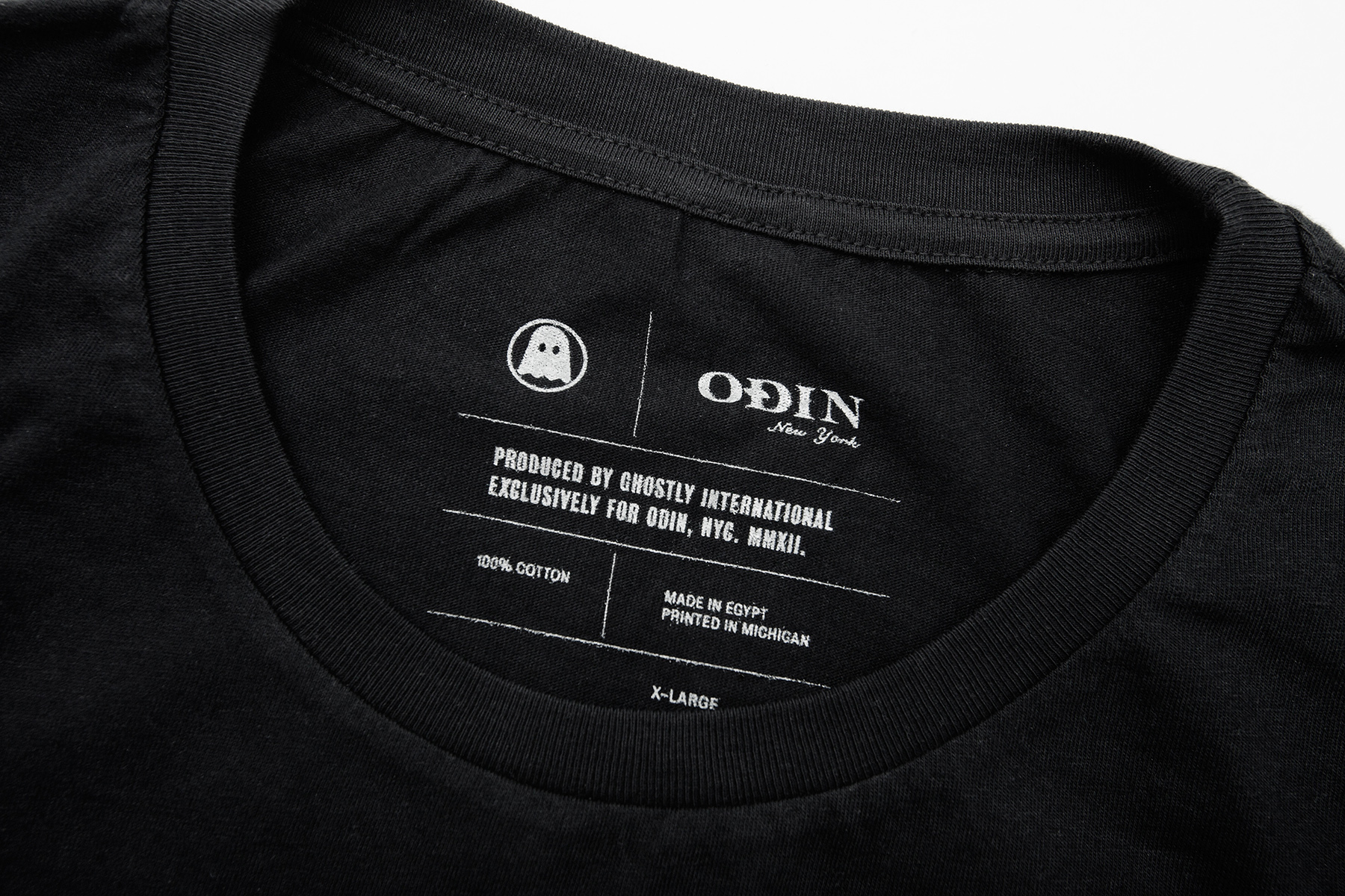
Ghostly has always pushed the boundaries beyond being just a record label, recently for a limited time in New York they have paired up with the handsome boutique Odin and opened a shop carrying everything from the Ghostly catalog on vinyl, to limited editions shirts, headphones and some of the nicest office supply that you need to see and hold in person. The address is below, i’ll be behind the counter this Sunday, stop by and say hello, we have Tycho – Dive vinyl and a Charles Bergquist poster that is pretty amazing in person.
We are thrilled to announce our first collaboration with the renowned New York men’s boutique Odin. Now through January 6th, Ghostly fans living in New York (or visiting) can stop by our temporary space beside Odin’s original East Village store and shop from a specially curated selection of Ghostly art, design, graphic tees, and vinyl.
Ghostly at Odin features a collection of some of our favorite limited edition prints, offered both framed and unframed. In addition, the collaboration includes a small co-branded capsule collection of our graphic tees, some never before available. The space is rounded out with our favorite design objects, selected with a mind for holiday gifting.
Ghostly at Odin
330 East 11th Street
(between 1st and 2nd Avenue)
New York, NY 10003
Now through January 6th
Hours of operation:
Monday-Friday 12 PM – 8 PM
Sunday 12 PM – 7 PM