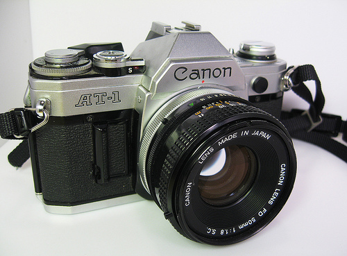
Li Hui or Hui+ as I’ve also seen referred to as, is a self-taught Chinese photographer who creates moody, often double-exposed, dreamscapes using a couple film cameras: Nikon FM2 & a light-leakedCanon AT-1. What apparently started off as a hobby to fend off loneliness, has turned in to a career.
Image Blender is my go to app for blending and masking but I was getting frustrated using the brush tool to mask a straight line, then it dawned on me that I could use a solid black or white image to “knock out” the part I wanted to be transparent (or in this case to be opaque). Once I blended down the solid black or white I could bring the image back in and use the blending modes to get the transparency.
The screenshots above show this process. The original photo was the edge of a window frame. I overlaid a blank white image at four different angles. I then flipped it and blended it over the mountain photo. Tip: Swipe to the right to move and rotate the image and then from the main screen tap and hold to flatten down, switch images or copy. I did the final color adjustments in picfx, another go to app for me. If you have any other Blender tricks post them below!
Norman Seeff has photographed some of the greatest legends of our time. One of my favorites was Steve Jobs. Seeff was able to photograph Steve both in the work environment with the Apple team, but also in Steve’s home.
In captions that support these images, which can be read on his website, Seeff recalls how Steve surveyed his work before he was comfortable enough to allow him to come to his home. This photoshoot would in turn produce one of the most iconic portaits of Steve Jobs of all time.
The Impossible Project launched the Impossible Instant Lab via Kickstarter, which is designed to transform any digital image via your iPhone into an instant photo that is exposed using only the light from the display, then processed and developed by chemicals. A photo that no longer needs an electronic device to be seen.
What are everyone’s thoughts on this? Is a photo just a photo, or…?
3. Cropped and mirrored and layered in Image Blender
1. Initial Photo of some shadows in a corner (taken with Stilla)
2. Cropped and mirrored
3. Final Image layered in Image Blender
1. Initial photo of some stairs
2. Mirrored (you may notice a habit here)
3. Final image layered in Image Blender
The first photos I started using in my designs were simple textures. (we’ve all seen the explosion of texture sites out there) but lately I’ve been using photos to get shapes that typically I would have drawn before. This has been largely driven by having a decent camera in my pocket at all times, allowing me to capture random staircases or light hitting the corner of an architectural feature just right. I find the natural light and texture in photographs have so much more depth in the final product then what I can come up with in photoshop …and its much easier to get to the end result.
I’m really loving the beautiful tranquility of Hungarian photographer Akos Major’s photos. I really admire photographers who can achieve such a crisp, light tone in their images. When I look at Akos’ photographs, I can feel the solitude and cold air in these photos and in some, I can almost taste the air. They remind me of the quiet winter nights growing up in Wisconsin. Still to this day one of my favorite things to do is lay out in the woods while it’s snowing and listen to the snow flakes pelt the fabric on my jacket and surrounding trees.
To view more of Akos Major’s work, check out the photographer’s website:
My friend Cameron Ballensky has been in town visiting for a few days, so we’ve been out and about shooting loads of film. Me, mostly 35mm, him Polaroid. After seeing some of the unpredictable results yielded by certain films he uses, I was really turned on by the idea of exploring this format myself (also two of my favorite photographers, Reuben Wu and Neil Krug, have inspired this in me as well). Cameron mostly get’s all of his film through The Impossible Project, a company that now produces Polaroid film, and as I was exploring their site, I came across the beautiful work of Chloe Aftel, a Los Angeles based photographer and film director.
Browse through her beautiful body of work on Flickr.
Chloe is also part of The Impossible Project’s launch of a new instant film material for 8×10 cameras (image below). More info can be found here.
My name is Michael Chase, creator of Area of Interest. Today, as a guest on ISO50, I’ll be going into the process of how I create an image.
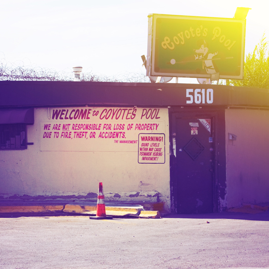
Shooting location
The first part of creating an image is finding a good location to shoot. It was difficult to tell if Coyote’s Pool was still open for business because it was so run down. Paint was flaking badly from underneath the awnings. All the old banners were sun bleached and fraying. Barbed wire covered one side of the roof which I assumed was to keep bar patrons from climbing onto the establishment. As I walked closer to the building I began to wonder if “Coyote’s Pool” was slang for public outdoor toilet based on the smell of it. I was sure it would yield some great textures and there were plenty.
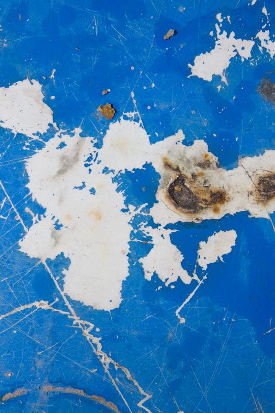
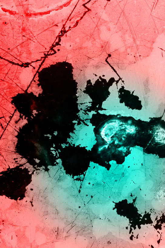
Original photo
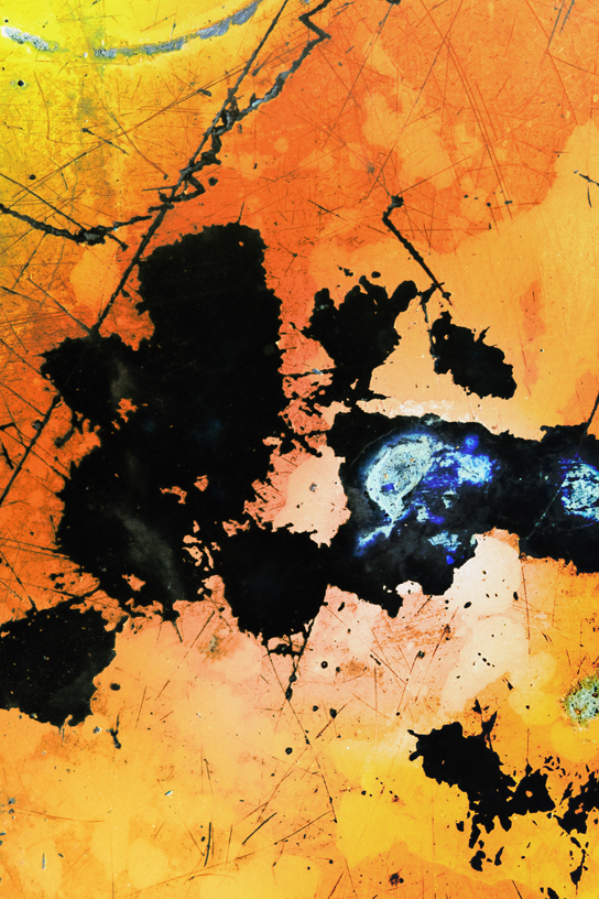
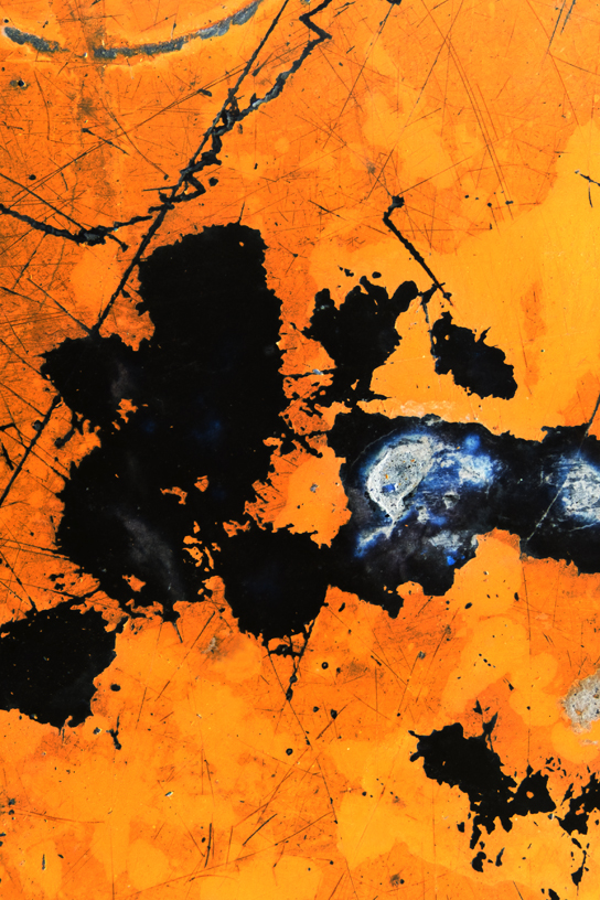
Some of the most fascinating textures were on the tables in the patio area. This is the original image taken from one of the tables. I’m always on the lookout for cracks, splits, flakes, discoloration, residue, splatters, splotches, and other signs of decay. I use these sorts of textures to highlight the subject of impermanence which is the central theme of my work.
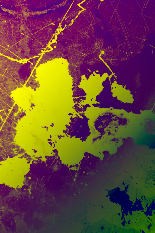
Inverted and flipped
Occasionaly I’ll dramatically alter colors and levels while editing to give myself ideas of which direction I’d like to go next. Sometimes a simple thing like flipping an image or inverting colors can spur me into a completely new direction.
Gradient layer 1
Lately I’ve been working a lot with layering filters and gradient fills. I’m fond of the unusual color combinations that I’ve stumbled on which can really make an image pop.
Gradient layer 2
I tend to make a mess and work backwards. Once I’ve gone too far I’ll strip back until I find a good balance. I know I’m close to being done when I keep returning to the same image over and over. Then it’s subtle level, hue, and lighting tweaks here and there to give the image the atmosphere and mood I want to present.
Animated
Here’s a time lapse of the entire process.
Thanks to Jakub and ISO50 for letting me stop by and do this guest post.
")
")
")
")
")
")
")
")
")
")
")
")


")
")
")
")
")
")
")
")
")
")
")
")
")
")
")
