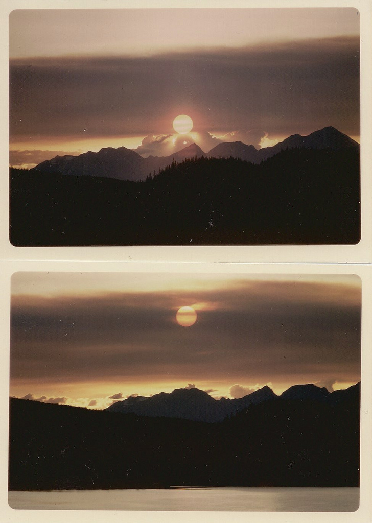
I’m really loving the beautiful tranquility of Hungarian photographer Akos Major’s photos. I really admire photographers who can achieve such a crisp, light tone in their images. When I look at Akos’ photographs, I can feel the solitude and cold air in these photos and in some, I can almost taste the air. They remind me of the quiet winter nights growing up in Wisconsin. Still to this day one of my favorite things to do is lay out in the woods while it’s snowing and listen to the snow flakes pelt the fabric on my jacket and surrounding trees.
To view more of Akos Major’s work, check out the photographer’s website:
My friend Cameron Ballensky has been in town visiting for a few days, so we’ve been out and about shooting loads of film. Me, mostly 35mm, him Polaroid. After seeing some of the unpredictable results yielded by certain films he uses, I was really turned on by the idea of exploring this format myself (also two of my favorite photographers, Reuben Wu and Neil Krug, have inspired this in me as well). Cameron mostly get’s all of his film through The Impossible Project, a company that now produces Polaroid film, and as I was exploring their site, I came across the beautiful work of Chloe Aftel, a Los Angeles based photographer and film director.
Browse through her beautiful body of work on Flickr.
Chloe is also part of The Impossible Project’s launch of a new instant film material for 8×10 cameras (image below). More info can be found here.
My name is Michael Chase, creator of Area of Interest. Today, as a guest on ISO50, I’ll be going into the process of how I create an image.
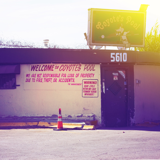
Shooting location
The first part of creating an image is finding a good location to shoot. It was difficult to tell if Coyote’s Pool was still open for business because it was so run down. Paint was flaking badly from underneath the awnings. All the old banners were sun bleached and fraying. Barbed wire covered one side of the roof which I assumed was to keep bar patrons from climbing onto the establishment. As I walked closer to the building I began to wonder if “Coyote’s Pool” was slang for public outdoor toilet based on the smell of it. I was sure it would yield some great textures and there were plenty.
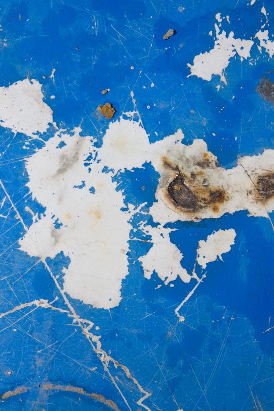
Original photo
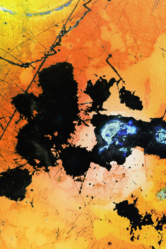
Some of the most fascinating textures were on the tables in the patio area. This is the original image taken from one of the tables. I’m always on the lookout for cracks, splits, flakes, discoloration, residue, splatters, splotches, and other signs of decay. I use these sorts of textures to highlight the subject of impermanence which is the central theme of my work.
Inverted and flipped
Occasionaly I’ll dramatically alter colors and levels while editing to give myself ideas of which direction I’d like to go next. Sometimes a simple thing like flipping an image or inverting colors can spur me into a completely new direction.
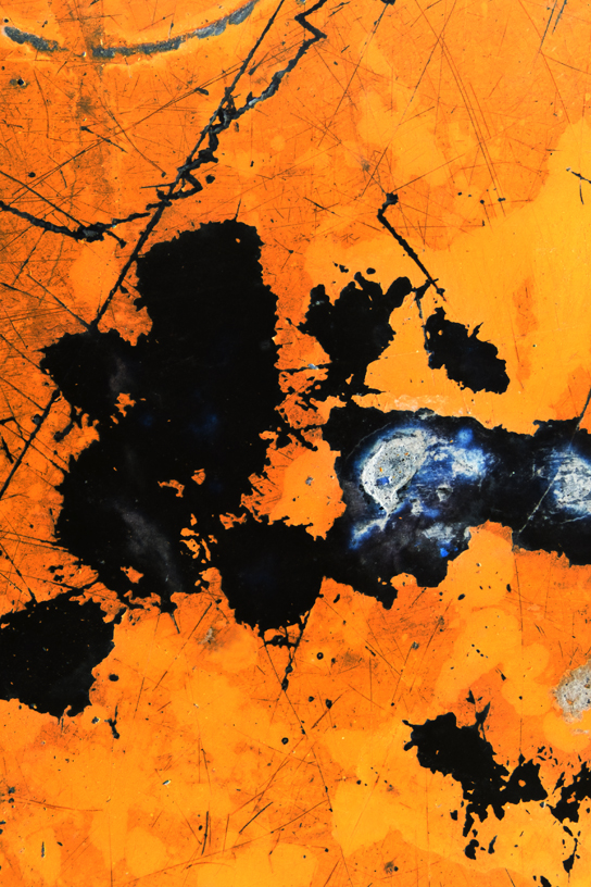
Gradient layer 1
Lately I’ve been working a lot with layering filters and gradient fills. I’m fond of the unusual color combinations that I’ve stumbled on which can really make an image pop.
Gradient layer 2
I tend to make a mess and work backwards. Once I’ve gone too far I’ll strip back until I find a good balance. I know I’m close to being done when I keep returning to the same image over and over. Then it’s subtle level, hue, and lighting tweaks here and there to give the image the atmosphere and mood I want to present.
Animated
Here’s a time lapse of the entire process.
Thanks to Jakub and ISO50 for letting me stop by and do this guest post.
Ghostly International and Art Directors Club collaborate on an exciting 4 day event in New York City this September showing the diversity in their artistic roster. Below is the information and schedule on what to catch and make sure to get your tickets soon, this site just launched today.
ABOUT THE EVENT
The Ghostly universe has been steadily expanding since its humble beginnings in Ann Arbor, Michigan in 1999.
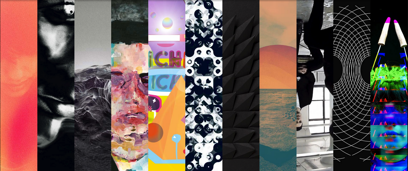
The Art Directors Club begins its CRE8 series of music and art focusing on Ghostly International, a unique culture identity that has helped elevate the careers of visual artists including Michael Cina, Sougwen Chung, Andy Gilmore, Will Calcutt and Matt Shlian, while releasing work from musicians such as Matthew Dear, Com Truise, Gold Panda, Lusine and School of Seven Bells.
The Ghostly aesthetic and it’s accompanying ethos has always sought to cast off the restrictions of genre and form. An assertion that creativity, in its apolitical nature, is an act worth striving to achieve. Unconcerned with classification, Ghostly highlights the act of making in and of itself, no matter the medium.
In 2010, Ghostly launched Ghostly International Editions, a “label” of artwork and artists that has grown into a collective of some of North America’s best designers and artists.
Of Art and Artifice is not a retrospective—it is a comprehensive state of the union, a peek into what’s next after 13 years of creativity from Ghostly International, creating an essential selection of work from the Ghostly family into a never-before-seen collection.
ABOUT THE ART DIRECTORS CLUB
Founded in 1920, the Art Directors Club is the premier organization for leaders in visual communication, boasting one of the most concentrated groups of creative talent in the world. A not-for-profit membership organization, the ADC’s mission is to connect creative professionals around the globe while simultaneously provoking and elevating world-changing ideas.
SCHEDULE
Thursday
September 13th / @6pm
Opening Gala
Live music performances by:
→ Com Truise
→ Lusine
→ Michna (DJ)
Live projection performance by:
→ Sougwen Chung
Friday
September 14th / @6pm
Artist Talks Day 1
Hosted By Incase:
→ Michael Cina
→ Andy Gilmore
→ Will Calcutt
Saturday
September 15th / @6pm
Artist Talks Day 2
Hosted By Incase:
→ Matthew Shlian
→ Timothy Saccenti
→ Sougwen Chung
To play the media you will need to either update your browser to a recent version or update your Flash plugin.
Mushroom Projects has been a favorite lately, the original mix of this single that 40 Thieves remixed is almost 17 minutes, I imagine the recording jam session might last days.
Knxwledge released his latest via bandcamp, closest J Dilla feel since Bullion.
With Tokimonsta and Hundred Waters both on a train together touring the US with Skrillex collabs obviously are a natural result. This one out of all of the ones floating around sounds the best to me.
Tensnake posted this floor filler today on his fb, Diva House vocals in full effect in 2011-2012, if you can do Diva House vocals you could be sitting on a million dollars this year if you play your cards right.
To play the media you will need to either update your browser to a recent version or update your Flash plugin.
Daphni seems to be taking the front seat ever since Caribou got of the tour curcuit, the organic sample based material seems to be turning into darker bangers at higher tempos, i’m really into but i’m not sure how others are feeling, the listeners that expect precious Caribou sugariness.
Its like digging thru my old disco house records, Bob Sinclair jazzercise samples with full on disco strings, the tambourine has never been mixed louder with that the release cut out completely, Tom Trago I hope you know your history though, good dance floor cut.
Nashville is quickly releasing a handful of 80’s flashback artists, i’ve found 3 good ones in the past couple months, I don’t know if it was the Drive Soundtrack or Cut Copy just reached Middle America, I really adore this one from Future Unlimited.
NPR just stamped this on LA’s Daytime Disco duo Poolside with: “one of the most played albums at the station for almost a month now”
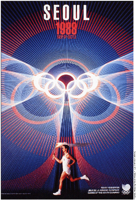
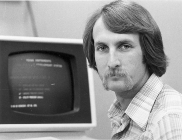
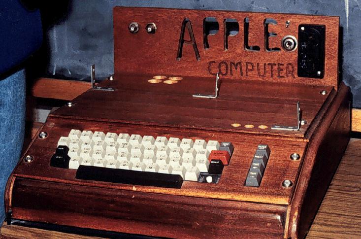
Ah, the 2012 Summer Games, now nothing more than the hazy recollection of infinite spoilers and borderline mental illness. While the overall visual presentation wasn’t quite as bad as a lot of people built it up to be (it was certainly better than this bullshit — but not this), London 2012 was an Olympics whose branding I seriously doubt designers will still be going on about 40 years after the fact. Perhaps it was just too advanced for our feeble 21st century minds to comprehend, so to ease us back into our stasis of perpetual nostalgia I present some more universally agreeable fare, from the simpler age of 1976, when everything happening in this picture was perfectly acceptable and also this crudely fashioned chunk of internet-free wood was your computer.
The 1976 Montreal Olympics branding sits right up there with Munich (my personal favorite) and Mexico on the pantheon of graphic design’s greatest achievements. I’m curious to see which of the more recent Olympics — if any — ends up being canonized by the design community in years to come. From the looks of things we shouldn’t hold our collective breath, it’s all been downhill since 1984.


")
")
")
")
")
")
")
")
")
")
")
")
")
")
")


