Just a little Sunday theme music in the form of Jeff Buckley’s hauntingly beautiful cover of Leonard Cohen’s classic "Hallelujah". Always sad to think such a talent is no longer with us.
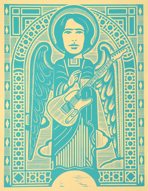
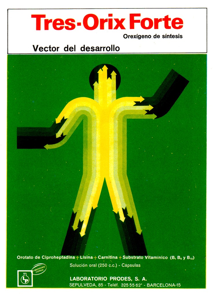
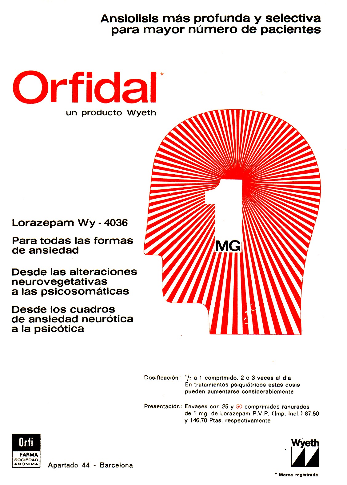
I’m always amazed by the number of pharmacies in Spain (they’re everywhere) and also by the package design of the products in the pharmacies. They aren’t quite as good as these examples anymore, but still a whole lot better than we have in the states.
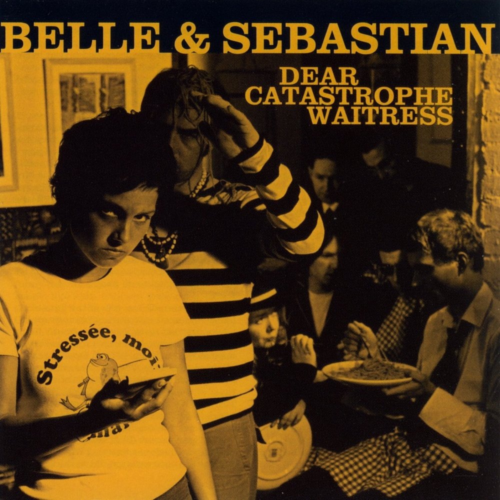
In keeping with the holiday (does this count as a holiday?) I thought I’d post a song from Belle & Sebastian (everyone’s favorite Scottish indie-folk outfit and perhaps my favorite band). I’ve always loved their album covers, usually very simple duotone photos depicting something to do with the album title. Always classic and fitting for the style of the music. I’ll be posting more from them in the coming weeks.
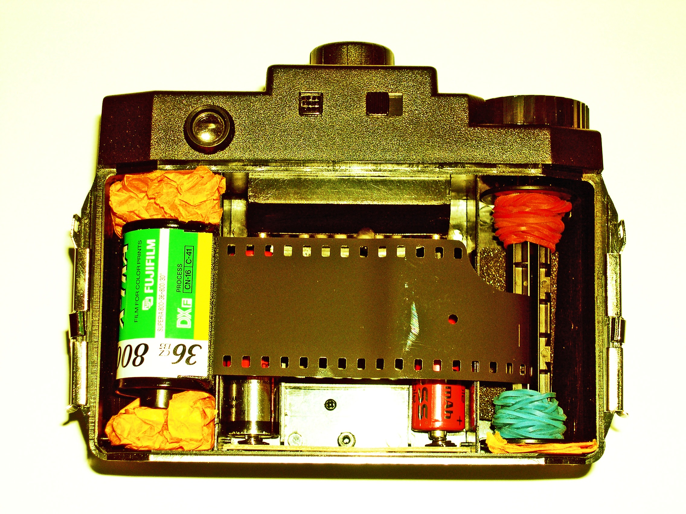
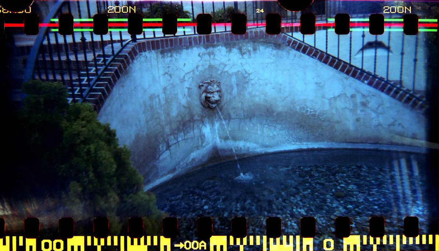
This post is from my friend Forrest who does a lot of lofi photography stuff. On top is his modified Holga and the bottom is a shot taken with it. I love how the exposure extends all the way to the edges.
"We all know the Holga can create some amazing 6×6 images, but did you know it can also use 35mm film? With a bit of ingenuity, foam, and tape, a Holga can be outfitted with 35mm film to create some spectacular photos. After developing, you can scan your negatives to catch the full effect of the Holga 35mm frame."
The Lomography site has a page about the Holga 35mm mod process which can be found here.
VOTING IS NOW CLOSED! Thanks to everyone who participated, I really appreciate all the great feedback. I will be going through and picking a winner over the weekend, you will be notified via email if you’ve won.
UPDATE: As per Damo’s request this is now a contest. The best analysis will receive a signed copy of this poster. You must enter a valid email address in the email field when placing your comment so you can be contacted if you win (the email address is not viewable by the public). If you’ve already entered a comment but did not enter an email address, just place another comment with the email and reference your original comment. I can see the IP address you post from to match them up. This contest ends this Friday, Feb. 15th.
UPDATE: After considering some of the early responses to this post (namely Jacob’s) I’ve added two more versions for your consideration.
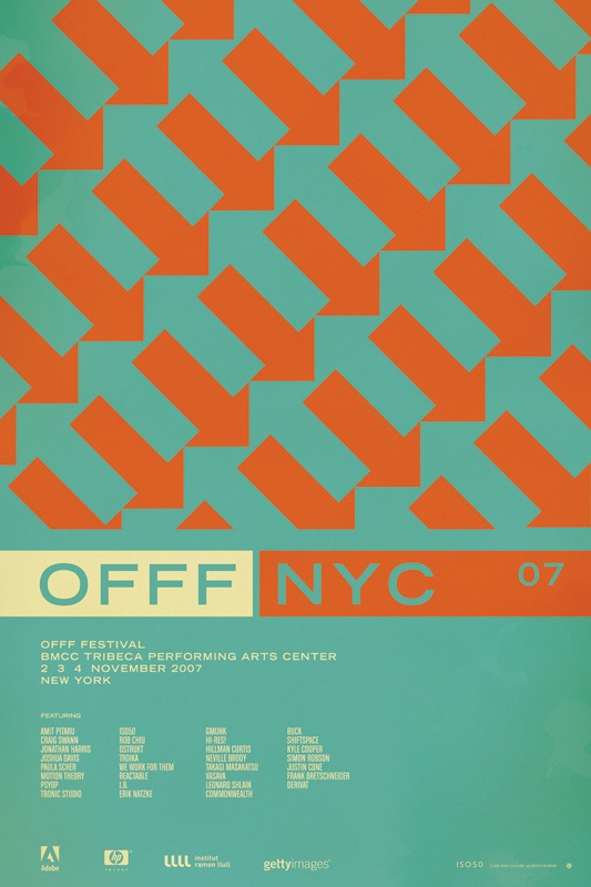
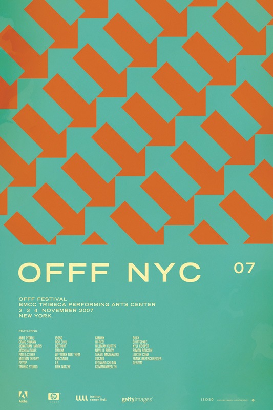
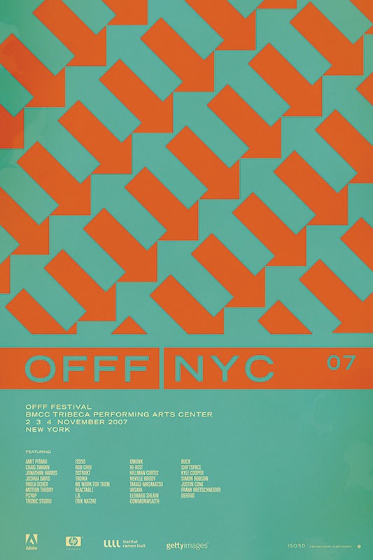
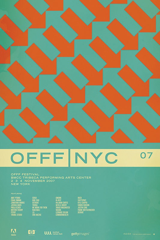
So I have been putting together a batch of prints that will be released over the next few months. Included is the poster from the OFFF 2007 festival in New York. There have always been multiple versions and I’ve really had a hard time deciding which I like best, and consequently, which will get printed. So I thought I would try a little experiment and let you guys choose your favorite. They are shown above in order: verions "A", "B", "C", and "D". Let me know which you like best by sounding off for A, B, C, or D in the comments. Or you could just say they are all terrible and to start over. Click the images above to view larger versions of each.
My 2 cents: At this point I think B, C, and D are the strongest. B has a cleanliness and reservation about it that I like. The type is able to stand on it’s own and given that it’s Trade Gothic Bold Extended, that’s a very good thing. But I think the solid bar in C and D really pulls things together. Right now I am really leaning towards C just because it feels so cohesive. The top portion is reserved for the red / orange color and the bottom, informational portion has the cream. I think this links the main title and the arrow design together nicely and makes the overall composition feel more like a single unit whereas some of the others seem a bit broken up.
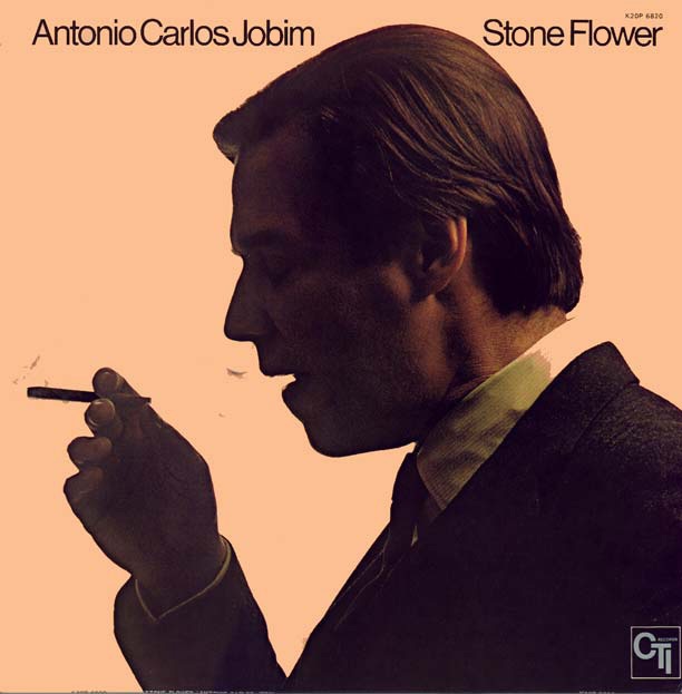
Jakub sent me this image tonight which is, of course, amazing. It reminded me of my favorite Bossa Nova song "Aguas de Marco" so I thought I would post both. Note this is not the cover of the album this song is from. Impeccable style going on here, typography is top notch and the photographic composition is near perfection. That salmon color in the background is usually a dead giveaway for cross processing, wonder if that’s what’s going on here? If you look closely at his collar you’ll see a bit more evidence of the xp.
As Jakub pointed out, the original version has a black border as well as an alternatively effected version of the photo. Sort of torn on which I like best, the border sort of encapsulates the negative space which is nice, but there’s something about this version I think is a bit cleaner. There’s also a rather nice full vertical version here.
Antonio Carlos Jobim y Elis Regina-"Águas De Marco (Waters Of March)"
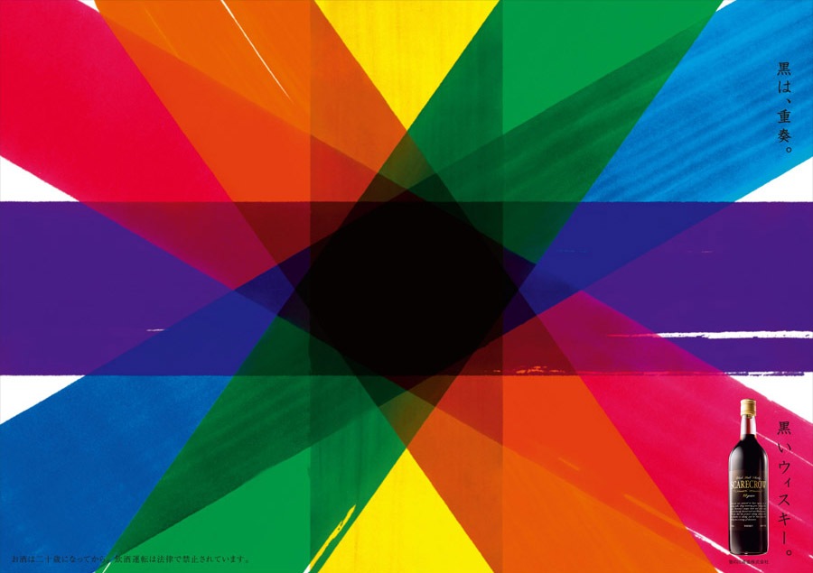
Not exactly sure what this is for, seems to be some variety of Japanese liquor or wine named "Scarecrow". At any rate, loving the colors and textures here. I wonder if this was handmade or digitally composited? I’ve rotated the image to fit a larger size in the page format. Click for original horizontal version. Via FFFFOUND