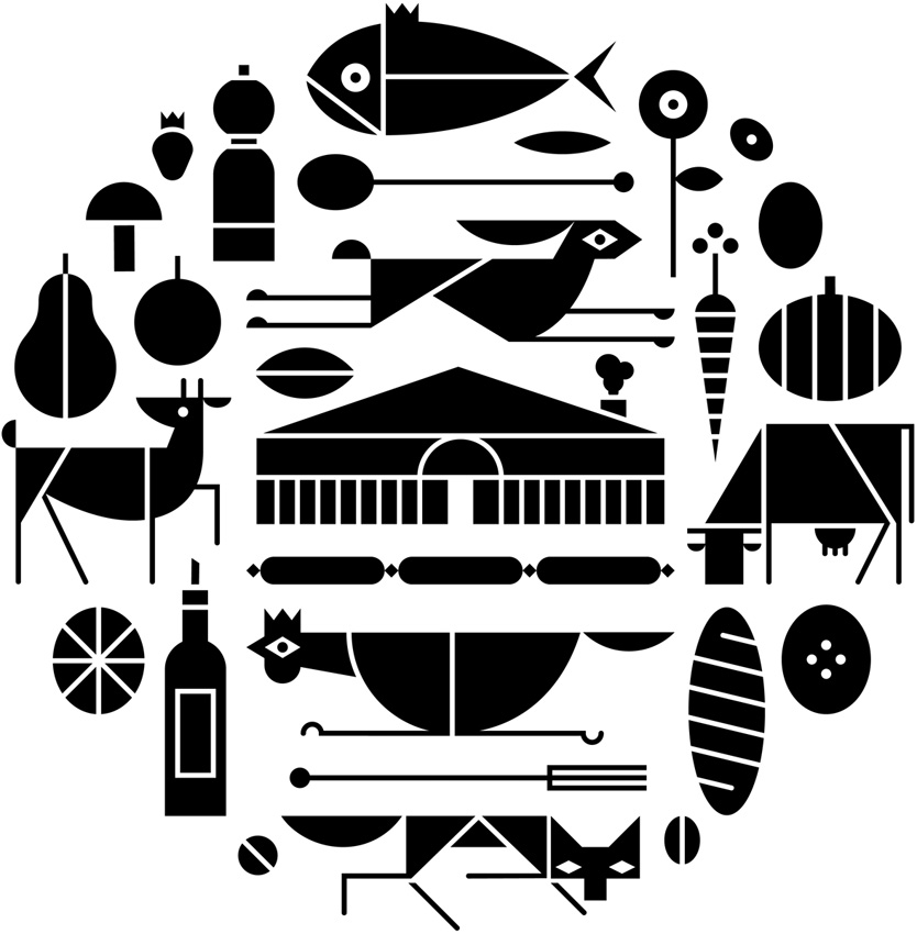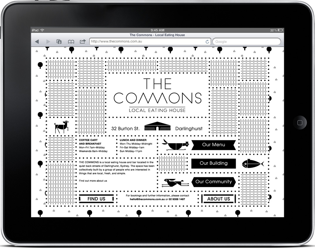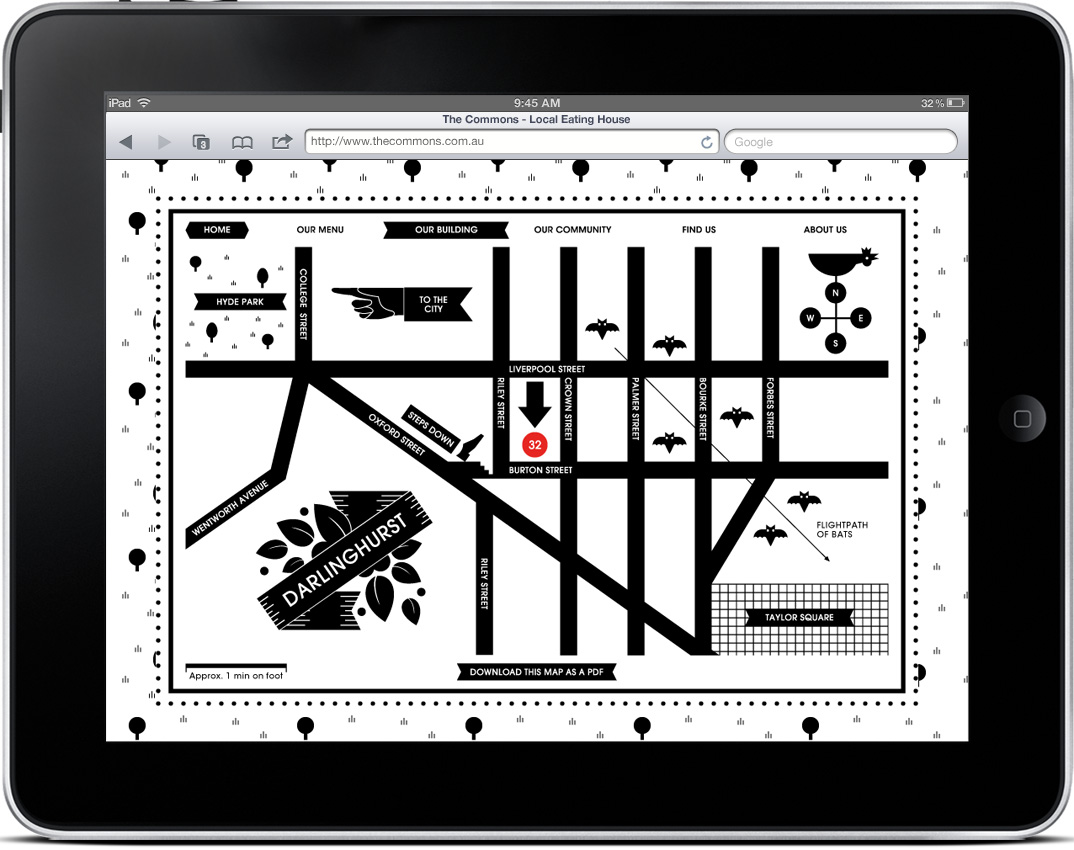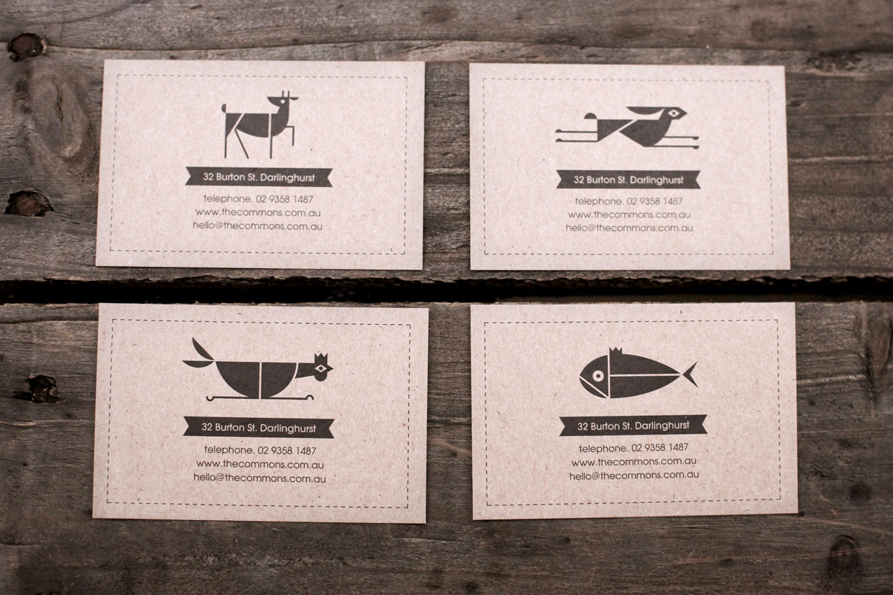

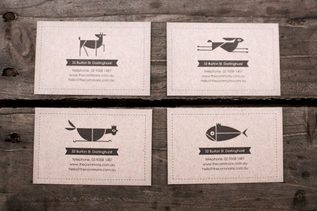
I typically start my designs in black & white, but eventually I reach a point where I feel like the work is missing something, and at this time I begin to incorporate some color. That’s why I’m impressed by design that succeeds in B&W, and Craig & Karl’s work for The Commons is some of my favorite yet. The fact that it is successful across an entire system is even better. Check out more pictures here.
Craig & Karl via Allan Peters


Ben Newman is a British illustrator with such an interesting use of shape, line, color and composition. Although I have no idea what some of his pieces are even remotely trying to say, I still feel a welcoming connection. My eye is seeming worked back and forth throughout each piece playfully. The bird illustration in particular reminds me of the type of illustration you’d see in grandma’s living room from the late 40s or 50s.
If you enjoy Ben’s work, check out his online shop and portfolio.
Via Wanken / Grain Edit


Just about as good as it gets.
Quadradão via Grainedit


This is the work of OK-RM, a London based design studio. The style reminds me a lot of Sulki and Min and maybe a little bit of Qubik. I enjoy this style; where type is placed all over the page, in a seemingly gridless manner, while still maintaining a sense of balance and proper hierarchy. To me it shows a kind of fearlessness, and a clear love of letterform.
via CTT


Dwell has an excellent piece on Swiss design shop Geigy. The in house agency has such a rich portfolio of beautiful work, most for the medical industry. I particularly enjoy the packaging work.
Grain Edit also has some more info and pics from a book about Geigy design here
Source Dwell

I’m very pleased to announce that not only will I be speaking at the next FITC, but it will be right here in San Francisco, August 16th-19th, 2010. I’ve presented at FITC numerous times in the past — recently Toronto and Amsterdam — and it’s always an incredibly immersive and educational experience. For the uninitiated, FITC is a series of events focused around interactive platforms like Flash, Flex, and AIR, along with animation and motion/film. But that’s just sort of the core of it, there are all sorts of other design related topics being covered (case in point: the fact that a print designer / musician like myself is involved). Basically just a very inspirational event centered around design and technology. Also, they have incredible parties each night often involving boats and free booze.
For the San Francisco event I’ll be speaking a bit about my background, process, and theory along with some walkthroughs and presentations of recent work. For a rough idea of the style of my presentations have a look at my Academy of Art lecture from April (although this was geared for the students in the Academy program, as opposed to professionals, so it was a little different from what I normally do).
FITC always stack the events with great speakers but this SF date seems to be the most epic yet. It’s the only where you’ll see Yugo Nakamura, Colin Moock, Erik Natzke, Kyle Cooper, Jared Ficklin, Kevin Lynch, and Robert Hodgin (along with over 60 others). It’s also probably the last time I’ll be speaking in 2010 as I finish up the Tycho album and prepare for touring.
Early bird pricing for the event ends Friday July 2nd, so be sure to get your tickets now (they also sell out very quickly, so if you don’t get in on the early bird be sure to get them soon after). You can register here. Enter code “isofifty” under discount code to get an additional 10% off the registration.
Hope to see you out there!
FITC: Tickets | More Info


A couple of weeks ago I stumbled across these beautiful pieces by Cristiana Couceiro. I was immediately engaged by the simple, collage-like style and muted mid-century colors. There is also something about the use of monochrome mountain imagery and type that really catches my eye.
See more of Cristiana’s work on flickr.


A few Decca record covers done by ISO50 favorite, Erik Nitsche. I was browsing Flickr for some or Nitsche’s work and I came across the massive assortment of images here, compiled by BustBright. I am in love with the type on these, especially the “Schlusnus sings” typeface. I’m not sure what it is but it amazing. And I always love Didot — if you browse the rest of the archive, you’ll see a lot of that.