Qubik
Posted by Alex
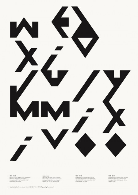
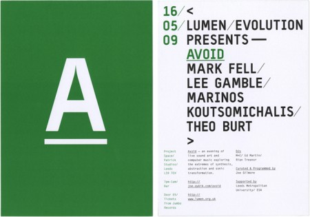
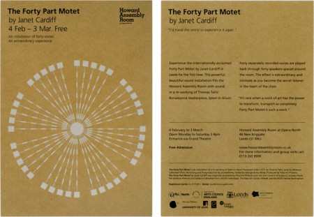
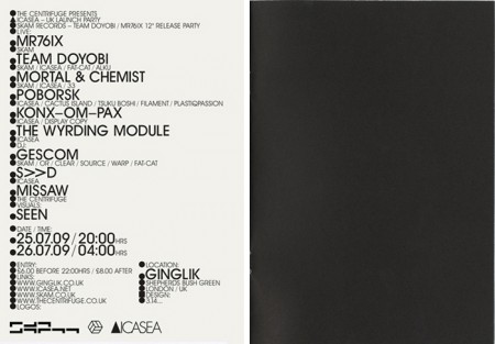
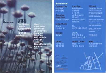
Qubik Design is a graphic studio based in Leeds UK. I like everything about these pieces except the color. The layout and type compositions I find very interesting; personally I just don’t prefer the chosen hues of green, blue or gold. Otherwise I think this work is fantastic. Especially that first one! I also like how clean and organized their site is. I’m starting to appreciate this much more now as a writer; recently I’ve come upon a number of sites that are so poorly laid out I give up researching, even if the work is amazing.

6 Comments Leave A Comment
Rob says:
April 25, 2010 at 6:19 amI don’t like the blue so much but the green works very well ! perhaps some extra grain would’ve finished it nicely, otherwise it looks a bit clean…
But who the frig am I to criticise?!
Rud says:
April 26, 2010 at 1:29 amThey remind me of these guys: http://conoranddavid.com/
John says:
April 26, 2010 at 11:58 pmwell I love the color the typo and general his concept QubiK (Joe) uses, the guy is genius, you must also check his installation and his music experiments.
J.
greg says:
April 27, 2010 at 9:30 amI think the gold is quite nice, actually. Color is a personal thing, y’know.
Hesh says:
May 26, 2010 at 6:29 pmWow, the green one just floored me. It’s absolutely gorgeous.
Any chance that anyone would know what typeface is being used? Sort of reminds me of a hybrid between DIN and Andale Mono.
Joe says:
November 15, 2010 at 7:57 amThanks for the comments – both positive and negative :) The typeface on the Avoid flyer is called Typestar.
– Joe