John Maus is supporting Ariel Pink four nights in SF this week 10/14-17 at The Chapel. His forthcoming LP Screen Memories includes Teenage Witch which has footage of John when he was younger.
LACK records has recently become one of my favourite labels. Not just because they have a stellar back-catalogue, consisting of some great releases by Pablo Mateo and D-IX, among some other gems. But also because they have a really strong mix selection from friends of the label. Every time I listen to these mixes I discover a wealth of new music that gets me super hyped about life.
Their latest release is by Liit, with his EP titled Liit Fighter presents Hadouken. Prepare your ears for some really uplifting and addictive techno. Highly recommended!
Post by: Elaby Mackenzie.
I am a music blogger/enthusiast from Cape Town, South Africa.
Co-founder of Bluishvoid and contributor at Platform Magazine.
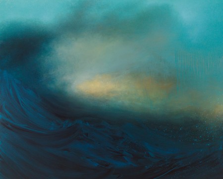
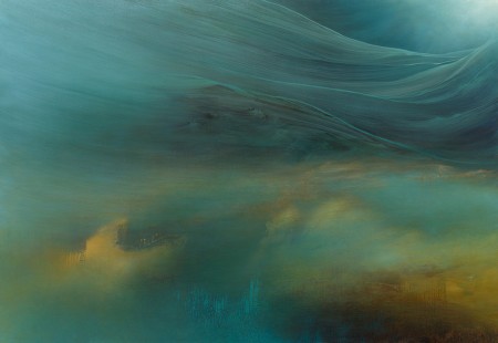
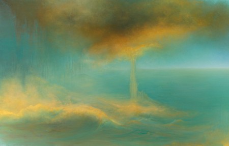
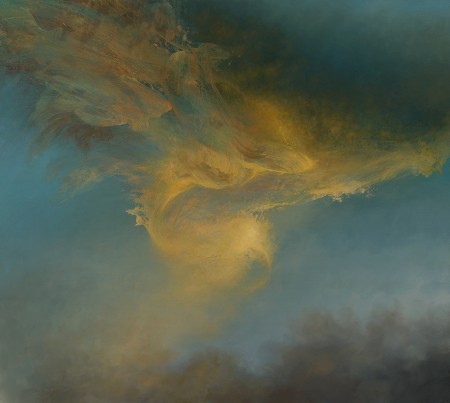
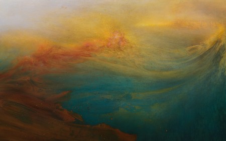
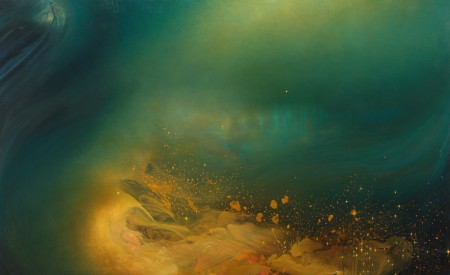
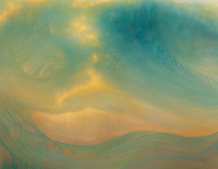
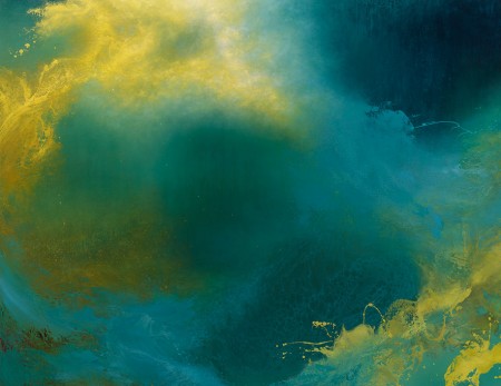
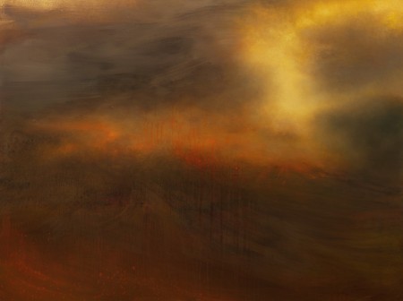
New York City based artist Samantha Keely Smith is back with all new work. Samantha’s work has been on my radar for a few years now and I did a post on her gorgeous work about two years ago. I reached out to Samantha and asked her a few questions about her influences and what her creative process involves.
In 2012 your work progressed into painting abstract, oceanic waves and creating a sense of heavy movement. What inspired this?
All of my images come from dreams, but my dreams are influenced by the emotions I experience and the things I learn/hear about in my day to day life. I’ve been concerned with the effects of global warming and the melting ice caps for some time, and that showed up in my dreams as the images I produced in 2012/2013. I’m still influenced by these concerns, only now my images have expanded beyond “oceanic.”
Without revealing too much, what is a typical process from start to finish for one of your paintings and how long does that take?
It’s a case of narrowing down the images from the dreams and trying to focus on one in particular. The images in the paintings are what I call “inner worlds” because really they are the result of attempting to translate an internal existence driven by emotion/instinct into something that makes some sense of the reality we live in. Because these dream images are fleeting I spend a long time chasing them during the process of the painting. Unfortunately this also means there is no real way to plan them out. So they can often take a couple of months to complete, with many changes (sometimes drastic) taking places over the course of that time. I work in thin layers, often somewhat translucent. I find that accidents/mistakes are an important part of my process too. I’m also in love with color and oil paint in general so my interest in the process of painting is part of the end result.
What musician/band has been the most influential for your visual cues?
There isn’t one musician, but many. Music in general is an important part of my daily studio practice. The kind of music I listen to while painting is dictated by the painting itself. I can’t say that music influences my visual choices, but it does feed the intensity of the work.
Are there any other practices/mediums in the broad world of art that you would like to try?
I can’t imagine having the time to do anything else since I paint every day, but in another life I’d like to experiment with film/video and installation art.
If you could pack up and move to work on your craft anywhere, where would you move to?
I’m not sure because I love the energy of NYC. My only problem with living here is financial. Being an artist in New York is very hard, mainly because of the high cost of living and how expensive artist’s work spaces are. I think I’d like to live somewhere near the ocean if I could. But only part time. I feed off the creative energy of the city and I’d miss that.
For more of Samantha’s breathtaking work, visit her website:
During a recent Soundcloud dig, I came across the brilliantly crunchy and grimy house music of Melbourne’s Rudolf C and Silentspook. Both tracks have an incredibly strong focus and flow and would be perfect the dancefloor.
Despite there being an array of demos and snippets scattered across their respective Soundclouds, there is definite potential in all they do, so definitely worth keeping an eye on.
Post by: Elaby Mackenzie.
I am a music blogger/enthusiast from Cape Town, South Africa.
Co-founder of Bluishvoid and contributor at Platform Magazine.
Seldom do you come by an album so seamlessly crafted around a certain aesthetic. However, 100% Silk’s latest signing, Brandon Knocke, a.k.a. Body-san has mastered just this in his forthcoming debut cassette, Corporate Interiors.The latest track, premiered here today, ‘Hotspot (She My Wifi)’ entices you with its hypnotically groovy pulse, extending the listening experience into an audio-visual one, whereby it transfers you into a world so perfectly captured in the image above. The vibes are mellow, but it’s incredibly hard not to be taken in by its infectious danceability. Corporate Interiors is definitely an album to look forward to. To get you even more excited, you should check out his equally brilliant track (and video) ‘KC VAPES’, which draws you even further into the strong visual dimension of his music.
Post by: Elaby Mackenzie.
I am a music blogger/enthusiast from Cape Town, South Africa.
Co-founder of Bluishvoid and contributor at Platform Magazine.
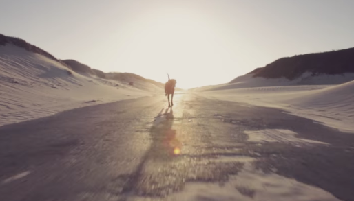
Christian Tiger School are an electronic duo from Cape Town. It has been amazing to watch how they have progressed over the last few years, and their forthcoming release, Chrome Tapes, via Tommy Boy Entertainment, promises to be a really exhilarating and fresh listen. Their first single, ‘Chorisolo,’ is a shape-shifting punch of electronic dynamism that comes paired with a really outstanding dog-championing video.
Post by: Elaby Mackenzie.
I am a music blogger/enthusiast from Cape Town, South Africa.
Co-founder of Bluishvoid and contributor at Platform Magazine.
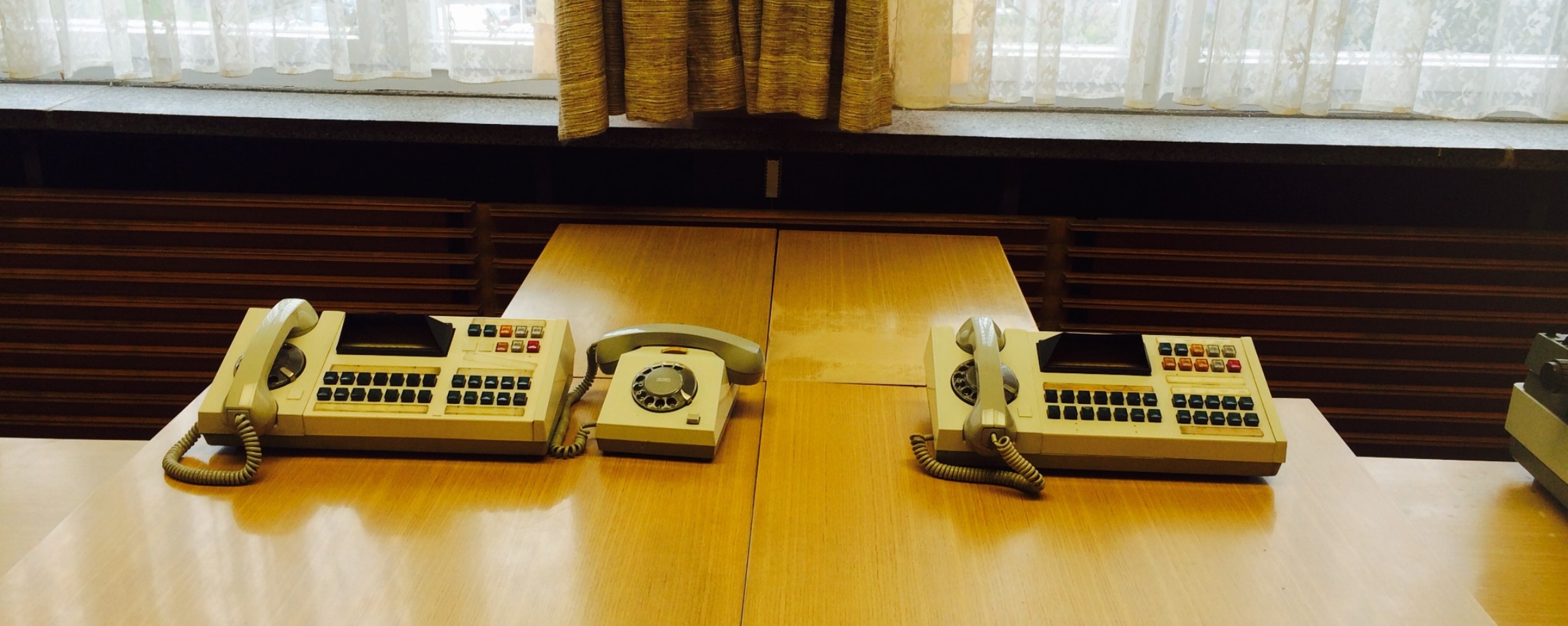
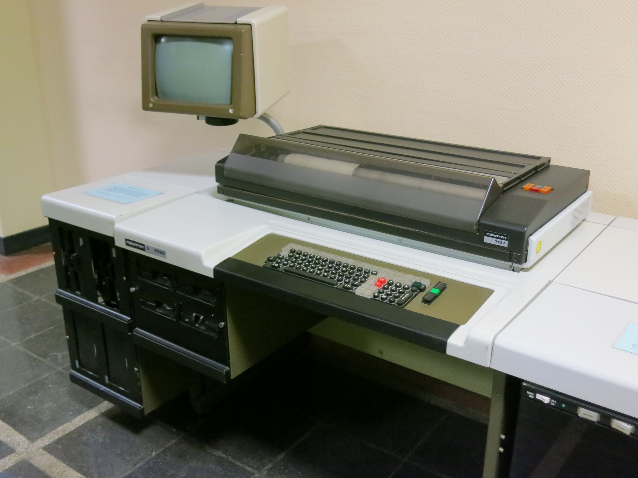
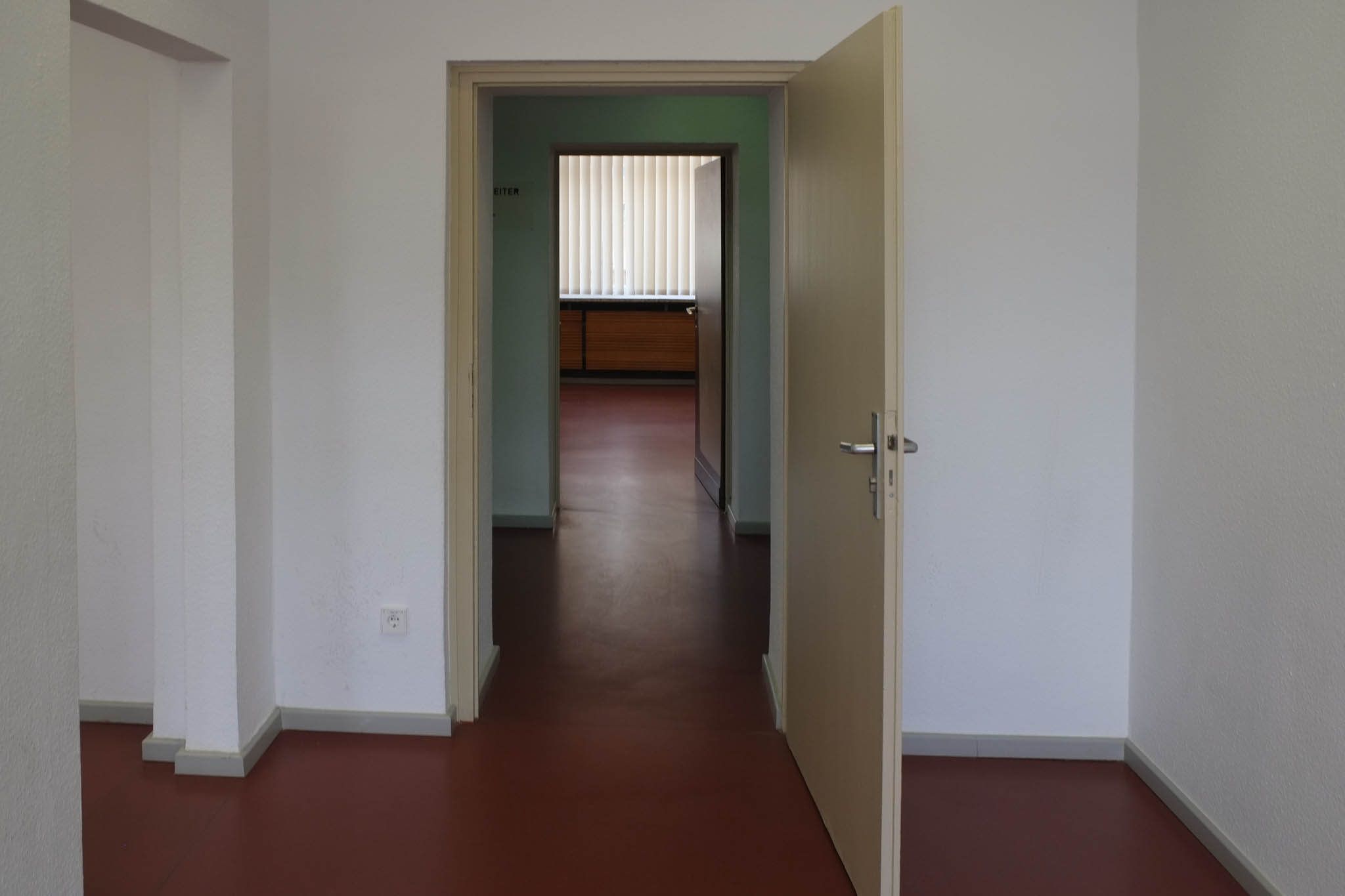
“The Stasi offices in Berlin have been frozen in time since they were stormed by activists on January 15th, 1990, shortly after the fall of the Berlin Wall three months earlier.”
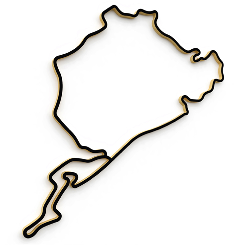
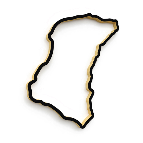
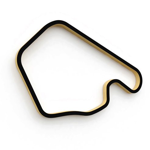
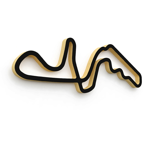
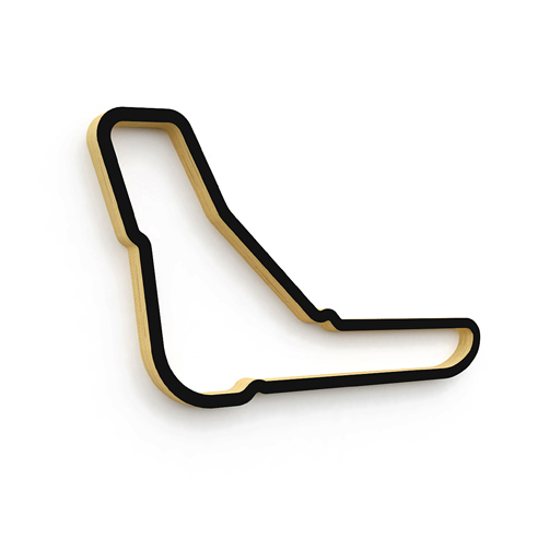
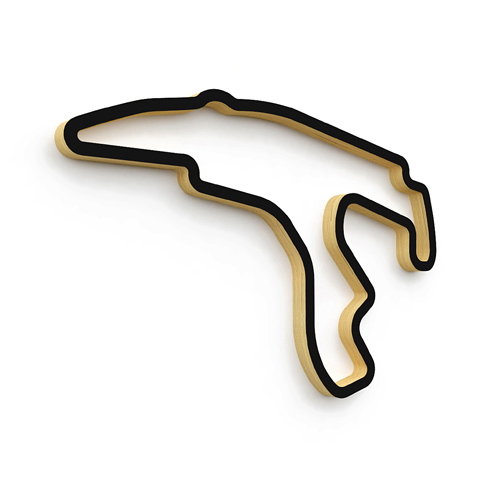
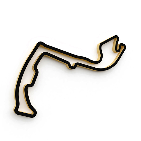
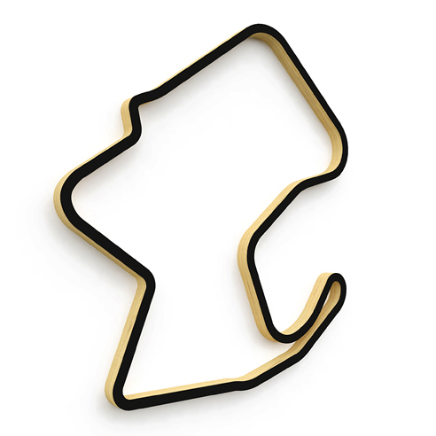
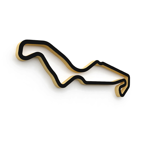
I moved into a new place a few months ago so inevitably I’ve been spending a lot of time thinking about how to make it a little more comfortable and home-y, and I was thinking about how cool it would be if someone made sort of floating, ribbon like sculptures of certain roads, tracks that would show the undulating nature of that area’s elevation changes. While it doesn’t look like that exists (yet) I did find these nice laser cut wood representations of classic circuits made by Linear Edge that you can hang on your wall.
They offer a selection of pretty much any circuit you can think of, from the American power tracks such as Road America & Laguna Seca to the windy Isle of Man TT course or the Nurburgring in its various layouts. They even have my alma mater, Limerock Park.
I like understated stuff like this- kind of looks like an inoffensive abstract shape to the layman, but to people who know about motorsport, these simple shapes can evoke a powerful image; an inanimate decorative object that holds movement and excitement within an obscured context.