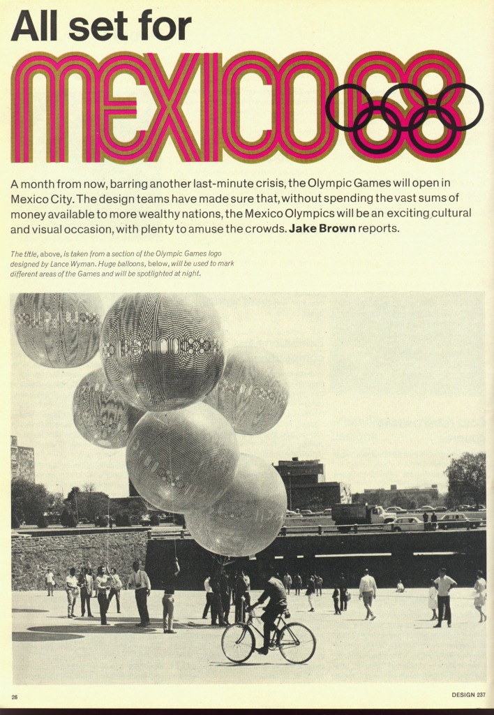
Another page from Design Magazine #237. The balloons feature the original illustration for the ’68 games by Ramirez Vazquez, Eduardo Terrazas (MEX) and Lance Wyman (USA) who designed the “Mexico 68” logo. Wonder if any survived?
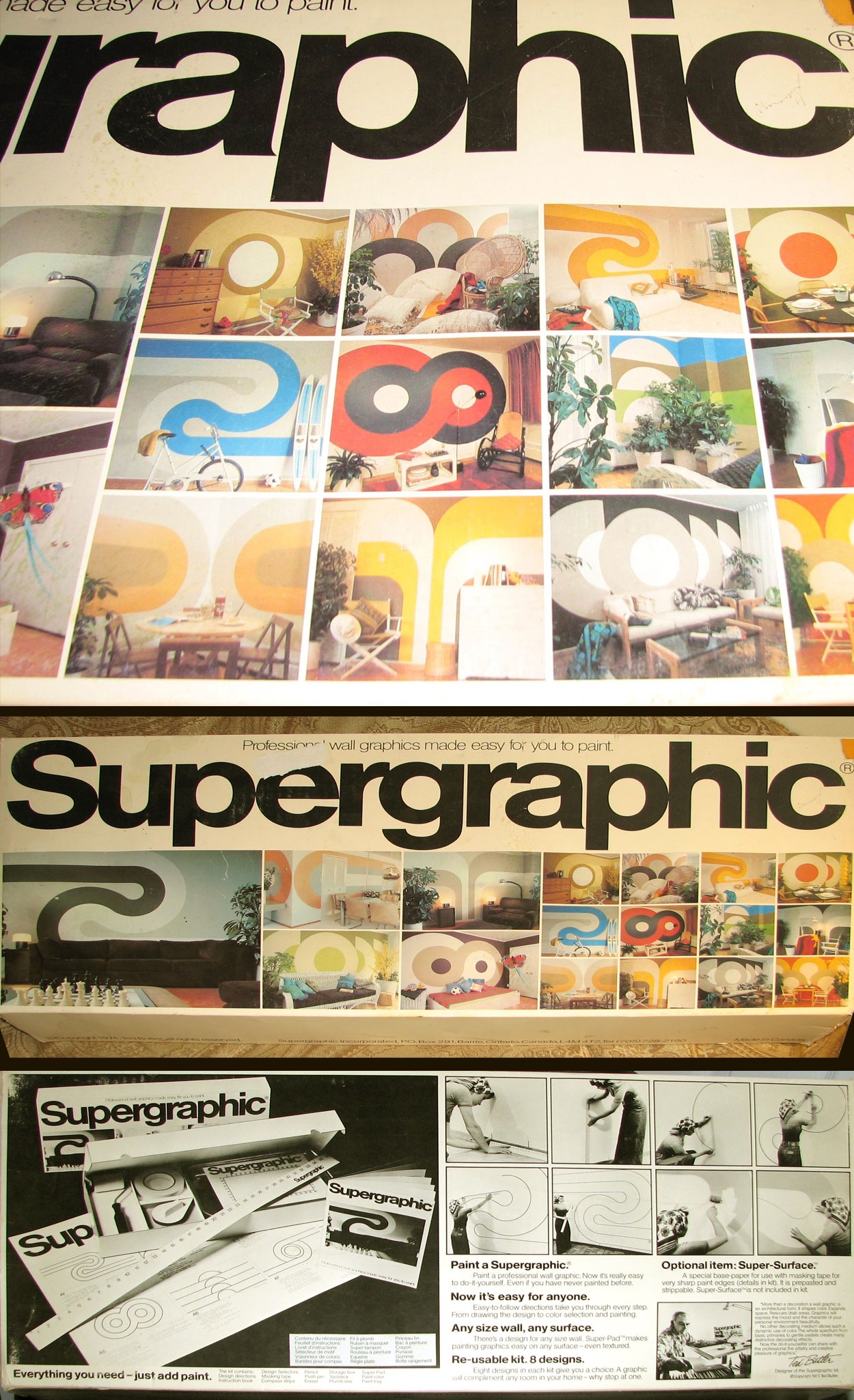
"I found a home graphics kit that was made in Canada back in 1974 named “Supergraphic”. Its slogan was, “Professional wall graphics made easy for you to paint” and was geared towards creating cutting edge graphics in your household without having to hire a professional, (back at that time). The examples featured in this do-it-yourself kit remind me of the graphics in your “High Ceilings” photo on your ISO50 blog."
Some very familiar forms in there, check out the circle pattern reminiscent of the 1975 CBC report. There’s also the L shapes that look like either an upside-down Huron Spectrum print or the Sacramento Regional Transit Logo. This concept is a bit garish by today’s interior design standards, but it would still make a nice addition to an office or rec room. The 70’s were really an interesting time for DIY arts and crafts. It seemed like people were more willing to take on projects such as these back then. I remember it seemed like everyone’s mom had a sewing machine, and actually used it. And a lot more people were into things like ceramics, wood working, and other hobbies with artistic leanings. This is something that in my experience, has sort of been lost on our generation. With everything in our lives either electrified or automated, I think we may have lost the patience for activities like these. Bonus: Name that font (The headline: "Supergraphic")
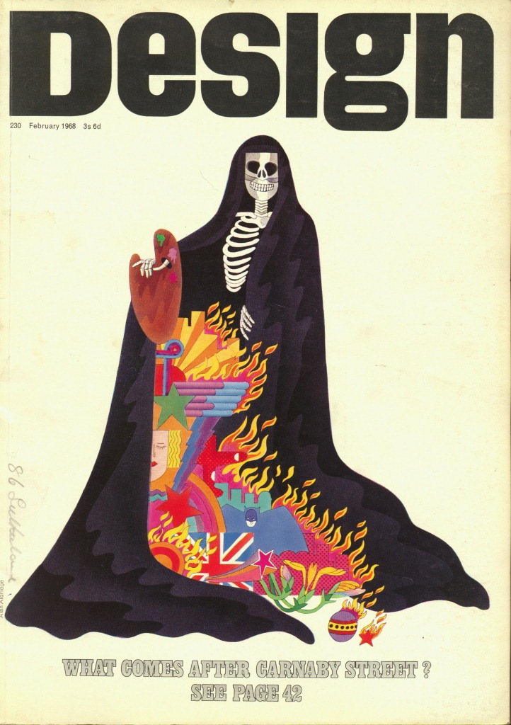
As Horacio pointed out in the comments, Batman makes a cameo on this 1968 Design Magazine Cover. Such a specific pop culture reference seems a bit out of place among it’s vaguely evocative surroundings (the Union Jack excluded). As the title suggests, this all must be in reference to Carnaby Street which was sort of a fashion / cultural center to the Mod movement in 1960s England. Perhaps it had lost it’s hip status by the time this issue was published and the cover depicts the death knell of the movement. At any rate, a very nice illustration worthy of framing. Right after you clone-stamp out the byline at the bottom, that is.
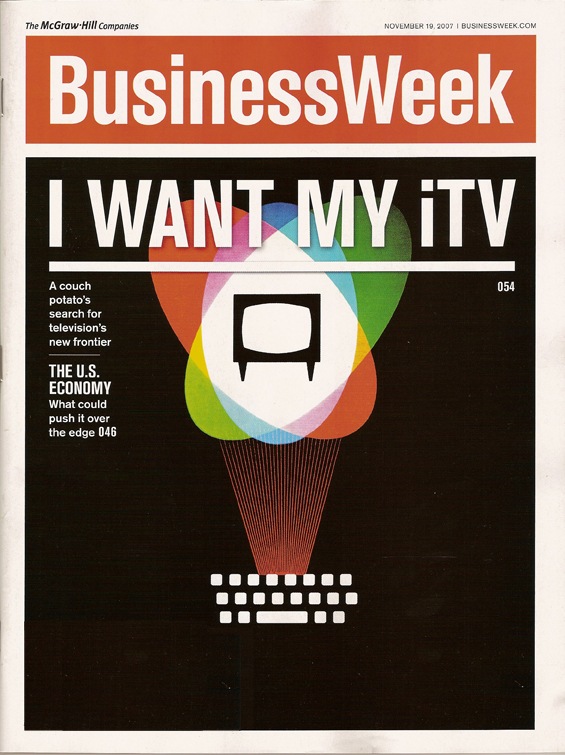
This via Matthew Tellier. Wish I had this illo by itself, really like the vibe. At any rate, a standout cover for BusinessWeek to be certain. Looks like it was originally screenprinted, anyone know the artist?
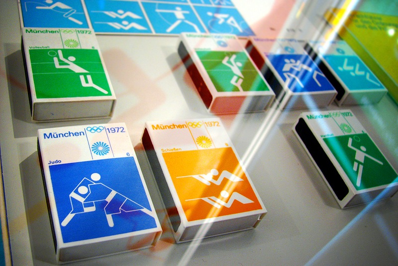
Some more Otl Aicher Munich ’72 artifacts. I found this image on Flickr but now can’t seem to find who took it. If you are that person, or know who did, please let me know so I can properly credit this. Of course the design is amazing, but the picture is great too. The reflections are really complementary to the designs.
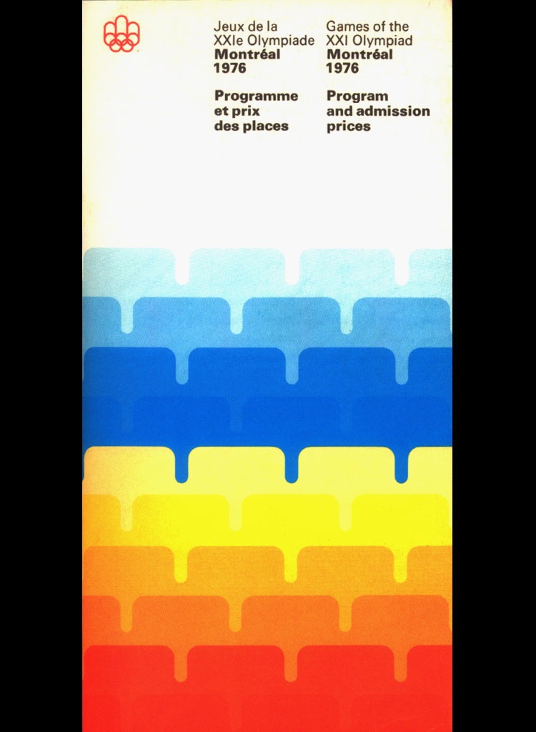
This image sent my way by Element Kuuda. This may be one of my favorites so far. Are those seats, as in stadium seating? Really love this color palette. Element sent some other nice images as well…will be posting those shortly.
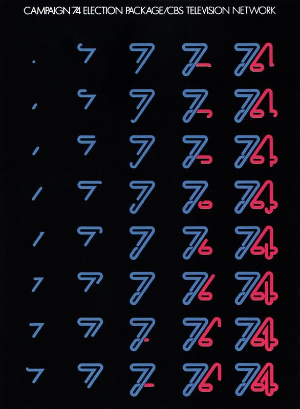
In New york for the OFFF (which starts tomorrow) so not able to post as often, but here’s a nice poster for the time being. As always, fill out the details if you have them. Sort of reminds me of the NFB poster but not quite as clever.