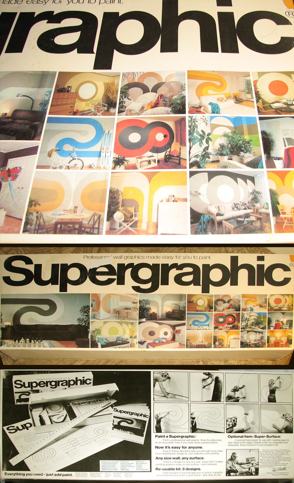
SUPERGRAPHIC
These great shots sent in by Jason Bustin:
"I found a home graphics kit that was made in Canada back in 1974 named “Supergraphic”. Its slogan was, “Professional wall graphics made easy for you to paint” and was geared towards creating cutting edge graphics in your household without having to hire a professional, (back at that time). The examples featured in this do-it-yourself kit remind me of the graphics in your “High Ceilings” photo on your ISO50 blog."
Some very familiar forms in there, check out the circle pattern reminiscent of the 1975 CBC report. There’s also the L shapes that look like either an upside-down Huron Spectrum print or the Sacramento Regional Transit Logo. This concept is a bit garish by today’s interior design standards, but it would still make a nice addition to an office or rec room.
The 70’s were really an interesting time for DIY arts and crafts. It seemed like people were more willing to take on projects such as these back then. I remember it seemed like everyone’s mom had a sewing machine, and actually used it. And a lot more people were into things like ceramics, wood working, and other hobbies with artistic leanings. This is something that in my experience, has sort of been lost on our generation. With everything in our lives either electrified or automated, I think we may have lost the patience for activities like these.
Bonus: Name that font (The headline: "Supergraphic")

23 Comments Leave A Comment
DOSEprodSAM says:
November 13, 2007 at 3:32 amHi from France !
When I arrived on the page for a few seconds (without reading) I thought that pic was your new catalogue or brochure or something :-)
SUPERGRAPHIC ! what a name !
erik says:
November 13, 2007 at 3:57 amit reeks of din. it has to be.
Pierce says:
November 13, 2007 at 4:41 amThis is really very cool. I think I’d buy this if it was still available.
On the other hand, it looks like all the box contains is tape, a ruler, a roller and some string. In that case all you’d really need is the instruction manual…
On the third hand, looking at the pictures, I guess you could just have a go yourself, and do pretty well.
Linda says:
November 13, 2007 at 5:09 amHelvetica!
rafael says:
November 13, 2007 at 5:11 amah, helvetica bold
Linda says:
November 13, 2007 at 5:14 amOops wrong contest.:-(
Linda says:
November 13, 2007 at 5:15 amHe’s asking about the smaller “Supergraphics”. Why are contests never easy?
Michael says:
November 13, 2007 at 10:45 amAkzidnenz Grotesk Bold Extended
Bobby says:
November 13, 2007 at 10:56 amMaybe it’s not possible, but I would love to see the manual and give some of those designs a try on my walls.
Scott says:
November 13, 2007 at 12:48 pmLinda….it was easy I think? I was just talking about the big headline, which I think you are right seems to be Helvetica? Although maybe there’s a type expert in here who can tell us otherwise.
Eric says:
November 13, 2007 at 1:09 pmIm no expert, but thats almost certainly helvetica. Almost every single piece of typography from the 70s that iv seen has used helvetica. check out this site i stumbled upon a few days ago, http://www.internationalposter.com
they have the most amazing collection of swiss typography iv ever seen, as well as art nouveau and soviet propaganda posters.
Greg Formager says:
November 13, 2007 at 2:42 pmHelvetica Neue 75 Bold I think.
rafael says:
November 14, 2007 at 5:38 amit´s helvetica bold, can’y be the “neue” version because it didnt’ exist back in the 70s, although Helvetica Neue 75 Bold has more resemblance to this than other digital versions. right?
more on that:
http://en.wikipedia.org/wiki/Helvetica
Tommyjolly says:
November 14, 2007 at 9:12 amI want to make love a swiss graphic designer.
I’m a graphic design student myself, and am german/english. Have lived in both countries myself. Whenever I do stuff at uni (study in England), you can see my german roots popping up. Kinda Bauhaus like. Weird, isn’t it?! I guess it’s a cultural thing and the overall sterile look in Germany. :)
north says:
November 14, 2007 at 2:37 pmi myself say its looks like some variation of helvetica, but michael’s suggestion of akzidenzgrotesk may not be far off, if anyone actually owns akzidenz maybe you could try and adjust it to the photographs to see if it matches?
Greg Formager says:
November 14, 2007 at 2:49 pmThe capital “S” doesn’t look like the Akzidenz “S”.
Metin says:
November 15, 2007 at 6:48 amfont might be DIN Bold.
Kappu says:
November 16, 2007 at 8:26 amAbsolutely WONDERFUL !
…I’m from France to =)
Gareth says:
November 17, 2007 at 9:00 amBeing that I was born in ’70, this interior design style was ubiquitous to the point where I didn’t give it a second thought, but by the early ‘80s I would only see it in un-remodeled worn-out public spaces like schools (especially the libraries). It didn’t age well, I recall thinking it was hideous, and as a pre-teen/teen I had subconsciously associated it with cold school-system authority. I still have that reaction to this day. **File under bad nostalgia** lol.
Aaron says:
November 23, 2007 at 10:03 pmif my eyes aren’t lying, the title Typeface for “Supergraphic” is without doubt Helvetica.
Aaron says:
November 23, 2007 at 10:08 pmHelvetica bold, maybe. Helvetica Neue has a much wider stance especially with the “h” and “e”…I know this because I am a design student and absolutely adore Helvetica Neue because of it’s versatility. But my guess is still Just simple Helvetica…the scale can throw one off fairly easily
James says:
December 14, 2007 at 10:09 amNot sure what that font is, but it certainly is not Helvetica. The tail of “a” in helvetica flicks out to the right, the example above does not. The mystery thickens.