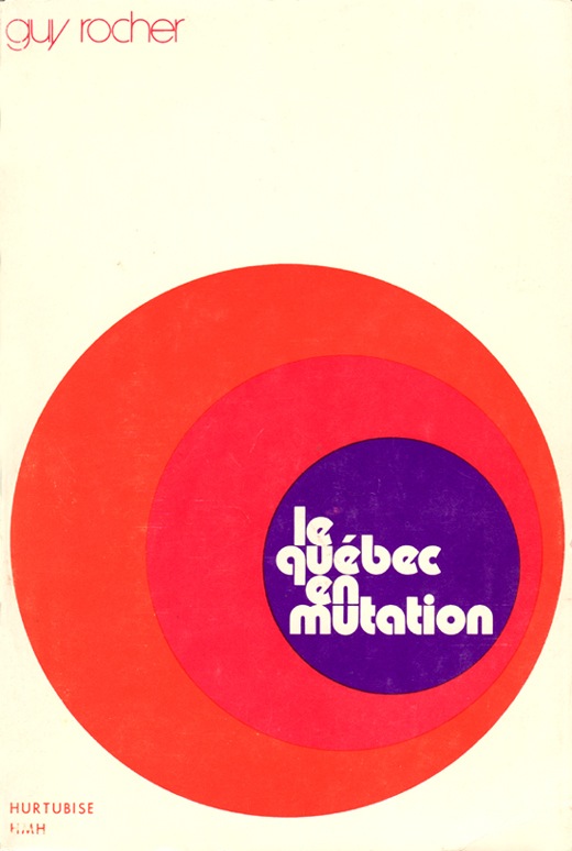
Le Quebec En Mutation
Posted by Scott
This time French Canada comes with the design skills. Not much info on this one, feel free to fill in the details in the comments.

This time French Canada comes with the design skills. Not much info on this one, feel free to fill in the details in the comments.
9 Comments Leave A Comment
Jessie Rumble says:
October 30, 2007 at 12:37 amI really like the way the 3 circles symbolize Canada : the biggest is the country itself, the blue one is Quebec and the pink/magenta one might be the growing influence or development of the region Québec inside Canada.
Well, this is only my interpretation :)
Scott says:
October 30, 2007 at 2:41 amSounds about right to me….funny the connotation the word “mutation” has in English. Not necessarily a positive word, I am assuming it simply means change/flux in French.
Yannic Walter says:
October 30, 2007 at 3:02 amSeems like it’s some sort of book cover.
http://en.wikipedia.org/wiki/Guy_Rocher
Guy Rocher is a canadian sociologist from Berthierville, Quebec.
Yannic Walter says:
October 30, 2007 at 3:03 amOkay, it’s a book:https://papyrus.bib.umontreal.ca/dspace/handle/1866/91
Horacio says:
October 30, 2007 at 8:02 ami like the typo on the top…nice :)
Alex / HeadUp says:
October 30, 2007 at 10:49 amInteresting use of those 2 shades of red, as well as the font for guy rocher…seems like one of ISO50’s favorite round sans serif fonts for the secondary text.
Christian (Élément Kuuda) says:
October 30, 2007 at 7:00 pmActually, there is a lot of awesome stuff that came out from french Canadians.
In fact, I went to the library and got a book about Québec designers and I scanned a bunch of pictures for you guys to see. I opened up a flickr account just for that… Try this
http://www.flickr.com/photos/16936330@N07/
Hope it works and enjoy the goodness of my home, I think they deserve the exposure, they are pretty underated and it really touches me to see that people somewhere else are excited about it!!!!
Sorry for being epic, I love this shit!!!!
Jon says:
October 31, 2007 at 11:08 amPoster above…
Thanks for sharing! I love the old CBC logo, and am currently using it a desktop background ;)
– Jon from Winnipeg.
Jessie Rumble says:
November 1, 2007 at 2:14 pm@Scott : “mutation” can have a positive meaning indeed. Well, rather neutral let’s say.