Avant Garde Poster Contest
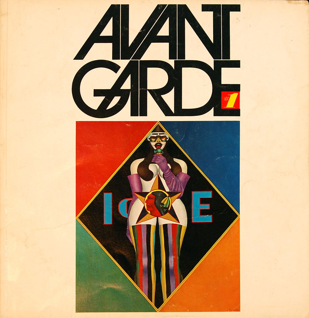
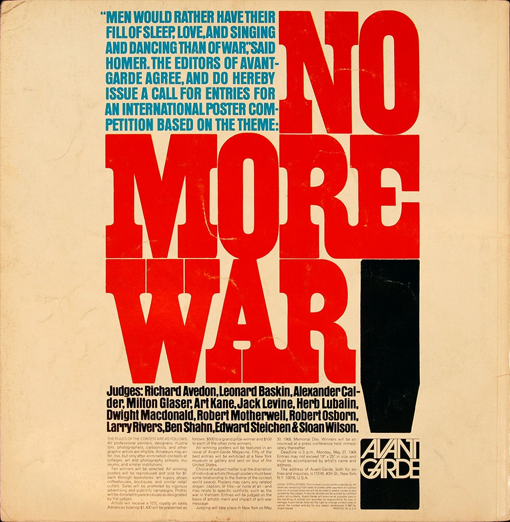
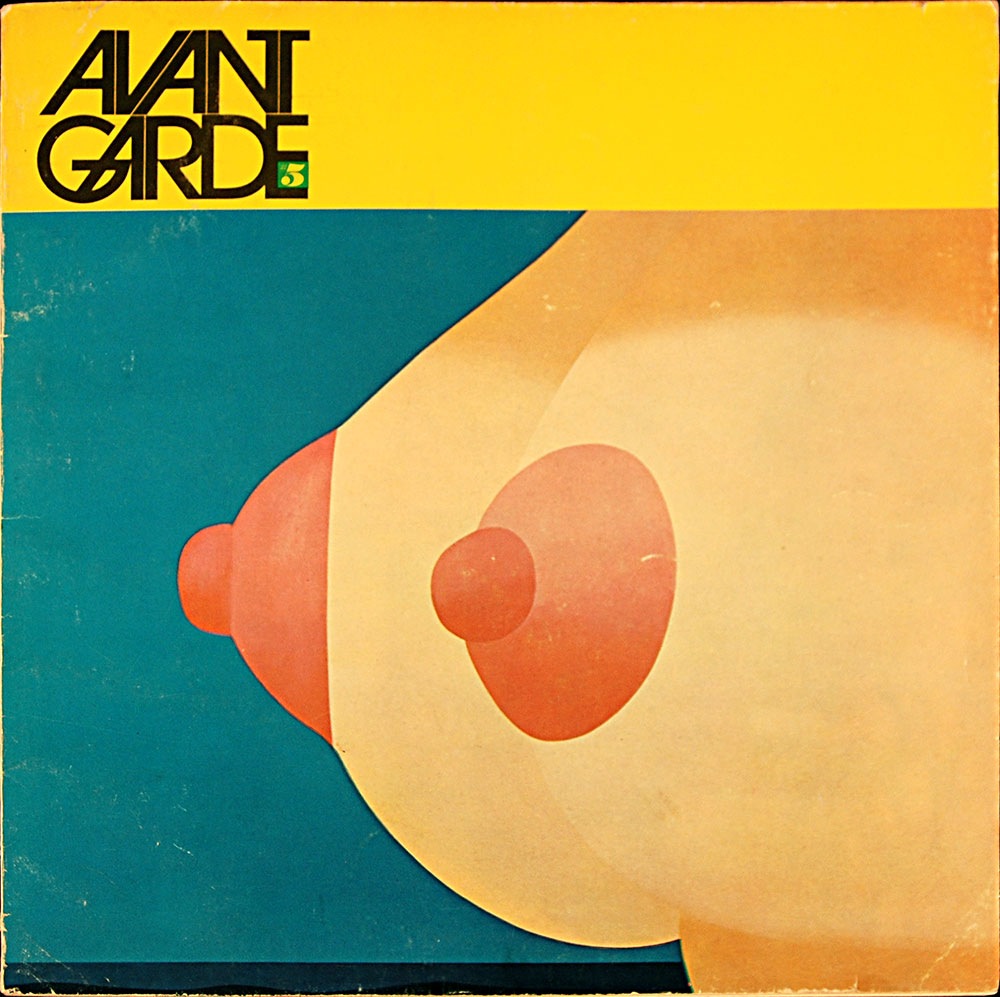
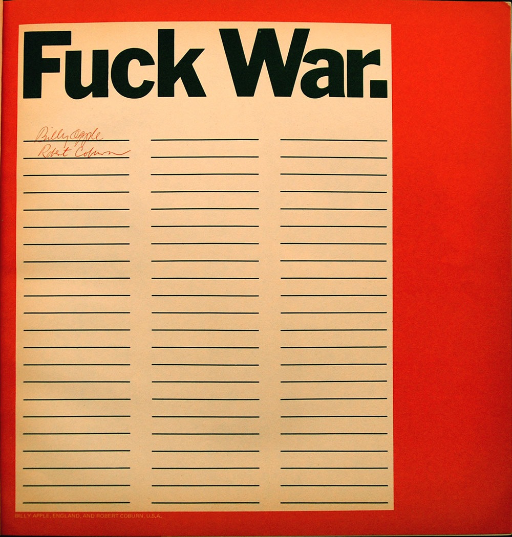
There was a massive anti-war protest across the street this weekend, thousands of people everywhere. All of the signs and posters reminded me of the Avant Garde "No More War" poster contest. I dug around and found these two issues, #1 and #5. On the back cover of Avant Garde #01 (1967) they printed a call for entries for the contest and announced the judges, Herb Lubalin being among them (quite intimidating for the contestants I’d imagine). The winners of the contest were announced in issue #5. I’ve posted my favorite example above, an entry by Billy Apple (England) and Robert Coburn (US). Efficient and to the point, I think the key here is that it goes beyond merely engaging the viewer and calls for active, on-the-spot participation. The choice of language also plays a large role in the impact of the design; in 1967 this was still a very shocking word to see in print for most people.
Although this was 40 years ago, the message is as poignant today as it was then: we once again find ourselves mired in an unpopular foreign war with dubious motives and no clear end in sight. I have to wonder if imagery like this was more effective in it’s time. People today have seen so many things and become so jaded to visual input that it’s very difficult to jar them awake with something like this anymore. I think the 60’s were one of the first times it became almost mainstream for people to question the government, so ideas like these were still new and somewhat disquieting for many.

9 Comments Leave A Comment
rafael says:
October 29, 2007 at 6:07 amthis reinforces what i was saiyng the other day about timeless design.
GM says:
October 29, 2007 at 8:09 amthat was a time when design could really matter; people were really interested in challenging and changing things. these days there are anti-war poster contests everywhere and unfortunately they seem to be more about doing ‘cool’ design than the subject matter at hand. hard to fault anyone for that since we live in a time where there is visual overload & mass equanimity in the face of horrendous crimes.
Christian (Élément Kuuda) says:
October 29, 2007 at 5:56 pmI find it incredible to see how these designs and subject are still acurate, its almost terrifying in a way that things did’nt really change much ever scince. These images are really nice though, cant get enough of these goodies!!!
Scott says:
October 30, 2007 at 2:44 amFor sure, it’s pretty sad that the people lucky enough to find themselves in a position to make the world a better place time and time again choose to make decisions for the wrong reasons and focus their own selfish interests.
An yes, those are some great images. I don’t think there is even one page in any issue of Avant Garde that isn’t well designed. The real beauty is that is was printed on a sort of heavy weight, rough textured paper (sort of like construction paper) and it just looks amazing the way it’s aged and yellowed.
Thomas says:
November 3, 2007 at 7:18 pmBilly Apple is a New Zealand artist… although I believe he was working in London at the time. He still uses this font-work and short slightly enigmatic statements today as his trademark.
clara says:
December 18, 2007 at 10:30 pmcan elem join? on the contest
Andrew Smith says:
January 8, 2010 at 7:49 amHmm i was listening to the guess who on vinyl the other day a what did happen to be in side with the record,…..But Billy Apple’s Fuck Was Roster,
on the reverse is a coffin with a rifle next to it a helmet and some hand grenades truely a very expressive and sincere piece of art work and what makes it better is it is about halfway filled with signatures….