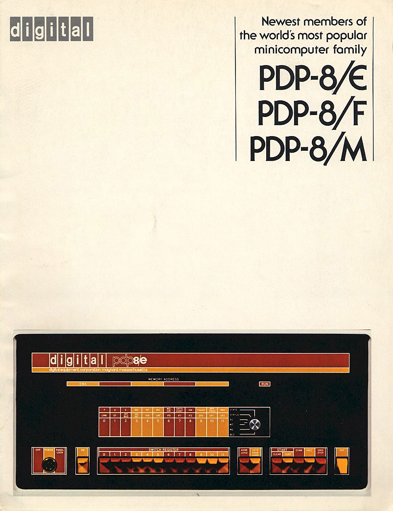
Whatever a “Minicomputer” is, this was the first one. It cost almost $15,000 in 1974 making it a pretty, but pricey machine. During this period Digital produced a lot of machines featuring interfaces similar to this. I love the color combos and the excellent grid based design. Those toggle switches complete this bold yet welcoming example of top-shelf 70’s industrial design. The color scheme could be construed as somewhat garish for a computer, but remember, this was the 70’s and they were probably trying to “break the design mold” of this particular class of devices. Unfortunately, soon after these became obsolete the industry veered right back into beige/grey tones and boring, toggle-less interfaces. The only standout enterprise-level computer hardware that comes to mind after this were the Silicon Graphics machines of the 90’s and the Sun Systems stuff around the turn of the century. More info on this particular model is here. I like the “digital” logo and it fits nicely up there in the corner. But I couldn’t resist tweaking the text in the upper right to make it look like a poster. You can click the image to see the original version. I have some examples of similar Digital equipment in blue and green I will be posting soon.
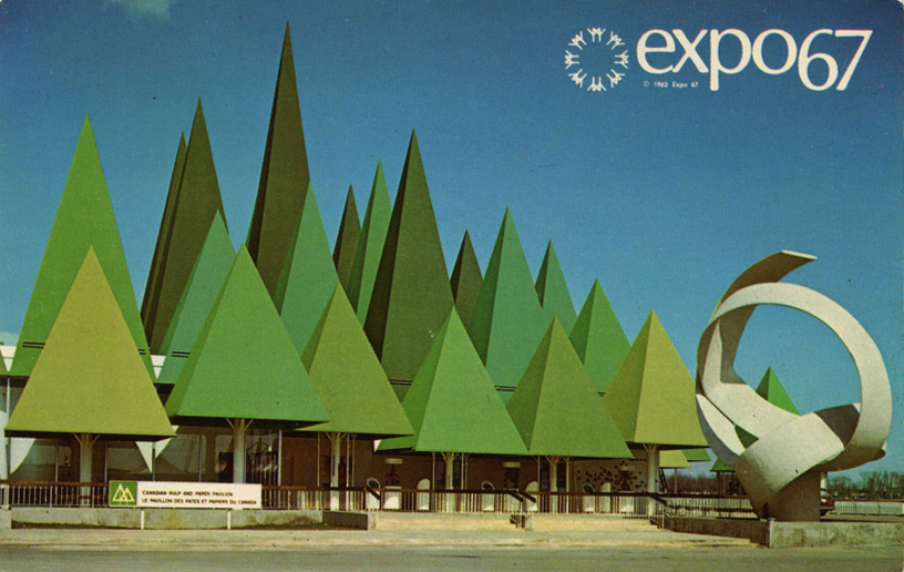
Wanted to add that I love the style of the photo. It’s almost as if it’s a drawing, one of those old product shots that sort of blurs the line between photo and illustration. Wonder how they achieved this? Was it an intended effect or a byproduct of the printing method?
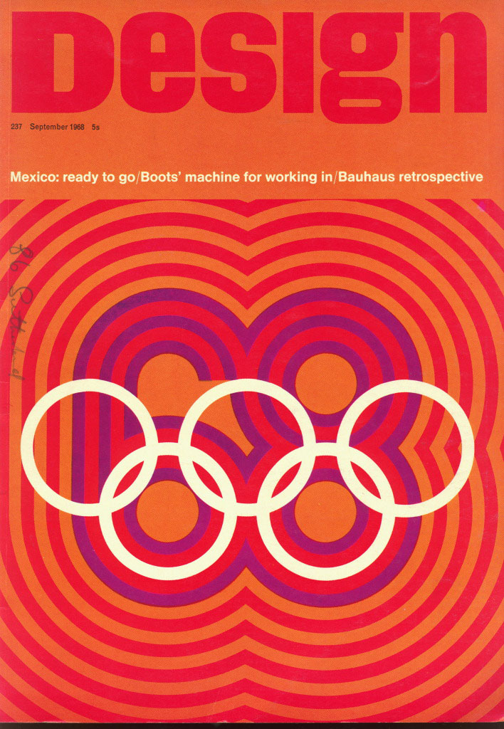
It’s hard to comment on something so perfect. First we have the header for Design Magazine itself. The type is beautiful, they’ve even managed to gracefully compress the ‘g’ so it doesn’t throw off the grid too much. And then of course we have one of the greatest logo designs of all time right beneath it incorporating an amazing color scheme. It’s all there. The logo for the ’68 Mexico Olymipics was created by American designer Lance Wyman (click the above image for a full size version). The posters for the games were a collaborative effort, an example and some info are here.
This incredible image came my way via Jakub … Not sure if they have the world expo anymore, but I doubt it would look this good. Click through for more pics – Image above now links to larger version via George. Continue reading →
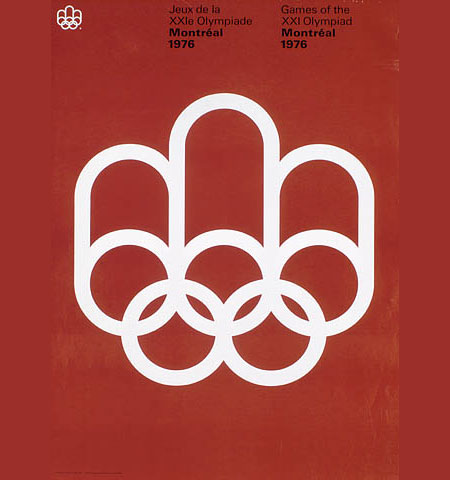
Had this laying around for a while, classic Olympic poster. This is a perfect example of how much the core ethics of design have changed. Take this one in, then have a look at these olympic logos…. what happened to design?
A lot of wonderful things going on in here. The logotype is incredible, the layout perfect, and the imagery spot on. Love the weight of the font and the subtly distinctive modifications. I am really averse to the modern trend of forcing a logo mark. This image recalls the time when they knew how to create a proper logotype.
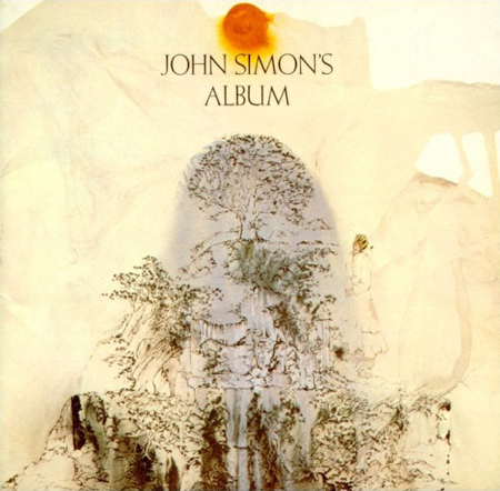
I wonder if the music is as good as the cover. Love the organic transitions and the seamless flow through each media. Particularly love that sun, amazing.