Captain Beefheart
Posted by Scott
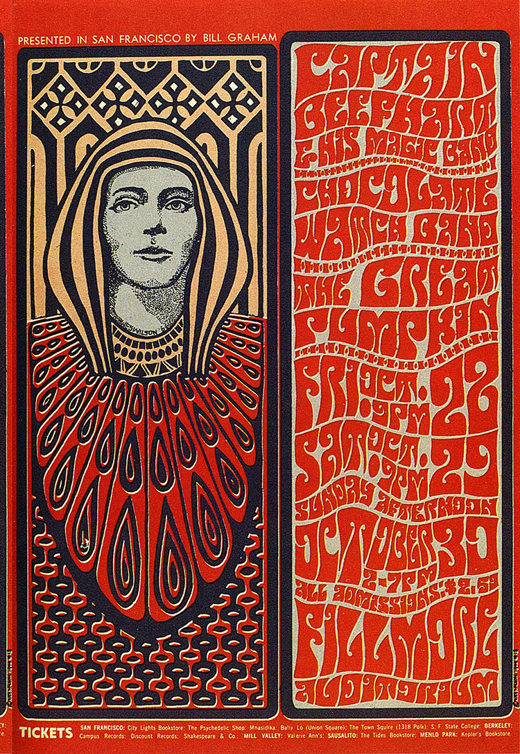
Here’s a nice example of the Fillmore West style by Wes Wilson. This style is a conglomeration of many of the early 20th century design themes. While a bit less than legible, the illustrative lettering indicative of this style is a work of art in itself. The psychedelic and Art Nouveau themes associated with the Fillmore movement have always been a great inspiration to me but I have always felt them to be a little overstated. When I do explore these themes in my own work I tend to temper them with a more minimalist slant.

9 Comments Leave A Comment
None says:
September 23, 2007 at 11:35 amNice stuff
Phil says:
September 23, 2007 at 7:59 pmi’ll be honest.
not a huge fan of the font…
Scott says:
September 23, 2007 at 8:55 pmPhil-
Yeah, I wouldn’t want to see lettering like this done these days.. But this particular style was all about a specific time and place. I think it worked back then for it’s the intended purpose.
Phil says:
September 23, 2007 at 9:55 pmif by “intended purpose” you mean they didn’t want people to be able to read it from afar off, then yeah, they were successful.
:)
Scott says:
September 23, 2007 at 11:42 pmhaha…well, I mainly meant that it spoke to the whole psychedelic movement of the time. I think it was more intended to get attention and once it had you, you might look closer to read it? But at the end of the day I really doubt he was going for legibility.
Moka says:
September 24, 2007 at 10:24 amThanks for the image and the link. I’m growing fond of your blog. I’ll be adding some of these Wes Wilson to my rock posters album in flickr. Take a peek: http://www.flickr.com/photos/11840520@N04/sets/72157602128551276/
Tho I warn you some of them I only had them in lo quality.
Scott says:
September 24, 2007 at 10:50 pmThanks for the link Moka. You’ve got some cool posters in there.
Bregman says:
October 15, 2007 at 3:27 pmYeah, I think the intention of the craft was beyond readability issues. It’s most likely not a typeface; probably hand-lettered.
I bet the artist was p*ssed when he/she realized they made a typo on “Beefhart”. Or maybe they were very laid back about it given the historical context.
Scott says:
October 15, 2007 at 3:40 pmI would bet they left it out intentionally to save horizontal space and still have the word read as big…. At any rate, you’re right, show posters are always sort of a quick and dirty thing, never really intended to stand up to 40 years of critical eyes so if indeed it was an error, maybe they just rolled with it.
And yes, I think it’s a safe bet that is *not* a standard font. This was obviously done by hand, or at the very least , very liberally adapted from a letterset.