DIGITAL PDP-8
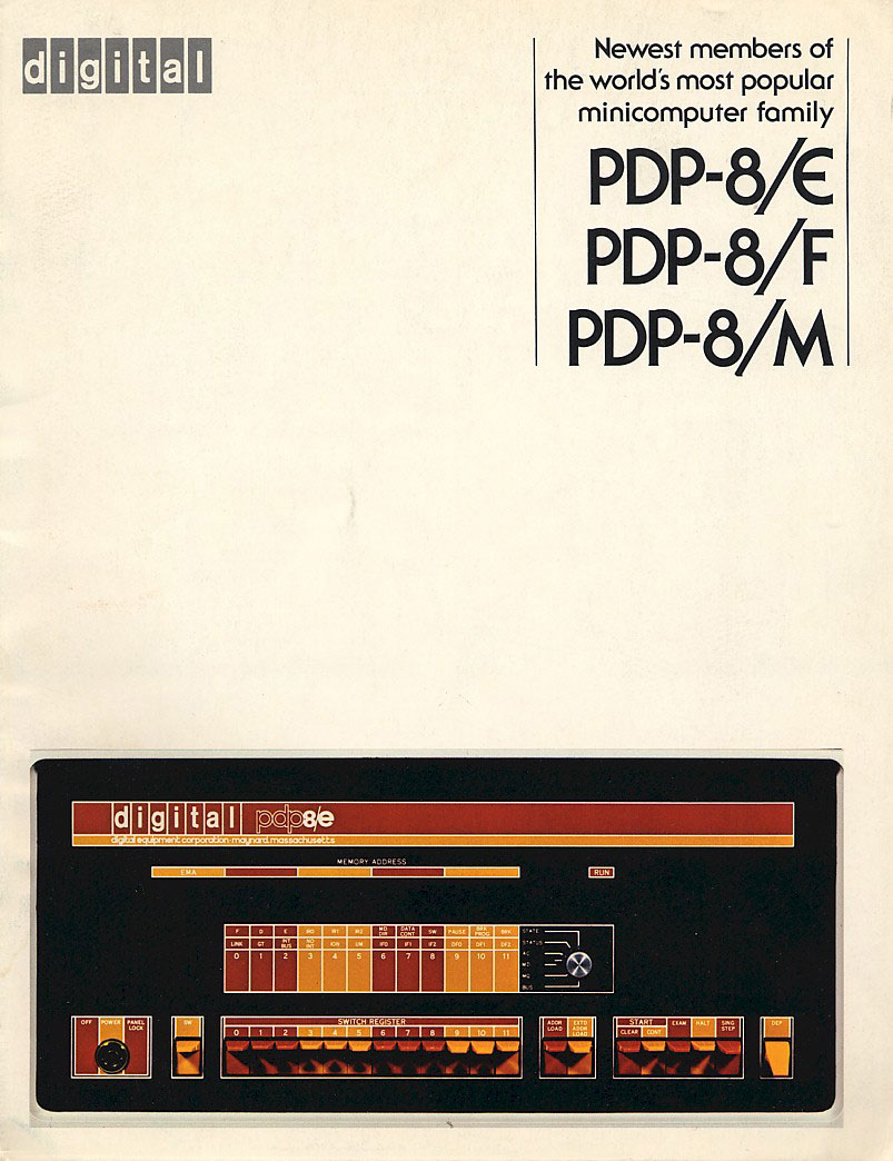
Whatever a “Minicomputer” is, this was the first one. It cost almost $15,000 in 1974 making it a pretty, but pricey machine. During this period Digital produced a lot of machines featuring interfaces similar to this. I love the color combos and the excellent grid based design. Those toggle switches complete this bold yet welcoming example of top-shelf 70’s industrial design. The color scheme could be construed as somewhat garish for a computer, but remember, this was the 70’s and they were probably trying to “break the design mold” of this particular class of devices. Unfortunately, soon after these became obsolete the industry veered right back into beige/grey tones and boring, toggle-less interfaces. The only standout enterprise-level computer hardware that comes to mind after this were the Silicon Graphics machines of the 90’s and the Sun Systems stuff around the turn of the century. More info on this particular model is here. I like the “digital” logo and it fits nicely up there in the corner. But I couldn’t resist tweaking the text in the upper right to make it look like a poster. You can click the image to see the original version. I have some examples of similar Digital equipment in blue and green I will be posting soon.
Wanted to add that I love the style of the photo. It’s almost as if it’s a drawing, one of those old product shots that sort of blurs the line between photo and illustration. Wonder how they achieved this? Was it an intended effect or a byproduct of the printing method?

10 Comments Leave A Comment
Horacio says:
September 20, 2007 at 8:30 pmLooks like the Altair, one of the first terminal computers. Looks nice by the way :)
Have you seen the Strokes video for the song “You only live once” ?. Take a look at the version2 of the video to see that retro computers. It’s great!
Thanks for posting :D
Eric says:
September 20, 2007 at 9:09 pmI love me some vintage computers. Check out the Core Memory book if you haven’t already seen it:
link
Ryan says:
September 20, 2007 at 10:30 pmDon’t forget about the NeXT machines post Jobs at Apple>
http://en.wikipedia.org/wiki/NeXT
Jerome Dahdah says:
September 21, 2007 at 1:51 amThe image immediately reminded me of Core Memory which Eric mentions. There is also a nice gallery that goes with the book, have a look:
http://www.corememoryproject.com
Scott says:
September 21, 2007 at 3:19 amThat’s a very cool book, will have to pick up a copy. Something about this brochure though, love the style of the photo. It’s almost as if it’s a drawing, one of those old product shots that sort of blurs the line between photo and illustration. Wonder how they achieved this? Wonder how they achieved this? Was it an intended effect or a byproduct of the printing method?
rafael says:
September 21, 2007 at 8:38 amhey scott, this post reminded me of things I’ve seen:
http://gizmodo.com/gadgets/home-entertainment/apple-holiday-catalog-1983-225237.php
http://www.lileks.com/institute/compupromo/index.html
there’s also an old IBM brochure wich unfortunately has a broken link now. I’ll look for those in my backup files.
it’s always nice to get inspiration from such unusual sources. excellent post. cheers.
rafael says:
September 21, 2007 at 10:23 amoh yeah, i found it:
http://www.flickr.com/photos/alienwhere_photos/sets/72157601769104737/
i actually made a wallpaper with these images for the agency i used to work on, please check:
http://www.cappuccinodigital.com.br/uploads/downloads/dow_arquivo3/1280.jpg
that’s it.
richard dean says:
September 27, 2007 at 9:44 amcheck this add out for the honeywell..
http://www.pixagogo.com/Photos/Albums/Photo.aspx?id=S4x-CcdFIZ
Jason says:
October 10, 2007 at 8:59 amSomewhere in the links above there was a video of one of these things being operated, and for that, unremembered linker, I thank you.
Also, I ran into one of these at Maker Faire earlier this year, and unfortunately didn’t appreciate it as much then.
Jeff Risberg says:
January 14, 2008 at 5:46 pmI have a WordPress theme that emulates the blinking lights of the PDP-8 and other vintage computers. You comment about photo vs illustration was right on track: what I did was take a photo, then reconstruct it pixel by pixel so that it becomes an illustration. Also re-arranged a few parts so that it becomes wider, to be used as the theme header.
Check my web site for details.