1970’s Alberta, Canada highways
Posted by Jakub
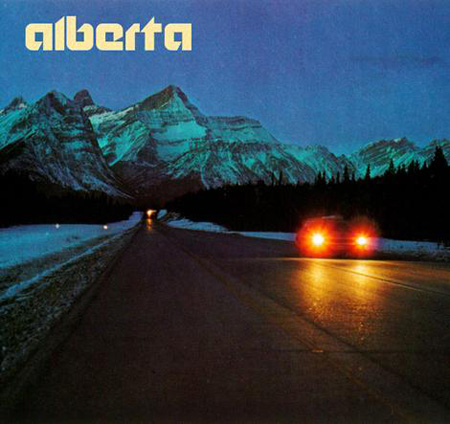
A lot of wonderful things going on in here. The logotype is incredible, the layout perfect, and the imagery spot on. Love the weight of the font and the subtly distinctive modifications. I am really averse to the modern trend of forcing a logo mark. This image recalls the time when they knew how to create a proper logotype.

4 Comments Leave A Comment
Greg Formager says:
September 18, 2007 at 10:14 amI agree, great logo and imagery there. I think I also agree with you about forced logos. I was wondering if you had an example or two of what you consider to be particularly bad “logo forcing”. Curious as to your specific take on things.
Scott says:
September 19, 2007 at 2:41 amGreg-
I will try to dig up some stuff. I guess back in my years of freelance work I used to always get annoyed with clients who insisted on a logomark even when one really didn’t make sense. A distinctive wordmark feels so much cleaner and refined. Of course there are times when a logo makes a lot of sense, a lot of times in fact. I guess I am just against complex logos and the best way to keep it minimal is to keep it to type only.
John says:
November 18, 2007 at 1:48 pmHi, there!..7d3b084308d33ed32324018b9f72177d
Mypephiliesia says:
March 31, 2009 at 8:05 pmКрайне хочется написать гадость, но может я один такой, подожду других комментариев