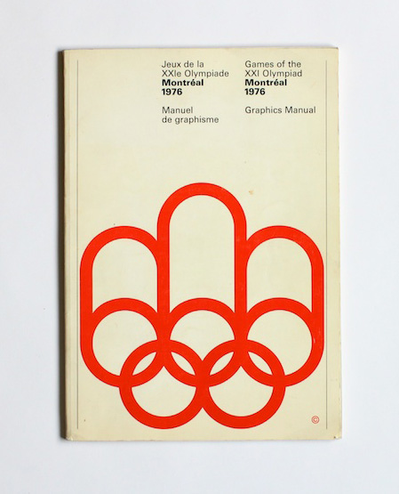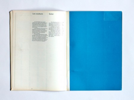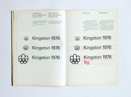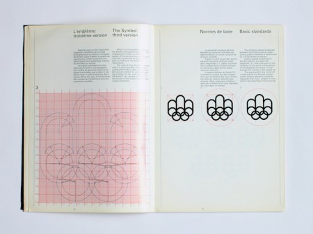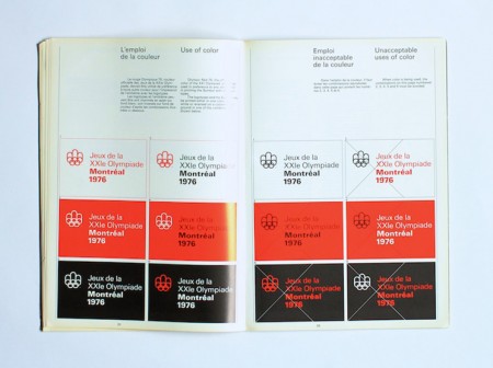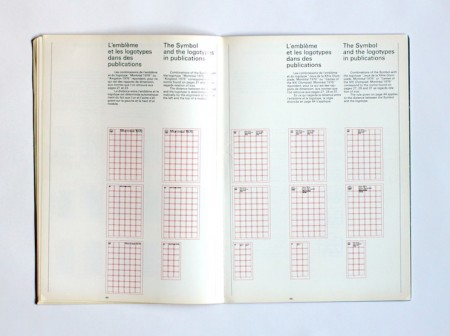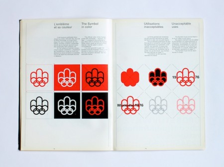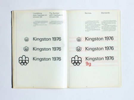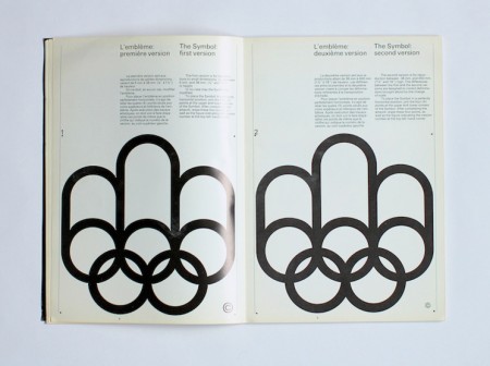


Ah, the 2012 Summer Games, now nothing more than the hazy recollection of infinite spoilers and borderline mental illness. While the overall visual presentation wasn’t quite as bad as a lot of people built it up to be (it was certainly better than this bullshit — but not this), London 2012 was an Olympics whose branding I seriously doubt designers will still be going on about 40 years after the fact. Perhaps it was just too advanced for our feeble 21st century minds to comprehend, so to ease us back into our stasis of perpetual nostalgia I present some more universally agreeable fare, from the simpler age of 1976, when everything happening in this picture was perfectly acceptable and also this crudely fashioned chunk of internet-free wood was your computer.
The 1976 Montreal Olympics branding sits right up there with Munich (my personal favorite) and Mexico on the pantheon of graphic design’s greatest achievements. I’m curious to see which of the more recent Olympics — if any — ends up being canonized by the design community in years to come. From the looks of things we shouldn’t hold our collective breath, it’s all been downhill since 1984.
Further reading / viewing here via AisleOne’s Flickr


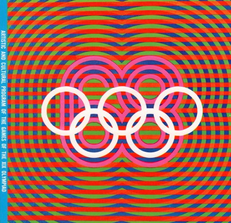
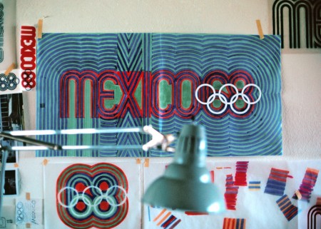
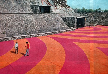
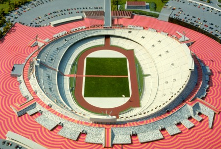
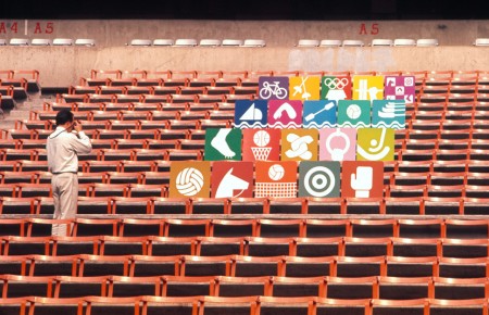
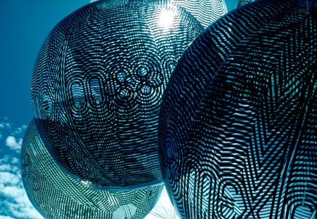
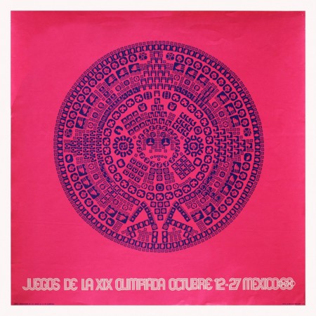
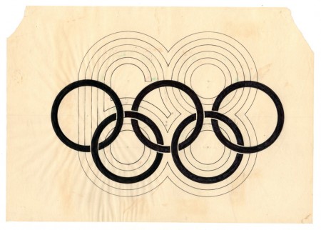
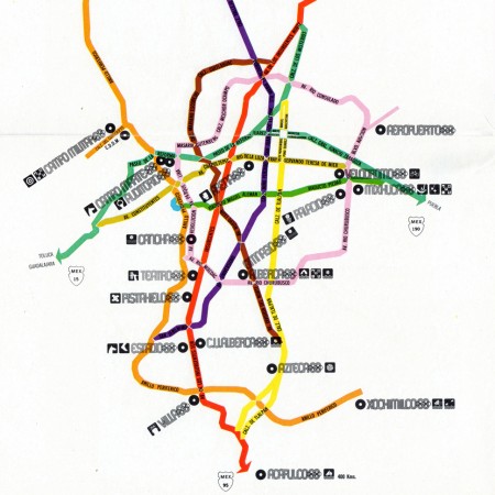
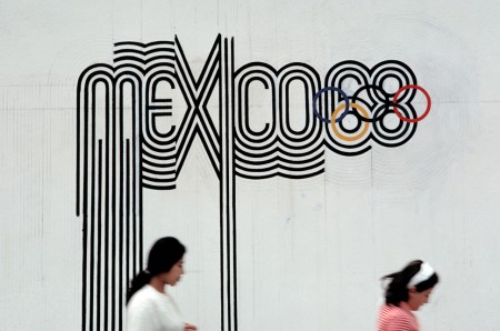
 With the London 2012 games (along with their controversial branding) in full swing I thought I’d revisit one of my favorite — Olympic or otherwise — branding campaigns ever: that which was created for the 1968 Mexico Olympics. Graphic Ambient has some beautiful images of the work in the real world, some of which I’d never seen before. I definitely have to say that I prefer Otl Aicher’s work for the 72 Munich games; but this has it’s own thing going on and after all it did come first! Related reading: Design Magazine #237 Via Graphic Ambient


I’ve just returned returned from a trip to both Munich and London, where I spent time with colleagues in both locations. Cosmic timing really, considering the London 2012 Olympics are on the horizon, and I’ve had Otl Aicher on the mind recently.
Much has been said in recent years about the shortcomings of the London 2012 graphic identity, but I hadn’t really been paying close attention to all the outrage, and had all but forgotten the design work – so I wasn’t prepared for the onslaught of Olympic schwag that greeted me at the official London 2012 shop at the St. Pancras Station in London. It’s borderline seizure inducing. Having just stepped off the train from Munich, where I spent time in Olympiapark and was exposed to Aichers work throughout the city, this London 2012 noise was especially jarring. And that mascot! Sigh. I took quite a few pictures, and had originally thought I’d post about Waldi vs Wenlock, but I decided I wouldn’t subject you to any of that madness. After all, this blog is here to celebrate beautiful things.
Scott has extensively covered Aicher’s work for Munich ’72 here before (in fact it’s where I was first exposed to it), but I thought the timing was right for us to be reminded just how amazing a coherent Olympic graphic identity and subsequent merchandising campaign can be.
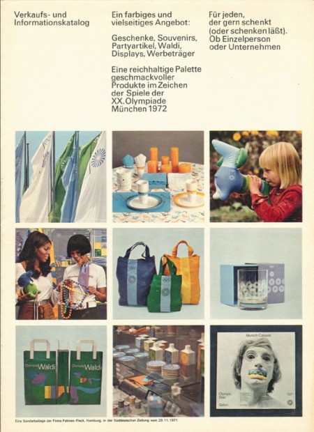
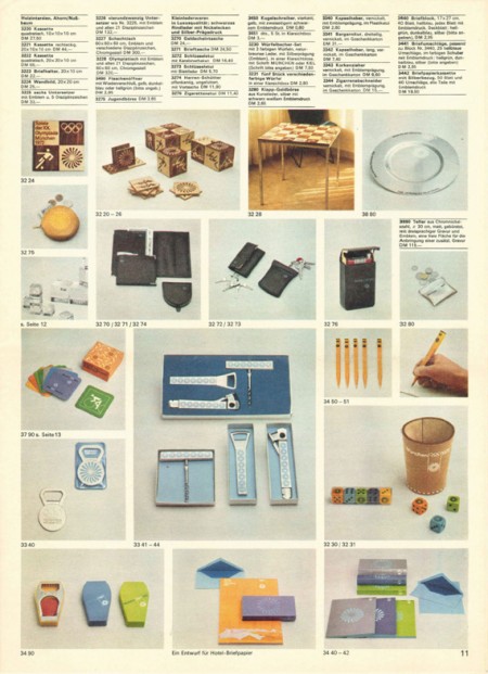
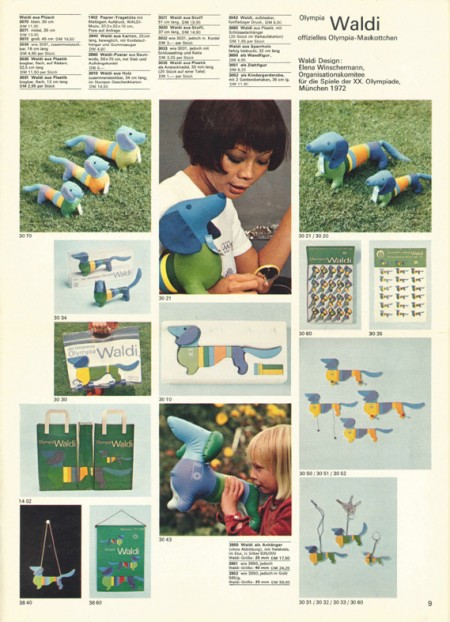
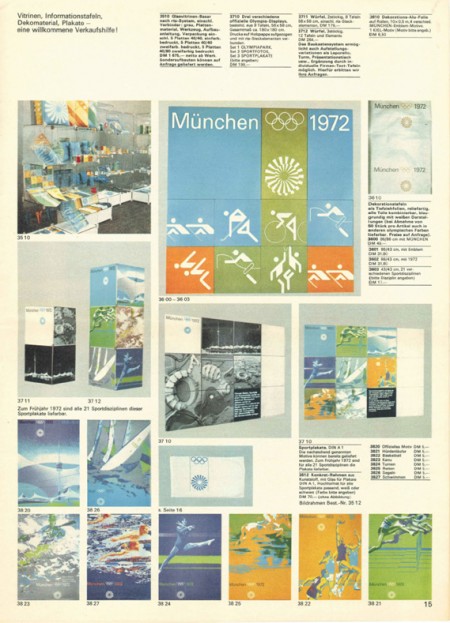
Creative Review recently posted the above scans of the official Munich ’72 merchandise catalogue, and there are a few images of what look to be the official gift shops as well. While Waldi was the only souvenir that was actually designed by Aichlers studio directly, I find it really impressive how cohesive the entire output of the “Olympic Souvenir” department was. This is most likely due to the fact that Aicher dictated a very strict set of rules as to how the logotype and symbols could be used.
It’s easy to pick apart London 2012 when stacked up against the extremely high bar set by Aicher’s work for Munich, but let’s be real here, remember Izzy from Atlanta? NOTHING is as bad as that. What. Is. That. Thing.
I’m not sure if they entered the competition, but if they did I’d be real curious to see what Bibliotheque came up with for the London 2012 graphic identity. After all, they know a thing or two about Aicher’s legacy, having put together an exhibition of his Munich ’72 work over at the Vitsoe shop in 2007, comprised entirely of posters and print from their their own collection. This unofficial Olympic torch poster they did is pretty amazing as well.
Bonus link: While googling around, I found this site that offers up the official Olympic report books as PDFs. The Munich 72′ books span 3 Volumes, upwards of 1200 pages. For the true Munich ’72 geeks.
Posted by: Rob Fissmer


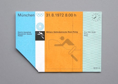
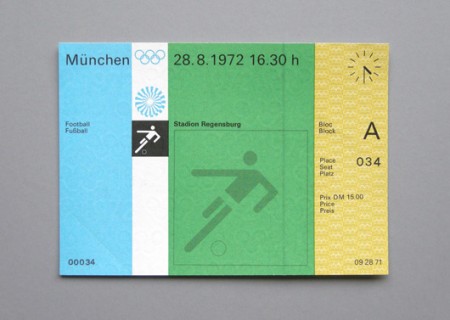
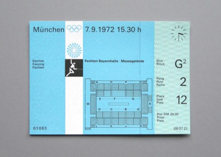
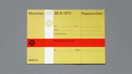
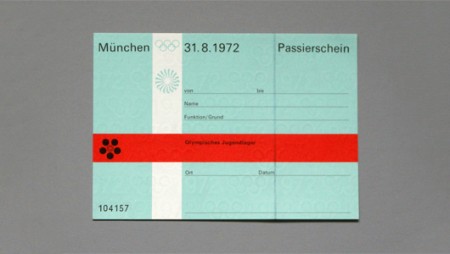
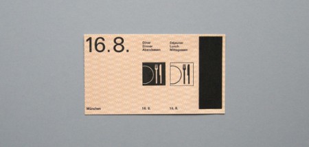
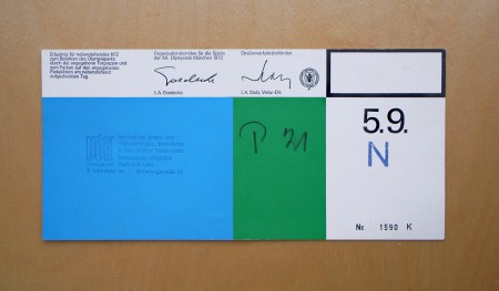
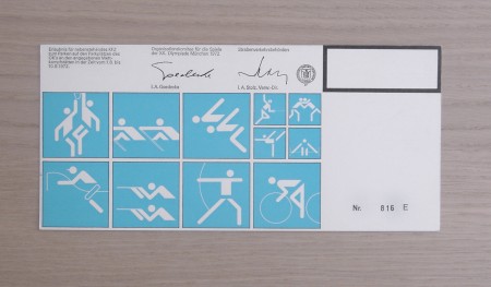
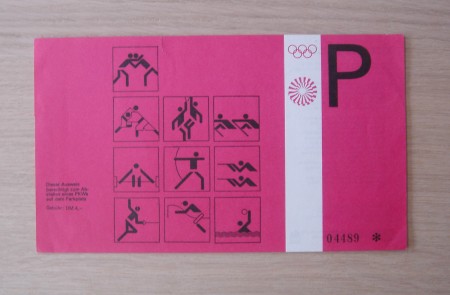
Shelby’s Blog is running A Week of the 1972 Munich Olympic Games feature and the second installment is pretty epic. This collection of ticket passes from the ’72 games were designed by the legendary Otl Aicher and feature the classic pictograms for which the Munich games are known.
I’m not sure why, but tickets of all kinds have always piqued my interest and this set may be the best I’ve ever laid eyes on. But forget the tickets, would just love some high-res copies of these photos for framing.
Wanken – A Week of the 1972 Munich Olympic Games


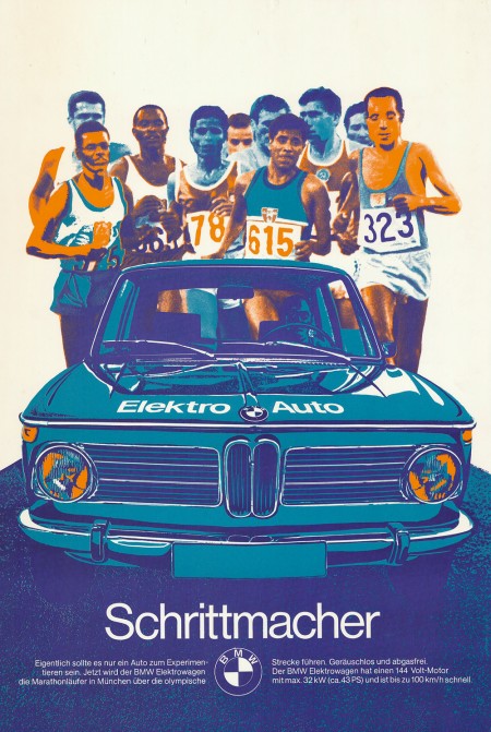
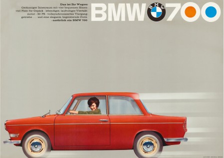
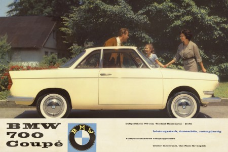
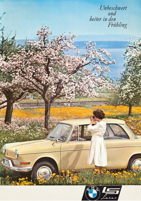
In keeping with my recent car kick I thought I’d post these vintage BMW ads. The first one — created as part of BMW’s affiliation with the 1972 Munich Olympics — is vaguely reminiscent of Otl Aicher’s posters. I’m assuming this was no accident. It’s also a big enough file that you could probably get a pretty good print out of it off a nice inkjet (click image to view full size). I really wish more vintage posters like this were available in higher resolutions. With most of this advertising stuff, the owners of the copyrights have no intention of ever printing them again, it’s a shame they can’t be reproduced and enjoyed by more people.
Via CarType


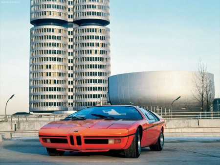
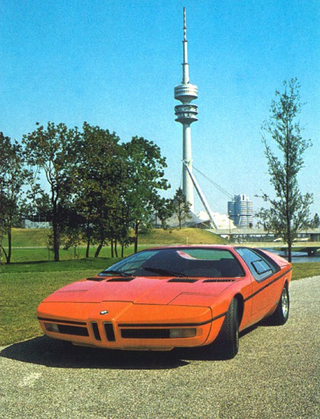
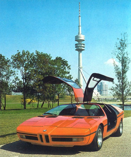
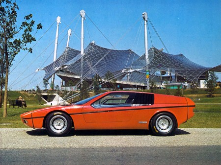
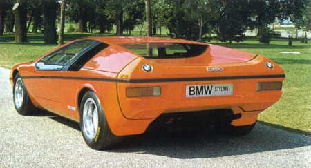
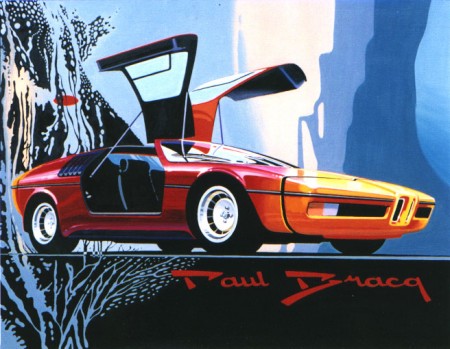
I’ve been geeking out on ’70s supercars lately and came across these gems depicting a BMW concept from 1972. The “E25 BMW Turbo” was commissioned to celebrate the 1972 Munich Olympics. BMW tasked famed automotive designer Paul Bracq to create the concept of which only two were ever built. Honestly, I love the front angles, but not really feeling that rear end. It feels very hatchback/kit-car-ish and the doulbe logos are killing me. Thankfully some of the finer points made it into production in the form of the M1 and some others.
That first shot is just off the charts; in the background you can see BMW’s Munich headquarters which was designed by architect Prof. Karl Schwanzer shortly before his death in 1975. In the other shots you can catch the games tent and the communications tower providing apt backdrops for the Turbo.


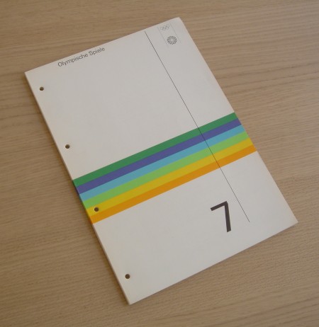
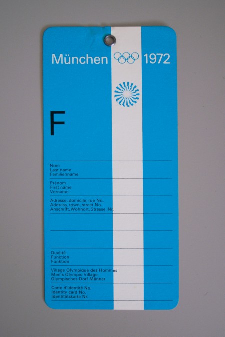
Alphanumeric has a great set of Otl Aicher work including these artifacts from the 1972 Munich Olympics. As much as I love the posters from Munich, there’s something about the official stuff (tickets, badges, etc.) that might be even more fun to look at. I love how they combine form with function and you can never go wrong with serial numbers. It’s amazing to think that people defiled that beautiful luggage tag with their names and addresses. I guess that’s what makes these all the more interesting, the fact that most were destroyed by being used for their intended purpose.
