Assembly Line Design
Posted by Scott
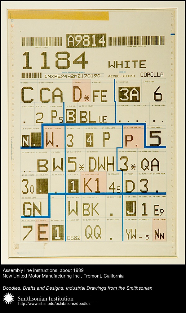
Loving this, already has the tape and everything, so many great details. Could do without the blue lines though. Via FFFFOUND
Loving this, already has the tape and everything, so many great details. Could do without the blue lines though. Via FFFFOUND
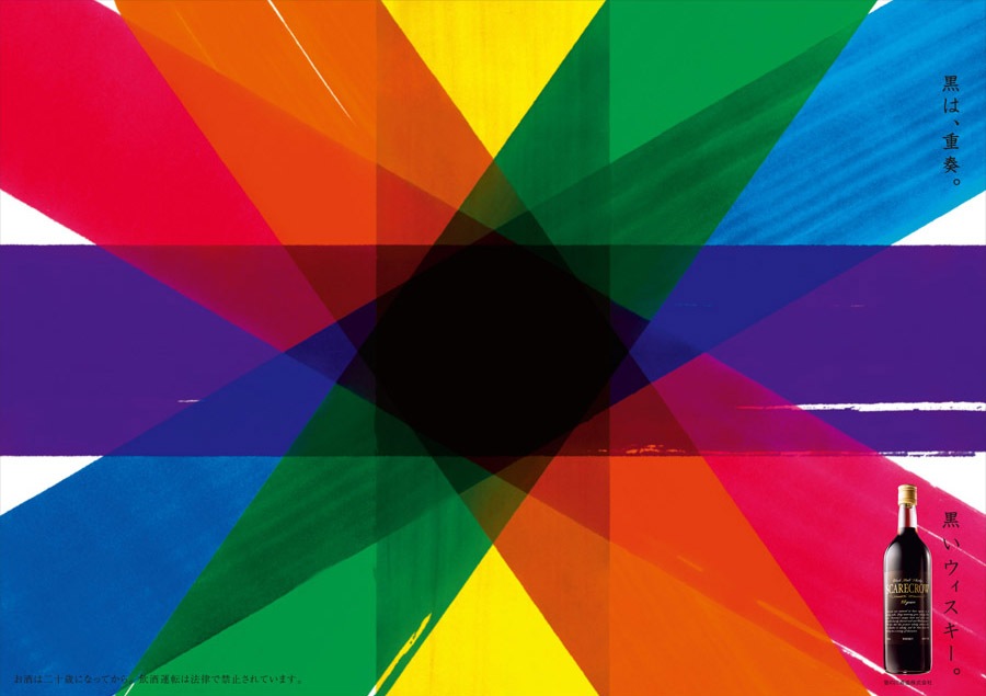 Not exactly sure what this is for, seems to be some variety of Japanese liquor or wine named "Scarecrow". At any rate, loving the colors and textures here. I wonder if this was handmade or digitally composited? I’ve rotated the image to fit a larger size in the page format. Click for original horizontal version. Via FFFFOUND
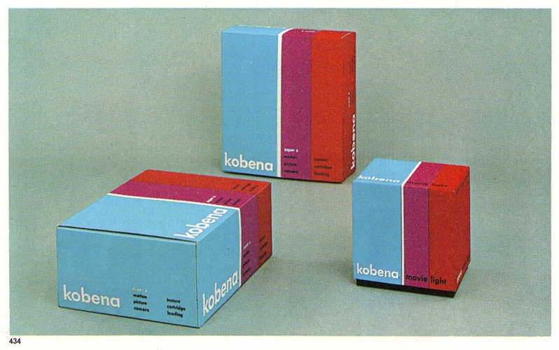
More great packaging, this time via Everydaylifemodern’s Flickr page. Would be great to have a laser cutter just so you could make concept packaging like this and put it on your shelf.
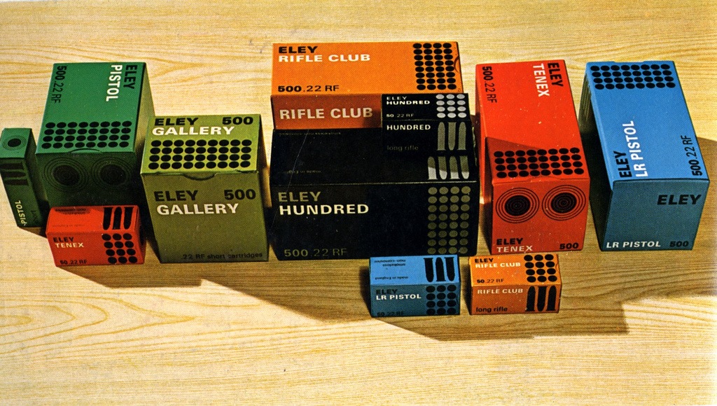
"Eley, Imperial Metal Industries (1966)
Range of packs for cartridges made by Imperial Metal Industries (Kynoch)
Artist: David Mawford / John Harrison
Agent | Studio: Service Advertising Co. Ltd., London.
Art Director: John Harrison"
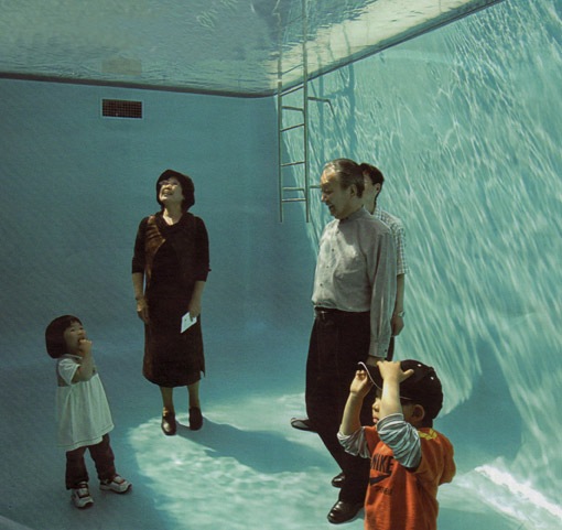
File this under things I wanted to but didn’t see in Japan. This photo by Sanaa is from the 21st Century Museum of Contemporary Art at Kanazawa. This would make for a great album cover with different subjects in there. Next time… Via FFFOUND.

Some nice packaging via Crabstick’s Flickr. I have to say that the quality of product packaging design has seriously declined over the past 20 years. If I ever saw anything in a box like this now I’d buy 15 of them regardless of what was inside.
Caught this on FFFFOUND yesterday. Loving this design but lacking much information on it. I really like FFFFOUND but they are sometimes bad about citing sources so it’s hard to find the origins of the work they post. At any rate, this is a very nice print, anyone have any more info on it?
UPDATE: Via Aurélia in the coments. This is the work of FRÉDÉRIC TACER who, according to his website, is a 22 year old design student at National College of Arts and Design Olivier de Serres in Paris. Looks like Frederic has a pretty good start, this certainly doesn’t look like the work of a student, more like a seasoned vet.
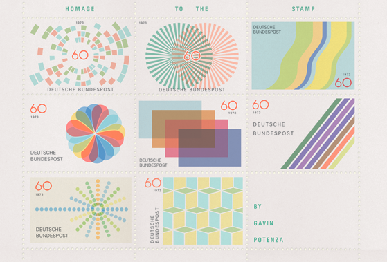
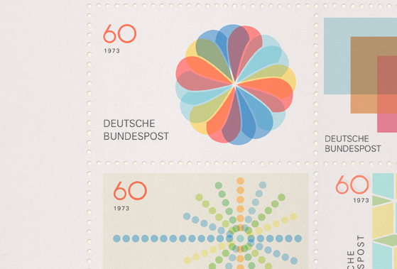
Ever since I saw his great 2007 Holiday Card on I’ve been waiting to see more from Gavin Potenza. When I awoke this morning this nice little birthday present waiting for me on FFFOUND. I love the concept and I love the fact that it’s purely a design exercise, which is very fitting considering the name of his site (exploratorydesign.org). As I say in my workshops, that’s when most people will do their best work, when there is no spec, no client, no parameters other than your own. Just you, your imagination, and your tools. As he says on his site, this piece was inspired by Otl Aicher, one can’t really go wrong with that kind of source.
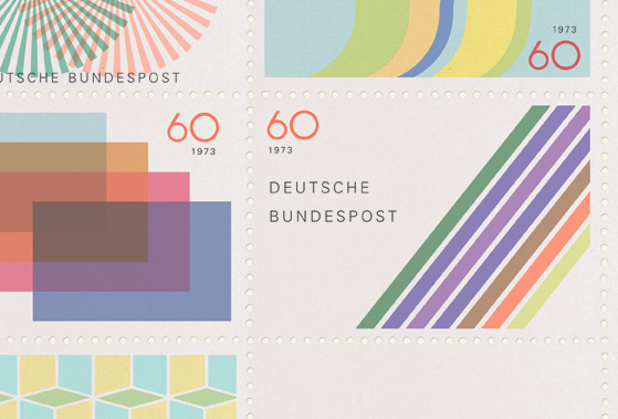
It’s minimalist, reserved design like this that intrigues me more and more these days. To me, modernism is about taking all your ideas about color and type and form and expressing them in the most efficient way possible, which I think is the very core of what we are all trying to do as designers. Also, stamps are awesome, I collected them when I was a kid…along with my obsessive hoarding of any other printed material I could get my hands on. Unfortunately I only had access to boring American stamps so it got boring real quick.
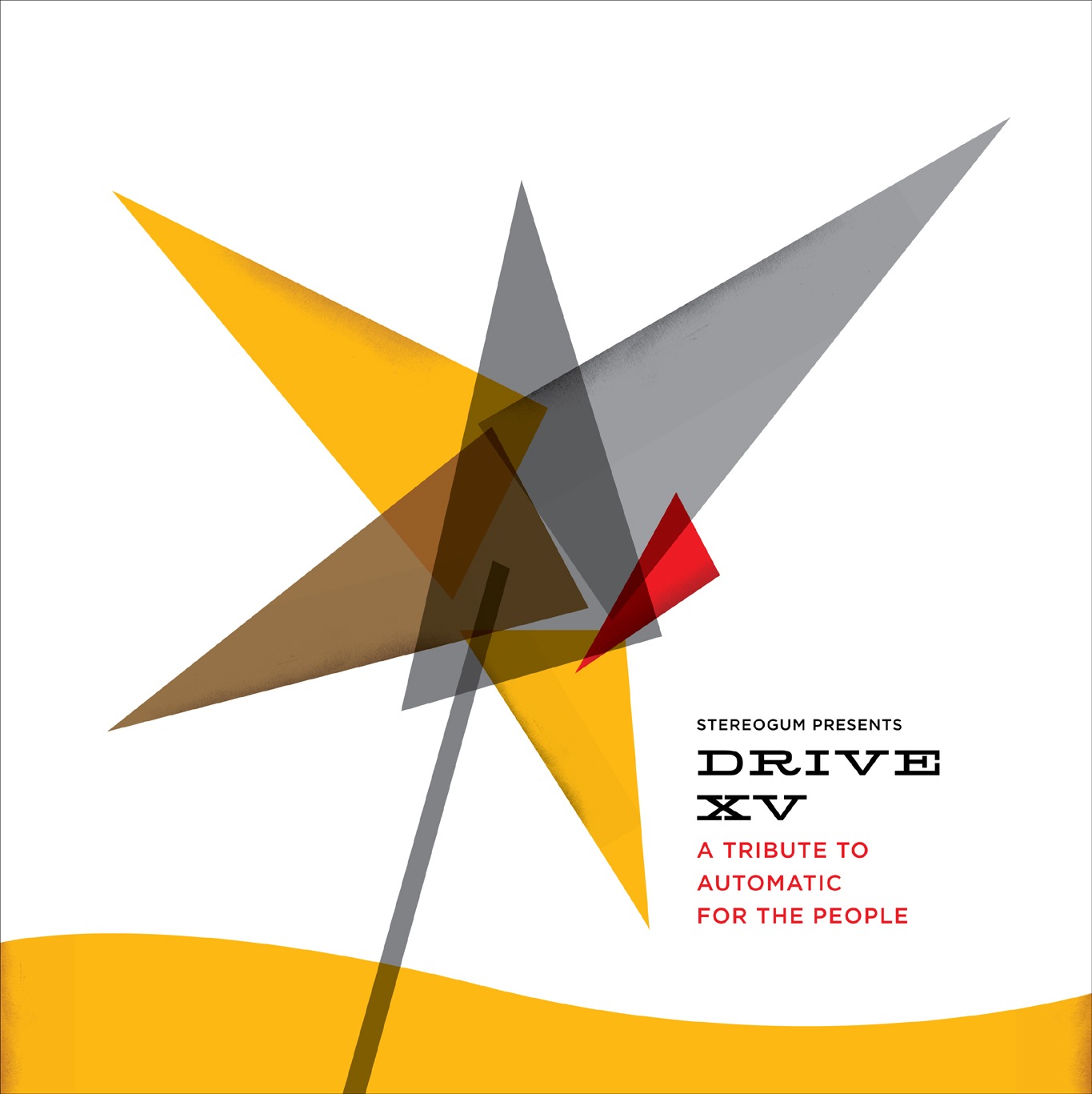
Was talking to the guys from Stereogum today about a design project and they sent me a link to Drive XV, the 15 year Tribute to REM’s Automatic For The People. I remember when Automatic For The People originally came out, it was really something unique at the time, one of my favorites. So apparently Stereogum has designers sort of re-imagine the cover art for the tribute albums and I thought this one came out quite well. Really like the type treatment and minimal approach. You’ll notice that it vaguely follows the form of the original. Bonus: name those fonts
Design aside, the Shout Out Louds’ tribute to Man On The Moon is superb, have a listen below. I hear some Paul Simon Graceland in that chorus, anyone else?
Shout Out Louds – Man On The Moon
[audio:remmoon.mp3]