ISO50

RSS

Search Results for: circle color

Matthew Lyons Process | ISO50 Exclusive

Posted by Alex


Matthew Lyons is an incredible illustrator. Just about every blog in existence has written a piece about him recently — and it’s no surprise — his work is absolutely stunning. As I mentioned in my post, the combination of his vast imagination and impeccable eye for color and composition begets some really exciting work.

I asked Matthew if he would prepare a short process description about one of his recent works. What follows is Matthew’s description of how he created the piece you see above, The Snide of a Scoundrel Man. Take it away Matthew!

Continue reading →

Hvass & Hannibal

Posted by Alex

hvass
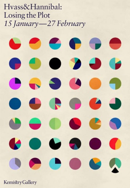
I only post one image by itself when I think it’s worth it. This one, advertising the Hvass&Hannibal show at the Kemistry Gallery, is such an image. I like the layout, sure, but the main reason I found this so captivating is the color combinations. Each little circle has a different (and often bizarre but terrific) color combination. Each could easily jump off this poster and onto whatever project you happen to be working on (assuming the word “fun” might describe your client…) Pink and green? Why not. Lime and red? Let’s do this. My favorite is 6th row down, 4th across. Reminds me of a Deth P Sun type palette.

Now I’m inclined to think that H&H had everything to do with the design of this poster, but I cannot find the credit information anywhere. It looks like something they would drum up, but if not, let me know and I’ll be sure to link out. If you’re in London, be sure to check out the exhibit! Here is the invitation.

Analog Visions

Posted by Scott

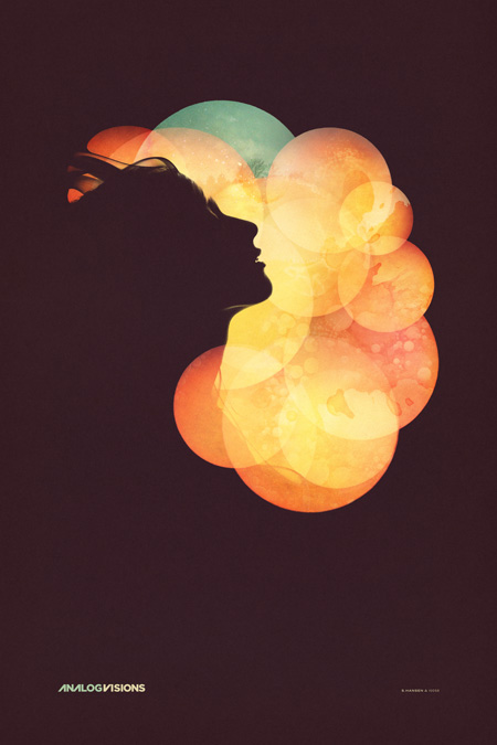
iso50-analog_visions-blogd
As promised, here’s the final poster for the Analog Visions show on Friday in Toronto. In case you missed it, I’ll be doing a solo show at Function 13 Gallery this Friday, November 20th. I’ve been working out concepts for how to hang the posters throughout the past week, I’ve decided against frames and want to go with something a little more raw feeling for this one. The work that I’ll be showing are all printed on Hahnemühle German Etching paper which has this incredible texture. I don’t want anything to get between the viewer and the piece. I have been working with Bulldog clips and nails, spray painting the clips matte white and using longer nails to let the piece stand off the wall a little. I think it’s going to look nice, but I’m still open to any suggestions, if you have any ideas for alternative poster hanging methods, let me know in the comments.

As for the poster design itself, I spent way longer than expected on this one. It was meant to be a quick promo poster for the gallery but the deeper I got into it the more I realized I had to finish it off properly. Once you hit on a concept you kind of have to decide whether to go all the way with it or save it for when there’s time to do it right. It was a stretch, but I was able to get it done in time (deadline was this morning) so it’s pretty nice to finally see it in it’s completed form. As you can see, this is another take on the Nocturne poster, featuring the same model. Seeing as how these events are the same night I wanted them to be related, but not exactly the same. I wanted the Nocturne design to be a little more divergent from my earlier work while this one was meant to sort of bridge the gap between new and old given the nature of the gallery show. You can see a larger version of the image over at the studio site.

The version above is probably the fifth or sixth, not counting the various in between states. The final file ended up around 4GB, 24×36″ at 300dpi but I did most of the heavy lifting with low resolution smart object stand-ins so it wasn’t too slow. In case anyone was wondering, this is the project I was referring to in the Photoshop Question / Problem post. All of the circles were smart objects based on the same photograph. As stated above, I worked with a model I shot here in the studio for the silhouettes, but I worked with another photographer for some elements of the background. I used some shots from Jacob Sargeant’s beautiful Experimental Set on Flickr for the detailing and color shifts. Thanks to Disign Police for turning me on to Jacob’s work.

Time for a day off and some much needed rest, hope to see you out in Toronto.

» Scott Hansen / ISO50 Solo Show @ Function 13 Gallery
» Tycho Live – ISO50 Gallery Afterparty @ Nocturne

Playlist Archive

Posted by ISO50
  • playlist 16

  • playlist 15

  • playlist 14

  • playlist 13
    View original post

    Playlist 13 – Compiled By Jakub

    Load Playlist 13

    • Track Listing:
    • Tycho – Hours
    • Neon Indian – Polish Girl
    • Toro y Moi – I Can Get Love
    • Unknown Mortal Orchestra – FFunny Frends
    • M83 – Midnight City
    • Poolside – Harvest Moon
    • Gotye – Somebody that I used to know
    • Beirut – Santa Fe
    • Thundercat – Goldenboy
    • Peaking Lights – All The Sun That Shines
    • Little Dragon – Ritual Union
    • Andre Obin – Soft Rain
    • Benoit & Sergio – Let Me Count The Ways
    • Kolombo – Waiting For
    • Washed Out – Amor Fati
    • The Field – Is This Power
    • John Maus – Streetlight
    • Jacob 2-2 – LeVar [ISO50 Exclusive]
    • Soft Metals – Psychic Driving
    • Burial – Shell of Light (Shlohmo Remix)
    • Clark – Absence
    • Atlas Sound – Terra Incognita
    • 18 Carat Affair – Watching Your Dance
    • Trouble Books & Mark McGuire – The Golden Waste
  • playlist 12
    View original post

    Playlist 12 – Compiled By Jakub

    Load Playlist 12

    • Track Listing:
    • Austra – Lose It
    • Dirty Beaches – True Blue
    • Gang Gang Dance – Mindkilla
    • Benoit & Sergio – Boy Trouble
    • Selebrities – 08 Time
    • Jeans Wilder – International Waters
    • Ford & Lopatin – Channel Pressure (Instrumental Version)
    • Bibio – Saint Christopher
    • Brian Eno – I’ll Come Running
    • Crosby, Stills & Nash – Dark Star
    • Diamond Rings – It’s Not My Party
    • Craft Spells – You Should Close the Door
    • Midnight Televison –
    • Com Truise – VHS Sex
    • Brian Eno & David Byrne – Mea Culpa
    • Teen Daze – Surface
    • Clams Casino – Fakest Year Ever (Squadda B)
    • Eddie C – Listenin’
    • Magick Mountain – One for My Ego
    • D/R/U/G/S – Love/Lust (Keep Shelly in Athens Remix)
    • Yasume – Slowly, Clearly and Calmly
    • Fourcolor – Skating Azure
    • Lusine – Double Vision
    • Cloudland Canyon – Heme
    • Monster Rally – Chaska Beach
    • Hype Williams – untitled ( and your batty’s so round )
    • Vince Watson – Solitude
  • playlist 11
    View original post

    Playlist 11 – Compiled By Tycho & Aarnio

    Load Playlist 11

    • Track Listing:
    • Cut Copy – Where I’m Going
    • Beach Fossils – Fall Right In
    • Radiohead – Feral
    • Belong – Perfect Life
    • Modeselektor – I Love You
    • Chad Valley – Anything
    • The Juan Maclean – Give Me Every Little Thing (Gmelt)
    • Kano – I’m Ready
    • Siriusmo – Blaue Sonne
    • Daft Punk – End of Line
    • Depeche Mode – Useless (K&D Session)
    • Teeel – Dark Passenger
    • Cex – Theme Song to Cex
    • Woo – A Complex Art
    • Dorian White – Exit
    • Can – Bel Air (Edit)
    • Geotic – Beaming Husband
    • Monogold – Feel Animal
    • Moths – Heart
    • Painted Palms – All of Us
    • Yes – Survival
    • Broadcast and The Focus Group – The Be Colony
    • Jay Dee aka J Dilla – One
    • Jensen Sportag – Jareaux
    • Yoshinori Sunahara – Balance
    • Dntel – Peepsie
    • Marina & the Diamonds – Obsessions (oOoOO RMX)
    • Memoryhouse – Caregiver
    • Yo La Tengo – Don’t Have to Be So Sad
    • The Antlers – Kettering
  • playlist 10
    View original post

    Playlist 10 – Compiled By Tycho & Aarnio

    Load Playlist 10

    • Track Listing:
    • Belle & Sebastian – Didn’t See It Coming
    • Working For A Nuclear Free City – Quiet Place
    • Deerhunter – Desire Lines
    • Tapes ‘n Tapes – Conquest
    • The Helio Sequence – Back to This
    • Film School – P.S.
    • Yo La Tengo – Beach Party Tonight
    • Minks – Ophelia
    • Benoit Pioulard – Tower
    • The Walkmen – Woe Is Me (NPR World Cafe Session)
    • Junip – Rope and Summit
    • Kisses – People Can Do The Most Amazing Things
    • Mark McGuire – Brain Storm (for Erin)
    • Stewart Walker – Benstrumental
    • Atlas Sound – Spring Break
    • Matthew Dear – More Surgery
    • The Radio Dept. – David (Rice Twins remix)
    • Lovelock – Pino Grigio
    • Seams – Hung Markets
    • Bloc Party – Tulips (Club Version)
    • Anoraak – Above Your Head
    • Oriol – Coconut Coast
    • The Field – Caroline
    • Games – Everything Is Working
    • Gonjasufi – Candylane (Bibio Remix)
    • Soft Powers – just like tropica-L
    • DJ Shadow – Erase You [Count alt mix]
    • The Dining Rooms – Costi Ti Amo
    • Peter Broderick – Pulling the Rain
  • playlist 9
    View original post

    Playlist 9 – Compiled By Tycho & Aarnio

    Load Playlist 9

    • Track Listing:
    • The Morning Benders – Cold War
    • Rollerskaters – Sleep Tight
    • Via Tania – Fields
    • Tame Impala – Alter Ego
    • Best Coast – Boyfriend
    • Memoryhouse – Lately (Deuxième)
    • The Hundred In The Hands – Sleepwalkers
    • School Of Seven Bells – Babelonia
    • Dusty Brown – Back to Back
    • Lorn – Cherry Moon
    • Wax Stag – Folk Rock
    • Baths – Maximalist
    • Flying Lotus – Zodiac S**t
    • Tycho – From Home (Mux Mool Remix)
    • The Samps – Yellow Jacket
    • Onra – Long Distance (Instrumental)
    • The Beat Broker – Deep Sleep
    • ceo – come with me
    • Delorean – Infinite desert
    • Korallreven – The Truest Faith
    • Phoenix – Lisztomania (Classixx Version)
    • The Whitest Boy Alive – Intentions
    • The Swiss – Bubble Bath
    • Com Truise – Slow Peels
    • Computer Magic – Electronic Fences
    • Oneohtrix Point Never – Zones Without People
    • Odd Nosdam – Up In Flames
    • Fur – Lackadaisical
    • Ducktails – Mirrorimage
    • Medications – Brasil ‘07
    • Red House Painters – Dragonflies
    • Say Hi – November Was White, December W
    • Gravenhurst – Hourglass
  • playlist 8
    View original post

    Playlist 8 – Compiled By Tycho

    Load Playlist 8

    • Track Listing:
    • The Radio Dept. – Domestic Scene
    • King Of Woolworths – Nuada
    • Deerhunter – Little Kids
    • Headphones – Gas And Matches
    • Caribou – Odessa
    • Mux Mool – 11 Lady Linda
    • Siriusmo – Nights Off
    • Kavinsky – Pacific Coast Highway (Jackson Remix)
    • Toro Y Moi – Low Shoulder
    • Deru – Hello
    • Jon Hopkins – Light Through The Veins
    • Toro Y Moi – 109
    • The Radio Dept. – Heaven’s On Fire
    • The Pains of Being Pure at Heart – Come Saturday
    • Paul Michel – Lonely Dirges
    • Alcian Blue – You Just Disappear
    • Trans Am – Music For Dogs
    • Little Dragon – A New
    • The XX – Islands
    • Stars – This Charming Man
    • Yo La Tengo – Little Eyes
    • Midlake – Rulers, Ruling All Things
    • Chris and Thomas – Broken Chair
    • The Advisory Circle – Sundial
    • Casino Versus Japan – Hello You
    • Stars – Set Yourself On Fire (End Times Edit)
  • playlist 7
    View original post

    Playlist 7 – Compiled By Aarnio

    Load Playlist 7

    • Track Listing:
    • Black To Comm – Trapez
    • Paul White – Highlife
    • Beach House – Norway
    • Juana Molina – Un Dia
    • Lone – Karen Loves Kate
    • Pogo – Alice
    • Grizzly Bear – Cheerleader (Neon Indian ‘Studio 6669′ Remix)
    • Little Dragon – Feather
    • Beach Fossils – Daydream
    • Caribou – Schedules and Fares
    • The Mercury Program – Stand & Sing
    • Arovane – Seaside
    • Boards Of Canada – Kaini Industries (Bibio cover)
    • Kurt Vile – My Best Friends (Don’t Even Pass This)
    • Cocteau Twins – Lorelei
    • Peter Broderick & Machinefabriek – Homecoming
    • A Setting Sun – Raspberry
    • Brock Van Wey/BVDUB – Lest You Forget
    • High Wolf – Don’t Fuck With The Tropics
    • Lusine – Cirrus
    • Studio – Radio Edit
  • playlist 6
    View original post

    Playlist 6 – Compiled By Sam Valenti IV

    Load Playlist 6

    • Track Listing:
    • Phantogram – When I’m Small (Barsuk/BBE)
    • Memory Tapes- Run Out (HSR)
    • Zomby – Digital Flora (Ramp)
    • The Go Find – Run Out (Morr Music)
    • Omni Trio – Skeleton Keys (Omni Trio Remix) (Moving Shadow)
    • A Mountain Of One – Freefall (10 Worlds)
    • Lali Puna – Clearcut (Arovane Remix) (Morr Music)
    • Syntaks – Buio Omega (Ghostly)
    • CFCF – Letters Home (Paper Bag)
    • Paul White – The Punch Drummer (One-Handed Music)
    • Bear In Heaven – Ultimate Satisfaction (Home Tapes)
    • Midlake – Roscoe (Beyond The Wizard’s Sleeve Remix) (Bella Union)
    • BGM – 900X (Asthmatic Kitty)
    • Mux Mool – 1st and 4th (Ghostly/Moodgadget)
    • Grizzly Bear – While You Wait For The Others (Warp)
    • DJ Q- We Are One (Filter)
    • Dominik Eulberg – Daten-Uebertragungs-Kuesschen (Sistema Remix) (Traum)
    • Saint Etienne – The Place At Dawn (Sub Pop)
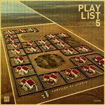
  • playlist 5
    View original post

    Playlist 5 – Compiled By Aarnio

    Load Playlist 5

    • Track Listing:
    • Casino Versus Japan – It’s Very Sunny
    • Bullion – Caroline, No
    • Ducktails – Landrunner
    • Atlas Sound – Walkabout
    • THE DRUMS – Submarine
    • The xx – Shelter
    • Washed Out – Feel It All Around
    • Dam Funk – Sunset
    • Fleetwood Mac – Dreams (Mingus Rude edit)
    • Gold Panda – Quitters Raga
    • Fever Ray – Triangle Walks
    • Kings Of Convenience – Mrs Cold
    • The Radio Dept. – David
    • The Canyons – Apples and Pears
    • Bibio – Fire Ant
    • Burial & Four Tet – Wolf Cub
    • Manuel Tur – Stay Feat. Larissa Kapp
    • Adelaide – Bombardiers
    • Sorcerer – Distort Yourself
    • Lindsey Buckingham – Trouble
    • STL – Silent State
    • Broker/Dealer – To Hear the Fires
    • Coma – Sum
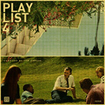
  • playlist 4
    View original post

    Playlist #4 – Compiled By Tom Croose

    Load Playlist 4

    • Track Listing:
    • Flying Lotus – Massage Situation
    • Wax Stag – Folk Rock (Bibio Remix)
    • Jorge Ben – Cinco Minutos (5 Minutos)
    • St. Vincent – The Strangers
    • Todd Rundgren – I Saw the Light
    • Maria Helena Toledo & Luiz Bonfá – Whistle Samba
    • The Long Lost – Woebegone (Flying Lotus’ Luckiest Charm)
    • Isan – No. 1. (Lent Et Douloureux)
    • Peace Orchestra – Shining
    • Mount Kimbie – William
    • Metronomy – A Thing For Me (Breakbot Remix)
    • Superpitcher – Sad Boys
    • Bullion – That’s Not Dee
    • Césaria Évora – Angola (Get Down Dub By Pepe Bradock)
    • Ecstatic Sunshine – Duck
    • Born Ruffians – Litle Garçon
    • Cass McCombs – I Went To The Hospital
    • George Harrison – The Light That Has Lighted the World
    • Johnny Cash – Country Trash
    • Santo & Johnny – Sleepwalk
  • playlist 3
    View original post

    Playlist #3 – Compiled By Tycho

    Load Playlist 3

    • Track Listing:
    • 800BELOVED – GALAXIES
    • THE PAINS OF BEING PURE AT HEART – YOUNG ADULT FRICTION
    • GRIZZLY BEAR – CHEERLEADER
    • THE WHITEST BOY ALIVE – 1517
    • BIBIO – AMBIVALENCE AVENUE
    • DEERHUNTER – AGORAPHOBIA
    • EXPERIMENTAL AIRCRAFT – UPPER EAST SIDE
    • BULLION – LONG PROMISED – ORIGINAL MIX
    • J DILLA – GOBSTOPPER
    • MUX MOOL – NIGHT COURT
    • ELIOT LIPP – BEAMRIDER
    • MODERAT – A NEW ERROR
    • DEASTRO – LIGHT POWERED
    • MAX TUNDRA – WHICH SONG
    • NATHAN FAKE – SUPERPOSITIONS
    • ROYKSOPP – HAPPY UP HERE
    • DAMN ARMS – DESTINATION PT. I
    • EVERYWHERE FT. MARTINA TOPLEY-BIRD
    • FEVER RAY – WHEN I GROW UP (VERSION BY LISSVIK)
    • TIM HECKER – SEA OF PULSES
    • TYCHO – COASTAL BRAKE MANUAL REMIX
    • PANDA BEAR – I’M NOT
    • A SUNNY DAY IN GLASGOW – WATERY (DROWNING IS JUST ANOTHER WORD FOR BEING BURRIED ALIVE UNDER WATER)
    • AIRIEL – CINNAMON
    • SHIGETO/A SETTING SUN – POLAROID ROMANCE
    • ARIEL PINK’S HAUNTED GRAFFITI – FOR KATE I WAIT
    • CHRIST – PYLONESQUE
  • playlist 2
    View original post

    Playlist #2 – Compiled By Aarnio & Tycho

    Load Playlist 2

    • Track Listing:
    • 1. SKALPEL – SCULPTURE
    • 2. CLOUDLAND CANYON – DAMBALA
    • 3. BIBIO – ABERRIW
    • 4. JIM O’ROURKE – FUZZY SUN
    • 5. M83 – YOU APPEARING (ADDLED EDIT)
    • 6. GROUPER – HEAVY WATER/I’D RATHER BE SLEEPING
    • 7. TSTEWART – WHAT’S THIS COLOR
    • 8. AMERICA – AMERICA – TIN MAN
    • 9. MICHNA – DO WHAT YOU WANT TO DO
    • 10. RATATAT – MONTANITA
    • 11. STUDIO – LIFE’S A BEACH!
    • 12. PETER BJORN AND JOHN – ERIK’S FISHING TRIP
    • 13. TOM TYLER – DAYLIGHT ROBBED HER
    • 14. CLOSER MUSIK – 1,2,3, NO GRAVITY
    • 15. FARBEN – AS LONG AS THERE’S LOVE AROUND – ORIGINAL MIX
    • 16. PAUL KALKBRENNER – AARON
    • 17. THE CHAP – AUTO WHERE TO
    • 18. MILOSH – COULDN’T SLEEP
    • 19. MOUNTAINS – BLOWN GLASS TYPEWRITER
    • 20. ANIMAL COLLECTIVE – VISITING FRIENDS
  • playlist 1
    View original post

    Playlist 1 – Compiled By Tycho

    Load Playlist 1

    • Track Listing:
    • School Of Seven Bells – Half Asleep
    • Gang Gang Dance – Egowar
    • Mahogany – One Plus One Equals Three Or M
    • Empire Of The Sun – Walking On A Dream
    • The Whitest Boy Alive vs Mylo vs Cut Copy – Otto’s Golden Journey (Andy Webb’s Dreamy Blend)
    • Phoenix – 1901
    • Air France – No Excuses
    • College – The Energy Story
    • Christ. – Cordate
    • Flying Lotus – Auntie’s lock/Infinitum (featuring Laura Darlington)
    • Flying Lotus – Roberta Flack (Mike Slott’s Other Mix)
    • The Avalanches – Since I Left You (Cornelius Remix)
    • Super Furry Animals – Some Things Come from Nothing
    • Engineers – Let’s Just See
    • Sigur Rós – Gobbledigook
    • French Kicks – Abandon
    • Blind Man’s Colour – Brother Sport (Animal Collective Cover)
    • Beirut – The Concubine
    • The Kooks – Kids (MGMT Cover)
    • Benoit Pioulard – Ash in the Sky
    • Bibio – Bewley In Grey
    • Daedelus – Experience

Saccenti’s visuals for School of 7 Bells

Posted by Jakub

sviib_bowery_full_04
sviib_bowery_full_06
sviib_bowery_full_03
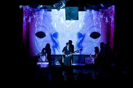
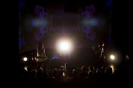
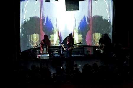
You may know Tim Saccenti for his unreal spacey Battles video or his wild Animal Collective videos or press photos for Flying Lotus and Jimmy Edgar but his live visuals this weekend for School of Seven Bells were jaw dropping, not only did School of Seven Bells play a gorgeous live show but Tim Saccenti nailed the visuals and captured the sound perfectly, I almost felt like I was experiencing something that was on some other level. Below is a great review of the night:

Digital Transcendentalism
Timothy Saccenti’s Visuals andthe School of Seven Bells

The question that immediately comes to mind as one looks into the silky black voids of photographer/director Timothy Saccenti’s mind, manifested wonderfully in images of black expanses occupied ironically by an artist or an object beyond one’s capacity for reaction, is this: What possible world am I occupying and how am I existing in this space and time? With the School of Seven Bell’s visuals, Saccenti (in conjuction with Flame artist Alvin Cruz) achieves, brilliantly and originally, the apex of what all artists can hope to achieve; as the mirrored yet chaotic colors begin to rise up on the screen, the viewer relinquishes control of his or her consciousness of the moment and enters the beautiful, black, colorful, numbing minds of Saccenti and Cruz.
So what makes these images so otherworldly yet familiar enough that one can fall into them so whole-heartedly? The peice mixes familiar epiphenomenal stimuli (shapes and images) with powerful digital distortion, creating a space that is paradoxically common and foreign. The experience places the viewer at the precipice of human comprehension and tethers them to the rock of humanity with fibers so inconspicuous that it is hard to know when one might fall into the black abyss. It is exhilarating. Paired with the ambient, submissive music of The School of Seven Bells, an audience is treated to complete perceptual experience involving the lyrical mastery of the band and their interstellar sound.
There is a diamond shape that occupies the screen for much of the piece. Besides being a spatial image that one can clearly identify, it suggests another, semi-erotic, human form that boldly stares back at a transfixed audience. It is difficult not to see a vaginal, pink shape in the diamond. It is natural and digital, surrounded by a hazy distortion and heavy digital sounds that are reminiscent of television snow. Watching the two female singers, it is hard not to feel lulled by a kind of siren song.
One of the more powerful images, a white face with dark eyes, exists as a kind of character throughout the piece. It comes and goes as the viewer’s ability to make it out is realized and lost. The face is mirrored on both sides of the screen as one’s own face so commonly is. The face swings back and forth with an organic fluidity that is imperfectly natural and correct. Amongst the computerized movement of box shapes and spheres, this face stands out with its organic movement that, at the apex of its swing, faces the audience and becomes black (with white eyes). It is an eerie and fantastic moment as the echoing voices of The School of Seven Bells rise and fall to the metronome of the huge face.
The image that most dramatically drives the feeling of nature is the wilderness at sunrise; however, in digitally transcendental fashion, the piece juxtaposes the desert grasses with outstanding digital effects. The sunrise image sits inside a sphere that seems to rotate as the image remains still. The sphere fits inside the skeleton of a neon cube in an eclectic picture that moves with a more perfect, digital, fluidity. The circle is also seen in another major part of the piece. Inside of a large, white circle are numbers that follow around the circle’s circumference, similarly to that of an ancient calendar. Here, Saccenti seems to be exploring the most seamless connections between man and nature. Time is a human invention developed to understand the most fundamental engine of nature. It is a similar idea that drives the image of the Hindu deity, Ganesh. Here, the audience explores the human invention of religion as a tool for understanding the impossibilities of nature. A statue of the deity rotates slowly, giving a reverend importance to his presence.
The pairing of these two artists could not have been more perfect. The School of Seven Bells creates an original sound using a similar juxtaposition. Soft voices and flowing guitar riffs round out the heavy digital sound that backs up each song. These two elements collide to produce a sound that is otherworldly.
Throughout the piece, we see the majesty of nature and the boundless imagination of humanity. Represented beautifully by digital displays, the viewer enters a possible world that can only exist with the imagination of this brilliant collaboration, through the conduit that is their talent.

– Steven Graf

Making of The Obama Print

Posted by Scott
iso50_obama_phase005

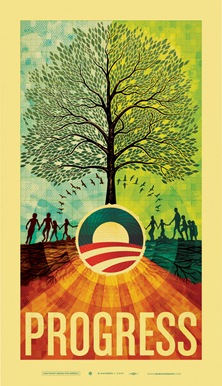
Fig 1: Finished ISO50 Obama print

As regular visitors to this site may know, I created a print (Fig.1) this past May as part of a fund-raising effort for the Barack Obama campaign. The campaign approached me earlier this year about creating a poster based on the theme of "Progress" and I decided to take a stab at it. Once completed, the poster was printed in a limited edition of 5000 and has since sold out. I had intended to write this article earlier, but I’ve been rather busy so it had to wait until now.

Overall, the process was something of a roller coaster ride and certainly left me with some valuable lessons learned. It’s been a little over a month now since the dust settled on this whole thing (the final copy sold around June 7th) so I’m hoping that the time passed will lend a bit of clarity and result in a more insightful analysis of the journey from start to finish on this project.

This is, by far, the longest post I have ever written. As such, I wasn’t able to spend as much time as I usually do worrying about the writing. This is mostly just a stream of consciousness recap of the process and is primarily nuts and bolts commentary; I’ll leave the job of deriving the meaning and symbolism of the piece to you.

So here it is, the long and the short of it: everything that went into the making of the Obama print.
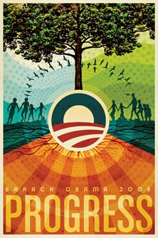
iso50_obama_phase002a

Fig.2: An early mock-up

Initial Stages
When planning out an image I usually like to dive right into Photoshop as a first step, just to try and establish a color-scheme and basic structure. Only later do I usually start to work with physical objects and pen and paper to try and work out the main elements, keeping in mind the initial digital mock-up. I sometimes hear people talking about always using pencil and paper as a first step in design, but I personally find the computer a much faster and intuitive way to concept things out so I like to leverage that power right off the bat as a good way to kick-start the project.

The campaign had asked that I pursue a style in line with my earlier work as they felt it would make the most sense for this poster and I agreed. So I set out working with various elements from earlier works (you may recognize the people from the Skyway print). I also had an old book about trees with a very nice illustration I had always wanted to use so I scanned it and placed it in the mock up as sort of a framework for the illustration I would later create over it. As you can see in Fig.2 above, the early mock-up was already looking a lot like the final product. At this stage I am usually just trying to find an overall form and color arrangement that works, the details always follow, but if I am feeling inspired I’ll often find myself creating the bulk of the piece in the early stages and then later working with that and refining things.

The message of the print had to center around a handful of concepts that the campaign was using, "Hope", "Progress", "Change". Shepard Fairey had already created two prints for the campaign that each featured an image of Obama so I knew I wanted to pursue another theme for the imagery. The fact that this was a fund raising poster and not intended as a campaign poster also made it easier to interpret the imagery more liberally. My initial idea was to metaphorically represent the core themes of the campaign in a collage, some more literally than others. I also wanted to vaguely communicate the concept of peace by configuring the main elements into a somewhat subdued peace symbol and working off of that shape for the core structure of the image.

Comping & Approvals
After a couple nights of working through ideas and pasting things together, I came up with the comp you see in fig.2. I ran this early mock-up by the campaign and they gave me the go-ahead to start production on the final product. This was a relief as the campaign was wanting the as soon as possible and now I’d have a bit more time to work out the detailing.
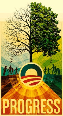
iso50_obama_phase002

Fig.3: A later mock-up

Now that I had the green light on the image I went forward with recreating it full scale. I often concept at a smaller size to make for quicker work within Photoshop so when it’s time to make the final product most of the non-vector graphics have to be re-created at the new resolution. This is always a good time to work out the kinks and really focus on the things that may have been overlooked when working through the rough drafts. Fig.3 shows the product of this second phase, a more developed and balanced overall composition at this point. I am still using the original tree illustration as a stand-in and have now exposed half of it to show the branches. It was later decided to go with a full tree but I still liked how it looked at this time. As you can see, the colors and detailing were all really starting to fully develop by this stage and it’s around this point that you can start to see the finished product coming together.
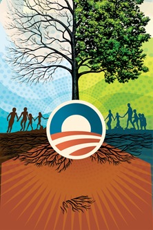
iso50_obama_phase004

Fig.4: Importing vectors to PS

This is always an exciting time as a designer as you’re getting the first glimpses of the final image. Unfortunately, this is where the real work began.

Production Begins
Because this print was going to be so large (23"x40" @ 300dpi raster), I had to do another phase of re-scaling to reach the final dimensions. To get it that big, I re-created all of the elements that I could in vector and brought them in from Illustrator to Photoshop. In fig.4 you can see the not-so-attractive results of this phase. This shot is from Illustrator so none of the texture or color is there yet, just the raw vector forms. Once I had those imported to Photoshop and had the image resized up, I set about placing all the large raster components again, doing the texture and color work and so on.
iso50_obama_phase003

Fig.5: Placing raster elements

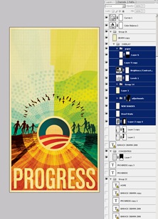
In fig.5 you can see that the textures and colors have been restored and the raster tree stand-in has been removed. At this stage the image is at full size and resolution so things are starting to move quite slow. It was also at this point that I had to switch to PSB format since it exceeded the file size limitation of the standard PSD format. With all the full size elements in place it was time to work out the tree illustration.

The Tree
I had been worrying a lot about how to approach the tree throughout the initial stages of the project. It was going to be the central element that tied the piece together and I really wanted it to stand out. I had batted around a few ideas but nothing really panned out until I settled on the idea of using individual leaves on a two dimensional plane as opposed to trying to create something with three dimensional depth as I had previously planned.
iso50_obama_phase003e

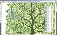
Fig.6a: The tree in Illustrator

As this was going to be a very complex vector graphic I went straight to Illustrator to create the tree (fig.6a). Photoshop can handle vector but not nearly as efficiently as Illustrator so when you’re going to be doing a lot of moving things around and transformations, it’s best to stick with Illustrator. This ended up being a very painstaking process taking about 3 days to complete. I drew various versions of the leaf and then rotated and resized them to flow into the spaces created by the branches. Once that was complete I pasted the vector leaves as a shape layer in Photoshop. I broke them up into multiple shape layers and changed the colors of each slightly to give some variance and depth.
iso50_obama_phase003f

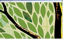
Fig.6b: Compositing tree in PS

Once I had the shape layers colorized and laid out the way I wanted them I began the process of detailing and texturizing the leaves. I added various patterns of concentric circles to give some depth to the otherwise solid color of the shape layers. I created a layer mask based on the outline of the leaves over a group containing all of the shape layers so that any elements or textures that I added in this step would only show over the leaves themselves.I also added a lighter stoke outline for some definition.
iso50_obama_phase003d

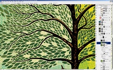
Fig.6c: Leaves detail

In fig.6c you can see the finished tree detail with the layer palette open. At this point I was getting pretty close to feeling like the image was complete, which was a good thing considering that Photoshop was really starting to slow down; even simple transformations were taking upwards of a minute. It’s a shame how Photoshop begins to break down on very large images even on a very powerful machine. I understand that Photoshop wasn’t exactly designed for this sort of work, but unfortunately it’s the only real option out there.
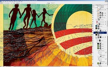
iso50_obama_phase003a

Fig.7: Vector roots detail

Detailing & Background
Next up I set about working with the root structure of the tree (fig.7). This got a bit tricky as the roots had to go through areas with different colored backgrounds causing problems with contrast and blending.I ended up breaking them into different shape layers and colorizing each individually. The background detail you see in fig.7 is a result of multiple layers with varying blending modes and color shades.
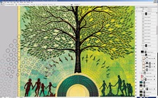
iso50_obama_phase003B

Fig.8: Background vector detail

I did some similar treatments to the various elements that continued across the background of the tree and sky, placing various repeating patterns in different blending modes to lend some depth to the solid fields of color. Most of the layers ended up being in color burn or multiply mode. By combining different overlay modes and stacking layers you can create a lot of depth and color variation, I usually find myself going about 3 levels deep with different textures on each layer and then a base layer with a solid color to anchor it.
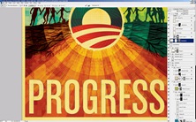
iso50_obama_phase003c

Fig.9: Working out the type

Typography
Finally I moved on to the type treatment. For the sake of continuity with the campaign’s own materials and Shepard’s earlier posters, I chose a typeface that somewhat resembled what they had been using. I ended up going with House Industry’s Chalet Comprime which is a compressed variant of their Chalet font. I converted the type to a shape layer to work out the kerning and sizing and created a mask based on the shape (fig.9). I then layered in various paper textures and shading to give the title some depth. It was right around this point that the piece ended up feeling finished, and I say "feeling" because that’s all it is, a feeling; that’s why it’s always so hard to tell when a piece is done, it’s just sort of this sense you get that nothing you could do at this point would improve things. It’s either that or you hit the deadline and in a perfect world you’d get the feeling first, but we all know that’s not always the case.
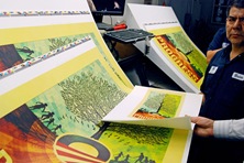
DSC_0127

Fig.10: Early proofs on the press

The Printing Process
Once I turned in the finished work the campaign flew me down to Los Angeles to be on press at Continental Colorcraft as the poster was being printed. Being on site for the printing helps a lot and saves a ton of time; there are no proofs to mail and changes can be made on the fly. The place was pretty impressive, a bunch of massive warehouse spaces with enormous machines covering the floors.
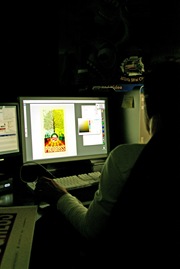
DSC_0131

Fig.11: In house color-correcting

I printed up a proof on the Epson at home to take with me (it’s in the printer’s hand in fig.10). I always find this helpful as it’s really easy to forget what the print is supposed to look like once they start running off copies. It was really nice to have a version that I had already compared to the screen to look at side by side with the press output.

The first run wasn’t very close on the colors so they took it to their pre-press guys to do some tweaking in Photoshop (fig.11). It was pretty interesting how they were able to separate out the various layers from a flattened TIFF file. I learned a lot of color tricks watching them work through the various filters and adjustments,a few I had never actually seen or used before.
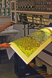
DSC_0231

Fig.12: Hot off the press

Once we got a solid version worked up they sent it off to etch another set of plates.The plates are large, thin sheets of metal with the four color separations etched into them. The pates are then mounted in the press where Cyan, Magenta, Yellow, and Black (K) are fed to each plate. So essentially the image is comprised of four colors pressed in succession on the same piece of paper. Hence the name, four color process (I know 99% of you are familiar with this but I didn’t learn it until much later in my career so thought I’d share for the few uninitiated that might be out there). At this point they fired up the machines and the prints started flying out, it was pretty impressive how fast they were able to print so many copies. At set intervals the press operator would pull samples and check them against the original proof for accuracy (fig.10, above). All told the printing process only took a few hours. At the end they had five large stacks of prints on pallets ready to ship out.
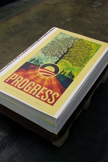
DSC_0154

Fig.13: A pallet of prints

At the end of it all I got to fly home with a tube full of posters and a huge sense of relief that the project was complete and out of my hands.

All in all I had a great time working on the project. This turned out to be a rather high pressure situation so I learned a lot about myself as a designer as I made my way through the various stages. The only stage I wasn’t really prepared for was the release of the print. It’s one thing to release prints to the design community as I have been doing for a while now, but it’s entirely something else to have an audience as broad as the one commanded by the Barack Obama campaign scrutinizing your work. The response was overwhelmingly positive, something for which I am very thankful, but the politically charged nature of the piece seemed to anger some people. This led me to reflect on my motivations for doing the piece in the first place. I have never pretended to be an expert on politics and have always steered clear of espousing my political views, but when you’re facing the potential continuation of a situation like we have endured for the past eight years in this country and you’re given an opportunity to help change that, even in a small way like with this poster, I think you have to take it. Looking back now I ask myself if I would do anything differently with this piece, to be honest I think I would have approached it slightly differently. But hindsight is always 20/20 and given the parameters and constraints of this project I am pleased with the outcome.
Comment on this post

Many Thanks to Karl Peterson for helping with the CSS on this article.