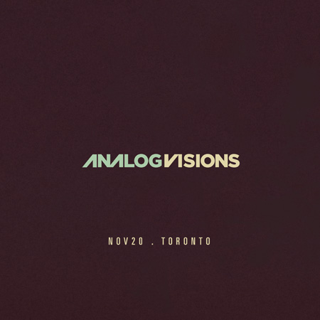
ISO50 Gallery Exhibition: Toronto 11/20
Posted by Scott

I’m doing a solo exhibition at Function 13 Gallery in Toronto next Friday where I’ll be showing some new work and large format stuff. I’m still working on the main poster for the event so I’ll be posting that on Monday probably. For now, here’s all the details:
Gallery Opening: Fri Nov 20th, 2009
6pm-9pm
FREE
Function 13 Gallery
156 Augusta Ave Toronto, ON M5T 2L5 [Google Map]
I’ll also be doing the live Tycho set afterward at Nocturne.

20 Comments Leave A Comment
Ross says:
November 13, 2009 at 6:08 amLoving that purple. Can’t wait for you to blow us all out of the water with the poster.
Daniel Carvalho says:
November 13, 2009 at 6:19 amAll the best. Cool post graphic (seriously, I’m not being sarcastic).
Jon says:
November 13, 2009 at 8:07 amYES!
mikey says:
November 13, 2009 at 9:23 amhello scott. i realy like this grafic and i can’t wait to see the poster art! by
the way what ‘s the name of this font?
prop4g4nd4 says:
November 13, 2009 at 9:28 amwaiting for the show pictures,
best wishes from across the atlantic.
jonathan says:
November 13, 2009 at 9:48 amdamn, i really wish i was home in t-dot
mike says:
November 13, 2009 at 11:44 amGot my ticket and can’t wait for visual/audio bliss! The vibrance and definition of the colours in your work are stunning.
Designl Police says:
November 13, 2009 at 12:15 pmYo Scott, which typeface are you using here? It looks almost like a modified Gotham Black – would you mind indulging us? Loving the new polymer purple by the way!
Daniel Carvalho says:
November 13, 2009 at 2:33 pmDesignl Police, I must admit, my first gut reaction was Avant Garde, because those classic alternate looking characters just stood out at me. But I confess, I didn’t look at it properly, because it definitely doesn’t appear to be so.
I think you got it right, I think it’s Gotham. Ah… I love Gotham, I’m actually surprised I didn’t pick that up immediately, I’ve used that typeface extensively.
Scott says:
November 13, 2009 at 3:53 pmYep, it’s Gotham (I think black). I just made the alt characters to sort of tie it in with my older style of type design. The idea of this show is mostly new work but also to bridge the gap from my older stuff and so I wanted the branding to be more of an evolution than a clean break.
alex rapada says:
November 13, 2009 at 4:50 pmi really wish i could be there to see it. please come out to los angeles and do a music/art gallery showing…
Keith says:
November 13, 2009 at 5:52 pmi desperately wish i could be there…come to DC sometime…this city could use some sensory serenity…
Daniel Carvalho says:
November 14, 2009 at 6:37 amYou can actually kinda pick that up from the pic which is really cool. I think it’s great you didn’t do a clean break. There’s some really neat elements in your old stuff that I think I’m gonna miss.
Andy says:
November 15, 2009 at 12:29 pmSWEET! Can’t wait to check it out.
Peter says:
November 15, 2009 at 5:39 pmBought my ticket and, conveniently, have the day off work.. see you there!
Christof says:
November 15, 2009 at 9:50 pmAh, I think the trek across the country is perhaps a bit far for me. I’ll just have to buy more of your posters so I can have a showing in my room every day. If you ever make it out to Vancouver, BC, I’ll be the first in line. You’re work is both intellectually and emotionally moving, I wish that I could be there.
Jannis Gerlinger says:
November 16, 2009 at 2:03 amreally really cool :)
Dave in TO says:
November 16, 2009 at 6:56 amLooking forward to the show. I’ll arrive with daughter after her ballet class!!!
Jakub says:
November 16, 2009 at 7:10 amI’ll be there with Scott hanging out and rockin’ the merch booth
baratas says:
November 18, 2009 at 3:14 pmVery good.