Hvass & Hannibal

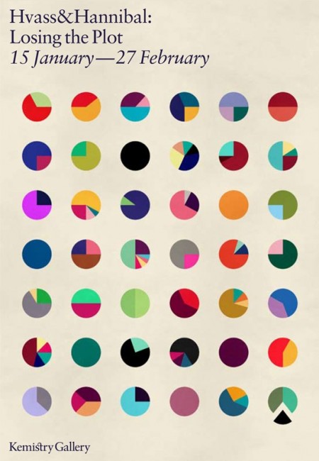
I only post one image by itself when I think it’s worth it. This one, advertising the Hvass&Hannibal show at the Kemistry Gallery, is such an image. I like the layout, sure, but the main reason I found this so captivating is the color combinations. Each little circle has a different (and often bizarre but terrific) color combination. Each could easily jump off this poster and onto whatever project you happen to be working on (assuming the word “fun” might describe your client…) Pink and green? Why not. Lime and red? Let’s do this. My favorite is 6th row down, 4th across. Reminds me of a Deth P Sun type palette.
Now I’m inclined to think that H&H had everything to do with the design of this poster, but I cannot find the credit information anywhere. It looks like something they would drum up, but if not, let me know and I’ll be sure to link out. If you’re in London, be sure to check out the exhibit! Here is the invitation.

2 Comments Leave A Comment
mariana says:
January 6, 2010 at 8:56 amLOVE it! It’s like a bunch of mini informational graphics with a FUN twist :) Great color combos indeeeeed.
Joaquim Marquès Nielsen says:
January 7, 2010 at 12:25 amHmm, the 4th circle in the first row is a nice color combo… and then of course the black one! It’s so… mysterious :p