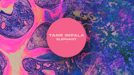
Hear it First: Tame Impala “Elephant”

The Tame Impala record is quickly becoming the BIG indie rock record of the year in my eyes, the way they are rolling of the previews have been great. Check out the new single “Elephant”

The Tame Impala record is quickly becoming the BIG indie rock record of the year in my eyes, the way they are rolling of the previews have been great. Check out the new single “Elephant”
A lot of the time 4/4 tracks aren’t about being dance music, it just conforms into a ground floor for a song, giving it this heartbeat without asking you to get up. Sam Willis isn’t doing dub or house he’s just giving us a great song that grows and eventually fades and that 8 minutes was just about sharing a mood, I hope to hear more from him.
Take Phil Gerus advise, make 2:21 hooky songs, make people search for you and want more.
School Of Seven Bells cover Lil Wayne, I had a feeling this would happen one day, they have good taste in Pop artists. I’m into it, iTunes tells me i’ve listened to it 8 times, its simple and really shows off Alley’s beautiful voice, so why not have fun and cover a song you enjoy if you have the skills?
The perfect ladder concept by Co & Co. I don’t care how much weight it doesn’t support, where’s my order form.

circa_1983 – Not only should you follow circa_1983 but you should check out his website

almond_surfboards – Even if you don’t surf they make it look like candy.

johncurley – I love it when someone can make something soo noisy and blurry soo appealing.

 One of the reasons I enjoy creating on my iPhone, is it takes me out of my usual process. The image above I created with Fuzel It’s similar to Grid Lens but lets you make your own slices that you can load up with images. The lines are the slices I made and then I added a tringle to each slice. (I added the clouds with Blender). This is all fairly simple to do in Photoshop with masks but not nearly as simple to manipulate. Being able to tap points and change their size as I’m moving them around feels much more “organic”. I find the results are less forced and there seems to be a more natural progression of the design. I recently switched from a mouse to a tablet which I find much more natural, but you really cant beat direct contact with the screen. Posted by: Seth Hardie Instagram: @hallwood
For some reason Eluvium made a new alias: Martin Eden. Eluvium was successful, why switch up? Either way he did a beautiful job with this song thru and thru.
HIGHLY RECOMMENDED ohhhhhhh yessssss John Maus is has created the Monty Python Holy Grail version of a Pop song, its genius in my mind, what a vocal? best part has to be 1:52 and on, my jaw dropped, ballsy vocalist super super ballsy, I love it.
When I first put on Solar Year I just wanted to hear what Grimes did for it but then genuine male vocals came under the chorus pads, it was nice to hear some electronic artists slow it down and just share this release of mood.
We have featured some amazing illustrators on ISO50 such as Matthew Lyons and many others, but it wouldn’t be right if we didn’t include the amazing work of Glenn Thomas. Glenn is an illustrator and designer know as “The Fox and King”. I am constantly amazed by his use of texture and light as well as his brush techniques. He is also a top notch animator. Very quality stuff. If you get a minute, make sure to check his work out, you won’t be dissapointed.
Posted by Tav Calico
I’ve just returned returned from a trip to both Munich and London, where I spent time with colleagues in both locations. Cosmic timing really, considering the London 2012 Olympics are on the horizon, and I’ve had Otl Aicher on the mind recently.
Much has been said in recent years about the shortcomings of the London 2012 graphic identity, but I hadn’t really been paying close attention to all the outrage, and had all but forgotten the design work – so I wasn’t prepared for the onslaught of Olympic schwag that greeted me at the official London 2012 shop at the St. Pancras Station in London. It’s borderline seizure inducing. Having just stepped off the train from Munich, where I spent time in Olympiapark and was exposed to Aichers work throughout the city, this London 2012 noise was especially jarring. And that mascot! Sigh. I took quite a few pictures, and had originally thought I’d post about Waldi vs Wenlock, but I decided I wouldn’t subject you to any of that madness. After all, this blog is here to celebrate beautiful things.
Scott has extensively covered Aicher’s work for Munich ’72 here before (in fact it’s where I was first exposed to it), but I thought the timing was right for us to be reminded just how amazing a coherent Olympic graphic identity and subsequent merchandising campaign can be.
Creative Review recently posted the above scans of the official Munich ’72 merchandise catalogue, and there are a few images of what look to be the official gift shops as well. While Waldi was the only souvenir that was actually designed by Aichlers studio directly, I find it really impressive how cohesive the entire output of the “Olympic Souvenir” department was. This is most likely due to the fact that Aicher dictated a very strict set of rules as to how the logotype and symbols could be used.
It’s easy to pick apart London 2012 when stacked up against the extremely high bar set by Aicher’s work for Munich, but let’s be real here, remember Izzy from Atlanta? NOTHING is as bad as that. What. Is. That. Thing.
I’m not sure if they entered the competition, but if they did I’d be real curious to see what Bibliotheque came up with for the London 2012 graphic identity. After all, they know a thing or two about Aicher’s legacy, having put together an exhibition of his Munich ’72 work over at the Vitsoe shop in 2007, comprised entirely of posters and print from their their own collection. This unofficial Olympic torch poster they did is pretty amazing as well.
Bonus link: While googling around, I found this site that offers up the official Olympic report books as PDFs. The Munich 72′ books span 3 Volumes, upwards of 1200 pages. For the true Munich ’72 geeks.
Posted by: Rob Fissmer