Great new series of posters by the Heads of State. I love the colors! (Vaguely reminiscent of the 826LA Time Travel series, with less type or floating people…) I wish travel agencies packed their walls with anything nearly this cool looking. I might actually decide to go somewhere based on the poster — as opposed to questioning my travel plans as I stare at a 1980’s US Air sponsored photograph of “Miami”.
Track Listing
The Radio Dept. – Domestic Scene
King Of Woolworths – Nuada
Deerhunter – Little Kids
Headphones – Gas And Matches
Caribou – Odessa
Mux Mool – 11 Lady Linda
Siriusmo – Nights Off
Kavinsky – Pacific Coast Highway (Jackson Remix)
Toro Y Moi – Low Shoulder
Deru – Hello
Jon Hopkins – Light Through The Veins
Toro Y Moi – 109
The Radio Dept. – Heaven’s On Fire
The Pains of Being Pure at Heart – Come Saturday
Paul Michel – Lonely Dirges
Alcian Blue – You Just Disappear
Trans Am – Music For Dogs
Little Dragon – A New
The XX – Islands
Stars – This Charming Man
Yo La Tengo – Little Eyes
Midlake – Rulers, Ruling All Things
Chris and Thomas – Broken Chair
The Advisory Circle – Sundial
Casino Versus Japan – Hello You
Stars – Set Yourself On Fire (End Times Edit)
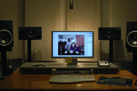
Came across this workstation concept over at Unplggd. The Novanta was designed by Luke Riggall and features — among many other things — Speakers, a USB and Audio Hub, Monitor Stand, and iPod Dock. It’s definitely eye catching and a logical extension of your Mac setup, but it seems a little bulky to be practical. The apparent lack of adjustability would be a big problem for me too. But the cable management system looks very useful and the whole thing has a very utilitarian vibe that I’m liking. I don’t think this could be my main work desk but it would make a great secondary for the print room or a smaller office space.
On that note I’ve been really geeking out on desks lately. My last desk was a little too wide for my needs and the surface was pretty thick. It was getting in the way of my outboard rack and I figured something a bit more svelte would open up the space a little. I’ll try to post some pics next week.
I’ve seen these posters floating around the internet for a while. I searched long and far to try and find anything at all about them, always to no avail. It was tough when all I had was the letters NR and my feeble attempts to describe their excellence to Google. Recently I saw them again on Shelby White’s blog and was very excited to at least have a small lead as to their origin.
Turns out they were designed by Wolfgang Weingart for Kunstgewerbeschule Basle in 1974. These, and a number of other Swiss poster designs, are at The Swiss Poster Collection at Carnegie Melon University. I would love to see one in person; I’m very curious how large they are. I like to imagine them as these massive wall sized super posters, best viewed at a distance. Ready to intimidate any graphic designers that unwittingly wander underneath.
Every time I’m at Faye’s Video (btw they’re not just about VHS tapes and employee film ratings, they make awesome espresso too) I notice the cover for Jaques Tati’s Trafic. I’ve never seen the film but the cover art is striking to say the least. I finally decided to look it up to get more info and came across this post at Balduin about the various versions of the poster for international release. While the cover is great, I was really blown away by the titles (second image), that’s got to be my favorite part. Now I’ll have to rent the DVD just so I can screenshot it and print it out.
As promised here are the results for yesterday’s contest: Mux Mool – “Skulltaste” CD Winners: Chad, Erika, Spencer (I have emailed you guys)
Thanks to everyone that played! i’ll line up another free giveaway very soon, hopefully its something we will do frequently on ISO50.
Black Moth Super Rainbow I think is one of those bands that fits perfectly on the blog, they have their melodies down, always impressive synth work and dynamic range on the noise and crazy sequencing. With the addition of the vocals from the Air song, this should be a must have for the veteran and newbie listeners.
I’ve been meaning to post a Millionyoung song, he reminds me of Washed Out but a version that you might hear going out instead of home listening. The digital synth work is laid on heavy but his voice evens it out nicely.
France’s Kavinsky is probably one of the only Ed Banger artists I still listen to besides older Mr. Oizo. I can’t get away from his sound, he doesn’t always go overboard and I love the 80’s night cop chase feel and strong artist branding behind the project.
These New Puritans song is too short, even though it rides a thin line of something i’d probably never listen to(I think its the piano part and voice combo) but the horn and vibraphone playing totally redeems it!
H&FJ just put out a really cool article on combining fonts. They break it up into four lessons and provide visual examples and typeface options. All the examples use their fonts, but the lessons carry over to usage with other typefaces easily.
I found the article to be especially inspiring, or at least liberating. I have a weird mental block when it comes to combining typefaces. I’ll often use two different ones, but never three without a huge mental commotion. I don’t know what it is, but I get really stressed out trying to finagle more than two typefaces into a design. Of course it depends what type of design it is. I guess I always felt like there was this mystical over-arching design rule that prevented exciting combinations of type (I know that sounds ridiculous). Anyway, something about their examples opened things up for me. It’s nice to hear it from the high authorities that this sort of thing can be this effective.
I’m also consistently amazed how good they are about talking about type; the adjectives they use are always way out of left field but completely spot on. Calling Gotham Rounded ‘cheeky’, for example, wouldn’t have come to me right away but makes complete sense once I hear it. If you recall their scene in Helvetica where they rattle off some rather satisfying descriptions of type — that was awesome.


