Snatch The Gravy Up
Happy T-Day.
Happy T-Day.
Animal Collective has done it again, listening to the previews I wasn’t too excited but the EP as a whole all the way thru is a treasure. Bleed is a heavy echoed out call and response song that simply makes you feel like your with the band in a bat cave with a cello. HIGHLY RECOMMEND hanging out in this bat cave with headphones on.
I found Apse accidently looking for some new post rock but instead of grabbing up the rock tracks I directly went for this looped tribal psychedelia for its build, i’d hope if there was ever such a day that Animal Collective and Sigur Ros did an instrumental album it would sound like this for 80 mins.
I don’t know what to say about this Piano Magic song besides that if it came out in the early 90’s it would of been huge, such good song writing and the guitar parts are written soo well, gawwww! this song deserves an award, damn this state of music! this band needs to be doing really well.
Arms is ex-Harlem Shakes guitarist and wonderful writer, a definite must have for Broken Social Scene, Mobius Band, and Clap Your Hands Say Yeah plus someone else that’s on the tip of my tongue that I might blurt out in the comment section. Todd’s singing style with the guitars in this song could please any rock crowd with its hints of big classic rock and new indie rock perks. HIGHLY RECOMMEND
ENJOY YOUR THANKSGIVING.
[audio:bleedac.mp3] [audio:tropica.mp3] [audio:fainth.mp3] [audio:whirring.mp3]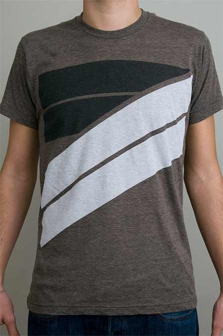
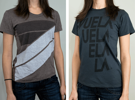
There are a some new shirts up at the ISO50 Shop and I thought I’d announce them here before they go out in the newsletter next week. First is “Syv”, which is printed on the new American Apparel Tri-Blend “Coffee”, which is sort of a dusty version of the normal heather grey tri-blend with a slight coffee tint. When I first saw samples of these I was immediately hooked. The color and feel are exactly what I have been wanting for a while now and they compliment the design I had in mind well.
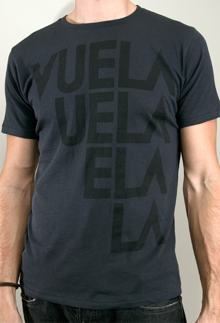
Next is the new Vuela colorway, black on black. I have been using American Apparel black shirts for a while now and while they have their own thing going on, I wanted to be able to work with a shirt that felt a little more vintage. I found a company called Alternative Apparel (no points for originality on the name…) who offer some pretty interesting colors. I like how their swatches aren’t truly red, or blue, they’re sort of a distressed version with a little color shift. For the Vuela shirt I went with their “Earth Coal” color, it feels sort of like a vintage concert tee, nice and soft with a slim cut. Definitely of the most comfortable tees I own.
All designs are available in men’s and women’s sizes. Quantities are limited so if you’re trying to get in on these before the holidays, now would be the time.
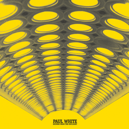
With more and more of the 1980’s PBS/older cartoon watching generation maturing and fine tuning their craft as musicians the more i’m excited about where hip hop is going. I’m sure if we asked a ton of these guys like Paul White, Bullion, Lone, Prefuse 73, Powell etc what they grew up on it would probably be a heavy dose Disney, Looney Tunes, and Hanna Barbara. I hear a great LP in Sounds From The Skylight, one that shows a crate digging addict, an open playful mind, and someone that truly cares and believes in taking this sound further and having fun doing it.
DOWNLOAD THE LP HERE FOR FREE
[audio:pwhigh.mp3] [audio:pwtrying.mp3] [audio:pwdream.mp3]

A little while ago, I wrote about my current class assignment to reinvigorate a brand that is “dead, dying or defunct”. As we are nearing the semester’s end next month, I thought it would be a good time to begin describing the process of this project. The final deliverable is a book, in which we describe the history of our chosen brand (and why it’s time for a update), outline the new identity guidelines (visual standards manuals, usage considerations etc), and show potential extensions (mock ups of storefronts, products, etc). For this process post I’ll describe my brand choice and eventual logo development.
(project permalink on my site)
When I wrote the first article, I was considering No Fear as my primary option. With such a versatile name, I figured I could take the brand in a number of different directions. However, as much fun as it would have been to revisit the dominant clothing of my middle school years (along with LA Lights), I was concerned that the project would not really extend anywhere beyond a basic brand overhaul (new logo, visuals, products, etc). I saw little opportunity for humor or much conceptual work, and I opted to move in a different direction.
I decided to rebrand Playboy — a brand that many might say is arguably not dead, dying or defunct. Like many magazines, they actually are “dying” (financially), but for my project I focused on the decay of the overall perception of the brand. The graph below displays how I feel the brand has progressed in a more abstract fashion. Basically, these days, I would say most people would be embarrassed to say they read Playboy. A baseless assumption perhaps, but when was the last time you saw someone reading Playboy in public?
To keep up with the increasing trashiness of the American Men’s magazine, Playboy has been forced to reposition itself as “one of the boys” as it were, and is now indistinguishable from the Maxim’s of the world. Rather than hold on to the sophisticated standards of their early years, Playboy has come to embrace its unfortunately crude place in the magazine world. This evolution (rather, devolution) is tragic and the original soul of the brand has been lost. Maybe not “dead, dying or defunct”, but Playboy has certainly lost something along the way. I saw an opportunity to bring some of the original classiness and sophistication back with a drastic repositioning…

Recently one of the most relaxing songs i’ve been listening to is by Greg Davis, its 22 minutes of soft drone, it doesn’t give you much but also never asks for your attention, its very calming and glides out perfectly at the end.
I’ve been waiting for a new Legowelt EP since his release of Nacho Patrol, this track Day Sailor grabbed me right away, we don’t get this kind of atmospheric synth pop anymore I really missed it. HIGHLY RECOMMENDED
People shouldn’t confuse Minimal and Minimalist in this day in age, Minimal is a dying form of techno made by guys that isn’t meant for dancing but more about how much you can cut up a techno song and then use glimpses of sounds you find around the house while Minimalist is more of a classic sound that is timeless, raw and always a treat to listen to if you get talents like Terrence Dixon, Derrick May or in this case up and comer Actress to unveil something new that sounds old which in this case is a great thing.
Animal Collective has a new EP coming out next month and one of the big buzz songs is a rerelease of What Would I Want Sky which was just a BBC Session track in the past. The song consists of swirling noise and organized chaos which I think is Animal Collective’s strong suit and followed with looped vox to make it indie rock approved.
[audio:purebliss.mp3] [audio:daysail.mp3] [audio:gheaven.mp3] [audio:skyanimal.mp3]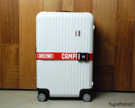
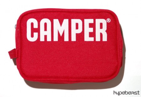

I’m always looking for ways to make traveling easier; it’s a chore lugging heavy gear around airports and trying to scam your way onto planes with oversized, overweight “carry-ons” to avoid checked overage fees. I currently use a custom ATA flight case — which I check — for carrying prints, and an SKB 3I-2011 carry-on for music equipment. I really like the SKB but it’s just a little smaller than I need it to be and sort of cumbersome to wheel around.
Over the years I keep seeing the 4 wheeled roller suitcases here and there — particularly in Tokyo where it seemed like everyone had them. The 4 wheel concept seems great for getting around the apparently the cases are very light (and strong), leaving plenty of overhead to make it under the magic 50 lb. check barrier. On my recent trip to Toronto I finally was able to catch the brand name of one of the nicer ones I’ve seen, the German-man Rimowa. I jotted it down and did a search when I got home. The more I looked into these cases the more I was amazed at the build quality and aesthetics. Unfortunately they’re ridiculously expensive — $1000 for the carry-on model I want — so I’ll be sticking with my humble SKB for the time being.
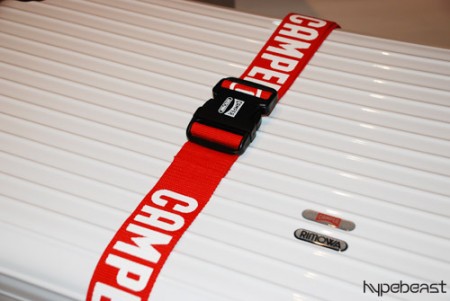
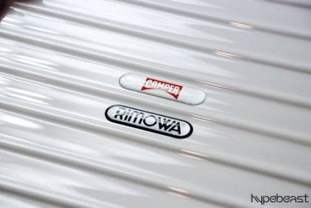
During my search I came across this post on Hypebeast about the limted edition (30!) Camper Rimowa Salsa and was in severe gear-lust mode to say the least. This thing is beautiful, fully appointed with custom strap and everything.
Rimowa also happens to have a pretty interesting Flash-based site (which weighs just about as heavily on your bandwidth as their products do on your wallet). I rarely find Flash-based manufacturer sites like this of any use (in fact I loathe them most of the time, opting to browse via HTML on a retailer’s site instead) but Rimowa’s is pretty slick and actually rather functional. Seeing the models standing by the cases is a clever way to quickly gauge their relative sizes.
You’ll find some more interesting shots of various Rimowas here.
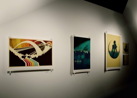
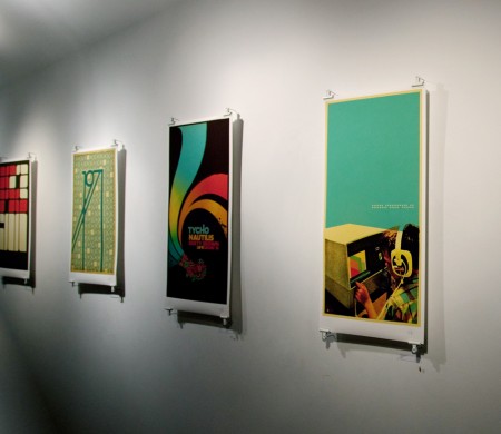
It was a pleasure as always to visit Toronto, I really appreciate everyone who came out to the Function 13 gallery and the show afterward at Nocturne, I had a great time at both. Unfortunately I didn’t bring my camera (it’s a long story, but some last minute baggage issues didn’t leave room) so I don’t have many pics from the night. Luckily, Sean Pollock from The Buzzout Room (a great radio station by the way, you can stream it here) brought along his Canon 5D MK2 and got a couple shots of the gallery (shown above).
A couple others brought out their cameras — among them Bram Timmer who also has a 5D MK2, I was pretty jealous — so I’ll try to get some shots from them and post up a full set of the gallery. If anyone has some decent shots let me know.
As you can see I went with the bulldog clips for mounting the prints. Thanks to everyone for the great suggestions in the original gallery post. I experimented with neodymium magnets but had some issues with grip, the posters kept slipping from between them. I ended up spray painting bulldog clips white and hanging them over long, thin nails so that the piece stood off the wall a little. There is a strip of 2″ tall foamcore that runs the width of the print clipped behind each at the top and bottom. This helped straighten everything out and give a “mounted” feel without the need to damage the back print. I was really pleased with the results, under the gallery lighting the whole thing really came off dramatic. The lack of a frame and the inch between the wall and the print really made the piece feel more accessible and hilighted the texture and feel of the Hahnemühle German Etching paper. Thanks again to the guys from Function 13 for helping out with everything.
If you missed the gallery opening night you can still catch the show, it will be up until mid-January at Function 13 Gallery, 156 Augusta Ave Toronto. If you were there and missed out on getting a piece before it sold, some of the designs can be had at the ISO50 Studio Shop or the ISO50 Merchline Shop.
Thanks again, see you all again in April at FITC Toronto.