Rebranding Playboy

A little while ago, I wrote about my current class assignment to reinvigorate a brand that is “dead, dying or defunct”. As we are nearing the semester’s end next month, I thought it would be a good time to begin describing the process of this project. The final deliverable is a book, in which we describe the history of our chosen brand (and why it’s time for a update), outline the new identity guidelines (visual standards manuals, usage considerations etc), and show potential extensions (mock ups of storefronts, products, etc). For this process post I’ll describe my brand choice and eventual logo development.
(project permalink on my site)
When I wrote the first article, I was considering No Fear as my primary option. With such a versatile name, I figured I could take the brand in a number of different directions. However, as much fun as it would have been to revisit the dominant clothing of my middle school years (along with LA Lights), I was concerned that the project would not really extend anywhere beyond a basic brand overhaul (new logo, visuals, products, etc). I saw little opportunity for humor or much conceptual work, and I opted to move in a different direction.
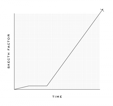
I decided to rebrand Playboy — a brand that many might say is arguably not dead, dying or defunct. Like many magazines, they actually are “dying” (financially), but for my project I focused on the decay of the overall perception of the brand. The graph below displays how I feel the brand has progressed in a more abstract fashion. Basically, these days, I would say most people would be embarrassed to say they read Playboy. A baseless assumption perhaps, but when was the last time you saw someone reading Playboy in public?
To keep up with the increasing trashiness of the American Men’s magazine, Playboy has been forced to reposition itself as “one of the boys” as it were, and is now indistinguishable from the Maxim’s of the world. Rather than hold on to the sophisticated standards of their early years, Playboy has come to embrace its unfortunately crude place in the magazine world. This evolution (rather, devolution) is tragic and the original soul of the brand has been lost. Maybe not “dead, dying or defunct”, but Playboy has certainly lost something along the way. I saw an opportunity to bring some of the original classiness and sophistication back with a drastic repositioning…
Continue reading “Rebranding Playboy”
The assignment was to inject new life into the chosen brand — to reposition it in a way that would save its reputation and provide it with new and continued success. To do this, we were required to research the history of our brand in depth; plotting out audience profiles, constructing mood boards, mapping important dates and brand evolution, determining market opportunities — basically a full immersion in the world of our brand. After this process was complete, we were able to begin our brainstorming surrounding the new “soul” of our brand.
For me, the new soul was largely based on the old soul (or at least what I, having not been alive to see it, perceived to have been the old soul). Playboy was once regarded as a sophisticated and classy magazine for the modern gentleman. It attracted all of the best writers and was a beacon of style and culture; truly with a finger on the pulse of American society at the time. I latched onto the joke you often here “I read Playboy for the articles”. These days, this statement always gets a laugh because of its assumed falseness — it would be absurd to imagine that a large percentage of the current Playboy audience “reads” it anymore. (Of course, I know some people read it, but I am taking certain assumptions to the extreme for the sake of the exercise).
I imagined a Playboy comprised solely of articles, devoid of nudity (or images of any kind) — something that people would have no choice but to read. In the same way it was regarded as progressive and irreverent in the past, so too could it be now, with an effective and drastic restructuring. Strangely enough, the boundaries Playboy pushed back in the 60’s have now come to be relatively standard operating procedure for men’s magazines. A drastic change, such as eliminating nude spreads altogether, would be one of the ways Playboy could once again be on the forefront exciting editorial content.
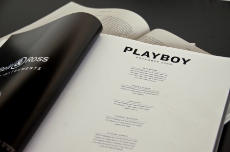
An all article Playboy
The centerpiece of the project is considered to be the logo. We spend most of the first part of the semester doing logo development and it is a very intense process. I’ve mentioned before that sketching is not my forte and I had a really difficult time initially coming up with any viable ideas. My first direction involved what I was calling the “nerdy bunny”. I liked how graphic and simple it was, but it didn’t really get me very excited. Like most first ideas, this one was ejected into the stratosphere.
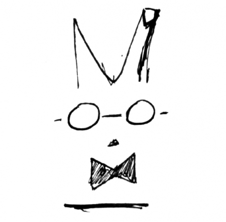
The Nerdy Bunny
After a number of disappointing rounds of sketching and critiques I got really frustrated. This happens every semester and each time I pout around for a few minutes and then think of something exciting (to me at the time) amidst my sulking. My idea this time involved a fox, or some more sophisticated animal, eating the bunny. Most likely a manifestation of my frustration, this idea sounded funny to me and that was enough to at least sketch a little and see where it could go. A five hour delay at the airport aided this process significantly.
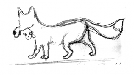
First sketch of Fox/Bunny Idea
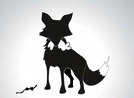
Computer comp of Fox/Bunny Idea
I was at home at the time and showed these sketches to my family. The general consensus of the Cornell household was that they were “too violent” and I was asked “how could I do that do the cute little bunny”. Valid points. In class the logos were met with the same hesitations — people liked the concept (of another animal logo eating the old animal logo), but were distracted by the sad little bunny. I decided to get rid of the actual bunny and replace him with something — maybe his iconic bow tie, but I wasn’t sure.
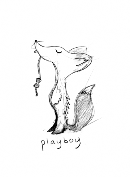
Friendly Fox
In addition to ditching the dead bunny, I wanted to make the fox more friendly. I looked at a lot of vintage animal illustrations and began trying to render something that might conjure this retro feel and also maintain the concept of the fox eating the bunny. I replaced the sad little bunny with his bow tie and this seemed to work. It was subtle enough that no one was getting upset about the loss of the bunny. I worked on this direction for a really long time and eventually landed on something I was really happy with. What you see below was *the logo* for my project for at least a couple of weeks. (As you can see, the tagline reads “Playboy Children’s”. After I ditched this logo, it reinserted it into the end of the project as the logo for the Children’s line of Playboy products, to be described in a later post.)
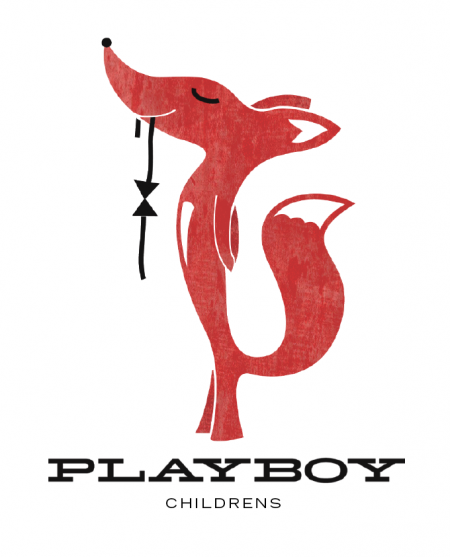
As I moved forward, the logo didn’t feel serious enough. It looked exactly how I wanted it to look, but I was having trouble imagining it being versatile across many applications. As brand extensions were to be a major part of our book, I worried this logo would look kind of odd on an airplane (for example) that billed itself as sophisticated and classy. At this point, we were almost at mission critical stage — where a logo overhaul was just about out of the question due to the remaining amount of work required. Luckily, and thanks to the encouragement of my teacher, I had a massive amount of sketches backlogged to look through. I found the two below that I thought might provide a nice hybrid direction — keeping all of the concepts (fox, bow tie), while simultaneously injecting a bit more style into the overall look and feel.
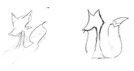
Long lost sketches
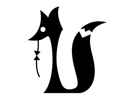
Computer comp of new direction
These sketches were refined and refined (and refined) to the point of complete absurdity. I spent most of the time trying to make sure the the animal read as a fox and not some sort of odd dog. I think I probably drew thousands of foxes during this process. The shape of his head changed the most over the course of the development. The eventual result of this process is below.
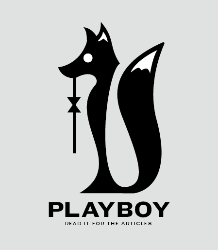
Final Mark
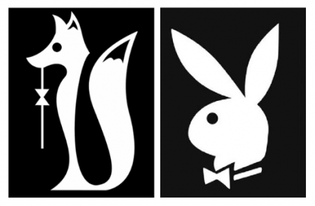
Logo comparison
The final mark is a variation of the original “bunny” symbol. As mentioned, the animal depicted is a fox and you are to deduce that he has “consumed” the old logo and left only the distinctive bow tie hanging from his mouth. This changing of the guard represents the evolution of the brand — not only visually, from a cute and cuddly bunny to a sly and cunning fox — but also in terms of perspective, in that the new animal is more sophisticated and better suited to represent the new priorities of the magazine.
Of course, as humor has always played a role in Playboy’s history, the bow tie hanging from the fox’s mouth conjures this tongue-in-cheek (or tie in mouth) mentality — as well as paying homage to the original iconic symbol. Most importantly, the fox stands proudly; having bested the bunny and established himself as the new symbol for the brand. This confidence and swagger is something that will be pervasive throughout all aspects of the brand.
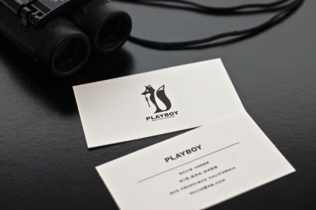
Example stationery
The new brand will strip away all of the trashiness and cheapness that has come to infect the pages of the current Playboy. With this logo guiding the visual conceptualizing, the goal of the rebranding will be to bring back the class and sophistication of Playboy’s early years. In some cases, this will be done in a drastic fashion; for example, the magazine will not longer feature naked women, rather, it will become solely a literary magazine for the intellectually oriented gentleman. In the end, the product will be a lifestyle — or perhaps more appropriately — a perspective. A way to live your life, according to Playboy. This is outlined in the final book and I’ll post up some pictures and production notes when I get it back from the binder.
The assignment is due in one month, and due to an assortment of crazy production deadlines, my book design was done last week. It is a large 11″x17″ portrait sized book, and will be bound in leather. It will be ready in two weeks. Given that I will have a fair amount of extra time to flesh out some extra part of this project, I am currently brainstorming ideas for something crazy and exciting that I can add onto the final deliverable. Currently, the most promising ideas involve video, but I think it might also be interesting to do some form of super large format infographic poster. We’ll see, for now I’m just happy to be done with the logo and the book.
(click here to read Part Two: Book Production)

136 Comments Leave A Comment
Bobby S. says:
November 24, 2009 at 1:48 amIt doesn’t get any better than a black fox…
shu says:
November 24, 2009 at 1:48 ami like it.. but i can’t help thinking i’m looking out for something in the negative space..
xumb says:
November 24, 2009 at 1:59 ami second shu’s comment
is there any hidden message?
Thomas says:
November 24, 2009 at 2:19 amditching the bunny is at best impossible, and at worst disastrous.
Imar says:
November 24, 2009 at 2:22 amLove the concept and the stylized fox. I agree with the others, the negative space really draws my attention.
Julian says:
November 24, 2009 at 2:23 amMe too,
I love the idea and concept generation…but keep looking for something in the negative space. The tail is like a handle. Might just be the sharp edge at the back of the head.
Great job though!
Luke says:
November 24, 2009 at 2:35 amHave to agree with the others, the negative space is a little distracting. I’m willing to bet it would only take a little tweaking of the line of the fox’s back to fix it. However, I’m sure at this point you never want to draw a fox again :)
Great concept, Alex. I love the idea, and it looks good.
Spencer says:
November 24, 2009 at 2:41 am@shu – funny i was thinking the same thing. looks nice tho
NAVIS says:
November 24, 2009 at 3:06 amI love the logo. I think what I love almost more than the image is the font you chose. You, sir, are a master at making text look amazing. I have no idea how you do it.
Although, if you ditch the nudie pictures, wouldn’t Playboy just become another GQ or better designed New Yorker? I think you could re conceptualize how the photos are done. Perhaps more artfully done photos instead of the commercially looking ones? Playboy losing the naked pictures is like Nike not making shoes. I think keeping tastefully/artfully created semi-nude photos would keep most current readers but also lure in many different demographics. All while maintaining its new brand.
Ross says:
November 24, 2009 at 3:40 amI understand the comments about the negative space. I’m sure there’s some way you could work a stylized naked woman silhouette into that gap…
Just kidding. I really like the cocepts behind your logo design choices, and the way you write about the process. I guess if this was an actual rebranding the loss of the bunny would be a no-no, but for a project it works. Good to see you thinking outside the fox. *cymbal crash*
David says:
November 24, 2009 at 3:53 amI really like this, fantastic work, and as with all negative space ‘issues’, once it’s been mentioned, it’s hard not to look at it the same way: make the curves work for you rather than against (there’s a Playboy slogan in there somewhere, or it might just be me!)
Sam says:
November 24, 2009 at 4:34 amThis rebrand is genius. I truly love it and its less far-fetched connotations. Your logo is really successful and despite what everyone says, I think any black and white logo will make you look at the negative space for clever inclusions; however, it is successful without those clever little silhouettes.
ralph fisker says:
November 24, 2009 at 4:43 amWhite space is first thing I noticed as well. I thought I was looking at a FreudWoman variant – http://encefalus.com/wp-content/uploads/2008/07/freud_woman.gif .
We says:
November 24, 2009 at 4:53 amI like the idea behind the killer fox. For all is very hard to wipe something so iconic in our minds. We grew with this icon and we feel strange at first sight.
What I can’t see is this tattooed in a Playmate.
Nice exercise btw.
I says:
November 24, 2009 at 5:14 amNegative space is bugging me aswell, I guess the problem is the fox being way to skinny so you try to imagine that a part of the fox is hidden behind something. The negative space makes me think of an oversized uvula, would change it. Rest of it is straight up brilliance!
Anonymous says:
November 24, 2009 at 6:14 amplayboy get rid of the bunny? seriously? i appreciate the effort but the entire project is totally wrong. playboy is known for 2 things: sexy naked women and the 70s iconic bunny. and you want to lose both? nice try but i’ll have to disagree with the concept and execution.
Skyler says:
November 24, 2009 at 6:17 amGreat Job! When I saw the fox logo I thought it was great, but wasn’t quite sure what direction you were trying to take the brand.
After reading your explanation and thought process, you’re spot on. Playboy USED to be considered classy and part of a overall lifestyle and over time it’s just gotten lost in a sea of men’s magazines.
I think you’ve managed to bring a fresh perspective to something that could have very easily just been another trite rebrand with no soul.
Skyler says:
November 24, 2009 at 6:21 amI also forgot to mention, I agree with NAVIS completely. The only problem I see with losing photos completely is potentially getting lost among GQ and other similar magazines. Redoing the style of the photos and going back to something similar to how the originals were done could be another potential solution that would keep the magazine more high brow without it alienating current readers and not completely abandoning what Playboy is.
Still, great job regardless.
faber. says:
November 24, 2009 at 6:26 amShh guys! The negative space is a huge wang.
Get it!?
(Nice work, Alex)
aaron says:
November 24, 2009 at 7:08 amhuge wang! perfect!
bdc
Paulo Canabarro says:
November 24, 2009 at 7:14 amGreat Job! I really like how you took the old bunny to the next level and introduced a new animal and the fact that the fox ate the bunny show a good transformation and rebranding as well.
The only thing that bothers me a lil is that I cant stop looking at the whitespace between the fox body ant its tail, just sucks in my attention and I try to look for a meaning for it. Is there one?
Awesome post Alex!
Derek Dietrich-Muller says:
November 24, 2009 at 7:59 amI think it’s brilliant.
I especially love the bowtie. It’s ads subtle subversive touch. The fox and illustration style recalls a different era of gentlemen… whom I wouldn’t want to hang out with, but can’t deny had style.
To the comments about losing the bunny. This identity really hinges on how in trouble the brand is.
This identity clearly takes the focus away from the pinups and puts in of the concept of the playboy itself. In doing so, the brand would feel closer to Esquire than Maxim.
If you still think it’s blasphemous to lose the bunny icon, if the company isn’t moving any product, you could lose that anyway in real life. I’m pretty sure someone would still make the costumes for Halloween.
zx says:
November 24, 2009 at 8:15 amLike the logo very much except the tie. The fox looks so sleek and ’rounded’ while the tie is too harsh with those two simple shapes.
Alex / HeadUp says:
November 24, 2009 at 8:35 amI suppose a re-brand effort in real life would be met with a similar level of resistance from your clients, it’s never an easy or comfortable process.
This is a great project so far, definitely holds promise, there is some good feedback to attend to here as well, I agree with the general consensus on the need for something to be done with that negative space which isn’t being used for anything, zx’s comment about the tie is also a good point.
Finally, yeah NAVIS is onto something, Playboy has always been known if not revered for their (relatively) tasteful depiction of the nude female form. Since there is no way we want to go raunchier a la Hustler to try and boost sales, but we also don’t want to alienate readers (or negate the existence of things like the Playboy Mansion), I think a great challenge would be to find a way to depict the playmates in an even more elegant, artistic, tasteful way that reinforces the new identity of sophistication and refinement. Maybe look to old Bond films, or something of the like.
Great stuff so far, thanks for sharing!
Rafe says:
November 24, 2009 at 8:36 amI’d been looking forward to this article.
I really like the rebrand. It evokes some type of classiness, while still being humorous. The font is also amazing.
Carson Shold says:
November 24, 2009 at 8:37 amAmazing redesign.
The only thing that I can see a problem with is the female ‘readership’ or clientele. Countless women love to wear the little bunny earrings or have the iconic bunny plastered across their wardrobe. I don’t think these women would be quite as thrilled with prancing around with a little fox instead.
The Playboy Bunnies also couldn’t be come the Playboy Foxes.. it just doesn’t have that same connotation to it.
All in all, great logo with keeping brand continuity and an even better explanation, but I don’t think the Playboy brand can move away from the bunny.
Cheers,
Carson
Alex / HeadUp says:
November 24, 2009 at 8:49 amTo elaborate on what I’m thinking (fantasizing?), you could actually look at Scott’s Coastal Brake art as a great example, which blends the female form with beautiful colors, bokeh effect photography, and the like…more expressive and stylish than typical Playboy airbrushed T&A.
Oliver says:
November 24, 2009 at 9:13 amAlex –
I love your sketches of the fox, really nice. The PLAYBOY CHILDREN’s image is my favorite. I see why you didn’t go forward with that design but it really is very nice.
– Oliver
eydryan says:
November 24, 2009 at 10:26 amI like how you kept the eye from the bunny but can;t help but feel a bit odd at your rebranding of playboy. Firstly, you change that iconic logo to something completely different (and imo go from male to female which is a bit odd) and then you want to do away with the whole nudity aspect?
I think regardless of the visual direction of the project (which will always look good done by you) the strategic part is somewhat off. I’m not saying target for horny teenagers but think about what rich, sophisticated men want to read and see, and know that playboy was just that back in the day: the edge of fashion, the best and the wildest parties and all the fantasies normal people had and playboys lived…
I know you can’t and probably won’t change the logo but still think more about the fox, it’s not what rich people living in the Mediterranean on their yachts are like. Those people are eccentric, and they like to show it. Slyness is not a quality they need nor desire, they have money to cover for that.
That would be my opinion, and as for the negative space I had no concerns with it, didn’t pop into my mind at all.
Harry says:
November 24, 2009 at 10:46 amPlayboy without naked women isn’t Playboy. I imagine this would fail as hard as the McDonalds Arch Deluxe. You don’t try and turn fast food into gourmet food and you don’t turn softcore porn into a literary magazine.
Great logo though.
Erik Wallace says:
November 24, 2009 at 11:46 amNice work, I agree with Harry’s comment… not sure if Playboy could be Playboy without Playmates and naked women. Where they can beat the Maxims of the world is with really stellar photography devoid of obvious photoshop work. The digital age has done a disservice to photography in magazines. There’s not a shortage of lackluster art direction and photography. Compare the Maxims of the world to Playboy of the 70’s and you’ll see how a men’s magazine should be. Esquire is in my opinion the best on the newsstands now.
eydryan says:
November 24, 2009 at 12:14 pmNot so sure about the Playmates but the naked celebrities are one of the main reasons people buy Playboy. That and actor interviews.
Seth T says:
November 24, 2009 at 12:21 pmhaha, the Fox with the bunny in it’s mouth is great!
I think the final brand is excellent and would be perfect if Playboy were trying to push itself in the direction of magazines like Esquire, Maxim, and GQ. I think if they took the stance as a diverse mens magazine that happens to have nudity, they could do well.
Anonymous says:
November 24, 2009 at 12:51 pmpeople should try giving an honest critique rather than blow smoke up people’s arse everytime they post something here. especially since this kid is in school. its good to hear praise but seriously almost everyone here would approve playboy losing naked women and their icon? that is one of the most recognizable icons in the world. it doesnt even need type next to it. this proposed idea would be laughed out of an empire like playboy. maybe for an offshoot brand, this might have potential but the logo needs tweaking. also, shooting the art like the coastal brake ep would be a total retread, that style has been done to death and is nothing new. when this whole retro phase goes back out of style, what would you do?
Jayson says:
November 24, 2009 at 12:56 pmVery nice stuff. I like the logo. I’m not sure rebranding it without nudes would work though. I’m honestly not sure a men’s magazine without pictures would work for that matter, but hey.
I hate to say this, but No Fear is doing pretty well still. It’s not the nationwide brand it was, but it’s huge in the dirt bike scene and was a major client where I used to work. They also have a large number of spin off brands.
eydryan says:
November 24, 2009 at 12:58 pm@anonymous if you would have read the comments, we actually did critique the stuff you mention.
Zach Burson says:
November 24, 2009 at 1:58 pmI feel like I am just adding my input in a see of criticism, but I hope my opinion get’s a look at least.
In regard to everyone saying re-branding would be detrimental and would fail without the pin up pictures, I believe that as a complete re-brand, it might fail. I think another direction to take would be to take all of those great articles from the playboy mags and put them in this as a completely different side magazine that playboy produces. Rather than lose the pictures completely, you get the pictures in one magazine and you get the great articles in another. By doing this, you don’t feel the embarassment of reading it in public. On top of that, playboy would be producing twice the amount of money by not only bringing in more demographic, and keeping the old, but also by selling two magazines. I know this is a long explanation and I apologize for not keeping it short, but I don’t understand why there are so many negative comments for something so great.
Post note: Like Oliver said, I really enjoy the children’s mag illustration as well. I see why you ditched the idea, but I think overall, it’s much more friendly. Would you mind an explanation of how you processed it? :)
Chris says:
November 24, 2009 at 2:21 pmWhile the logo on its own is actually very well rendered and distinctive, I think it has a conceptual problem.
As mentioned above, the negative space is too distinctive not to make the viewer wonder what they’re missing. It almost looks like a penis hanging behind his back — which is definitely not sophisticated.
However, my main problem is what message the (male)fox eating the (female)bunny sends. The girls are called bunnies and to have a fox devouring them conjures up all kinds of sexist ideas — including, but not limited to, domestic abuse and chauvinism. Which, regardless of the nude pictures, Playboy actually avoids. It positions itself as a celebrator of nude women, not an exploiter.
A brand that has always had to defend itself against being called pornography does not want to overtly display male dominance in its logo.
That, to me, is the biggest problem.
You probably couldn’t do photo shoots of naked women for your rendition of the book, so I understand the need to remove it. However, removing that aspect from Playboy would be like removing alcohol from wine. Sure, the flavor is great, but it wouldn’t be popular if it didn’t get you drunk.
Brandon says:
November 24, 2009 at 2:33 pmI have never commented on a blog before linked from underconstruction.com… but this is not worthy of a post. Poor concept and and the Playboy identity does not need updated. Please update something that is actually “dead, dying or defunct”. Also you didn’t redesign anything just implemented a character to the same style.
I would have been more impressed if you went after something more deserved like “8 Hour Energy” or any of the Convenient Stores in our Country.
eydryan says:
November 24, 2009 at 3:04 pmIgnore Brandon, he just fails to see the value in any work that’s not his. An ignorant.
Anyway, I see someone else has seen the sex change of the mascot but I feel I must reinforce my point of view here. I personally see the bunny as male (and coupled with the people who read the magazine it’s obviously a symbol of promiscuity, and an enjoyment of seeing many naked women) whereas the fox is always female, at least as a symbol. Hell, in my language where we have gender articles fox is always female. And even beyond that, all the traits of the fox are those of femininity.
Also, I can’t see the link between the rabbit and the female gender. There are no traits of the bunny that women possess, and its defining feature isn’t exactly that desirable.
mg33 says:
November 24, 2009 at 5:21 pmYou cannot, absolutely cannot rebrand Playboy without nudity. This project is an interesting one for sure, but you are very off-the-mark in suggesting Playboy is dead dying or defunct, or that it can exist without nudity. That’s why it was started! Not honoring that is disrespectful and narrow-minded.
I like the logo actually, I think it looks great. But seriously man, I don’t see how you get a passing grade on this project in terms of the bigger picture. It’s a clever direction, but not for Playboy.
I’ve got to laugh too: you actually opted out of an opportunity to work with nude images FOR A SCHOOL PROJECT… You could have really investigated a new direction for their photos, and done it in a cool way. Hell, play your cards right and I’m sure you could have gotten a decent model somehow to tastefully contribute to your project.
This is an opportunity wasted IMO. Good luck with the rest of the project, but I think it’s heading in an unfortunate direction in terms of what it could have been.
ji says:
November 24, 2009 at 6:49 pmcertainly not bad. its about as good as a rebranding could get for playboy. EXCEPT for the fact that Playboy does NOT need rebranding. The bunny is clean, iconic, and a superb design. I think you chose a bad subject. This is like trying to rebrand Nike.
Harry says:
November 24, 2009 at 7:02 pm@Brandon
Do you have a small dick or something? Clearly there’s something wrong, because normal people don’t talk shit in the blog comments.
Cargoplex says:
November 24, 2009 at 7:19 pmI’ve always loved Playboy’s Femlin character: http://en.wikipedia.org/wiki/Femlin
JustSomeJoe says:
November 24, 2009 at 7:59 pmLook closely at that negative space — it looks more like a bunny’s ear than The bunny’s ears did…
Or maybe it’s some sly fox’s tongue hanging out, panting in anticipation …
alex says:
November 24, 2009 at 10:18 pmWow great feedback, figured this one might stir the pot a little haha.
Coincidentally I saw this article in the Wall Street Journal today:
“The magazine lost about $13 million in 2008 and will lose roughly $8 million this year. Despite job cuts and other expense reductions — including reducing the frequency to 10 times a year and cropping 1.1 million off guaranteed circulation — the magazine was on pace to lose more money in 2010 than it will this year.”
Based on these numbers (prior to the outsourcing deal), I would feel very safe calling Playboy a dying magazine (not exactly a unique situation — it is a magazine after all). Of course they’re still iconic, but with their fiscal situation in “steady decline”, they certainly aren’t at the top of the “publishing pantheon” anymore.
Shogo says:
November 25, 2009 at 3:21 amLove your design, and how it mirrors the old rabbit while still changing the brand’s image.
I agree with all the comments on nudity though. Taking nude photos out of Playboy and making it solely article-focused would be just as undistinguished as before, only with a different audience. Keeping the photos but changing the presentation seems like the best way to go to me.
It was a lot of fun to read about your process behind creating the fox logo, and all the different iterations. Looking forward to part 2!
NAVIS says:
November 25, 2009 at 3:28 amPlus with the advent of internet pornography – I can see why Playboy is a dying brand. Yeah, they have the other little toys and nick-knacks you can purchase but that’s such a small, small core of people purchasing those products. So it’s either get raunchier or get classier. Either way, the brand HAS to take things to another level – for better or for worse. To me, whenever I hear Playboy, I just think of the Palms in Vegas and that’s about it. I never have any desire to pick up an actual magazine when I can just Google my porn. So perhaps change up the print/paper quality of the magazine and why not push it to another level? A classier, designer friendly level? But with sexy, artfully done nudity. Yeah, it’s iconic and so was K-Mart and that shit died out. Remember when K-Mart stock was a penny? Just because it’s iconic doesn’t mean people give a shit.
And to all you people saying the negative space looks like a cock. WTF. If your dick looks like that – what the hell is wrong with your penises? I see a fox. And thanks to Hendrix, we have Foxy Lady. The majority of people won’t pick up on the negative space and be like, “By golly! That there negative space sure looks phallic like!” Nyet. It might hit them later subconsciously that its curves have erotic undertones but other than that, it’s pretty obvious that it’s a fox.
I will admit though – it is daunting to rebrand the bunny logo. It is iconic and tastefully done and applies extremely well over many other applications. If anything, I find the tie coming off the foxes mouth a little odd. I get the humor behind it but it looks off. It throws subtle parts of the design off. The bunny is so round whereas the fox is more rectangle. But, it’s a tough re branding project and I think with time, you’d find a suitable fox to give Playboy a new name. Personally, if I saw the new logo on a Playboy magazine on the shelves, you bet I would pick that up and read it to see what the hell is going on with the magazine.
Anonymous says:
November 25, 2009 at 5:16 amA great re-brand… the fox works at all levels, the bunny is terribly played out.
mg33 says:
November 25, 2009 at 5:21 amPlayboy isn’t the only magazine losing money, so it’s not uniqe in that sense.
Jayson says:
November 25, 2009 at 7:38 amReading all the feedback is kind of interesting. No one really seems to have issues with the actual graphic design part. I think the readership here likes the fox a lot. I know I do. All of the issues seem to be with the marketing level decisions.
D says:
November 25, 2009 at 8:38 amThe Nerdy Bunny is way cool!!! Haha
Benjamin says:
November 25, 2009 at 2:38 pmGreat job Alex. I enjoyed the write-up & in-depth explanation of reasoning and details. Nice and insightful.
The last thing I want to do is it tear down your work or be offensive/gross, so I am quite interested to see if you intentionally had any “part” in this uncanny similarity? (In reference to the “hidden mouth”, as well as the similarity to the ISO50 poster image.)
http://i45.tinypic.com/6s5p41.jpg
(I personally don’t read Playboy and never will, but it would have been quite creative (to say the least) to purposefully hide this in the negative space, specifically due to the nature of the logo/company and their doctrines.)
Fontless says:
November 25, 2009 at 4:00 pmAlex, what is the slab-serif font you used for the logo in your “Children’s” version? It reminds me of the old Electrohome logo, but I can’t find the digital foundry that has one like it.
alex says:
November 25, 2009 at 7:58 pm@Fontless — that’s Hellenic Wide. A great one for sure.
Will have a part II of this project up in the coming weeks. Will go more in depth with some of the brand direction decisions. Looking forward to getting the final book back from the printer when I get back to SF…
Scott H says:
November 25, 2009 at 11:02 pmActually, I really like the Childrens Fox, much more than your final fox, now I may be colored by adoration of nearly all things mid century, but it feels more whimsical and classy.
As for the re brand, and content shift, this is what college can provide, the impossible toy box to express what you can achieve.
hlw says:
November 26, 2009 at 7:56 amscott said it best.
slofu says:
November 26, 2009 at 4:32 pmI love the fox. I never liked the bunny, but like most other men I need girlie pix. I could even do without nudity if they were presented more like Bond girls. The controversy over the logo alone would generate sales. After about a year I’d omit the bowtie from the fox’s mouth. Good work, Alex.
Fontless says:
November 26, 2009 at 10:46 pmThank you Alex, very much appreciated.
matt23 says:
November 27, 2009 at 4:34 pmI think this is great, you’re a very talented graphic designer. For those wondering about negative space, this will clarify: http://stashbox.org/715828/playboy_logo.jpg
Harry says:
November 28, 2009 at 11:09 am@61
If your dick looks like that, I’d make an appointment with your doc.
Loosh says:
December 1, 2009 at 7:08 amOne more on negative space – the shape made by the left side of the fox recalls a woman’s open mouth. yikes.
Scott Lowe says:
December 1, 2009 at 8:30 pmAlex,
I love the work. The negative space between the tail and body is very strong and to be honest, I’m glad that nothing is there. It wouldn’t fit with your story.
I see what you are proposing not as a replacement for every playboy publication but as a new line (of sorts). The lack of a female in the publication I think is a missed opportunity. It would unite the brand to have to have some gorgeous female in the magazine. I think a good thing to work on would be some sort of insert (monthly calendar page, etc.) that includes a woman that is fully dressed doing something representative of what the demographic you are shooting for would see as an interesting woman. The woman could be preforming heart surgery or doing relief work or riding horses or sailing, whatever. It should be erotic without even hinting at nudity. The new fiery poster that Scott just completed is like what I envision but without the cultural commentary that you envision the magazine addressing.
I hope that sparks an idea and congratulations on what you have done so far!
Anonymous says:
December 4, 2009 at 9:10 pmExcellent work. Don’t even think about the comments on negative space – I think it only bothers those who don’t like being alone with their own thoughts. You took on an impossible idea and made it plausible. Nice work.
A girl with an opinion says:
December 4, 2009 at 9:21 pmExcellent work. Don’t even think about the comments on negative space – I think it only bothers those who don’t like being alone with their own thoughts. You took on an impossible idea and made it plausible. Nice work.
Ryan White says:
December 5, 2009 at 3:03 amAlex, great job. I even love the red fox. When I read the first couple of paragraphs I didn’t expect you to make such a good point and then back it up with a great design.
Totally bad ass.
Chris Toth says:
December 5, 2009 at 7:41 aminteresting account of the creative struggle. Wait till he gets in the real world and the creative struggle is just the beginning.
This “project” would likely never make it to the creative folks and be destroyed in research but IF it did…. After months of meetings and design and creative folks HOPING the logos they submitted would become this amazing new icon in the world of POP culture forever cementing their place in the design world FOREVER….
The best designs (read the top creative directors personal attempts) would make it to the marketing people who put the whole thing in motion. Out of control issues or the need to feel like they were a part of this monumentous occasion would make endless revisions for about 3 months and the Creative director would have handed it off to one of his senior underlings (because he is to important to deal with such minor details) this person would start out positive and slowly the stupid input from the cheerleaders would wear him down and he would pass it off to a young eager guy in the studio. This guy or gal would perform small miracles and actually solve numerous design riddles and come up with 3 fantastic award winning designs.
And then the fun would really begin. The senior people above this very talented soul would see the promise in his work and want to put some kind of thumbprint through a small revision so they could al claim it for their own book as well.
Then after our young lad manages to step through the minefield of tweaks that actually make the idea a little less good but good enough to not embarrass anyone they begin the process of funneling it through to the people who ACTUALLY make decisions. Hugh Hefners daughter as I understand it.
She would then take one look at this proposed idea and say “Who’s idea was this?” and of course the line of people would all be standing there… except the one guy who actually did all the work. She would turn to this group of overly paid ass wipes that gave up on their dreams for money and all have used the talents of people under them to push them up yet another pay rung… and say.
“Why in the world would we ever kill the bunny? This is brand suicide. All I asked for was the bunny with glasses to emphasize we have great articles. How in the world did we end up rebranding the entire magazine?
2 days later a designer would be sitting at her magnificent desk in an office bigger than 2 of the apartments he lives in, explaining how he could have logged 1570 hours of time on such a ridiculous idea.
With a deep gulp he would apologize and sulk back to his station while all the people above him were off for the rest of the week since they had worked so hard on this project and needed a rest. He would begin working on the much more monotonous drudgery and daydream of the day when he could have someone to pass this down to and take long lunches and….
Doug says:
December 5, 2009 at 11:38 am“I imagined a Playboy comprised solely of articles, devoid of nudity (or images of any kind) — something that people would have no choice but to read.”
Readers always have a choice. And if you tried to force them to read something by having no pictures (nude or otherwise) they would choose not to read anything and not to buy the magazine.
Steve Tanner says:
December 5, 2009 at 6:39 pmwe cant get rid of the rabbit its been around so long theres 1000s of people with playboy bunny tattoos,stickers,and more bunny stuff than you could imagine
Adi says:
December 6, 2009 at 2:52 pmchildrens? … bad! very bad!
Johnny says:
December 6, 2009 at 10:14 pmIf the negative space between the fox’s back and tail is a “huge wang” as mentioned earlier, then the negative space around the head and the fox’s front is a mouth and chin. You can work out what the bow tie is!
Robert says:
December 7, 2009 at 5:13 amPlayboy will never get rid of the bunny — nor should they.
It might be a good idea to update the look/logo, etc., but you don’t want to kill a concept that’s integral to the brand.
Your reinterpretation is essentially a cooler version of what Arnell Group did when they rebranded (momentarily, until they reversed it and went back to the old design) Tropicana. Update the look, sure, but why wouldn’t you show the orange with the straw in it?
Same goes for the bunny motif…
Chris says:
December 7, 2009 at 11:44 amI love your design. But… Playboy Bunny vs what could be mistaken for a dog… I don’t think Playboy Dog / Bitch is going to go down real well with Hugh’s girls.
Negative space is definitely drawing my eye to much, looking for the hidden message as mentioned in previous posts.
Dan Rubin says:
December 7, 2009 at 12:11 pmVery nice, Alex.
The folks giving all the negative feedback are missing the point of the exercise — not that negative feedback isn’t useful (at times), but criticizing while ignoring the goal of the project, especially in an educational context, is so completely pointless… There was a time most of these commenters would be called Trolls :)
Alphonse says:
December 7, 2009 at 2:29 pm@74
Nobody likes a whiner.
alex says:
December 7, 2009 at 10:54 pmWow this is a great discussion. I’m glad the rebranding triggered so many opinions! I’m excited to see how people react to the rest of the project. I spoke with the binder the other day, and it sounds like the book is nearing completion. I should pick it up this week. (Hope it looks good!)
In the subsequent posts I will expand on some of the other parts of the project that should make the rebranding objective much clearer. The logo was really only the first part of this semester long project — so there is still more to come.
Where is my invite to the Playboy Mansion? Isn’t that why I chose them in the first place…?
c man says:
December 8, 2009 at 4:20 amThere’s a lot of mention of the negative space. Perhaps that’s good – stirring some commotion!
Yet I also agree there’s something wrong with it.
It draws a lot of attention away from the fox. You can say it’s either a droopy old man dong, or even a woman’s vag; neither are very manly in the sense of being a young and strong male – your target audience. Floppy dong = naked grandmas. I also think the fox looks spooked and not very sly. Slyness comes from ears pointed back like your children’s Playboy logo, (the idea/association of playboy with children is also extremely creepy). Just my thoughts.
nailliK says:
December 8, 2009 at 7:45 amI love the logo rework, but I think you’re wrong about removing the imagery. I think a vintage take on nude photography, or maybe even partially nude imagery like Herb Alpert’s “Whipped Cream and Other Delights” album cover would be a fantastic substitution to the trash that’s in Playboy these days. Let’s face it: even if you do “only read the articles,” Playboy has always been a gentleman’s magazine with images of nude women.
Jables says:
December 8, 2009 at 7:48 amYeah the negative space is a bit…to speak candidly…phallic and flacid. The Bunny has a more feminine negative space between the ears with the V it makes. And nude women made the magazine. That would be the most disastrous part of the whole concept in taking them out. (Personally I think that Maxim, Blender and FHM are way trashier than Playboy. And they don’t even have Naked Women. It’s garbage to read.) You can still be classy while showing women in the buff. What bible thumping town did you come from? haha J/K.
But seriously the Fox is GREAT. It would make a GREAT logo for Hef’s other magazine, PLAYGIRL… just a thought though maybe make the Circle (his eye) a half circle to convey that Sly look you were going for. Either way I really like the Logo.
tracy a. says:
December 8, 2009 at 9:15 amI think it’s a fine logo. Theoretical, yes, but great work. I think Bunnies and Foxes are equally sexy. In fact, foxes are a bit more empowered than rabbit-girls. In another view, the bow tie dangling from the fox’s mouth could also represent the playful disrobing of a bunny girl, not just the consumption of the former logo / bunny-in-a-tie.
hand says:
December 8, 2009 at 10:18 amIt looks like he’s (?) turned Playboy into…the New Yorker. Hmm. Maybe. But I think he could take the new graphic sensibiity and introduce cutting edge art nudes with fashion. Sexually frank, but contemporary. It would then be something people would want to buy, as opposed to read for free online. Without the pix, it’s a fungible content source.
weet says:
December 9, 2009 at 6:59 pmlooks great! simple and direct.
Tyler says:
December 13, 2009 at 4:31 pmAm I tho only one here who is looking at a great idea? Ditching the bunny is great, it puts out an entire industry of filth out on their asses to find new nude magazines to model in, and paves the way for a sensational effort into remaking the image of a playboy in America and worldwide.
A lot of the design and business world doesn’t understand that the social underpinnings of our country are rapidly changing, this new generation is aspiring to something way more classy than we’ve seen before. A classy sexy, a classy tongue-in-cheek kind of dirty. Fat men on toilets with a playboy magazine isn’t going to last forever, nor is an elitist publication that eats itself from the inside.
AJ says:
December 14, 2009 at 6:19 amNot to give you a 5th grade critique but this redesign is PERFECT.
I am anxiously awaiting the application of the brand on other things like the binder, I could see a great add surrounding this new brand…there is just so much that can be done. You are definitely on the right track and you will definitely go far as a designer. This redesign has inspired me tremendously.
The fox is very sleek, and the hanging of the bow tie out of the mouth to not only represent a redesign but to show that playboy is now bigger and better.
Great Work!
Chris Toth says:
December 14, 2009 at 6:22 amI would say a case could be made for the exact opposite.
Compare our television landscape today to say 1960’s. Class is not exactly the direction we are heading in.
Get. Real The bunny is an icon that could literally go on forever. Could Playboy create an additional publication (online I would think) using the fox? maybe. but there is no way beautiful nude women are going out of style any time soon.
Ashely Adams : Online Printing says:
December 14, 2009 at 11:50 pmNice job, Alex. Your fox looks confident enough to take the place of the Bunny. But tell me, why is it that your fox seems to be lacking in the suaveness department. Is it because you made it take off the bow tie?
Know what, the fox looks smart and confident, but not like a debonair.
I’m not criticizing though. I guess, it’s just a new way to look at things.
Heather says:
December 16, 2009 at 12:26 pmI haven’t read all of the comments, so maybe someone else said this as well, but when I first saw the logo, knowing it was for Playboy, I thought the bow tie was a really cool itsy bitsy bikini. Gave it a sexual tweak….the fox had been able to get the girl to undress! Then I read the blog and realized it was the ‘famous’ bow tie. I guess, being a woman, I wasn’t as tuned in to the details of the original Playboy logo.
I love the look of the logo and the idea, though keeping some of the nudity in the magazine would be cool.
spelling matters says:
December 21, 2009 at 1:19 pmThe word you are looking for is “stationery” not “stationary”.
Great work on the design though.
Matt says:
December 22, 2009 at 5:35 amI think this is a great exercise in what is considered to be a rhetorical ‘brief’ from Playboy.
Casting any other considerations/arguments from moving away from the bunny logo aside, I think this is a fantastic stab at a theoretical logo redesign – and I mean logo redesign – and not rebrand.
A strategic rebrand goes deeper than a redesigned logo. The logo is a result of a rebranding strategy and entire sea change in direction for a product/company/business entity, not the other way round.
Playboy was a respectable gentleman’s magazine brand way back when – the creator of this logo is totally right.
The logo has now been used on tall kinds of commercial tat like teenage girl’s duvets/pants/t shirts etc.
The Playboy brand has evolved to mean something to other audiences now as some sort of glamour aspiration and somewhat diluted against what it used to be.
For example, leaving the merchandising side intact, if Hugh Hefner did want to take the separate entity of Playboy magazine with a view to completely changing editorial or audience or circulation or distribution for method with a view to ‘rebranding’ and he needed a logo to represent the changes above, I think this is a fantastic stab at a brief like that.
Nice work Alex.
Anonymous says:
December 22, 2009 at 9:41 amPlayBoy Has Always Been Classy, & Is NOT In Any Way Lude Or Trashie Like Other Magazines Out There That Displays Woman In A Crude Light..
I For One, DO Enjoy Readinding PlayBoy & Their Articles.. I Have Been Reading PlayBoy Since I Was A Teenager,
All Through My High School, College & After To This Very Day… I As I Young Girl Wanted To Pose In Playboy But Never Felt My Body Would Make The Cut..
BUT…. For You To Say That PlayBoy Has Lost Its Edge, You Are Truely Mistaken & I For One Am Offend That You Would Defile PlayBoy As You Already Have
Obviously, You DO NOT See Not Only The Work Of Art That Goes Into The Magazine, But Also The Safistcation..
You Disgust Me… Leave PlayBoy ALONE!!!!!!
heather says:
December 23, 2009 at 8:05 amsorry if my comment is a repeat–i certainly didn’t read through 103 comments. :)
i like the logo a lot, and i actually like the negative space between the fox and his tail. it’s very phallic and totally reminds me of a dildo. (now, now, no giggles, this is a sex magazine.) or some vaginal cavity.
i don’t know, either way there is a nice play of masculine and feminine/ black and white that is happening that’s quite lovely.
Anonymous says:
December 23, 2009 at 9:26 pmDon’t justify on a narrow column. Rivers will result. See above.
GDD says:
December 26, 2009 at 3:14 amMan, for a class? This seems better than most professional rebranding concepts.
Thinking about this realistically, they would never get rid of the baser parts of the business, the nude chicks, trashy reality tv and other such elements. What about the logo signifying a new brand segmentation. The Bunny representing the Maxim flavored division of playboy and the Fox being the James Bond side of the business, one in which Playboy has not seemed to Target or place much importance on as of late.
Rice says:
December 26, 2009 at 9:42 pmYou have talent, however I think there is a disconnect in your brain department. I wouldn’t hire you. In fact I’d fire you.
1) Playboy’s brand IS the bunny. Their brand (logo) is neither defunct or dying – just their product and business strategy. If you had updated the bunny somehow – (like Apple) – cool, well done. But to REMOVE the bunny? Fark me.
2) What does a fox have to do with a bunny? What does a fox have to do with playboy, do foxes f*ck like bunnies? Do you imagine the new playboy foxes roaming around with fox ears? Is a fox in ANY way sexy or does it related to the product?
3) Negative space – this is where you COULD have done wonders and instead you did nothing, poor effort not to include even a silhouette of the female form. Disastrous to your project, really.
4) “Read it for the articles” – are you in touch at ALL with their target demographic? So you now have a fox saying read Playboy for the articles – egads man – where are the naked women, part of the cache of having a few playboys hanging around the house is the classic element of it.
I enjoyed seeing your process, but I suggest you understand the product and its history first.
Emily says:
December 28, 2009 at 6:30 pmI think the re designed logo is brilliant. I do agree however with some of the feedback regarding the fundamental nudie pictures. I think to recreate the classic tasteful centrefolds, only use woman that are not fake tannned and plastic. recreate pin ups of the 50’s and 60’s.. leaving something to the imagination.. just to pay hommage to the original concept of playboy and what made it so famous. Bring back the music element too.. My parents used to lpay at the play boy hotel in lake geneva when i was a kid in the 70’s and it was so classy. The women where beautiful the music world class and the hotels were up market. give the mag it’s integrity while keeping it senual and sexy..
LUKE says:
January 6, 2010 at 12:29 pmGreat concept, Alex. I love the idea, and it looks good !!!!!!!!!!!!!!!
Matt says:
January 20, 2010 at 8:39 pmI know it’s been said a few times but given the logo is such a bold black, the negative space beams out of it, this would be the perfect place to sneak in a subtle message but I don’t know what you can put in there that wouldn’t ruin the general shape of the fox. Overall good job I think!
DM says:
January 21, 2010 at 2:16 pmGreat idea. Loved reading about the concepts and progression. I think the switch from bunny to fox is excellent – brand identifies with the consumer rather than only what the consumer likes to look at (bunnies). However I think (and I am a feminist old lady!) that the magazine must retain nudity. Just have the centerfold. But nothing else…My two cents.
paperdemon says:
March 4, 2010 at 9:13 pmTHE NEGATIVE SPACE MAN!!!!!!!! I fuck’n luv it!!!!!!!!!!!
THE NEGATIVE SPACE MAN!!!!!!!!
THE NEGATIVE SPACE MAN!!!!!!!!
THE NEGATIVE SPACE MAN!!!!!!!!
THE NEGATIVE SPACE MAN!!!!!!!!
THE NEGATIVE SPACE MAN!!!!!!!!
THE NEGATIVE SPACE MAN!!!!!!!!
THE NEGATIVE SPACE MAN!!!!!!!!
THE NEGATIVE SPACE MAN!!!!!!!!
THE NEGATIVE SPACE MAN!!!!!!!!
THE NEGATIVE SPACE MAN!!!!!!!!
THE NEGATIVE SPACE MAN!!!!!!!!
THE NEGATIVE SPACE MAN!!!!!!!!
THE NEGATIVE SPACE MAN!!!!!!!!
THE NEGATIVE SPACE MAN!!!!!!!!
THE NEGATIVE SPACE MAN!!!!!!!!
THE NEGATIVE SPACE MAN!!!!!!!!
THE NEGATIVE SPACE MAN!!!!!!!!
THE NEGATIVE SPACE MAN!!!!!!!!
THE NEGATIVE SPACE MAN!!!!!!!!
THE NEGATIVE SPACE MAN!!!!!!!!
THE NEGATIVE SPACE MAN!!!!!!!!
THE NEGATIVE SPACE MAN!!!!!!!!
THE NEGATIVE SPACE MAN!!!!!!!!
THE NEGATIVE SPACE MAN!!!!!!!!
THE NEGATIVE SPACE MAN!!!!!!!!
THE NEGATIVE SPACE MAN!!!!!!!!
THE NEGATIVE SPACE MAN!!!!!!!!
THE NEGATIVE SPACE MAN!!!!!!!!
THE NEGATIVE SPACE MAN!!!!!!!!
THE NEGATIVE SPACE MAN!!!!!!!!
THE NEGATIVE SPACE MAN!!!!!!!!
THE NEGATIVE SPACE MAN!!!!!!!!
THE NEGATIVE SPACE MAN!!!!!!!!
THE NEGATIVE SPACE MAN!!!!!!!!
THE NEGATIVE SPACE MAN!!!!!!!!
THE NEGATIVE SPACE MAN!!!!!!!!
THE NEGATIVE SPACE MAN!!!!!!!!
THE NEGATIVE SPACE MAN!!!!!!!!
THE NEGATIVE SPACE MAN!!!!!!!!
THE NEGATIVE SPACE MAN!!!!!!!!
THE NEGATIVE SPACE MAN!!!!!!!!
THE NEGATIVE SPACE MAN!!!!!!!!
THE NEGATIVE SPACE MAN!!!!!!!!
THE NEGATIVE SPACE MAN!!!!!!!!
THE NEGATIVE SPACE MAN!!!!!!!!
THE NEGATIVE SPACE MAN!!!!!!!!
THE NEGATIVE SPACE MAN!!!!!!!!
THE NEGATIVE SPACE MAN!!!!!!!!
THE NEGATIVE SPACE MAN!!!!!!!!
THE NEGATIVE SPACE MAN!!!!!!!!
THE NEGATIVE SPACE MAN!!!!!!!!
THE NEGATIVE SPACE MAN!!!!!!!!
THE NEGATIVE SPACE MAN!!!!!!!!
THE NEGATIVE SPACE MAN!!!!!!!!
THE NEGATIVE SPACE MAN!!!!!!!!
THE NEGATIVE SPACE MAN!!!!!!!!
THE NEGATIVE SPACE MAN!!!!!!!!
THE NEGATIVE SPACE MAN!!!!!!!!
THE NEGATIVE SPACE MAN!!!!!!!!
THE NEGATIVE SPACE MAN!!!!!!!!
THE NEGATIVE SPACE MAN!!!!!!!!
THE NEGATIVE SPACE MAN!!!!!!!!
THE NEGATIVE SPACE MAN!!!!!!!!
THE NEGATIVE SPACE MAN!!!!!!!!
THE NEGATIVE SPACE MAN!!!!!!!!
THE NEGATIVE SPACE MAN!!!!!!!!
THE NEGATIVE SPACE MAN!!!!!!!!
THE NEGATIVE SPACE MAN!!!!!!!!
THE NEGATIVE SPACE MAN!!!!!!!!
THE NEGATIVE SPACE MAN!!!!!!!!
THE NEGATIVE SPACE MAN!!!!!!!!
THE NEGATIVE SPACE MAN!!!!!!!!
THE NEGATIVE SPACE MAN!!!!!!!!
THE NEGATIVE SPACE MAN!!!!!!!!
THE NEGATIVE SPACE MAN!!!!!!!!
THE NEGATIVE SPACE MAN!!!!!!!!
THE NEGATIVE SPACE MAN!!!!!!!!
THE NEGATIVE SPACE MAN!!!!!!!!
THE NEGATIVE SPACE MAN!!!!!!!!
THE NEGATIVE SPACE MAN!!!!!!!!
THE NEGATIVE SPACE MAN!!!!!!!!
THE NEGATIVE SPACE MAN!!!!!!!!
THE NEGATIVE SPACE MAN!!!!!!!!
THE NEGATIVE SPACE MAN!!!!!!!!
THE NEGATIVE SPACE MAN!!!!!!!!
THE NEGATIVE SPACE MAN!!!!!!!!
THE NEGATIVE SPACE MAN!!!!!!!!
THE NEGATIVE SPACE MAN!!!!!!!!
THE NEGATIVE SPACE MAN!!!!!!!!
THE NEGATIVE SPACE MAN!!!!!!!!
THE NEGATIVE SPACE MAN!!!!!!!!
THE NEGATIVE SPACE MAN!!!!!!!!
THE NEGATIVE SPACE MAN!!!!!!!!
THE NEGATIVE SPACE MAN!!!!!!!!
THE NEGATIVE SPACE MAN!!!!!!!!
THE NEGATIVE SPACE MAN!!!!!!!!
THE NEGATIVE SPACE MAN!!!!!!!!
THE NEGATIVE SPACE MAN!!!!!!!!
THE NEGATIVE SPACE MAN!!!!!!!!
THE NEGATIVE SPACE MAN!!!!!!!!
THE NEGATIVE SPACE MAN!!!!!!!!
THE NEGATIVE SPACE MAN!!!!!!!!
THE NEGATIVE SPACE MAN!!!!!!!!
THE NEGATIVE SPACE MAN!!!!!!!!
Ghost says:
March 19, 2010 at 6:55 amThe negative space looks like a sick sperm cell or a penis that has been played with too roughly. Both make perfect sense.
As for ditching the bunny and using the fox…I like it as a Playboy side project, but not a rebrand. Overall good concept & execution.
James says:
March 21, 2010 at 5:58 amLooks great, I also like the style of the ‘children’s’ logo
Bryan "SK" Longoria says:
March 22, 2010 at 7:55 pmWow, I loved the rebranding. You can really feel the brand through the logo. This was an interesting post and a fun read. I’d love to see where the article goes. Great work.
Angie says:
March 22, 2010 at 8:37 pmTons of comments, and you seemed to have taken the best comments to heart, but I just wanted to elaborate on a thought that a few here seemed to have.
I don’t think that a fox is that wildly out of the question as far as what females would want to identify with, as opposed to a bunny. Isn’t it a really common term to call an attractive woman a fox? Even if it is a dated term, I still think people could still connect a fox to an attractive woman.
If they didn’t see that, then it seems that after the new brand rolled out (if this were real) all of the new materials could let you know about the cool idea of the fox eating the rabbit, and the men would relate more to the brand, which seems like what you’re trying to do by shifting the focus of the magazine to a gentleman’s lifestyle, and what they like, as opposed to just the women.
Just wanted to throw in my two cents. Nice work overall!
Jayde says:
May 3, 2010 at 12:57 pmIt’s a little difficult to get my head around changing from the bunny to the fox. Especially as my mother and I used to live in a flat next to one of the clubs and would always see a bunny girl with the cute bow ties and ears! I think the change is obviously something needed but I can’t see it becoming as iconic as the bunny. Playboy Foxes just doesn’t have a ring to it? And the fact the fox is meant to be showing class but is holding the bow tie in its mouth as if it’s ripped it off its neck looks as if it’s sneering almost at class.
I love the fox as a logo, I don’t even see the problem with the ‘negative space’ I see a well refined fox with a gorgeous posture but I just don’t think it fits for playboy
Melanie says:
May 6, 2010 at 11:48 amThis redesign idea is pretty fantastic. It’s difficult to touch such an iconic brand, but I think the fox actually suits the Playboy reader better than the bunny.
Richard says:
May 13, 2010 at 12:20 pmPlease get in touch, I would be very interested in a copy of your final book.
Ben says:
May 27, 2010 at 6:21 pmAm I the only one bothered by the fact that all the bow ties in the this re-brand are clip-on?
Canlı chat almanya sohbet says:
September 10, 2010 at 5:13 pmthanks you admin tşkler
chat says:
September 18, 2010 at 9:39 pmblog very good thanks
groepsex says:
November 29, 2010 at 3:43 pmThere should be no doubt about Cher’s acting ability. This woman went through Moonstruck, Mermaids and Tea with Mussolini. She’s an actor people.
magic bullet system review says:
January 3, 2011 at 8:13 amHey! That’s a really nice post. I’m very positive I will suggest it to my co-workers.If you happen to post extra posts please email them to me.
john says:
January 12, 2011 at 6:49 amTake advantage of this Sale on FDA-approved Tramadol. US Doctors- US Pharmacies- FREE delivery-FREE medical consultation :
http://menhealth.biz/search/search.php?q=tramadol&aff=46899&saff=0
chat says:
February 16, 2011 at 12:12 pmsohbet , sohbet odaları , chat odaları , chat , sohbet ve eglence platformu sizler icin Chat, Sohbet çet, Gurbetçilerle chat, Sohbet çet, Avrupa Sohbet çet, ögretmenlerle Sohbet çet, chat sohbet odalari, chatten flirten, Avrupa sohbet, chat, kizlarla, erkeklerle Sohbet çet, Almanya sohbet, Chatyap, Sohbetyap, Sohbetim Odalari
thx
chat says:
February 16, 2011 at 12:15 pmHey! That’s a really nice post.