Just a heads up that Adobe finally switched it’s trial downloads section to CS4 over the weekend. All of the CS4 apps are available via a Java downloader, and all are fully functional for 30 days. Link via 9to5 Mac
Poladroid is a new app that filters and effects your photos to make them look like, you guessed it, Polaroids. I would normally file something like this under gimmick and move on but I can’t help but appreciate the vignetting and color shift that the app lends to your digital photos, for an automatic filter it’s actually not that bad. Unfortunately it looks like you have to put up with the pretty fake looking border and drop shadow to get at that color shifting goodness, but it’s free so I can’t really complain. Check it out it at Poladroid’s site. All photos from Poladroid Flickr Group.
I hope you don’t mind if I go on a tangent here? I know the baseball season is over but enough is enough on these redesigns that look like the Mountain Dew logo. Who are the graphic designers that are doing these? The new logo looks like its going 80 miles per hour. The old classic Toronto logo had such strong pieces holding it together especially the color scheme, separated shapes and the leaf. The new one strips away the only Canadian element about it the maple leaf and even the color red, what on earth was the designer thinking?
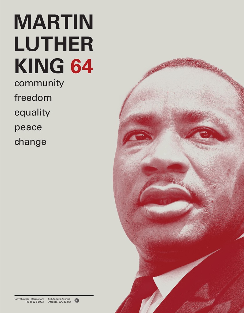
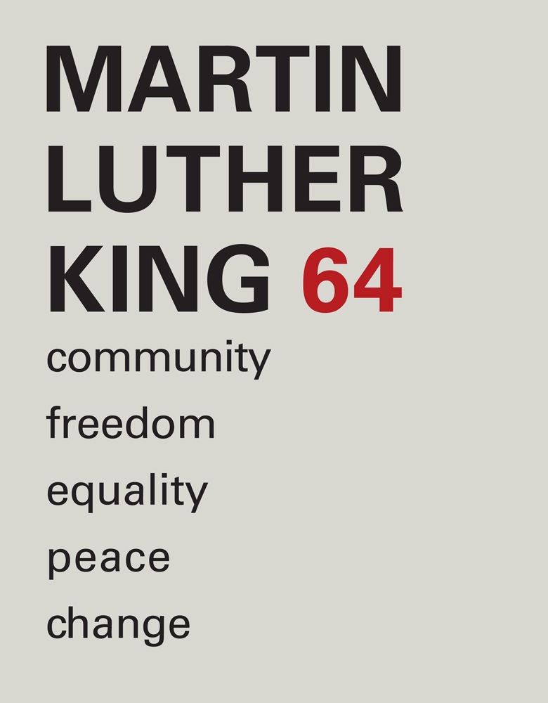
This student project by Ryan Hageman caught my eye today. Very nice color / typo interaction and a clean, direct style. There’s more over at his site notfreelance.com
Today marks a day of variety, we put up a cover of an old Chemical Brothers track reworked by Japan’s Shinichi Osawa. One of my favorite label’s Delsin delivers a deep and soft house cut from the mysterious Newworldaquarium. Caribou goes in a whole new direction with a Kelley Polar track that hints at he has been listening to a lot of electronic music and not just The Beach Boys. The Mountains seal the deal at the end with a gentle sleeper filled with layer upon layer of guitar.
Also, at the end there’s the original “Star Guitar” video by Michel Gondry just so you can pick if you like the cover more than the original, personally I don’t but its a wonderful effort by Mr. Osawa and featuring Au Revoir Simone never hurts. Chime in on the picks today since they’re all over the place and i’d love to hear if there’s something you like more than the other.
Shinichi Osawa – Star Guitar (feat. Au Revoir Simone)
[audio:starguitar.mp3]
Newworldaquarium – Tresspassers
[audio:newworld.mp3]
Kelley Polar – We Live In An Expanding Universe – Caribou Remix
[audio:polar.mp3]
Mountains – Blown Glass Typewriter
[audio:typewriter.mp3]
Chemical Brothers – Star Guitar – Video by Michel Gondry
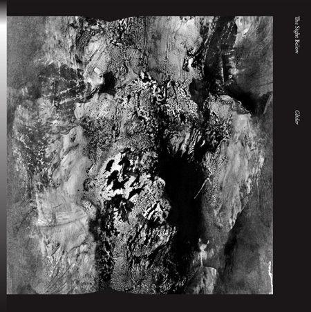
Before I start to gush about The Sight Below I think Alan Kellman from Allmusic Guide nailed the description perfectly: “The work of an anonymous Seattle-based producer with an evident affinity for the outer realms of shoegaze and somber ambient techno, Glider would have been an equally easy fit on Kranky, like label staple Loscil, or an idealized version of 4AD that has maintained the line running through the darker and spacier aspects of their early catalog. Alternately, this is just as likely to evoke the absorbing gray moods present throughout the Cure’s Faith and Seventeen Seconds as thaw-out techno like Yagya’s The Rhythm of Snow or Markus Guenter’s In Moll. Though heavily processed, caressingly foreboding guitars are a major component of the Sight Below sound, the root is Wolfgang Voigt’s Gas releases — whether or not a muffled thump is present, rhythm is paramount. Lesser producers would ride out these tracks for eight or nine minutes, rather than the six-minute average here; this producer keeps things tight and ever-developing, never straying into formlessness.”
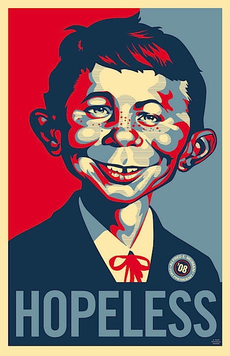
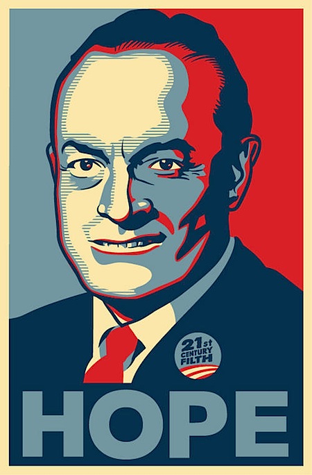
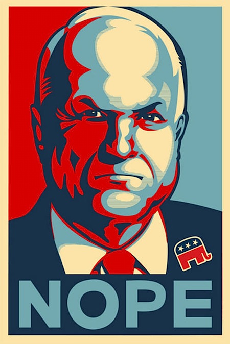
One testament to the success of Shepard Fairey’s iconic (and nearly ubiquitous) Obama poster is the sheer number of spoofs that have turned up since he created the now famous image. The Village Voice has compiled a rather comprehensive collection of them; some are good natured jabs while others come off a bit more incendiary. Either way, it’s an interesting look at the flip side of the veritable phenomena and centerpiece of a revolution in the visual communication and branding of election campaigns. I particularly like the Mad Magazine take pictured above; as a kid I obsessively collected every issue I could get my hands on and it’s great to see them still at it. Link
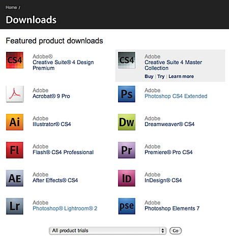 Just a heads up that Adobe finally switched it’s trial downloads section to CS4 over the weekend. All of the CS4 apps are available via a Java downloader, and all are fully functional for 30 days. Link via 9to5 Mac
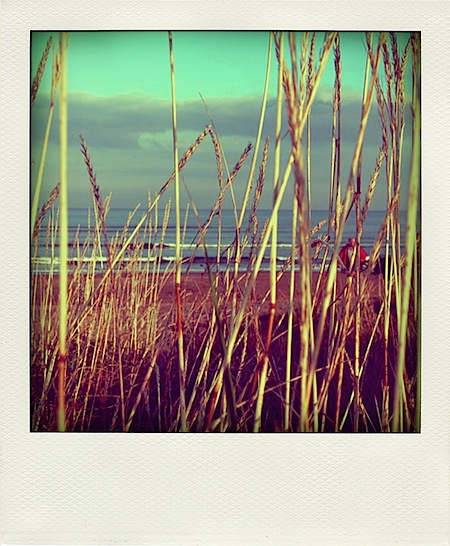
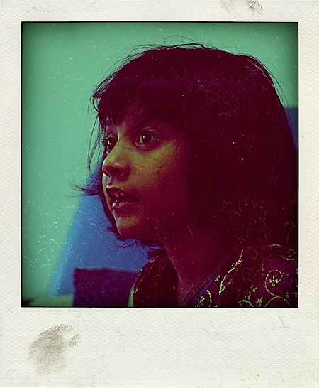 Poladroid is a new app that filters and effects your photos to make them look like, you guessed it, Polaroids. I would normally file something like this under gimmick and move on but I can’t help but appreciate the vignetting and color shift that the app lends to your digital photos, for an automatic filter it’s actually not that bad. Unfortunately it looks like you have to put up with the pretty fake looking border and drop shadow to get at that color shifting goodness, but it’s free so I can’t really complain. Check it out it at