ISO50 Fives Tee
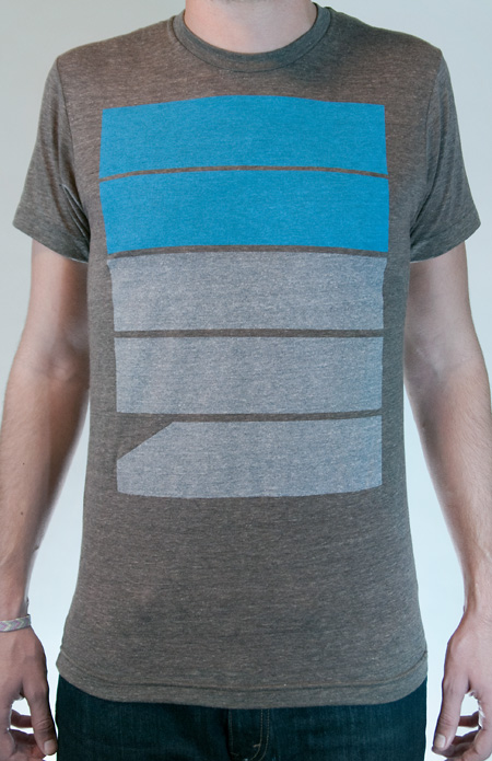
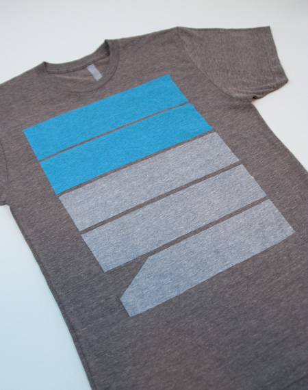
A new shirt design is now available at the shop. Five’s is printed on American Apparel Coffee Tri-blend and available in Men’s and Women’s sizes.


A new shirt design is now available at the shop. Five’s is printed on American Apparel Coffee Tri-blend and available in Men’s and Women’s sizes.

Just a quick note that today is the final day of the 20% Summer Sale at the ISO50 Shop. All regularly priced items are 20% off until midnight tonight (excludes giclee studio prints, MP3s). Get in while the gettin’s good!
These clock concepts by Saikat Biswas fall right in place with the concepts of the Holga D—just awesome. The clock no has hands or even markings to show the time, instead it uses a bar that grows progressively larger as time passes. We’ve all seen a similar design in the past when waiting impatiently for a flash site to load. To me this is a very interesting way to show time and I probably wouldn’t be hesitant to mount this on my wall.
The size of this clock is about 12 inches in diameter with a depth of about .6 of an inch. It also runs on 2 AAA batteries and as something more to note, the “loader” looking bar is actually a thin disc inside the clock and not a digital screen.
Read the full process.
I don’t know how I haven’t posted on this sooner. It is basically the best internet tool that has ever occurred in the universe. TeuxDeux is a mega-simple web based to-do application. I’ve been using it since it came out and it is now a permanent part of my workflow; not just for business, but also for laundry concerns, In-N-Out runs, and whatever else I have to DO. And it’s free. Boom goes the dynamite as they say.
You can watch the video above for a quick description, but just about anyone could figure this out within seconds. Basically you write in what you have to-do under the day you have to do it. Cross it off when it’s done. View is seven days wide but can be scrolled through if you are the kind of person to plan ahead (do they exist?). There is also a Someday area for things to-do in the undetermined future.
The iPhone app version has been in development for what’s seemed like ages. But! I just read this morning that they’ve submitted it to the iTunes store, so keep an eye out for it on their site.
On a side-note, I love and hate the “Someday” bucket provided at the bottom of the list. It’s great because there is a ton of stuff that I don’t have time to do during a given week that I plop down there. The reason I don’t like it is because I am constantly reminded how many things I would like to do “Someday”. This can be discouraging if they stay down there too long. Conversely, crossing something off of the ‘Someday” list is very cathartic and replaces any discouragement you might have felt with a sense of accomplishment.
TeuxDeux is a result of the collaboration between swissmiss and Fictive Kin.

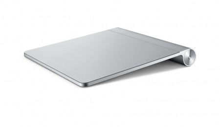
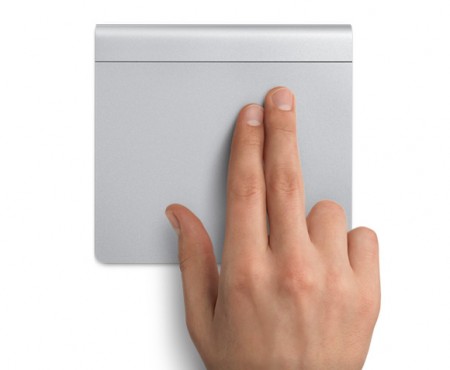
So Apple has just announced a giant trackpad titled the Magic Trackpad. It supports a full set of gestures; two-finger scrolling, pinching to zoom, rotating your fingertips, tapping is clicking, and so on—you get the idea. Of course it looks amazing because its an Apple product, but I question its practicality among designers/photographers. I get that Apple is trying to push technology into a more physically interactive realm but would you actually use this in replace of your mouse or tablet?
Personally I don’t think I could make the switch. I for one hate the trackpad for lack of control and use a mouse whenever possible. I think if I were to change my setup at all, I would probably have to add a tablet or purchase one of the new 12-Core MacPro’s.
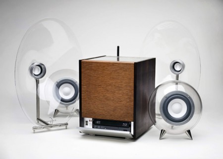
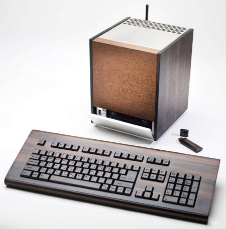
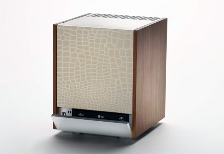
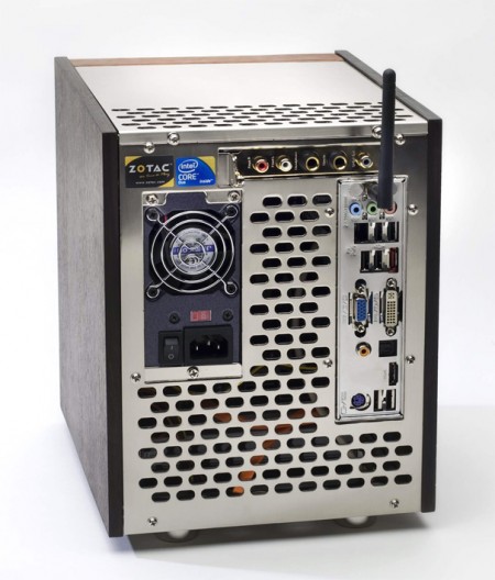
One of the things that turns me away from products is when they are slapped with something saying it’s “environmentally friendly” or “green” when its not. If cutting down trees and mining the soils for ore is environmentally friendly then this PC by Design Hara, is exactly that. I get that you could recycle this but do people really buy products (namely electronics) just because they can be recycled?
My initial thought about this PC was of course the design. It fits into the mid-century category by the materials choice. The option of Italian Cypress wood, Canadian Rose wood or even sheep leather really give this the computer it’s substance. The keyboard and even USB drive also really add to it. Maybe next we’ll see a wood-framed monitor. But as cool as this is and as much as I love the mid-century design aesthetic, I would probably only use this as a decoration (enter Mac vs PC debate).
Images via Yanko
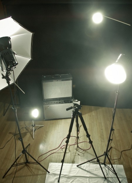
We’ve written before about photographic lighting. Another lighting arena that I’ve recently explored is continuous lighting for video. As I had absolutely no idea what I was doing when I jumped into this, I decided to start with a basic kit set up, and then go from there. I had researched enough to know that I would need at least three lights, but I was fuzzy on just about every other detail. I ended up going with the Smith Victor K84 Photoflood Kit. (Four lights: two A80 flood lights and two, smaller A5s.)
Now to this point, the kit has satisfied my requirements. I haven’t felt like I needed any additional lights on my projects and everything is lit well and looks (more) professional. That said, I have learned a lot in the process about what not to do.
First, these lights get unimaginably hot when they’re on for an extended period of time (more than 5 minutes). I use them in an enclosed room without a lot of ventilation and it can become unbearable really quickly. If you are interviewing someone, or performing under these lights, you need to either get things done fast, or have some way of cooling down your room. I broke a sweat just snapping the above picture, and they had only been on for 10 minutes.
Second, despite the benefits of using continuous lighting for photography (no camera syncing necessary, always see where you’re lighting etc), this kit is not powerful enough to really work in this regard. Unless the lights are right up on your subject, you’ll have to adjust the shutter speed significantly to get satisfactory results. It’s also impossible to get good portrait shots, mainly because your iris gets smaller as it gets used to the continuous amount of light; doesn’t look as cool as strobe. It works for some photo things, but I am mainly attempting to use this kit for lighting video. So far the footage has required a significant amount of color correction to make things look natural. The kit is a tungsten set up, which burns yellow/orange, and that is the color of the footage upon capture. Luckily I’ve been working a lot with Color and have been able to work around this.
The biggest positive to the kit is that it’s cheap (relatively). It helps to know some basic lighting strategy (three point etc), but the kit really doesn’t require much know-how to get up and running. It is a great starter kit and I feel like I have a much better idea of what I need, now that I have fumbled my way around with this one. Of course it will be a while before I can afford a real set up, but in the mean time I am having a good time experimenting and making mistakes. This probably wasn’t the kit of me at the end of the day, but it sure beats lighting things with assorted desk lamps and flash lights.
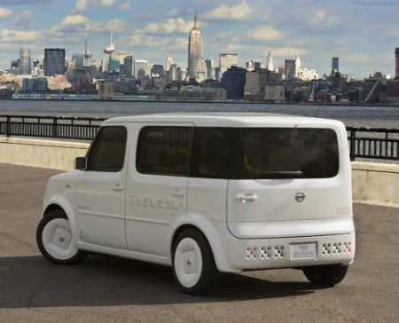
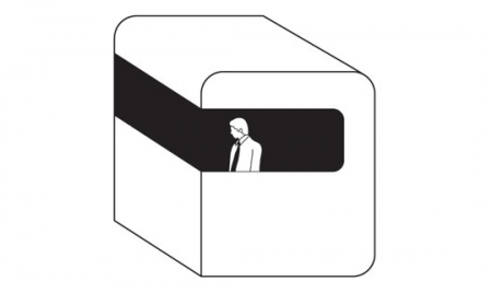
The other night i’m sitting on the computer and Mux Mool sends me a picture and starts laughing and talking about how there’s a Moodgadget car driving around. In my mind I always thought if I get enough money together one day I might buy a white Honda Element and turn it into the Moodgadget Logo. I might even put the generic man as a tint on the window but now no need because the Nissan Cube came into play. LOOK AT IT! I mean WHAAUUUT IS GOING ON!? who does that with a back window? only the Moodgadget logo.
Let me give a little background about the Moodgadget logo, a lot of people call it MOONgadget maybe because it looks like something that would land on the moon or I can’t pronounce my D’s because I might mumble sometimes but really its a dreamt up idea I had that involves my obsession with pods and early early Radiohead covers, the old Royksopp video, and those cube shaped rooms that take you up a mountain that are used mostly by tourists. The Moodgadget logo was designed by 3 friends of mine: Adrian (Creative Director of the silhouette iPod commercials), Danny (Art Director at Ghostly), and Adam (co-owner of Moodgadget) and the idea came from a dream that I had about these white pods what were controlled by these generic business men sitting inside them that floated almost assembly line style out of a glass dome flying by these row of trees and straight into the sun except for one that was in color meaning still black and white but the glass window was light blue and the guy inside had pigment to his skin. This guy wasn’t in the assembly line he was floating around exploring but not too smart of a fellow because he always questioned everything since it was all new to him and he was just overall really curious. I think that dream of the logo kind of symbolized the music industry back then for me which was a lot generic music and compilations that we’re very specific and what we do at Moodgadget is kind of break down those barriers that were up and share music that is all over the place but still catchy in a way, kind of like the music on the blog that we pick but still educates hopefully and makes you want to try listening to something new.
Let’s get back to the Nissan Cube, not my style because of how bad their commercial was for it which if I remember correctly was probably geared toward break dancers that pop n lock in their cars, people that love glowing LEDs filling their stereo screens and those people that go out to the club with a fedora hat on tipped to the side because they’re soo “street” it hurts. To be honest Nissan should of hired on a creative like Scott or some of you that send in great pieces that Scott reposts and not this Mitsubishi Eclipse regurgitation of a car commercial that probably could be sold to people like me if it was delivered to us in a way that doesn’t make me feel like a soulless 20 year old that can’t speak for himself and wants to dance to Soulja Boy or whatever ringtone Rap is popular now(the stanky leg? I dunno i’m so lame when it comes to the hot tracks on the radio) or Tiesto talentless trance music thats played in the bigger metro clubs around the world.
Either way, I’d like to see a song off this blog make it onto the next Nissan Cube commercial, maybe we’d post the commerical and the 4th generation Nissan Cube get a little help from a design firm from Sweden and we might sell a few of these cars.