JOYN:VISCOM Workshop: Natural World
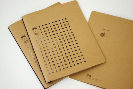
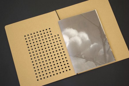
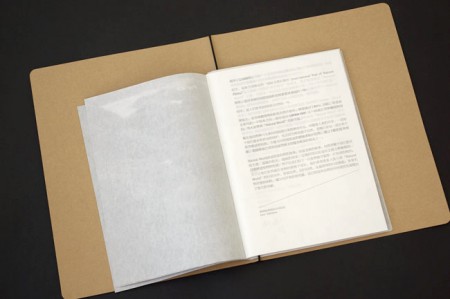
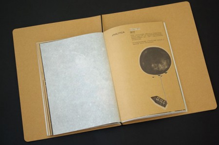
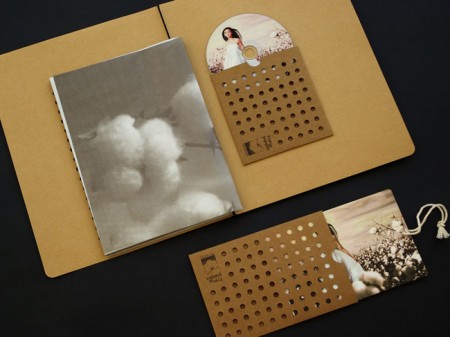
Absolutely beautiful work from Beijing-based JOYN:VISCOM Workshop. Loving the die-cuts and texture, would love a notebook that looked like this.
Via the excellent Graphic Exchange


Absolutely beautiful work from Beijing-based JOYN:VISCOM Workshop. Loving the die-cuts and texture, would love a notebook that looked like this.
Via the excellent Graphic Exchange
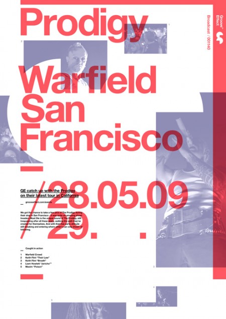
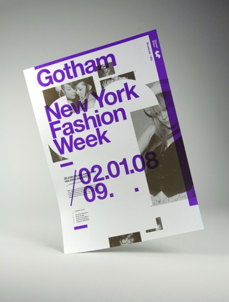
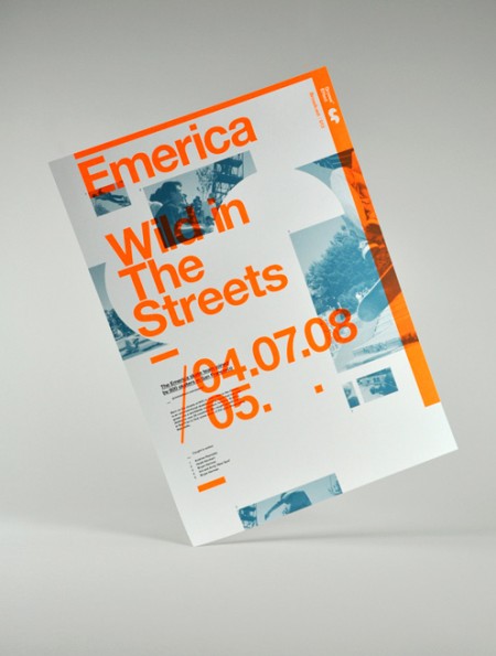
Older poster series by Darren Firth. I’ve always been a fan of Darren’s web work and recently came upon the project above while searching around for innovative ways to shoot pictures of printed work. I thought this was a cool idea; playful and interesting without being distracting. Of course the poster design is what I really like. I’ve never been able to pull off this kind of mega overlapping layout, and I always appreciate it when it’s done well like this. Hopefully going to see some new projects soon! Keep an eye out at Darren’s portfolio.
Follow up reading: AisleOne interview with Darren.

The University of Brighton has a nifty website up displaying the work of their Spring 2009 design and illustration graduates. I’ve placed some of my favorite pieces above, but there is a lot of impressive work to be seen. I think it’s great that the school puts this together for the graduates. While each student seems to be very web-capable (at least in terms establishing an online presence), this kind of collective resource allows each student to benefit from the aggregate buzz of the project. This institution-sponsored online portfolio presentation is something I think we will be seeing more and more of (in conjunction with, or probably as a replacement for, the onsite end-of-semester shows).
The work above is by the following designers, in this order: Kirsty Hole, Richard Carey, Edd Harrington, Kyle Bean. Those old school phones remind me of some of the work by Dan Mcpharlin.
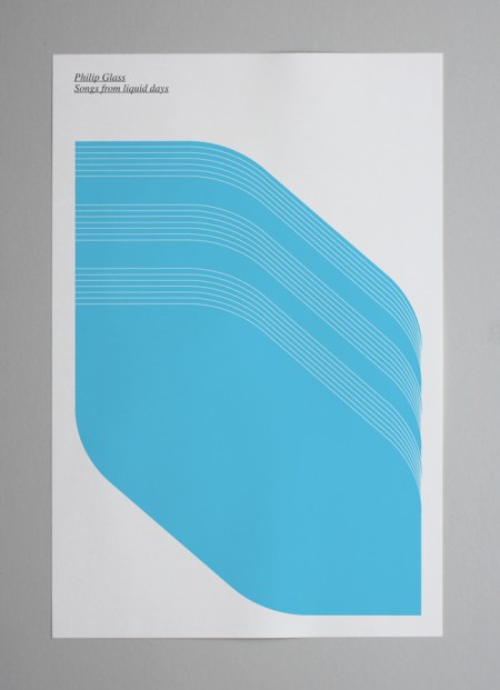
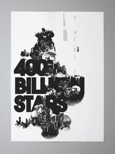
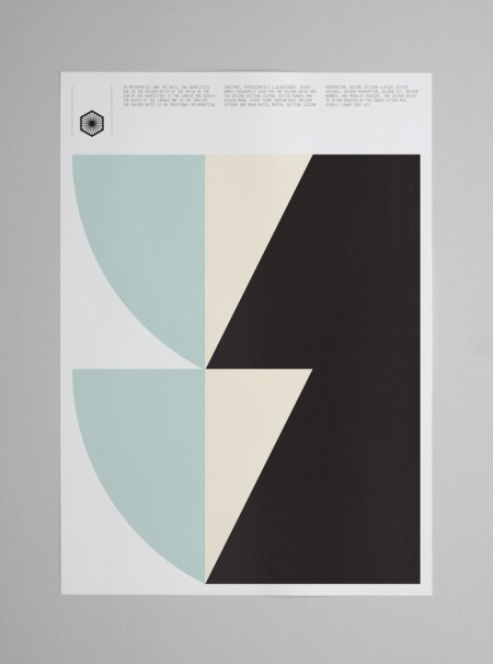
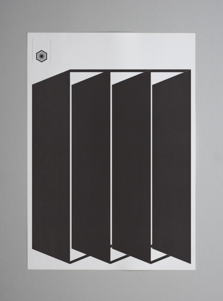
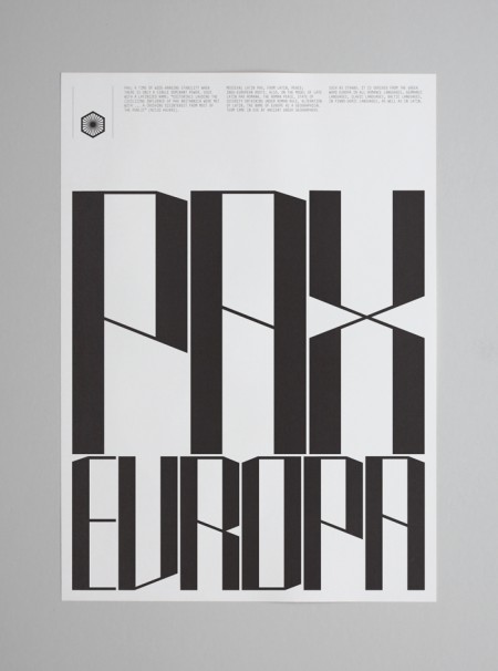
The work of Tom Balchin stopped me in my Google Reader tracks this evening. His Pax Europa project was my initial favorite, for the bold simplicity and terrific layouts, but there is a ton of terrific work in his portfolio. I came across the phrase “talent turbine” in the NYT Magazine the other day and have been itching for an opportunity to use it, so here goes; Tom Balchin is a talent turbine.

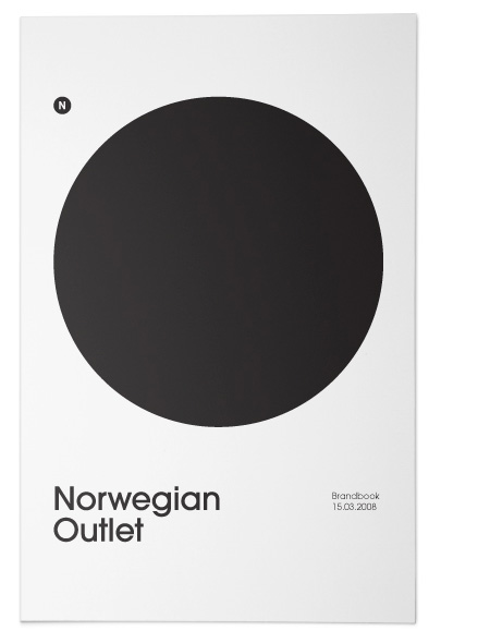
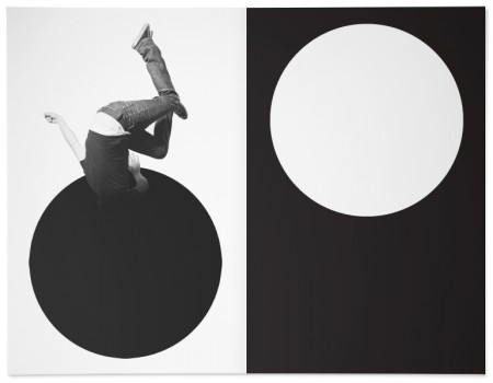
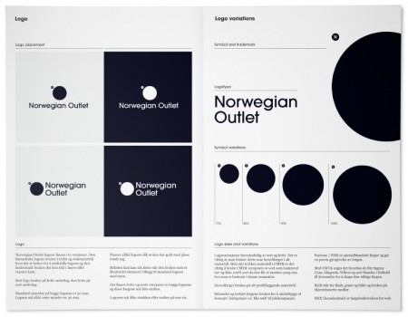
Excellent project by Norwegian firm Snansen for Norwegian Outlet.
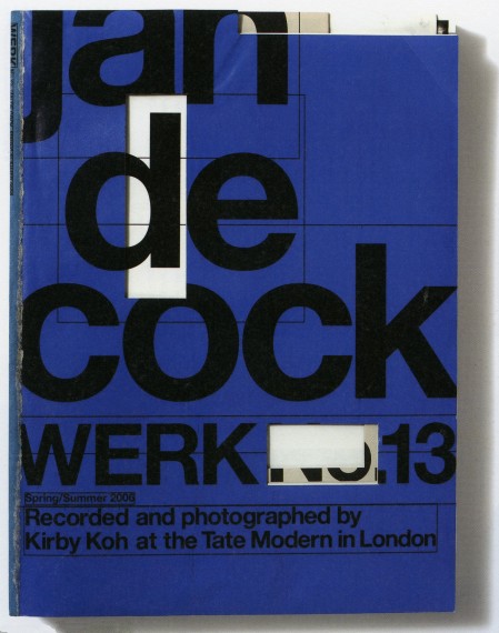
Werk
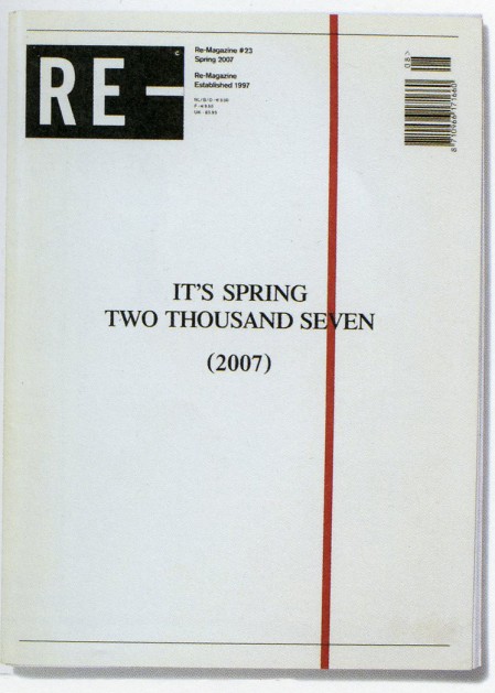
Re-Magazine
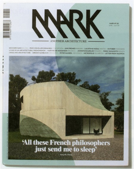
Mark
Our aim with this event is not to yearn for the magazines of yesteryear but rather to look upon those magazines extant in the world today, and in doing so, understand the culture and tastes of our time, reaffirm our awareness of paper’s function, and confirm the intelligence and ingenuity of humanity as seen in magazines.
Related Reading
– An Overview of Design Related Magazines
– Can Design Save The Newspaper?
– NYT Magazine ‘T’ Covers
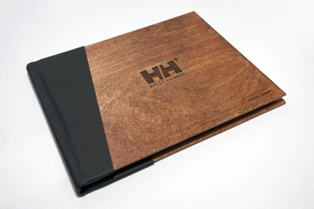
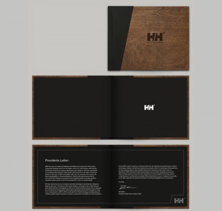
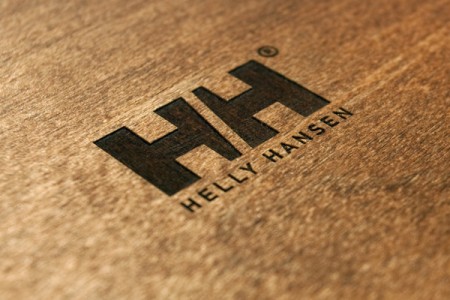
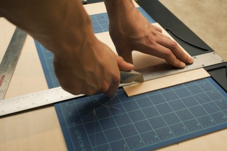
Awesome class project with process by Shelby White. I’m always a sucker for engraved wood. More pics and making of here.
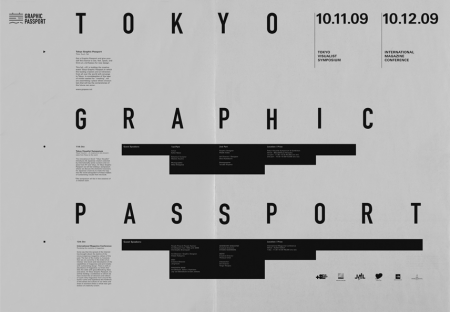
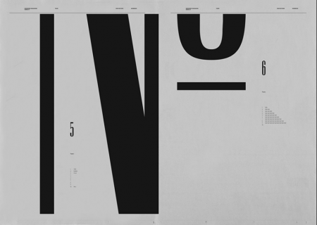
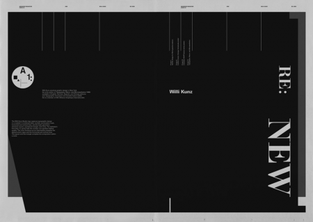
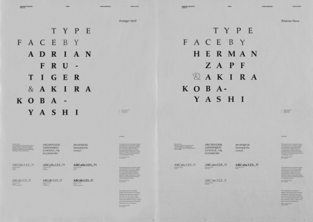
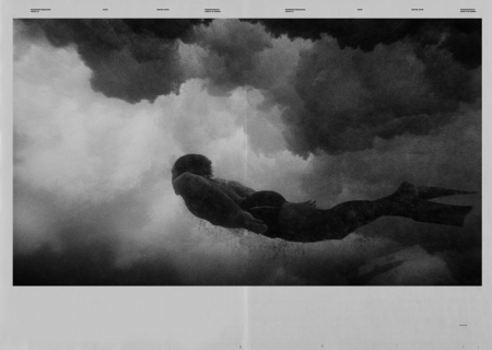
These spreads from Newwork Magazine are exceptionally awesome. At first I wasn’t sure why I was so taken by them, but I think it’s a combination of the following factors: sole use of (mostly) black and white, implementation of a strict grid, lots of little type details throughout, and a sophisticated and effective use of negative space. Newwork Magazine (ink on paper / 32″ x 23″) is put out by Studio Newwork.