Josef Schulz: Sign Out print exhibit
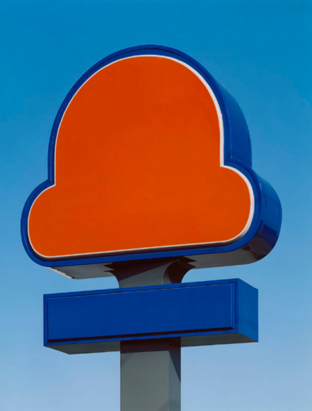
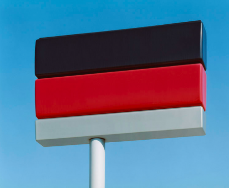
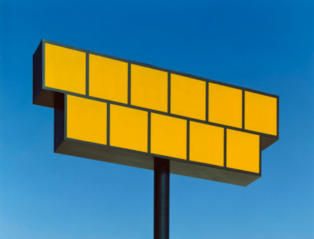
Found these prints from an exhibit by Josef Schulz on the basic_sound blog, I thought they were pretty fun looking, would love to see this idea taken even further with different colors and shapes.


Found these prints from an exhibit by Josef Schulz on the basic_sound blog, I thought they were pretty fun looking, would love to see this idea taken even further with different colors and shapes.
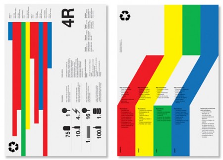
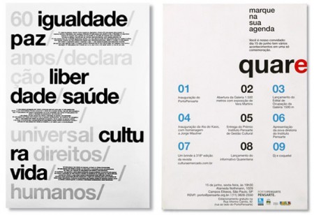
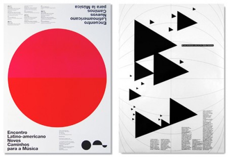
I’m definitely getting way into this style right now; what can I say, people are doing some amazing things with type and shapes. These posters are by Quadradao out of Brazil. There is something familiar about the look of course, but I think it’s still fresh in its own way. What I find interesting about it is how much harder it is to design effectively in this style than it looks like. Sure it’s just type and shapes, but try and work something equally refined and see if you don’t go completely nuts.
Couldn’t find too much information on the studio, but from what I can deduce they’re chilling down in Brazil pumping out crazy good posters like these. If I had to guess I would have said these were straight out of the Netherlands.
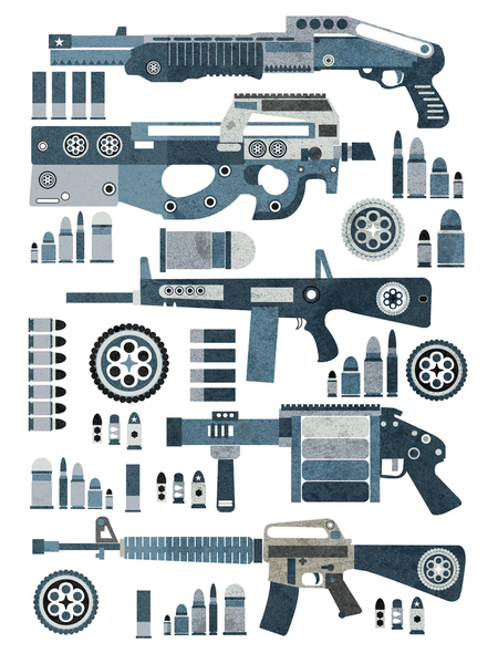
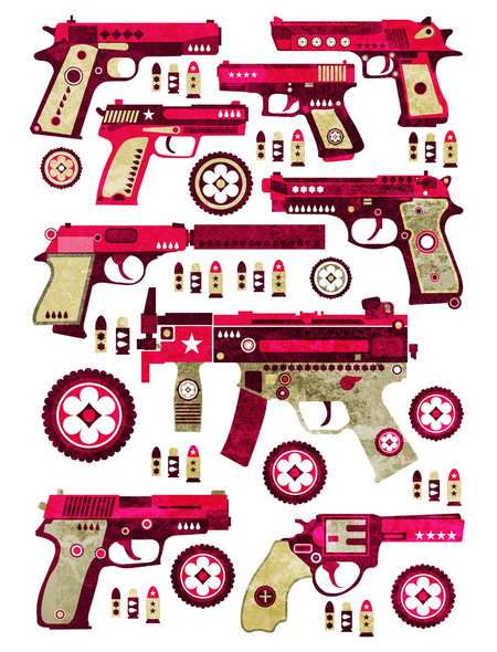
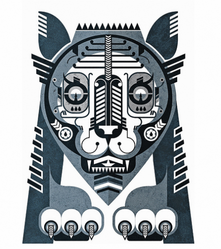
Combining a polished illustration style with the beautiful mechanics of small arms weaponry, Jonny Wan has created these terrific pieces. I like how he’s reduced the weapons to their most basic parts, while simultaneously adding gorgeous little details here and there. I feel like they would shoot creativity bullets instead of metal ones. His style reminds me of what might happen if you mixed Leandro Castelao and Sanna Annuka in a twisted pot of liquid talent. 2010 is sure to be a great year for Mr. Wan.
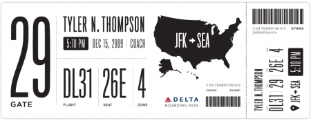
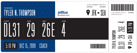
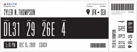
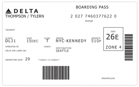
I have been flying a rather insane amount over the last few weeks. I complain about a lot of things when I’m traveling: the food, babies, people that insist on stuffing overhead luggage when it will NOT fit, etc. The one thing I have never considered is the boarding pass. Tyler Thompson has written an excellent article on why the boarding pass is indeed worthy of scrutiny. Take one look at the old Delta pass above and you’ll see why. As he states, “It was like someone put on a blindfold, drank a fifth of whiskey, spun around 100 times, got kicked in the face by a mule (the person who designed this definitely has a mule living with them inside their house) and then just started puking numbers and letters onto the boarding pass at random”.
Tyler has done Delta a big favor and redesigned their boarding pass, the design of which you see above. I think it’s obvious that aesthetically, these are much more pleasing to the eye. I would want to hold onto these after my flight was over just because they look awesome. Now of course, the design of a boarding pass has to be more than just beautiful. There are a number of criteria and limitations in place that might prevent your boarding pass from becoming a little piece of art. Worth mentioning in this regard is Timoni Grone’s response to Tylers inital designs. She runs through a meticulous process to come up with a redesign of her own, taking into account all the necessary “practicalities and priorities”.
The cool thing about his project is how he opened it up to others to submit reworkings and suggestions, a few of which he’s posted as you scroll down his page. He’s provided the Illustrator file for download and tweaking. Make sure to head over there and submit yours if you’ve got something brewing. And feel free to sound off if you too feel like the boarding pass design is indeed a fail.
I must say my favorite part of any boarding pass is the little scribbles the security guards make when you pass the initial check at the metal detectors. They do it with such purpose and apparent deliberation, that I think the scribbles must mean something. I always wonder what would happen if I augment their scribbles with scribbles of my own (or scribble before they do). Would I get sent to Homeland Security? Maybe two scribbles on your boarding pass = terrorist. Anyway. I feel safe knowing we have such a complicated system in place.
I could write a similar article about the terrible design of movie tickets, which I feel have slid drastically in the past few years. Since when is a movie ticket printed on receipt paper worth saving? I used to love hoarding all of my movie ticket stubs — now, calling it a “stub” would be an absurd misrepresentation. I call my movie tickets trash.
Thanks @rohrsh

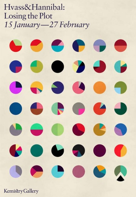
I only post one image by itself when I think it’s worth it. This one, advertising the Hvass&Hannibal show at the Kemistry Gallery, is such an image. I like the layout, sure, but the main reason I found this so captivating is the color combinations. Each little circle has a different (and often bizarre but terrific) color combination. Each could easily jump off this poster and onto whatever project you happen to be working on (assuming the word “fun” might describe your client…) Pink and green? Why not. Lime and red? Let’s do this. My favorite is 6th row down, 4th across. Reminds me of a Deth P Sun type palette.
Now I’m inclined to think that H&H had everything to do with the design of this poster, but I cannot find the credit information anywhere. It looks like something they would drum up, but if not, let me know and I’ll be sure to link out. If you’re in London, be sure to check out the exhibit! Here is the invitation.
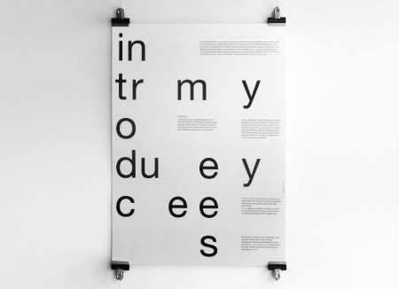
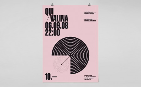
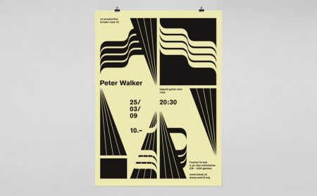
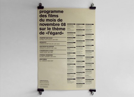
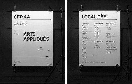
Yes! League! When I look over my ffffound over the last few weeks, there has been one dominant style I’ve been gravitating towards for its beauty and sophistication. This work by League sums it up perfectly. It’s often imageless, utilizes type in some unusual way, is bold and graphic, and has some crazy asymmetrical balance at work that makes me want to practice graphic design forever and quit it immediately…simultaneously.
I love layouts with many scattered elements, all necessary and unable to be removed, but you’re not sure exactly why. For example, those tiny thick black lines on the CFP AA poster above — wee bits like this are amazing to me.
And by the way their home page might be my favorite single page on the web right now.
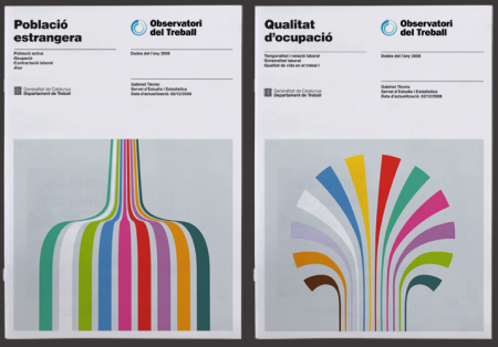
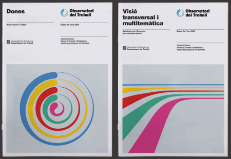
I hope everyone had a great Thanksgiving holiday last week (or weekend if you’re abroad)! I just got back from DC tonight after a nice long break and was greeted by this excellent work by Hey Studio. Their entire portfolio is filled with incredible work, but I was especially attracted to this piece for the Observatori del Treball. I love information graphics more than most things in the world and these illustrative forms reminded me of some really beautiful graphs I’ve seen in the past. Of course they aren’t providing any “info” here, but they look so good I don’t mind at all.
Check out the rest of their portfolio here. (The Playboy poster, third one down, made me smile…). Via Changethethought.
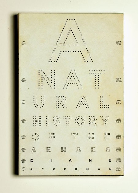
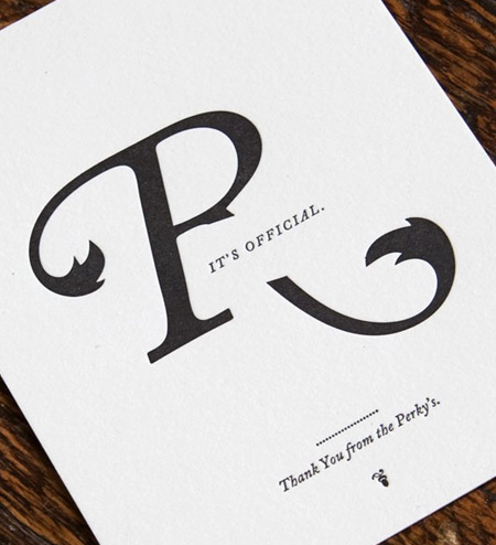
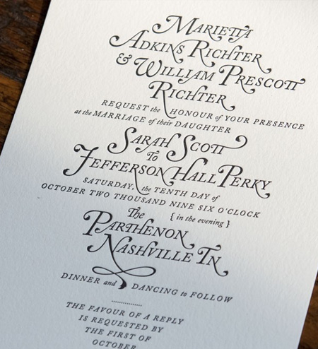
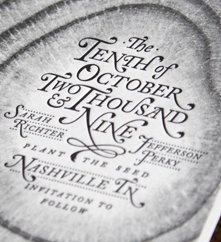
I’m always a sucker for letterpress. You could almost use any design and I’ll love it if it’s on the right paper and embossed like this. Perky Bros., aka Jefferson Perky, is producing some beautiful work out of his studio in Nashville, TN. You can check out the rest of his portfolio here.
I forgot when I heard this, but this girl with a letterpress was explaining how in the old days it was actually frowned upon to de-boss the paper. The more skilled the letterpress operator, the lighter the impression the type would make when it printed to the paper. She went on to explain how in recent times artists have begun to purposefully de-boss the paper when printing as an effect. It’s always interesting to see how people take equipment that’s been painstakingly designed to produce a certain effect and turn it on it’s head to do something new and creative. It sort of reminds me of a lot of recording techniques where you’re taking something designed to produce the most pristine possible sound and abusing the process to create effects and distortions.
Via Graphic ExchanGE